Download as PDF, PPTX
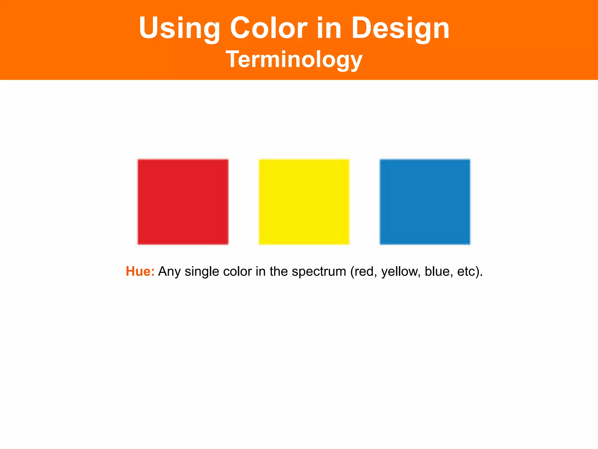
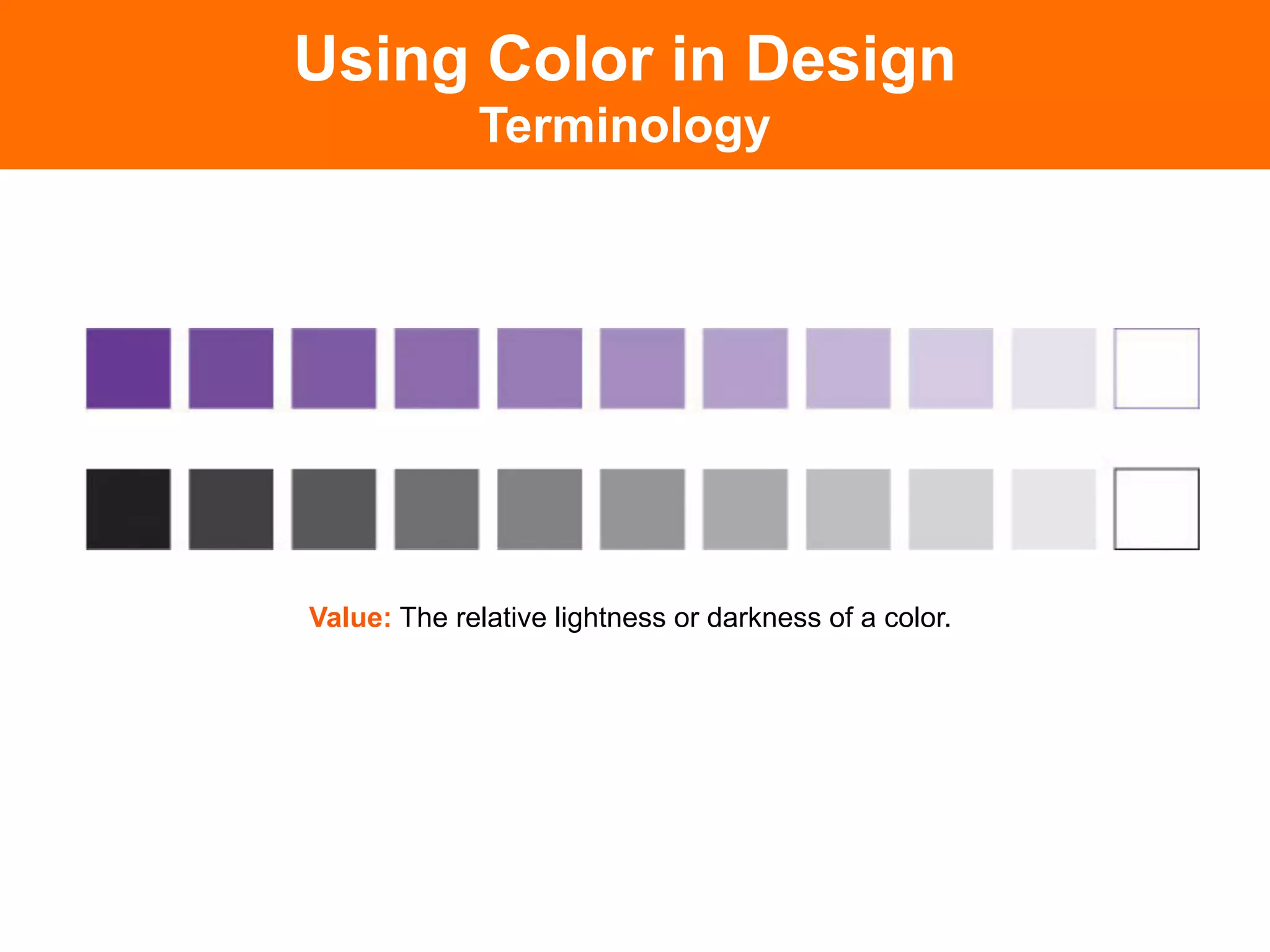
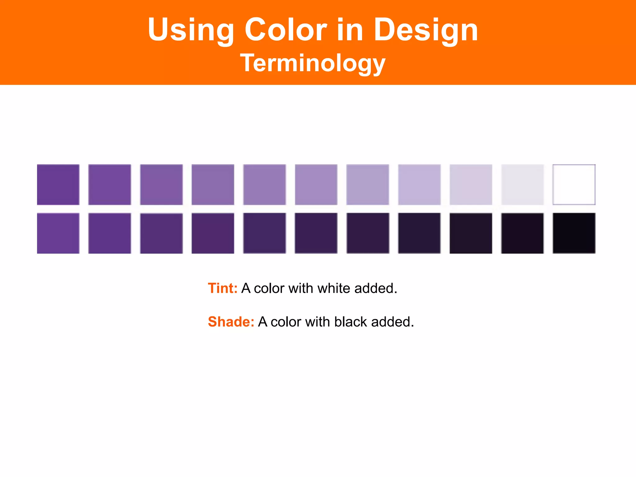
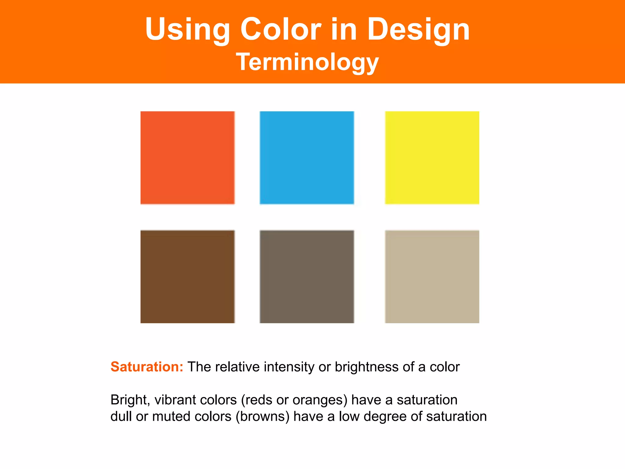
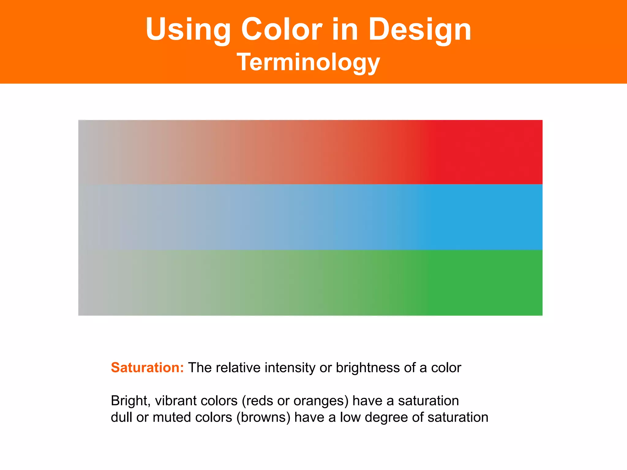
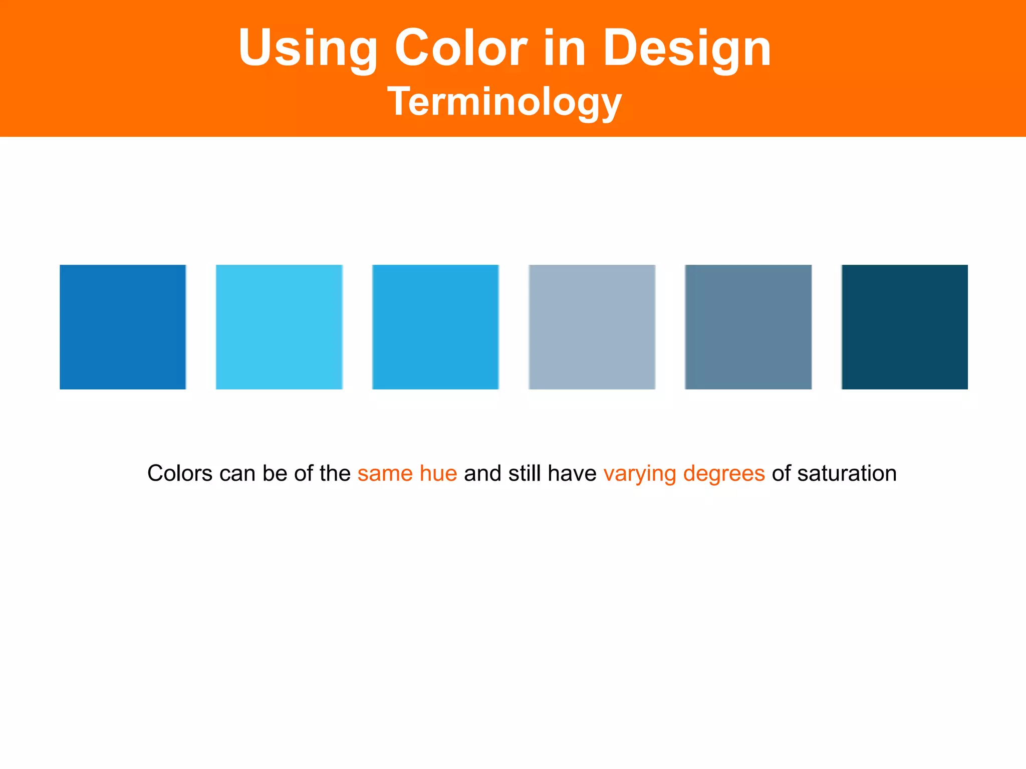
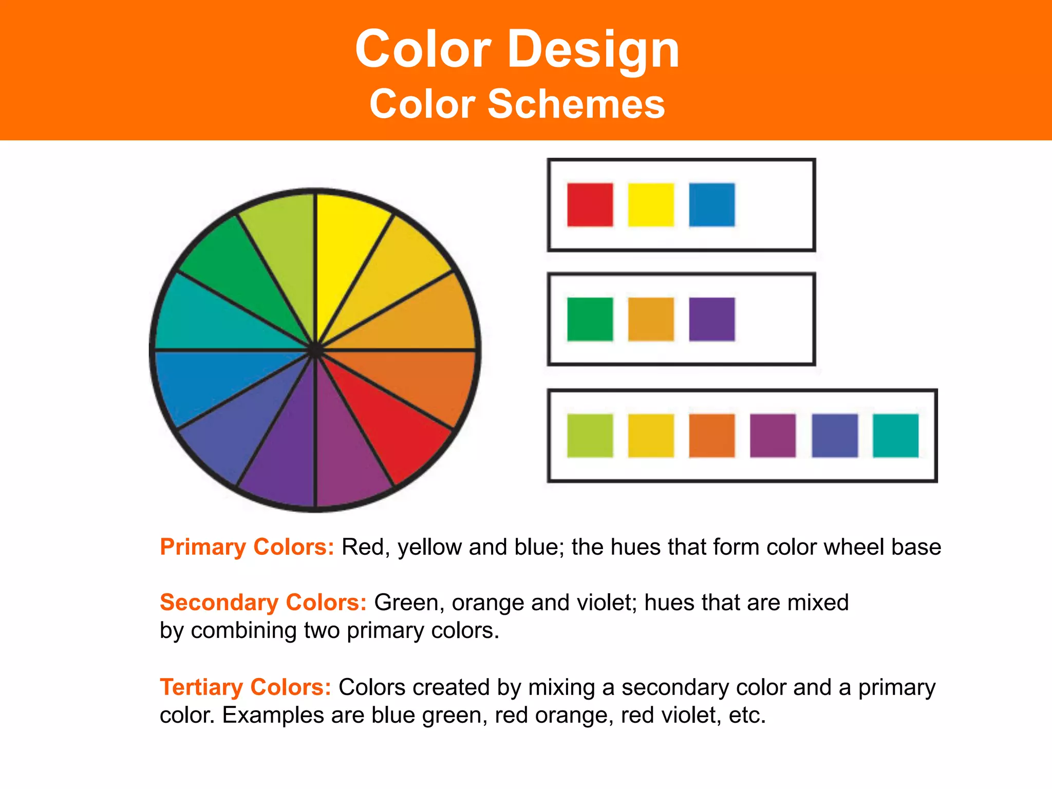
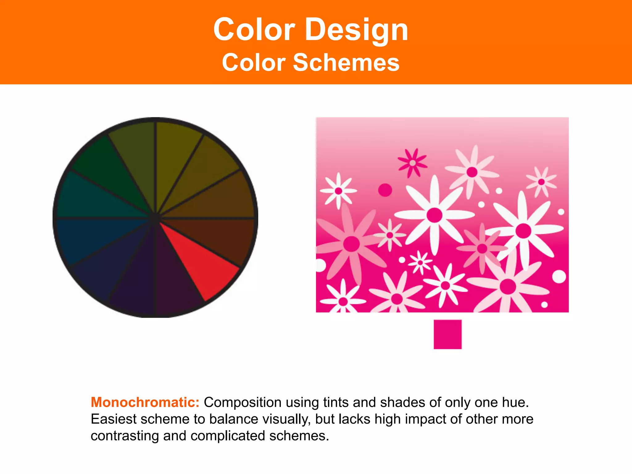
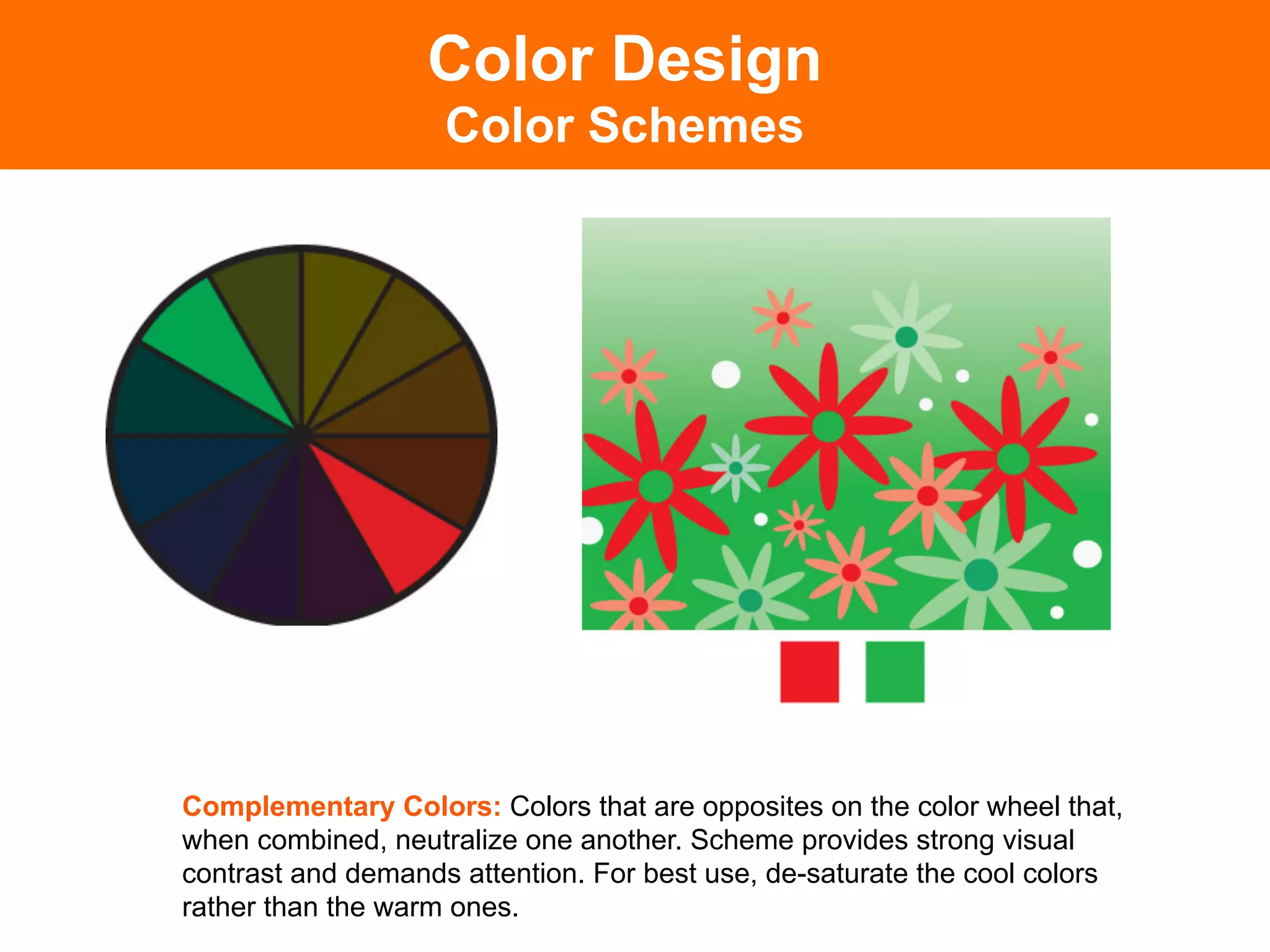
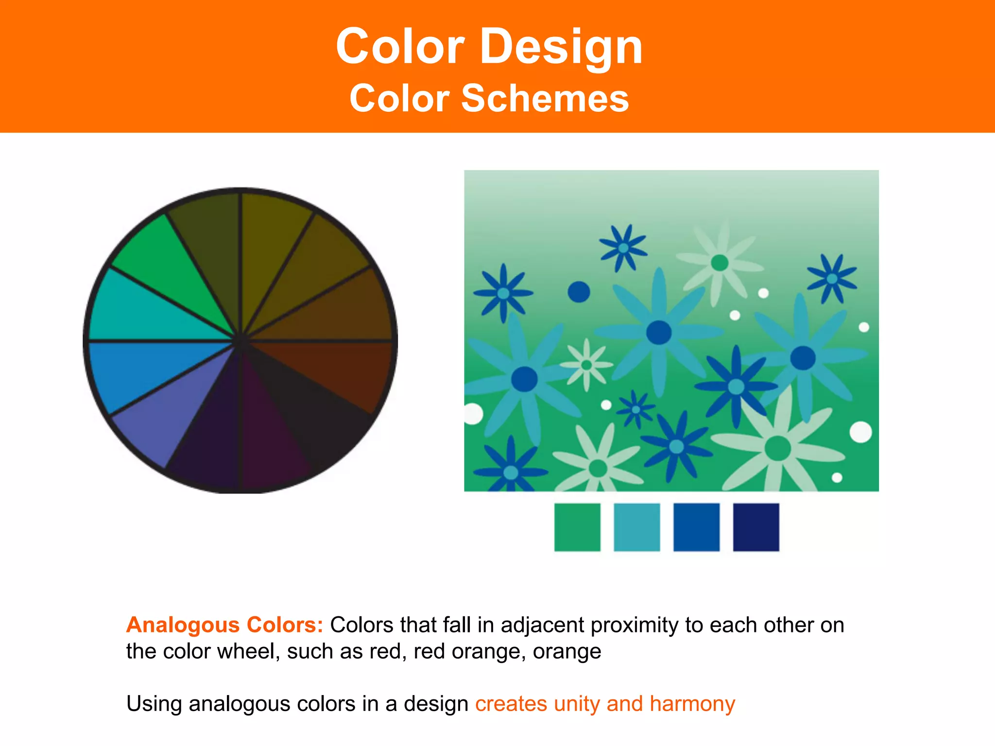
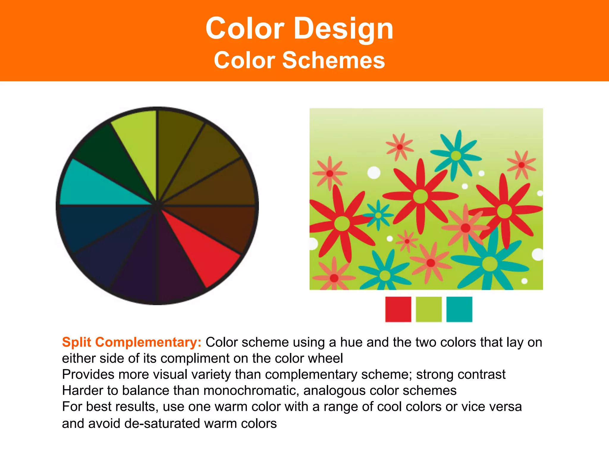
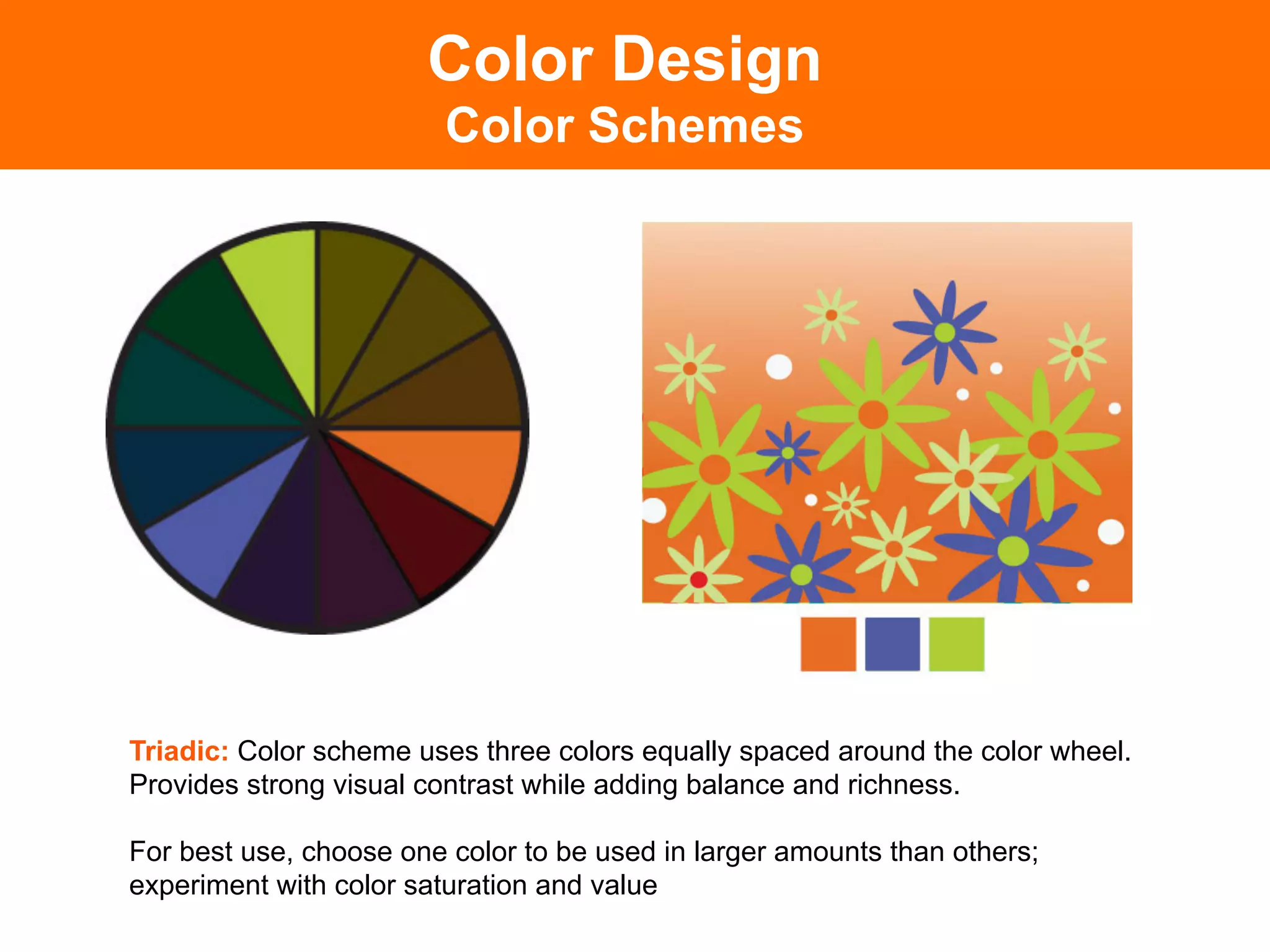
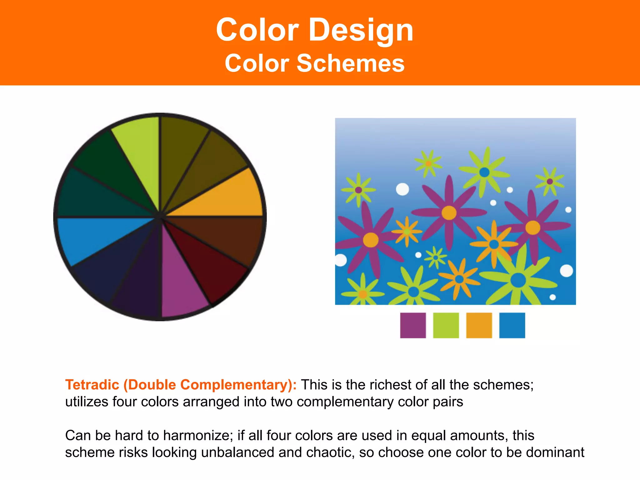
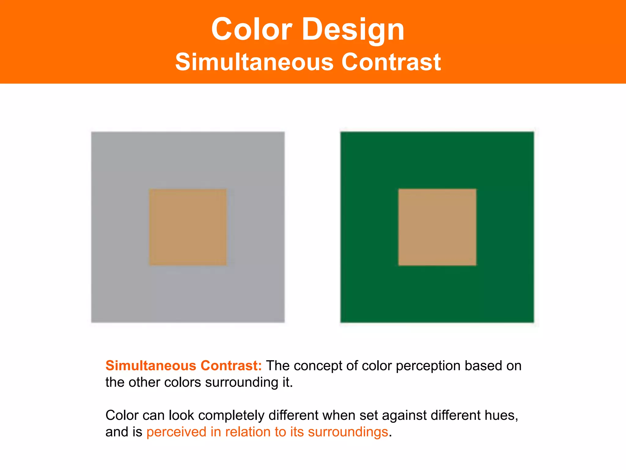
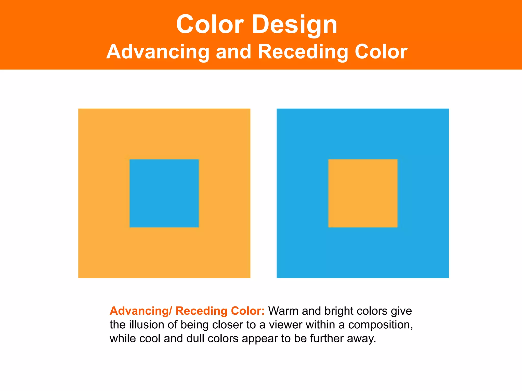
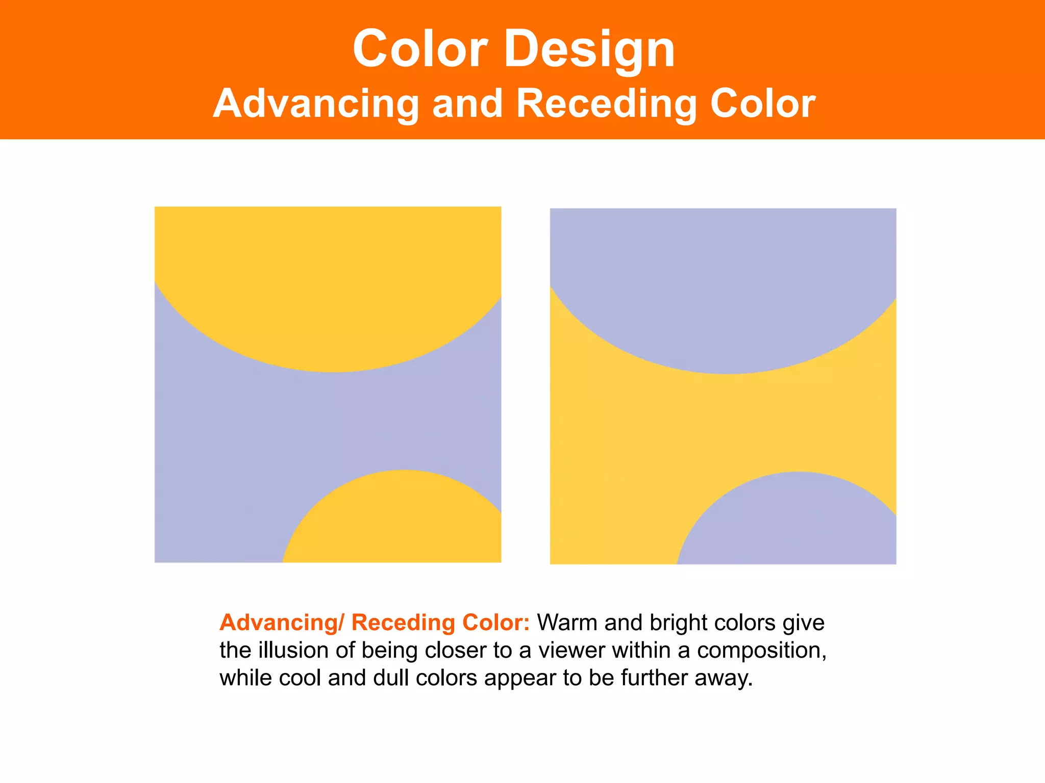
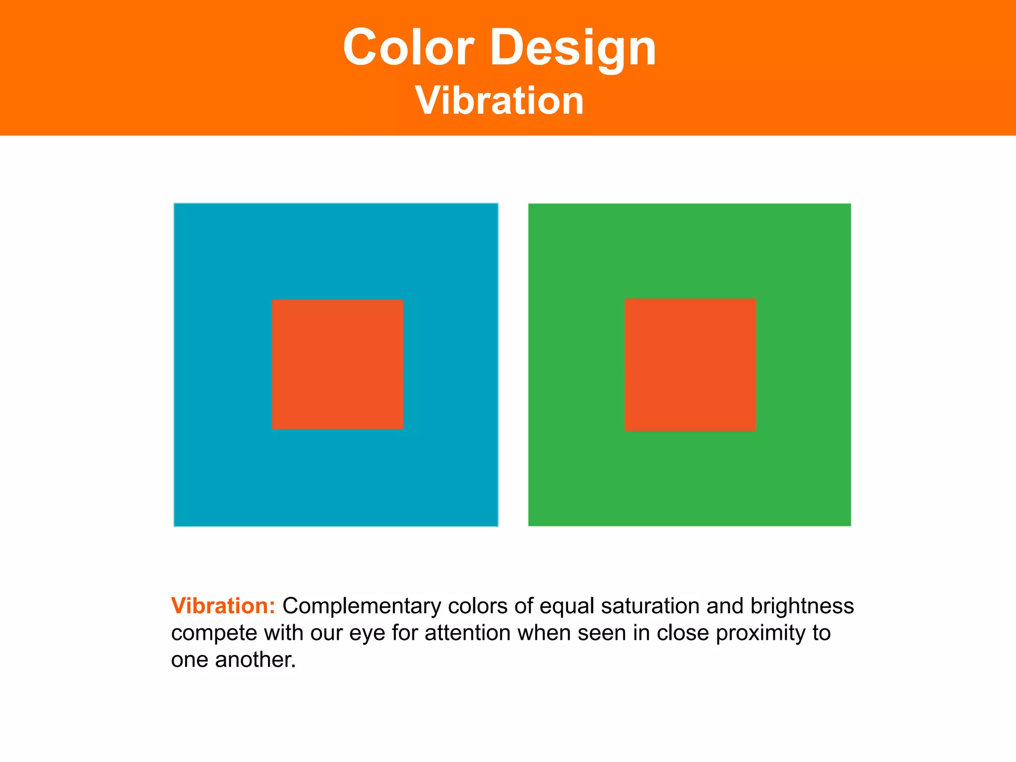
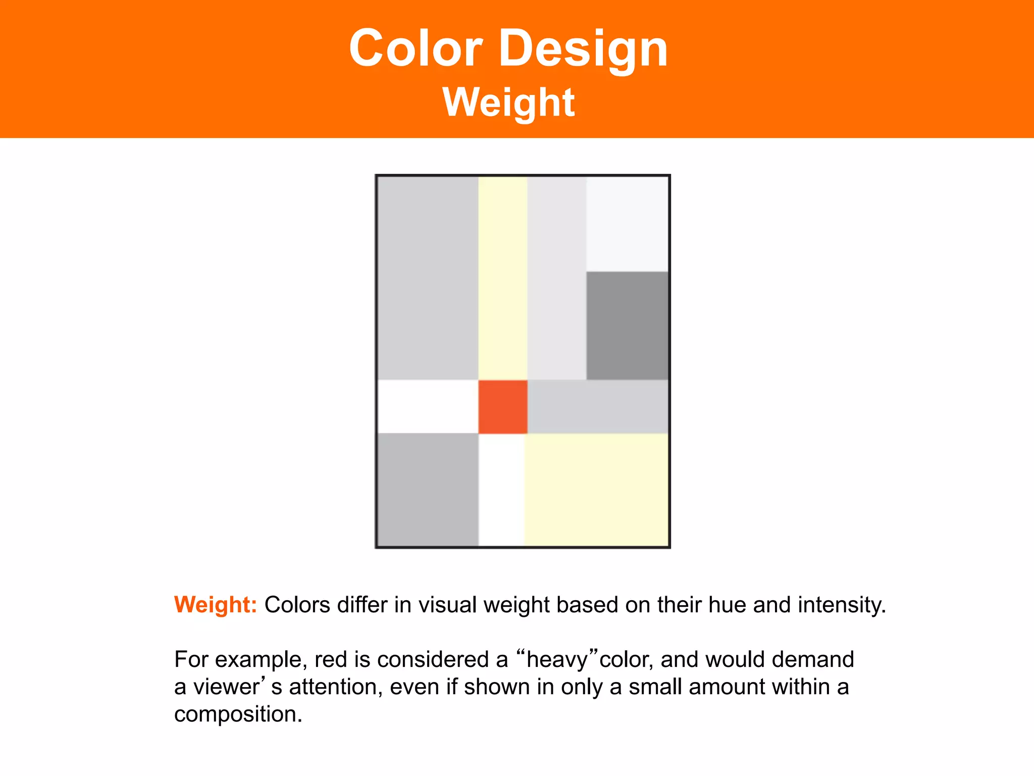
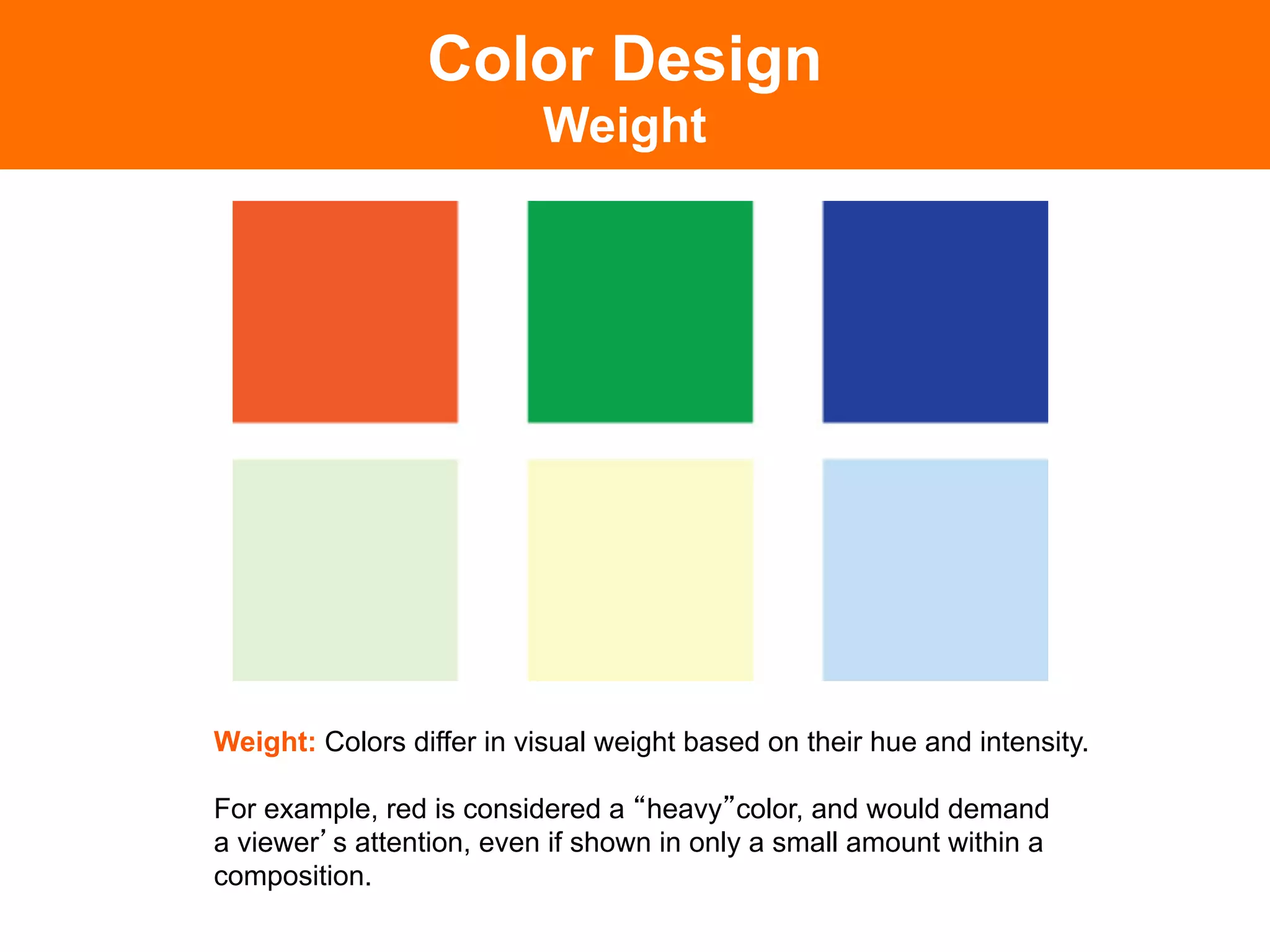

The document discusses color theory and its application in design. It defines key color terminology like hue, value, saturation and describes different color schemes including monochromatic, complementary, analogous, split complementary, triadic and tetradic. It also covers color perception principles such as simultaneous contrast, advancing/receding colors, vibration and weight.


![PowerISO 9.2 Mac Crack + Serial Key Free Download 2026 [Latest] Software.pptx](https://cdn.slidesharecdn.com/ss_thumbnails/software-251207185653-5d5700e6-thumbnail.jpg?width=640&height=640&fit=bounds)
![iStat Menus 7.20 Crack for MacOS 2026 Full Version [Latest] pptx](https://cdn.slidesharecdn.com/ss_thumbnails/softwareoverview-251207191544-22b737dc-thumbnail.jpg?width=640&height=640&fit=bounds)

![WinRAR Crack 7.13 Final Mac Keygen 2026 Download [Latest] Software.pptx](https://cdn.slidesharecdn.com/ss_thumbnails/software-251207185858-eb450678-thumbnail.jpg?width=640&height=640&fit=bounds)
![Soundtoys Mac v5.5.5.0 Crack for MacOS Full Version [Latest] pptx](https://cdn.slidesharecdn.com/ss_thumbnails/softwareoverview-251207193711-91d8ae6b-thumbnail.jpg?width=640&height=640&fit=bounds)


![Moho Pro 14.4 Crack for MacOS Works Until 2050 [Latest] pptx](https://cdn.slidesharecdn.com/ss_thumbnails/softwareoverview-251207192639-797289c4-thumbnail.jpg?width=640&height=640&fit=bounds)

