Skip to content
    geeksforgeeks
    • Interview Prep
      • DSA
      • Interview Corner
      • Aptitude & Reasoning
      • Practice Coding Problems
      • All Courses
    • Tutorials
      • Python
      • Java
      • ML & Data Science
      • Programming Languages
      • Web Development
      • CS Subjects
      • DevOps
      • Software and Tools
      • School Learning
    • Tracks
      • Languages
        • Python
        • C
        • C++
        • Java
        • Advanced Java
        • SQL
        • JavaScript
        • C#
      • Interview Preparation
        • GfG 160
        • GfG 360
        • System Design
        • Core Subjects
        • Interview Questions
        • Interview Puzzles
        • Aptitude and Reasoning
        • Product Management
        • Computer Organisation and Architecture
      • Data Science
        • Python
        • Data Analytics
        • Complete Data Science
        • Gen AI
        • Agentic AI
      • Dev Skills
        • Full-Stack Web Dev
        • DevOps
        • Software Testing
        • CyberSecurity
        • NextJS
        • Git
      • Tools
        • Computer Fundamentals
        • AI Tools
        • MS Excel & Google Sheets
        • MS Word & Google Docs
      • Maths
        • Maths For Computer Science
        • Engineering Mathematics
        • School Maths
    • Python Tutorial
    • Data Types
    • Interview Questions
    • Examples
    • Quizzes
    • DSA Python
    • Data Science
    • NumPy
    • Pandas
    • Practice
    • Django
    • Flask
    • Projects
    Open In App

    How to Make a Time Series Plot with Rolling Average in Python?

    Last Updated : 02 Dec, 2020
    Comments
    Improve
    Suggest changes
    3 Likes
    Like
    Report
    See More

    Time Series Plot is used to observe various trends in the dataset over a period of time. In such problems, the data is ordered by time and can fluctuate by the unit of time considered in the dataset (day, month, seconds, hours, etc.). When plotting the time series data, these fluctuations may prevent us to clearly gain insights about the peaks and troughs in the plot. So to clearly get value from the data, we use the rolling average concept to make the time series plot. 

    The rolling average or moving average is the simple mean of the last 'n' values. It can help us in finding trends that would be otherwise hard to detect. Also, they can be used to determine long-term trends. You can simply calculate the rolling average by summing up the previous 'n' values and dividing them by 'n' itself. But for this, the first (n-1) values of the rolling average would be Nan.

    In this article, we will learn how to make a time series plot with a rolling average in Python using Pandas and Seaborn libraries. Below is the syntax for computing rolling average using pandas.

    Syntax: pandas.DataFrame.rolling(n).mean()

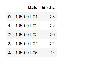
    We will be using the 'Daily Female Births Dataset'. This dataset describes the number of daily female births in California in 1959. There are 365 observations from 01-01-1959 to 31-12-1959. You can download the dataset from this link.

    Let's Implement with step-wise:

    Step 1: Import the libraries.

    Python3
    # import the libraries
    import pandas as pd
    import seaborn as sns
    import matplotlib.pyplot as plt
    

    Step 2: Import the dataset

    Python3
    # import the dataset
    data = pd.read_csv( "https://raw.githubusercontent.com/jbrownlee/ \
                       Datasets/master/daily-total-female-births.csv")
    
    #view the dataset
    display( data.head())
    

    Output:

    Step 3: Plot a simple time series plot using seaborn.lineplot()

    Python3
    # set figure size
    plt.figure( figsize = ( 12, 5))
    
    # plot a simple time series plot
    # using seaborn.lineplot()
    sns.lineplot( x = 'Date',
                 y = 'Births',
                 data = data,
                 label = 'DailyBirths')
    
    plt.xlabel( 'Months of the year 1959')
    
    # setting customized ticklabels for x axis
    pos = [ '1959-01-01', '1959-02-01', '1959-03-01', '1959-04-01', 
           '1959-05-01', '1959-06-01', '1959-07-01', '1959-08-01',
           '1959-09-01', '1959-10-01', '1959-11-01', '1959-12-01']
    
    lab = [ 'Jan', 'Feb', 'Mar', 'Apr', 'May', 'June', 
           'July', 'Aug', 'Sept', 'Oct', 'Nov', 'Dec']
    
    plt.xticks( pos, lab)
    
    plt.ylabel('Female Births')
    

    Output:

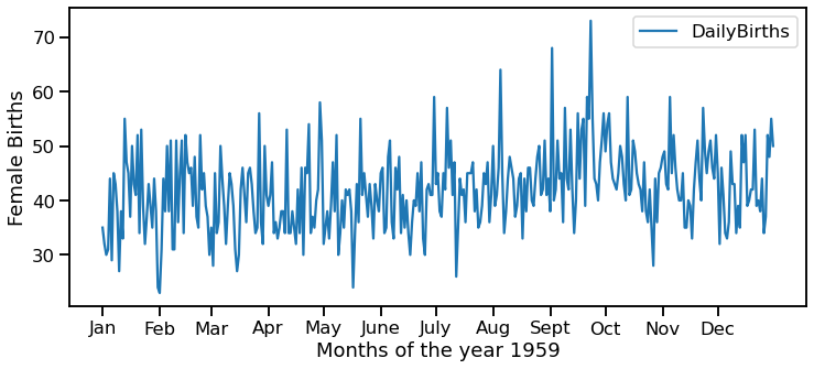
    We can notice that it is very difficult to gain knowledge from the above plot as the data fluctuates a lot. So, let us plot it again but using the Rolling Average concept this time.

    Step 4: Compute Rolling Average using pandas.DataFrame.rolling.mean().

    For rolling average, we have to take a certain window size. Here, we have taken the window size = 7 i.e. rolling average of 7 days or 1 week.

    Python3
    # computing a 7 day rolling average
    data[ '7day_rolling_avg' ] = data.Births.rolling( 7).mean()
    
    # viewing the dataset
    Display(data.head(10))
    

    Output:

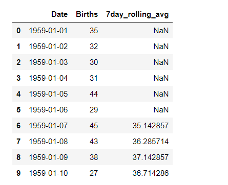
    We can observe that the first 6 values of the '7day_rolling_avg' column are NaN values. This is because these 6 values don't have enough data to compute the rolling average of 7 days. So, in the plot also, for the first six values, no values would be plotted.

    Step 5: Make a time series plot using rolling average calculated in step 4

    Python3
    # set figure size
    plt.figure( figsize = ( 12, 5))
    
    # plot a simple time series plot
    # using seaborn.lineplot()
    sns.lineplot( x = 'Date',
                 y = 'Births',
                 data = data,
                 label = 'DailyBirths')
    
    # plot using rolling average
    sns.lineplot( x = 'Date',
                 y = '7day_rolling_avg',
                 data = data,
                 label = 'Rollingavg')
    
    plt.xlabel('Months of the year 1959')
    
    # setting customized ticklabels for x axis
    pos = [ '1959-01-01', '1959-02-01', '1959-03-01', '1959-04-01', 
           '1959-05-01', '1959-06-01', '1959-07-01', '1959-08-01',
           '1959-09-01', '1959-10-01', '1959-11-01', '1959-12-01']
    
    lab = [ 'Jan', 'Feb', 'Mar', 'Apr', 'May', 'June', 
           'July', 'Aug', 'Sept', 'Oct', 'Nov', 'Dec']
    
    plt.xticks( pos, lab)
    
    plt.ylabel('Female Births')
    

    Output:

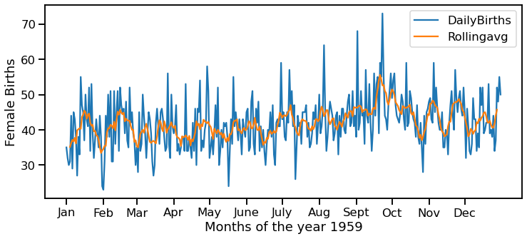
    We can clearly see through the above graph that the rolling average has smoothened the number of female births, and we can notice the peak more evidently.

    Create Quiz

    R

    riyaaggarwal
    Improve

    R

    riyaaggarwal
    Improve
    Article Tags :
    • Technical Scripter
    • Python
    • Technical Scripter 2020
    • Python-pandas
    • Python-matplotlib
    • Data Visualization
    • Python-Seaborn

    Explore

      Python Fundamentals

      Python Introduction

      2 min read

      Input and Output in Python

      4 min read

      Python Variables

      4 min read

      Python Operators

      4 min read

      Python Keywords

      2 min read

      Python Data Types

      8 min read

      Conditional Statements in Python

      3 min read

      Loops in Python - For, While and Nested Loops

      5 min read

      Python Functions

      5 min read

      Recursion in Python

      4 min read

      Python Lambda Functions

      5 min read

      Python Data Structures

      Python String

      5 min read

      Python Lists

      4 min read

      Python Tuples

      4 min read

      Python Dictionary

      3 min read

      Python Sets

      6 min read

      Python Arrays

      7 min read

      List Comprehension in Python

      4 min read

      Advanced Python

      Python OOP Concepts

      11 min read

      Python Exception Handling

      5 min read

      File Handling in Python

      4 min read

      Python Database Tutorial

      4 min read

      Python MongoDB Tutorial

      3 min read

      Python MySQL

      9 min read

      Python Packages

      10 min read

      Python Modules

      3 min read

      Python DSA Libraries

      15 min read

      List of Python GUI Library and Packages

      3 min read

      Data Science with Python

      NumPy Tutorial - Python Library

      3 min read

      Pandas Tutorial

      4 min read

      Matplotlib Tutorial

      5 min read

      Python Seaborn Tutorial

      3 min read

      StatsModel Library - Tutorial

      3 min read

      Learning Model Building in Scikit-learn

      6 min read

      TensorFlow Tutorial

      2 min read

      PyTorch Tutorial

      6 min read

      Web Development with Python

      Flask Tutorial

      8 min read

      Django Tutorial | Learn Django Framework

      7 min read

      Django ORM - Inserting, Updating & Deleting Data

      4 min read

      Templating With Jinja2 in Flask

      6 min read

      Django Templates

      5 min read

      Build a REST API using Flask - Python

      3 min read

      Building a Simple API with Django REST Framework

      3 min read

      Python Practice

      Python Quiz

      1 min read

      Python Coding Practice

      1 min read

      Python Interview Questions and Answers

      15+ min read
    top_of_element && top_of_screen < bottom_of_element) || (bottom_of_screen > articleRecommendedTop && top_of_screen < articleRecommendedBottom) || (top_of_screen > articleRecommendedBottom)) { if (!isfollowingApiCall) { isfollowingApiCall = true; setTimeout(function(){ if (loginData && loginData.isLoggedIn) { if (loginData.userName !== $('#followAuthor').val()) { is_following(); } else { $('.profileCard-profile-picture').css('background-color', '#E7E7E7'); } } else { $('.follow-btn').removeClass('hideIt'); } }, 3000); } } }); } $(".accordion-header").click(function() { var arrowIcon = $(this).find('.bottom-arrow-icon'); arrowIcon.toggleClass('rotate180'); }); }); window.isReportArticle = false; function report_article(){ if (!loginData || !loginData.isLoggedIn) { const loginModalButton = $('.login-modal-btn') if (loginModalButton.length) { loginModalButton.click(); } return; } if(!window.isReportArticle){ //to add loader $('.report-loader').addClass('spinner'); jQuery('#report_modal_content').load(gfgSiteUrl+'wp-content/themes/iconic-one/report-modal.php', { PRACTICE_API_URL: practiceAPIURL, PRACTICE_URL:practiceURL },function(responseTxt, statusTxt, xhr){ if(statusTxt == "error"){ alert("Error: " + xhr.status + ": " + xhr.statusText); } }); }else{ window.scrollTo({ top: 0, behavior: 'smooth' }); $("#report_modal_content").show(); } } function closeShareModal() { const shareOption = document.querySelector('[data-gfg-action="share-article"]'); shareOption.classList.remove("hover_share_menu"); let shareModal = document.querySelector(".hover__share-modal-container"); shareModal && shareModal.remove(); } function openShareModal() { closeShareModal(); // Remove existing modal if any let shareModal = document.querySelector(".three_dot_dropdown_share"); shareModal.appendChild(Object.assign(document.createElement("div"), { className: "hover__share-modal-container" })); document.querySelector(".hover__share-modal-container").append( Object.assign(document.createElement('div'), { className: "share__modal" }), ); document.querySelector(".share__modal").append(Object.assign(document.createElement('h1'), { className: "share__modal-heading" }, { textContent: "Share to" })); const socialOptions = ["LinkedIn", "WhatsApp","Twitter", "Copy Link"]; socialOptions.forEach((socialOption) => { const socialContainer = Object.assign(document.createElement('div'), { className: "social__container" }); const icon = Object.assign(document.createElement("div"), { className: `share__icon share__${socialOption.split(" ").join("")}-icon` }); const socialText = Object.assign(document.createElement("span"), { className: "share__option-text" }, { textContent: `${socialOption}` }); const shareLink = (socialOption === "Copy Link") ? Object.assign(document.createElement('div'), { role: "button", className: "link-container CopyLink" }) : Object.assign(document.createElement('a'), { className: "link-container" }); if (socialOption === "LinkedIn") { shareLink.setAttribute('href', `https://www.linkedin.com/sharing/share-offsite/?url=${window.location.href}`); shareLink.setAttribute('target', '_blank'); } if (socialOption === "WhatsApp") { shareLink.setAttribute('href', `https://api.whatsapp.com/send?text=${window.location.href}`); shareLink.setAttribute('target', "_blank"); } if (socialOption === "Twitter") { shareLink.setAttribute('href', `https://twitter.com/intent/tweet?url=${window.location.href}`); shareLink.setAttribute('target', "_blank"); } shareLink.append(icon, socialText); socialContainer.append(shareLink); document.querySelector(".share__modal").appendChild(socialContainer); //adding copy url functionality if(socialOption === "Copy Link") { shareLink.addEventListener("click", function() { var tempInput = document.createElement("input"); tempInput.value = window.location.href; document.body.appendChild(tempInput); tempInput.select(); tempInput.setSelectionRange(0, 99999); // For mobile devices document.execCommand('copy'); document.body.removeChild(tempInput); this.querySelector(".share__option-text").textContent = "Copied" }) } }); // document.querySelector(".hover__share-modal-container").addEventListener("mouseover", () => document.querySelector('[data-gfg-action="share-article"]').classList.add("hover_share_menu")); } function toggleLikeElementVisibility(selector, show) { document.querySelector(`.${selector}`).style.display = show ? "block" : "none"; } function closeKebabMenu(){ document.getElementById("myDropdown").classList.toggle("show"); }
geeksforgeeks-footer-logo
Corporate & Communications Address:
A-143, 7th Floor, Sovereign Corporate Tower, Sector- 136, Noida, Uttar Pradesh (201305)
Registered Address:
K 061, Tower K, Gulshan Vivante Apartment, Sector 137, Noida, Gautam Buddh Nagar, Uttar Pradesh, 201305
GFG App on Play Store GFG App on App Store
  • Company
  • About Us
  • Legal
  • Privacy Policy
  • Contact Us
  • Advertise with us
  • GFG Corporate Solution
  • Campus Training Program
  • Explore
  • POTD
  • Job-A-Thon
  • Blogs
  • Nation Skill Up
  • Tutorials
  • Programming Languages
  • DSA
  • Web Technology
  • AI, ML & Data Science
  • DevOps
  • CS Core Subjects
  • Interview Preparation
  • Software and Tools
  • Courses
  • ML and Data Science
  • DSA and Placements
  • Web Development
  • Programming Languages
  • DevOps & Cloud
  • GATE
  • Trending Technologies
  • Videos
  • DSA
  • Python
  • Java
  • C++
  • Web Development
  • Data Science
  • CS Subjects
  • Preparation Corner
  • Interview Corner
  • Aptitude
  • Puzzles
  • GfG 160
  • System Design
@GeeksforGeeks, Sanchhaya Education Private Limited, All rights reserved
Lightbox
Improvement
Suggest Changes
Help us improve. Share your suggestions to enhance the article. Contribute your expertise and make a difference in the GeeksforGeeks portal.
geeksforgeeks-suggest-icon
Create Improvement
Enhance the article with your expertise. Contribute to the GeeksforGeeks community and help create better learning resources for all.
geeksforgeeks-improvement-icon
Suggest Changes
min 4 words, max Words Limit:1000

Thank You!

Your suggestions are valuable to us.

What kind of Experience do you want to share?

Interview Experiences
Admission Experiences
Career Journeys
Work Experiences
Campus Experiences
Competitive Exam Experiences