Download to read offline

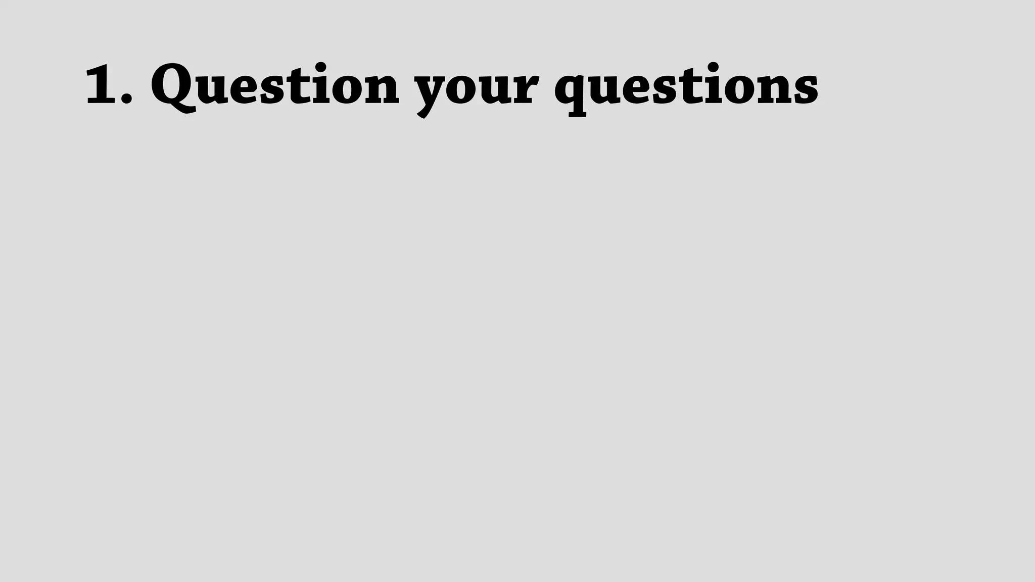
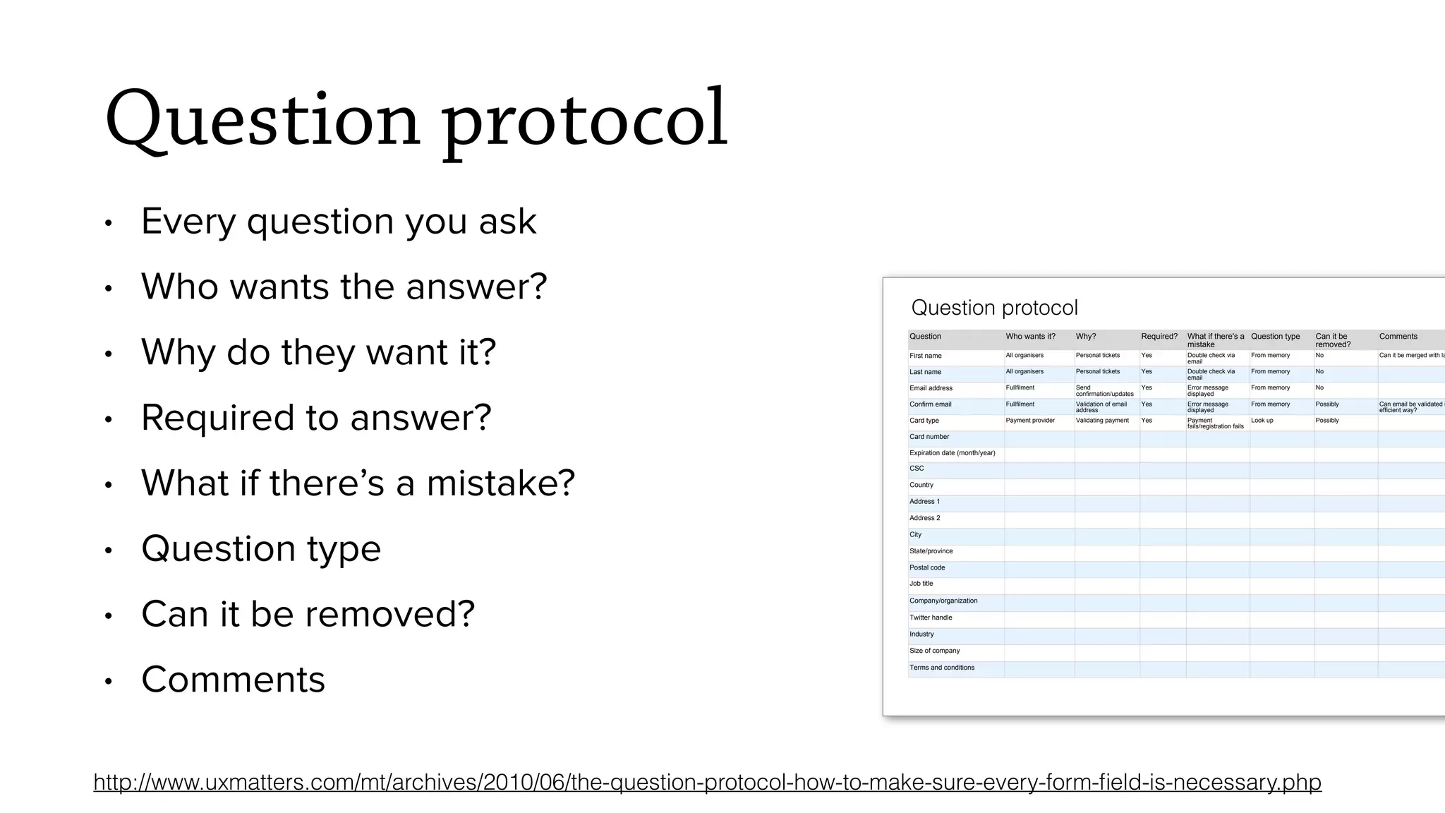

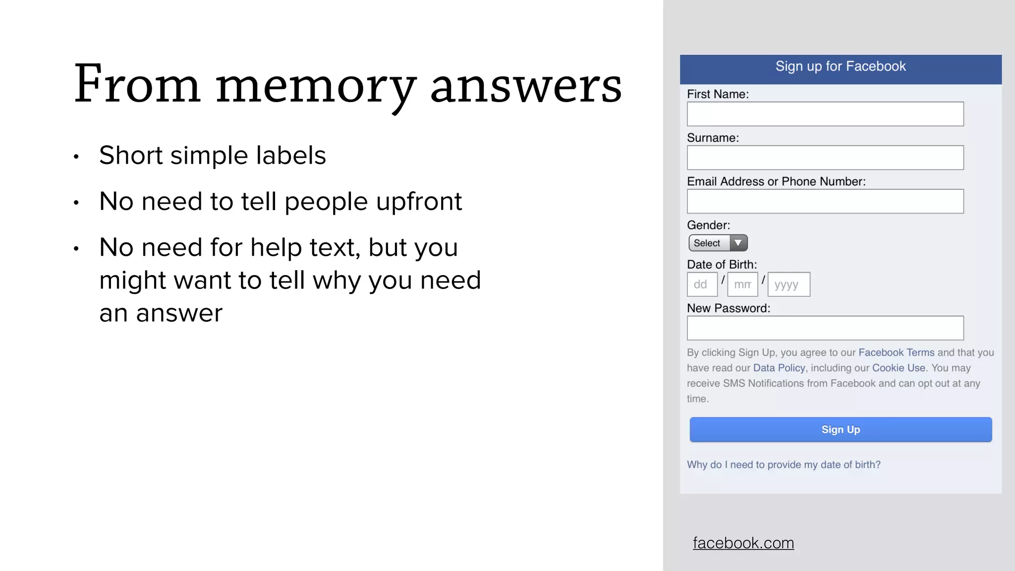
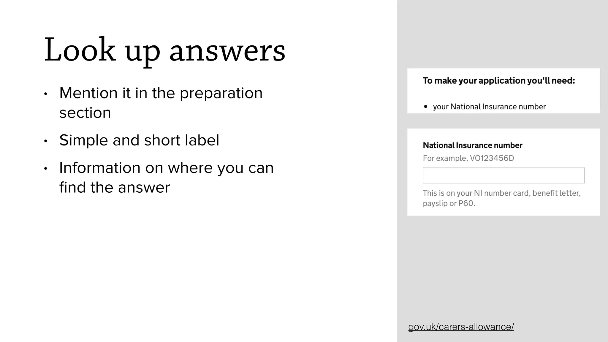
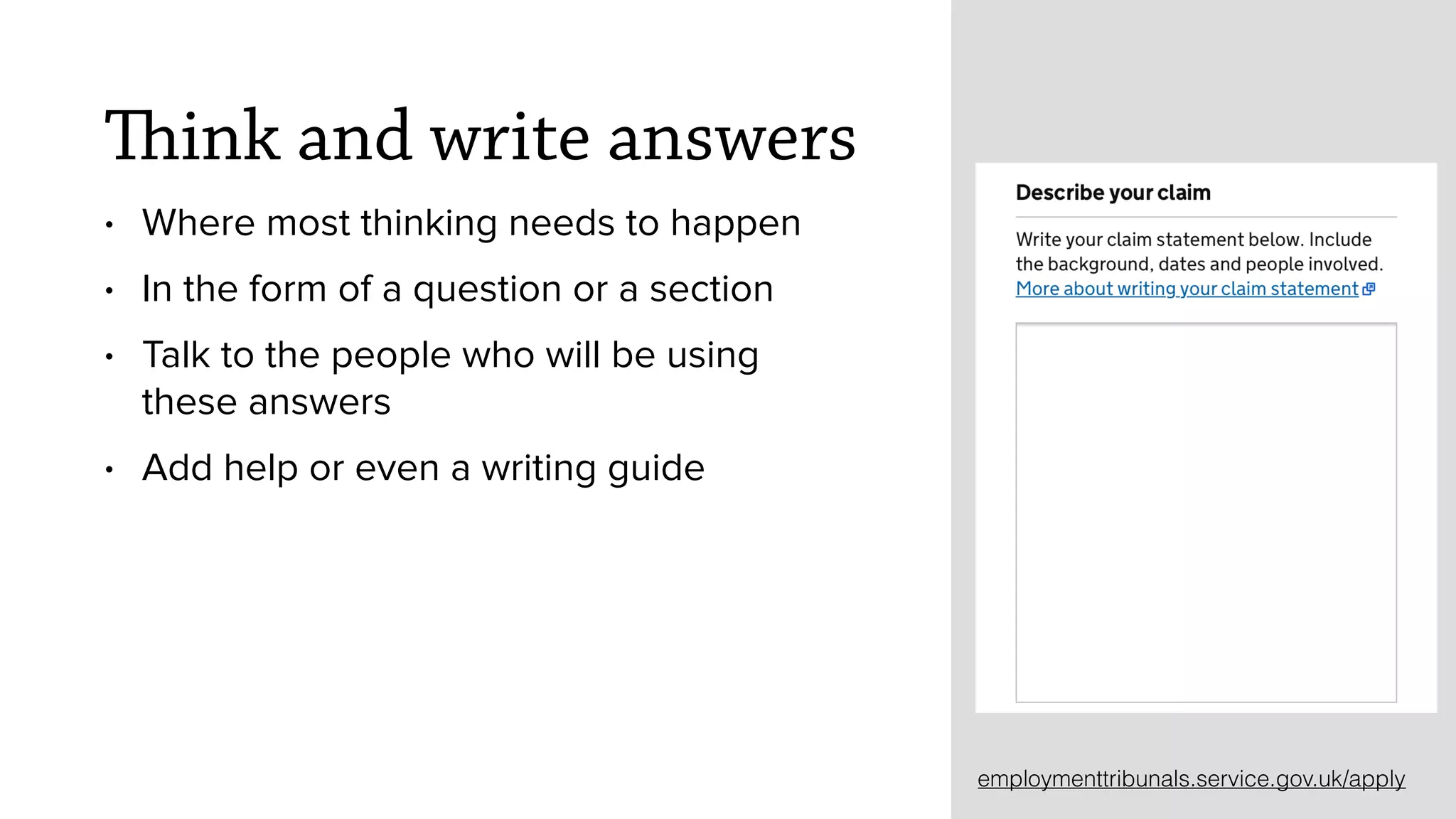
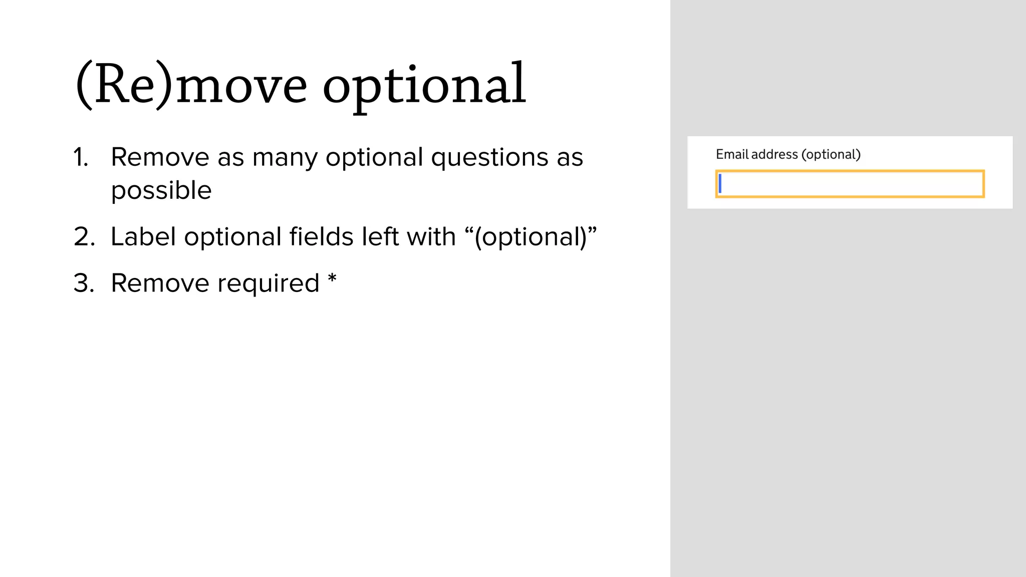
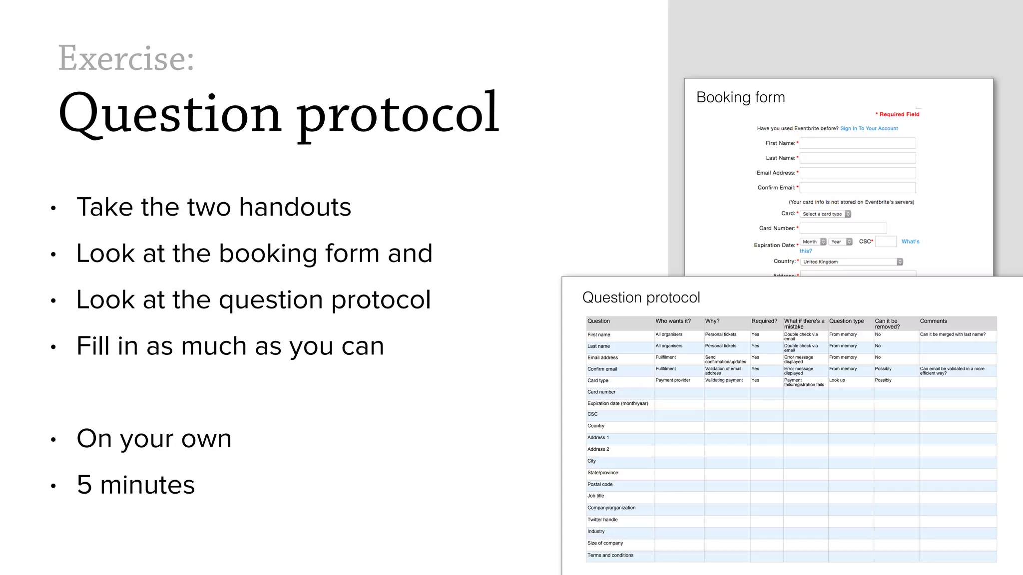

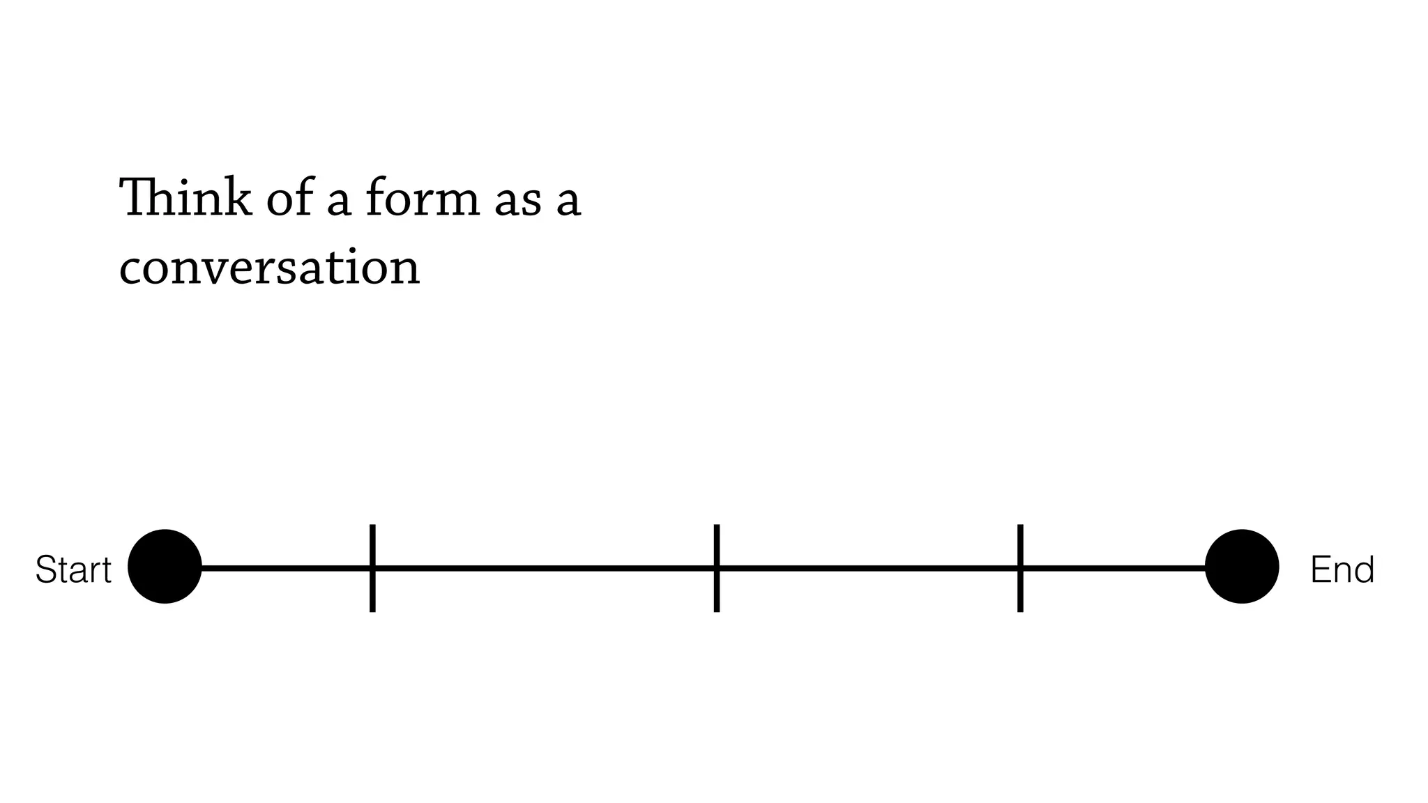
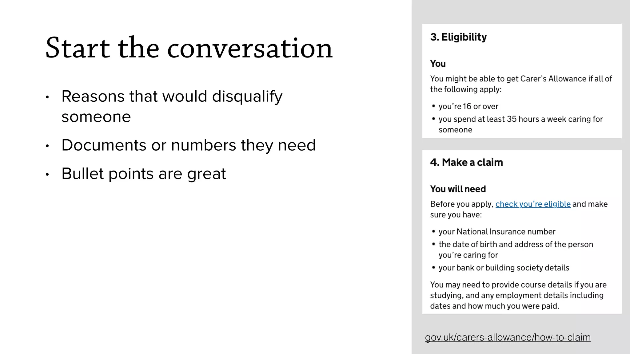
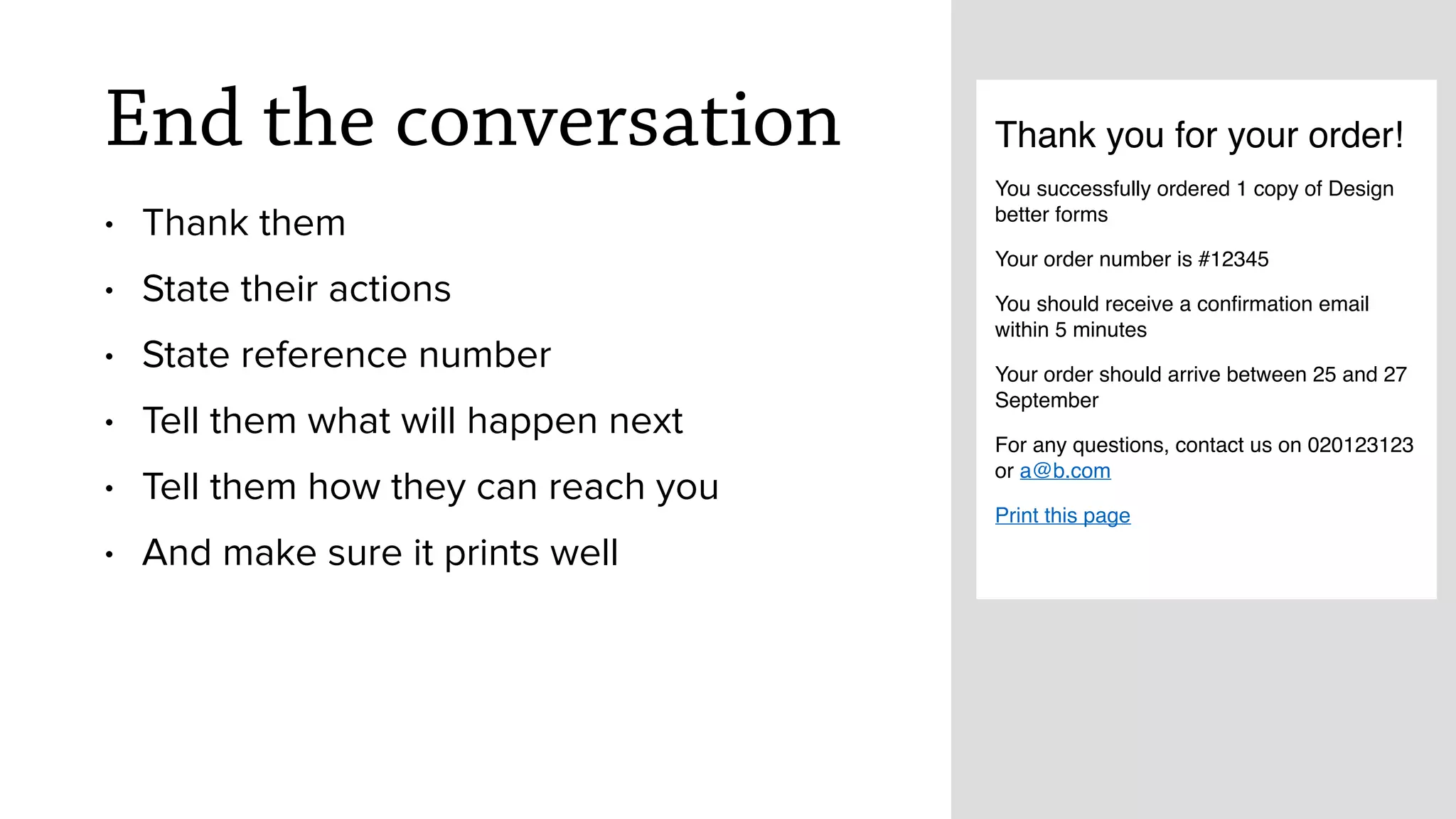
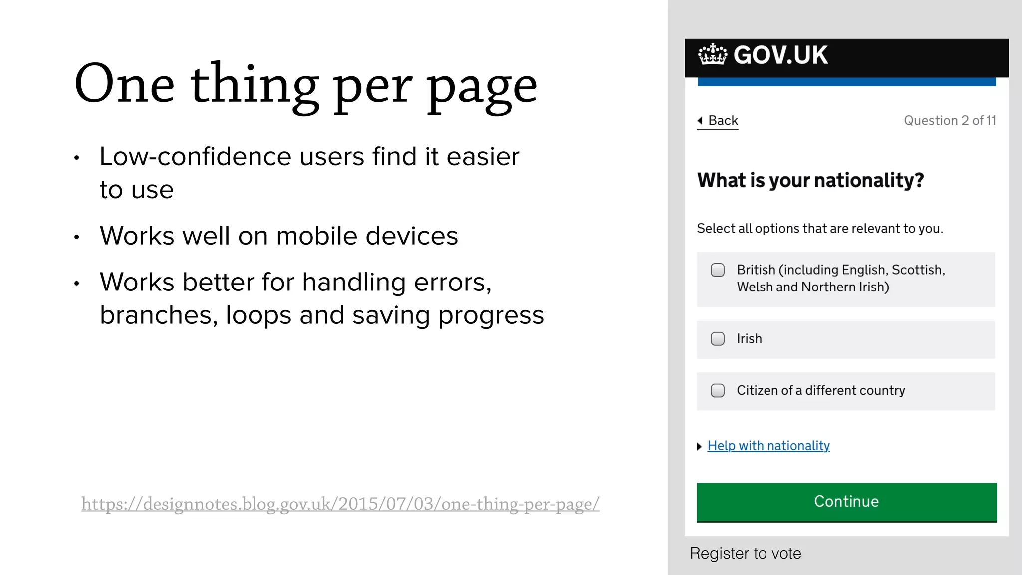
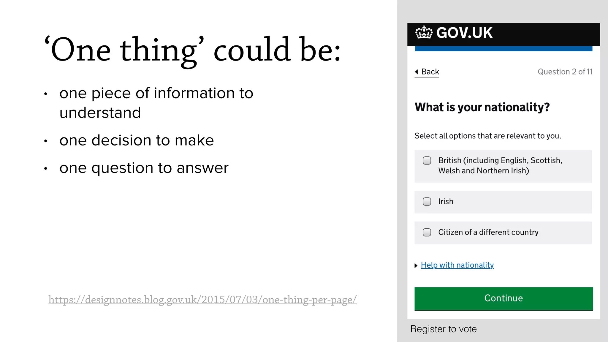
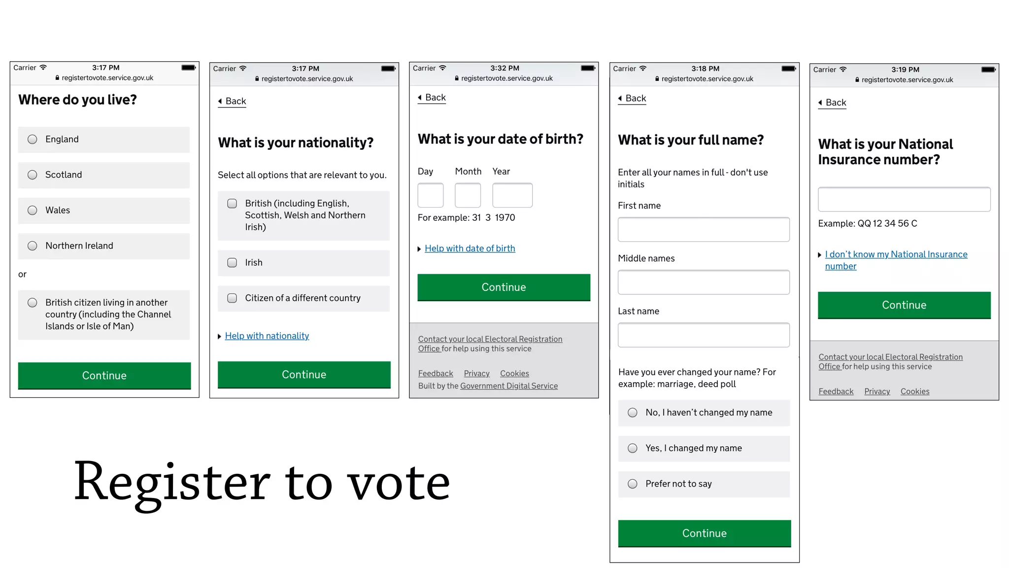

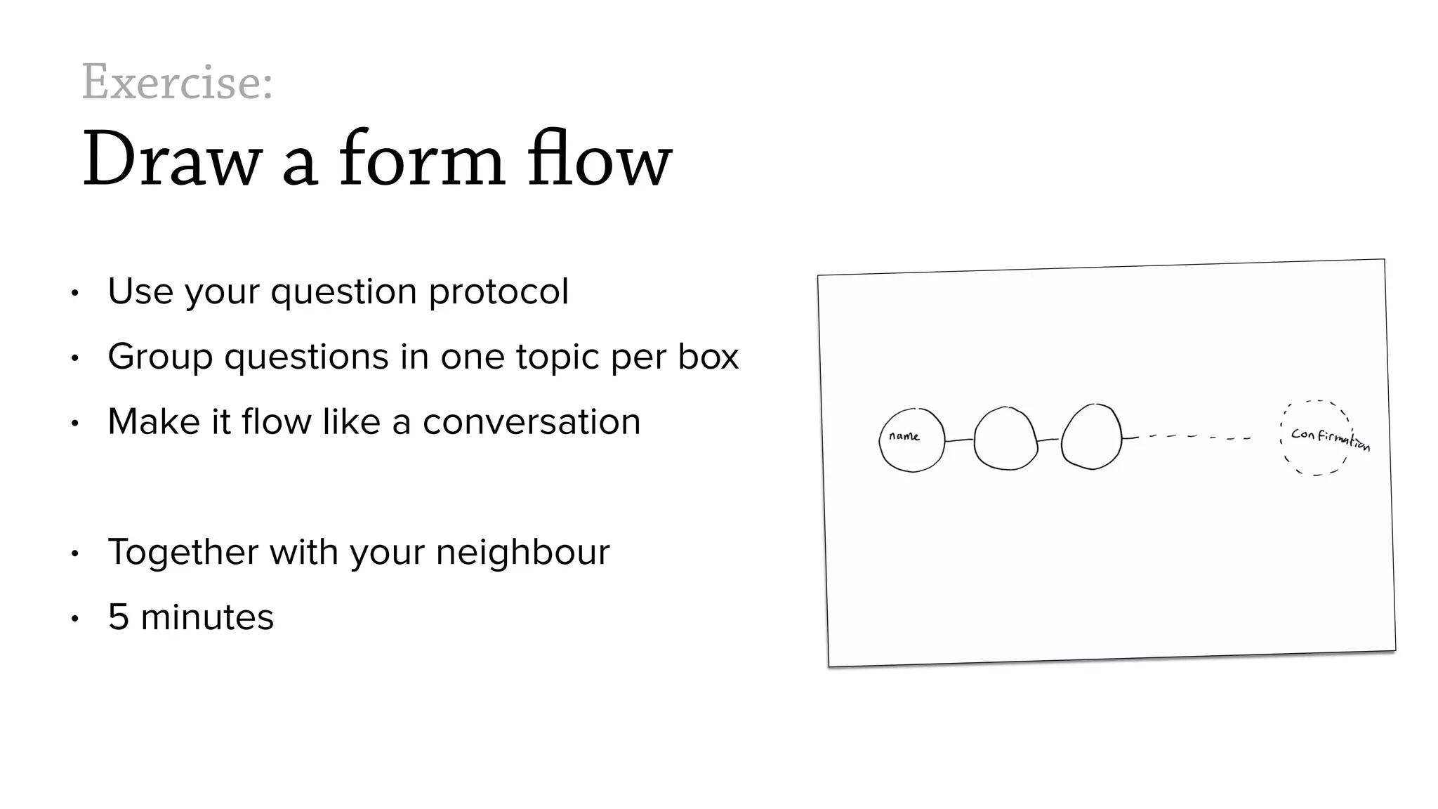

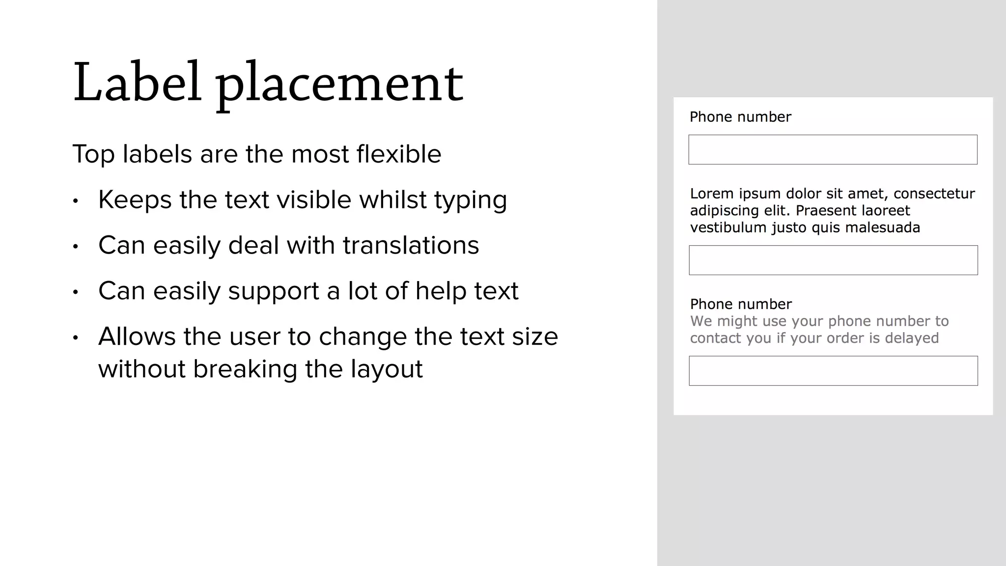
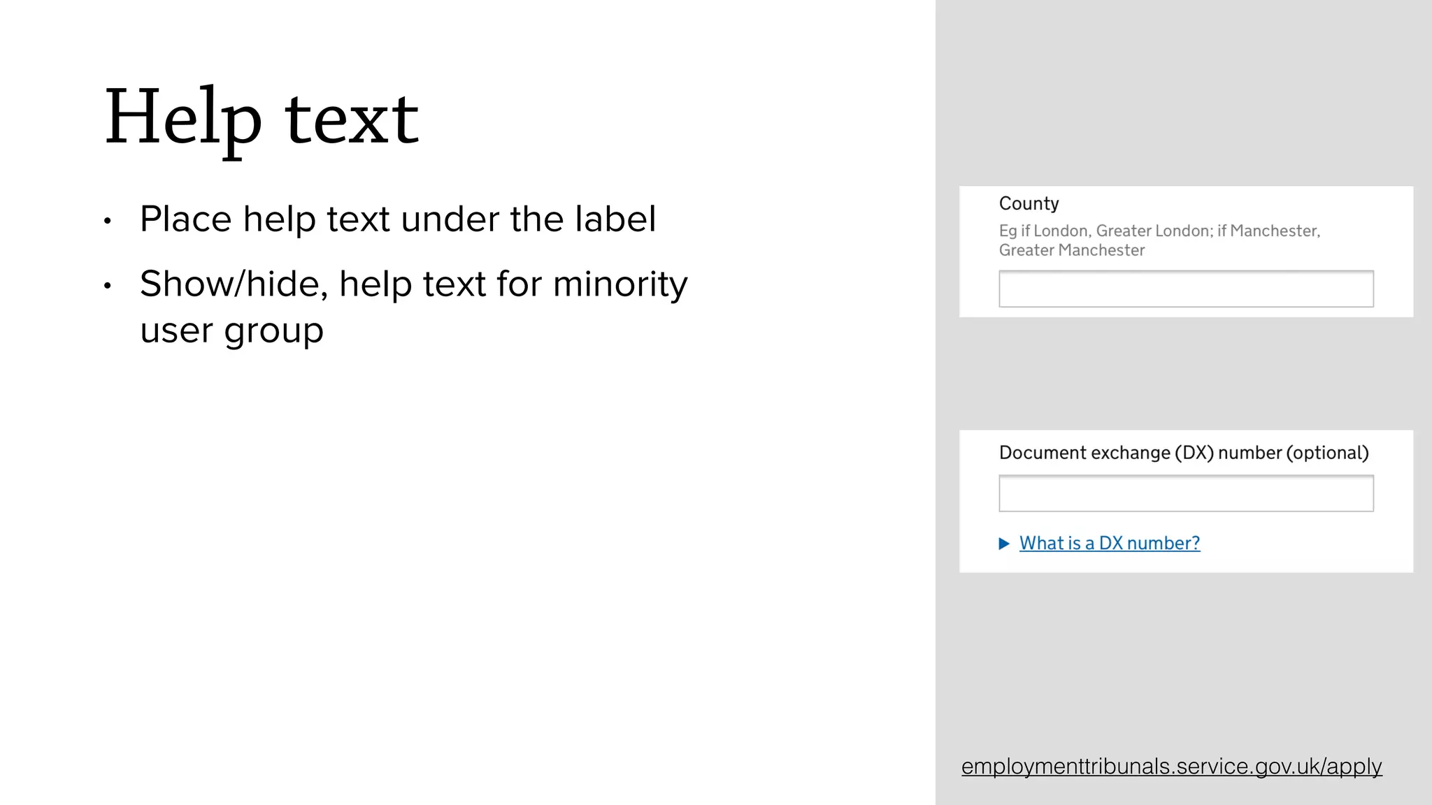
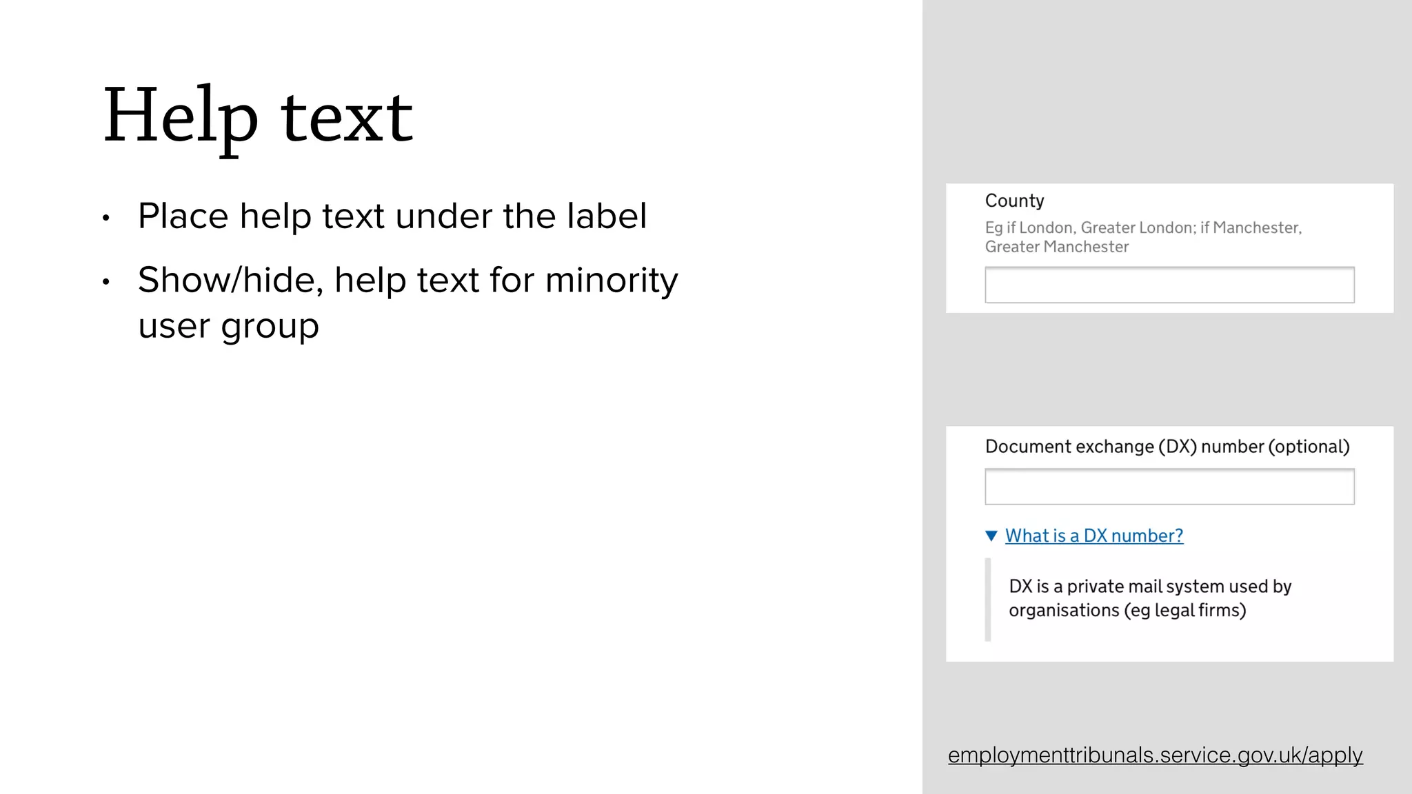
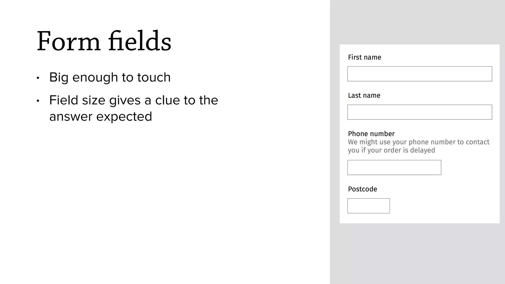

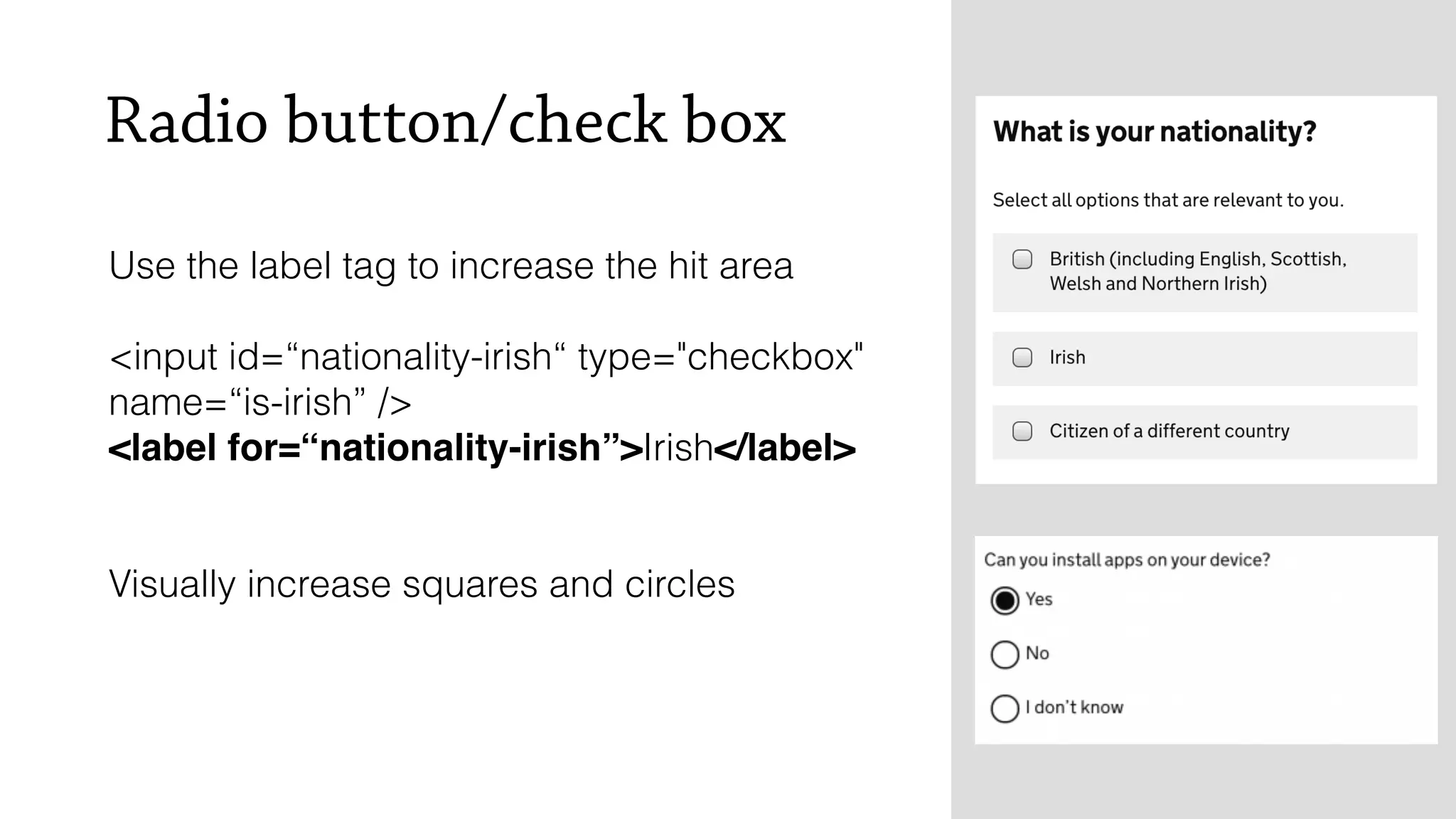
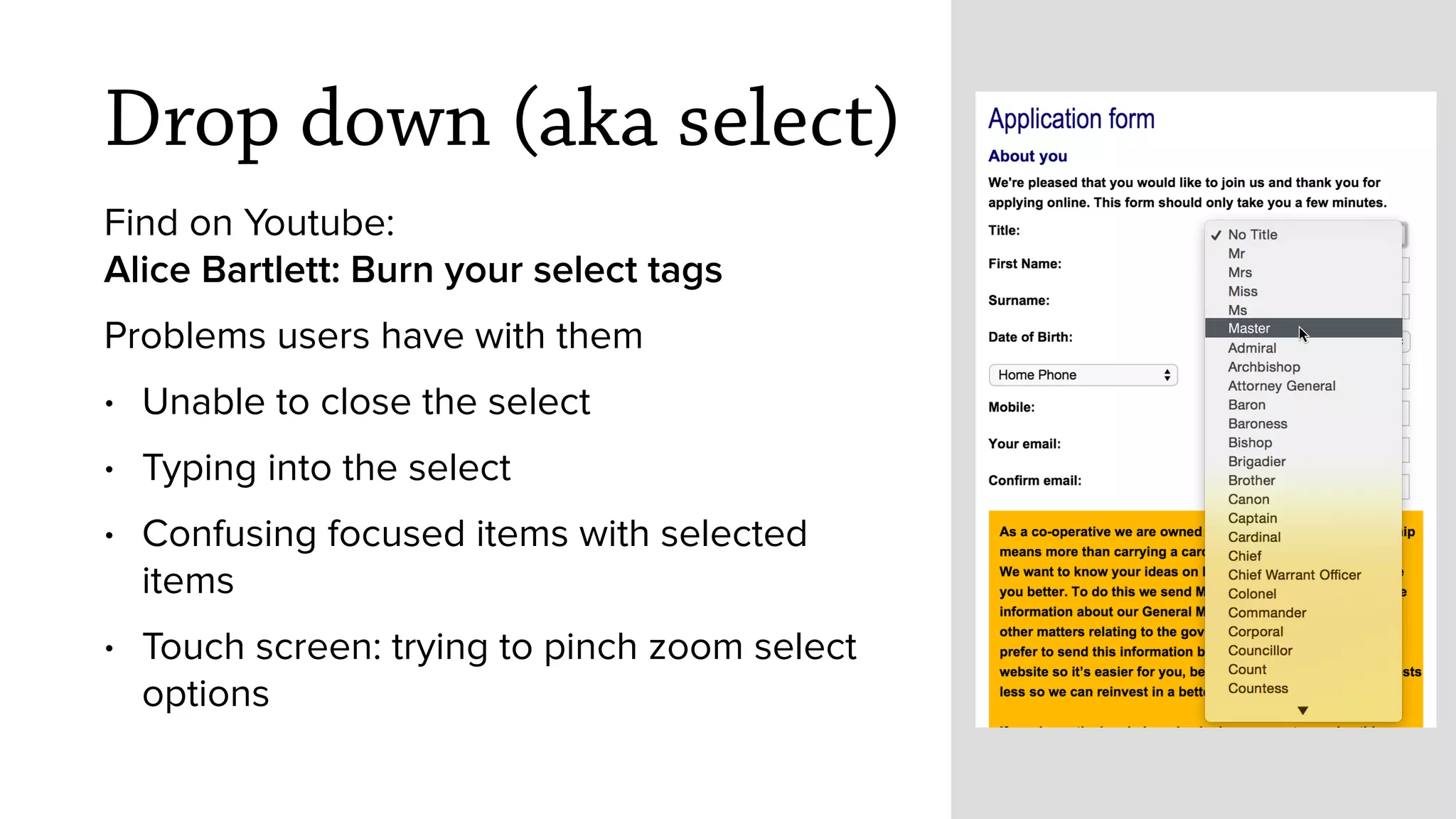
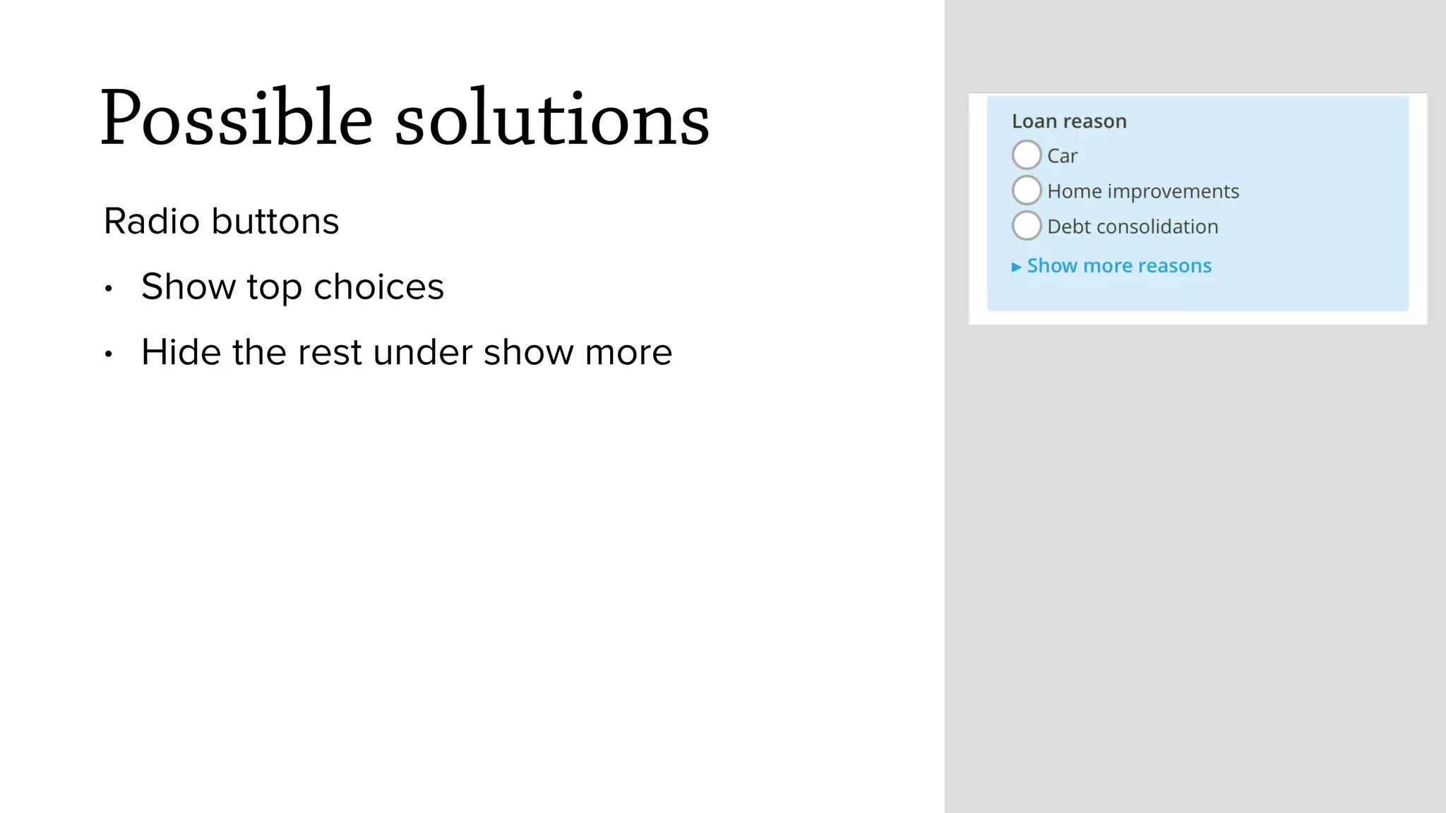
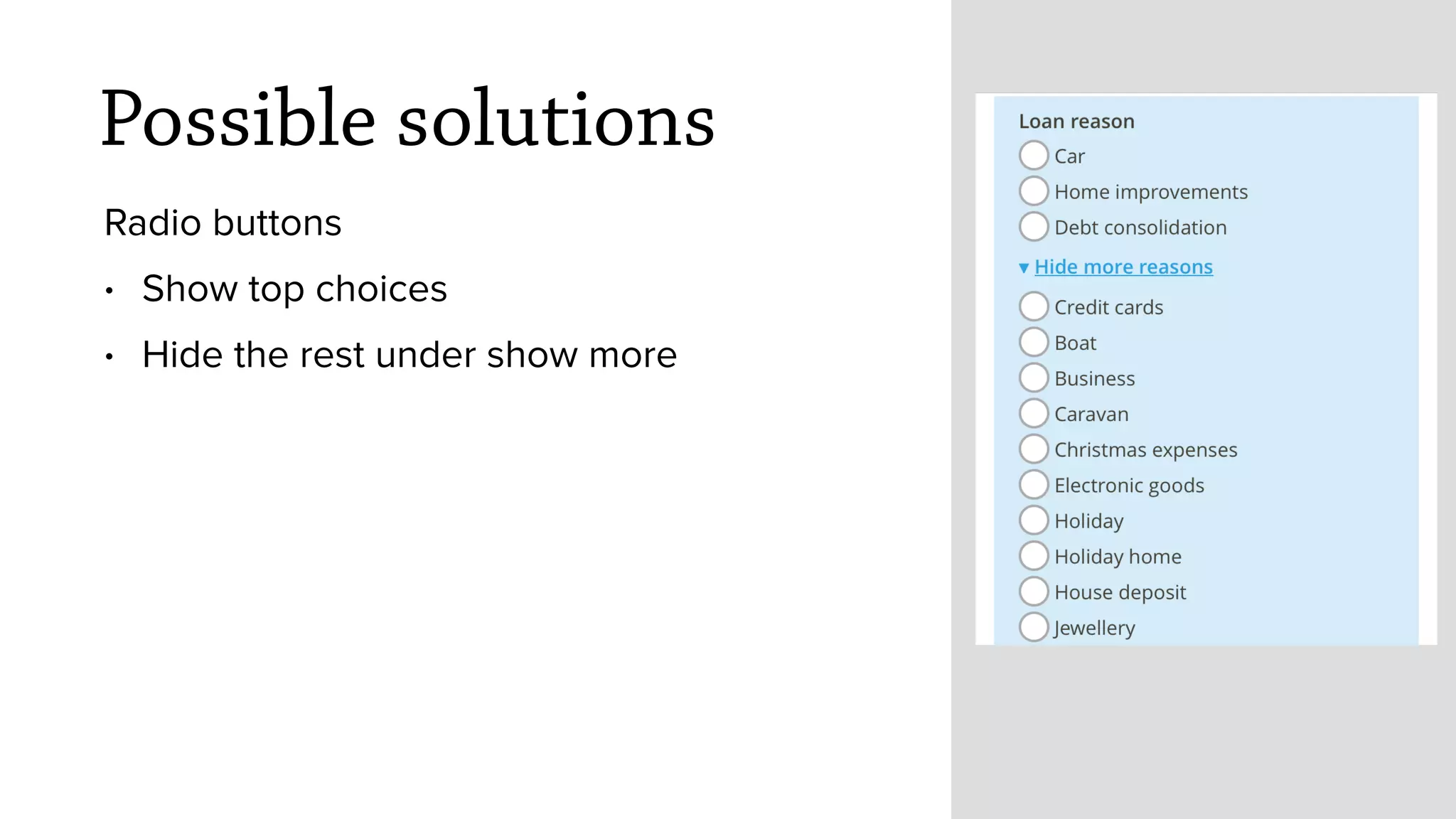

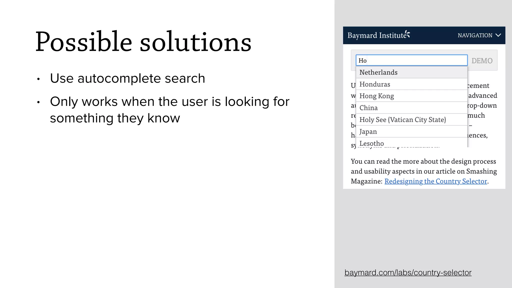
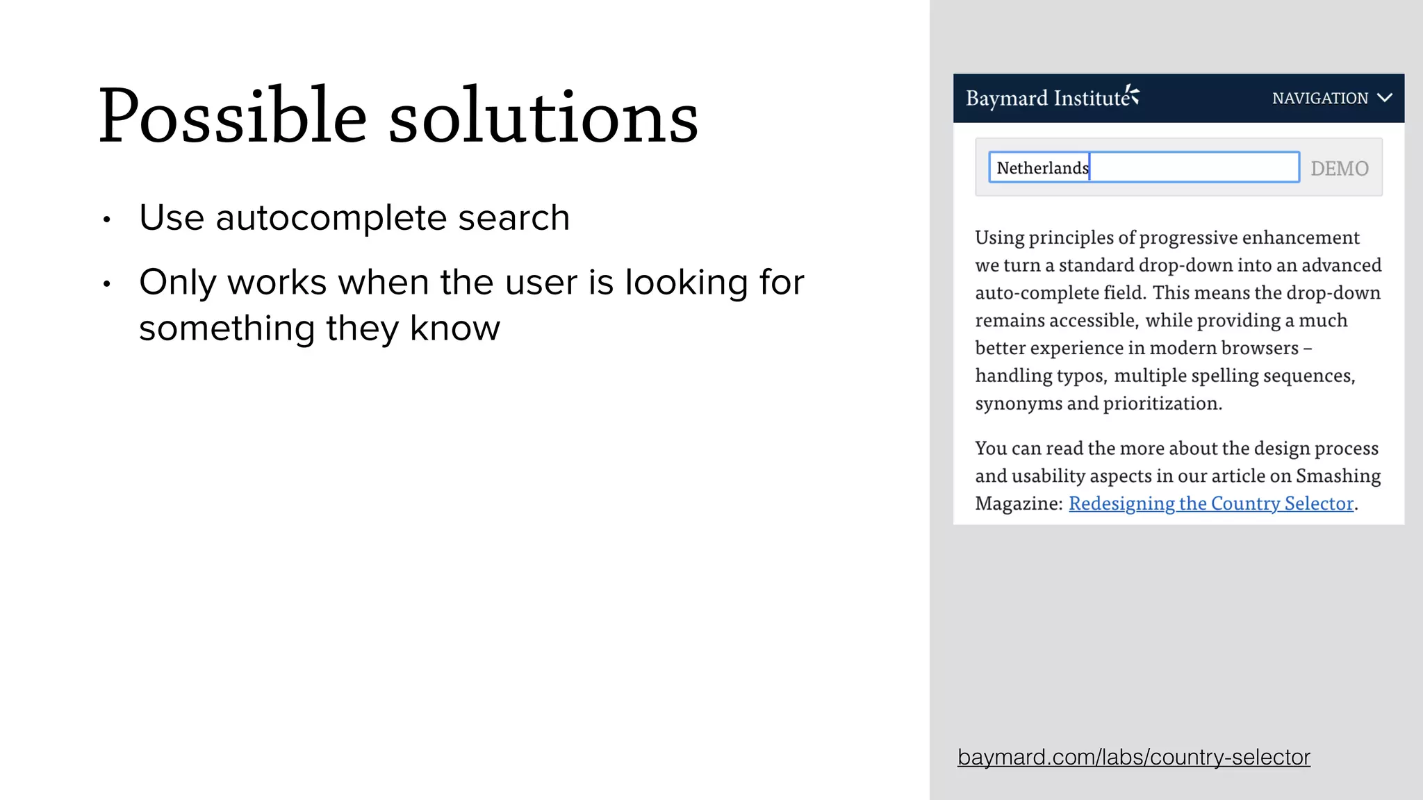
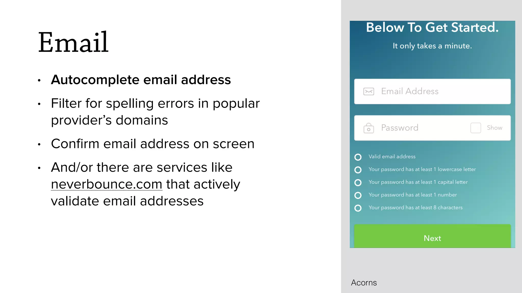
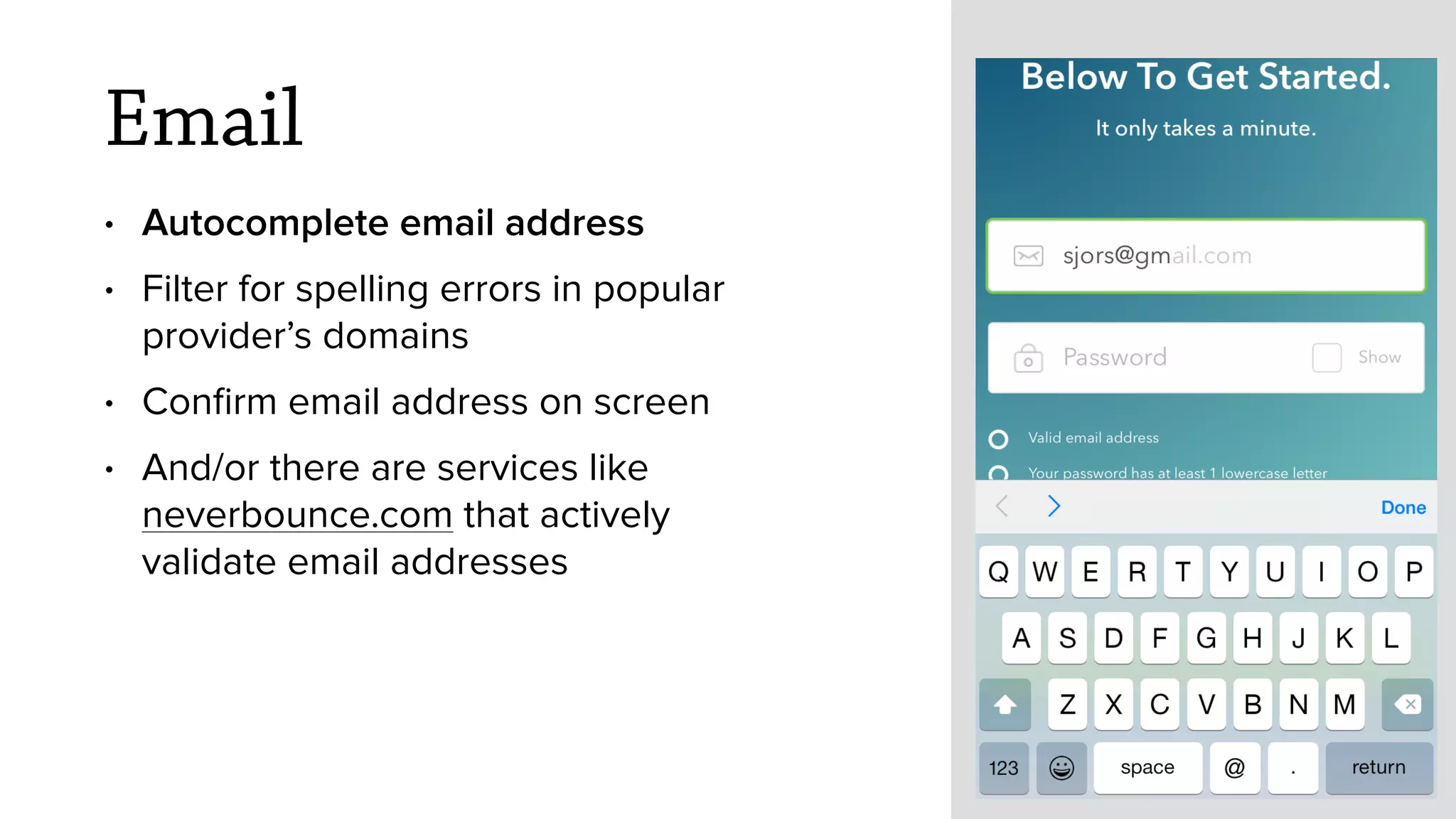
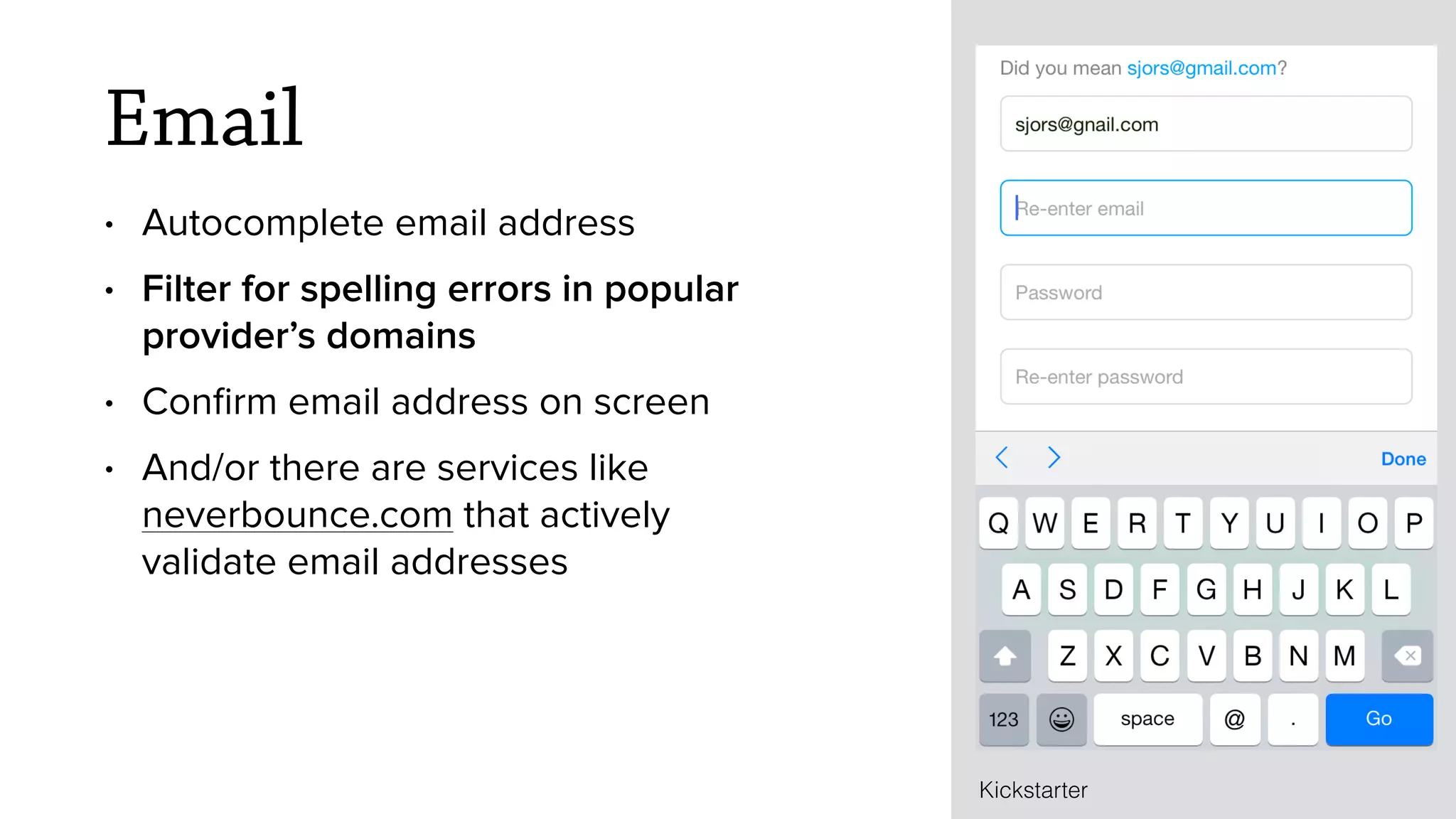
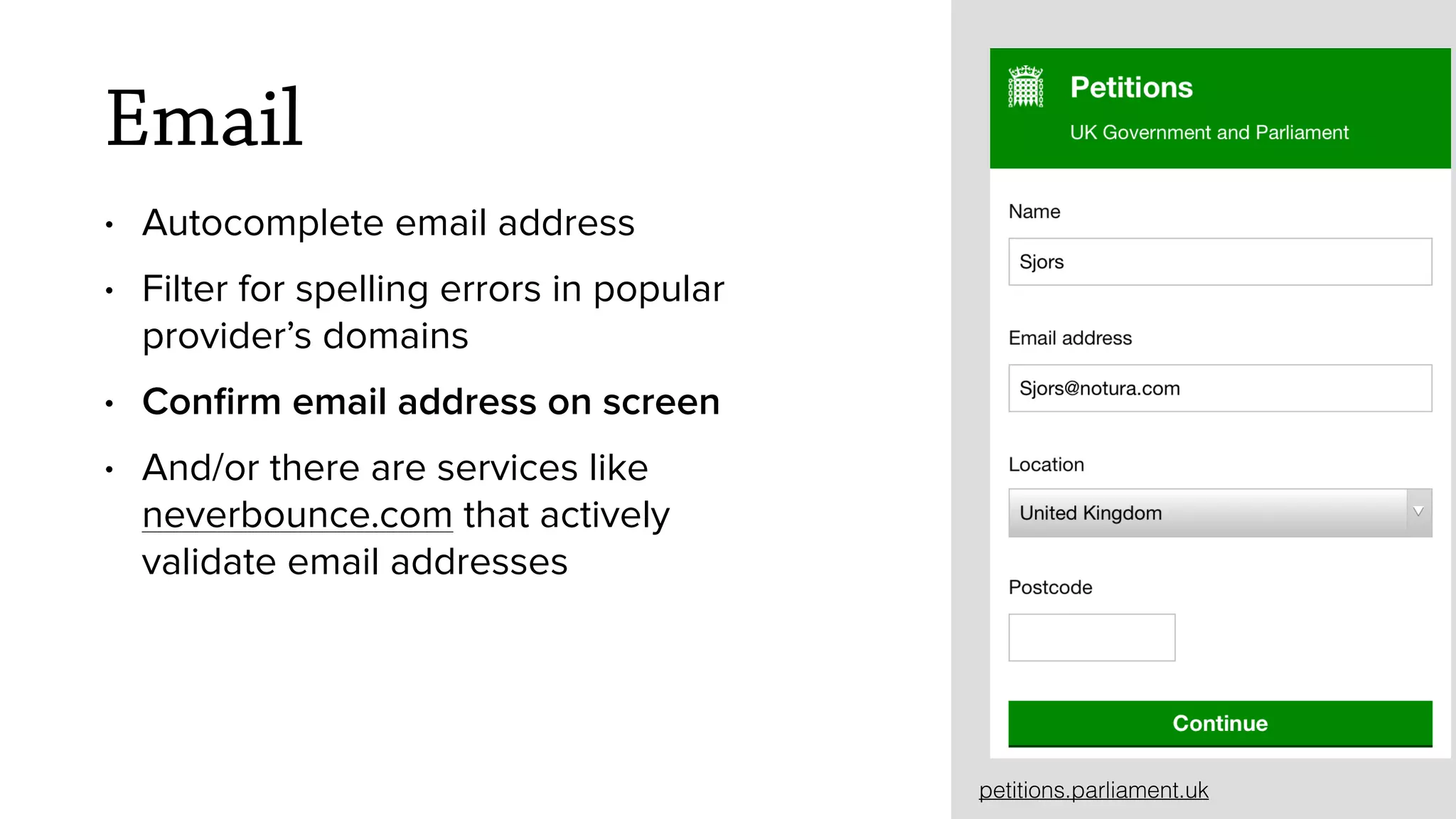
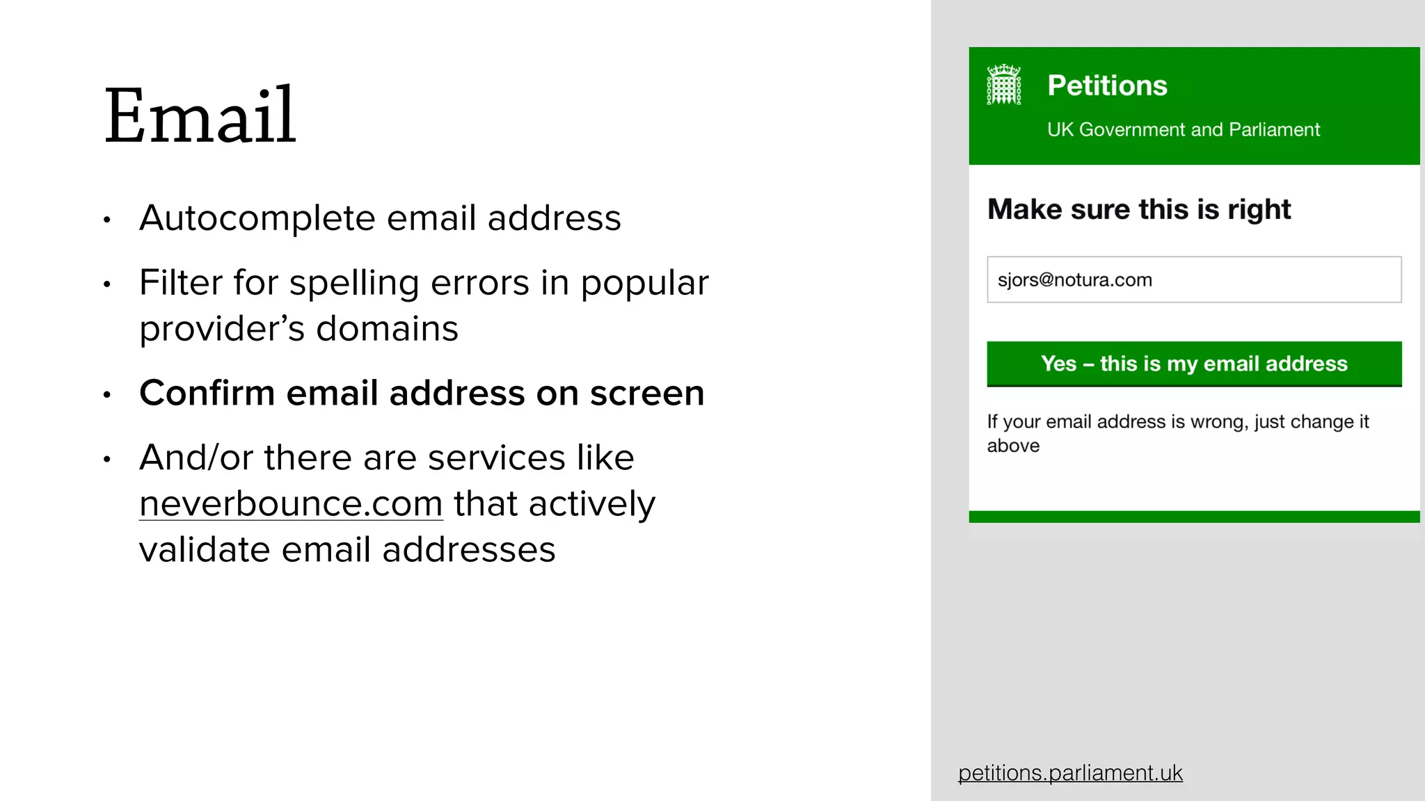
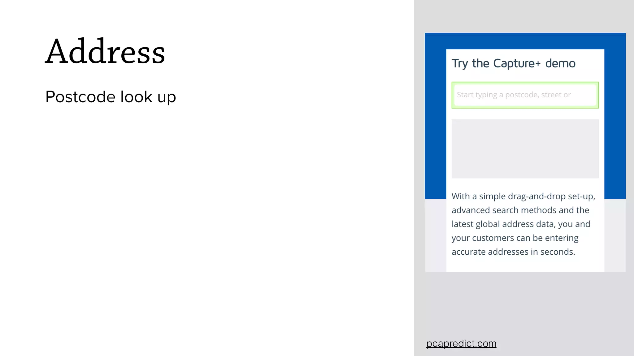
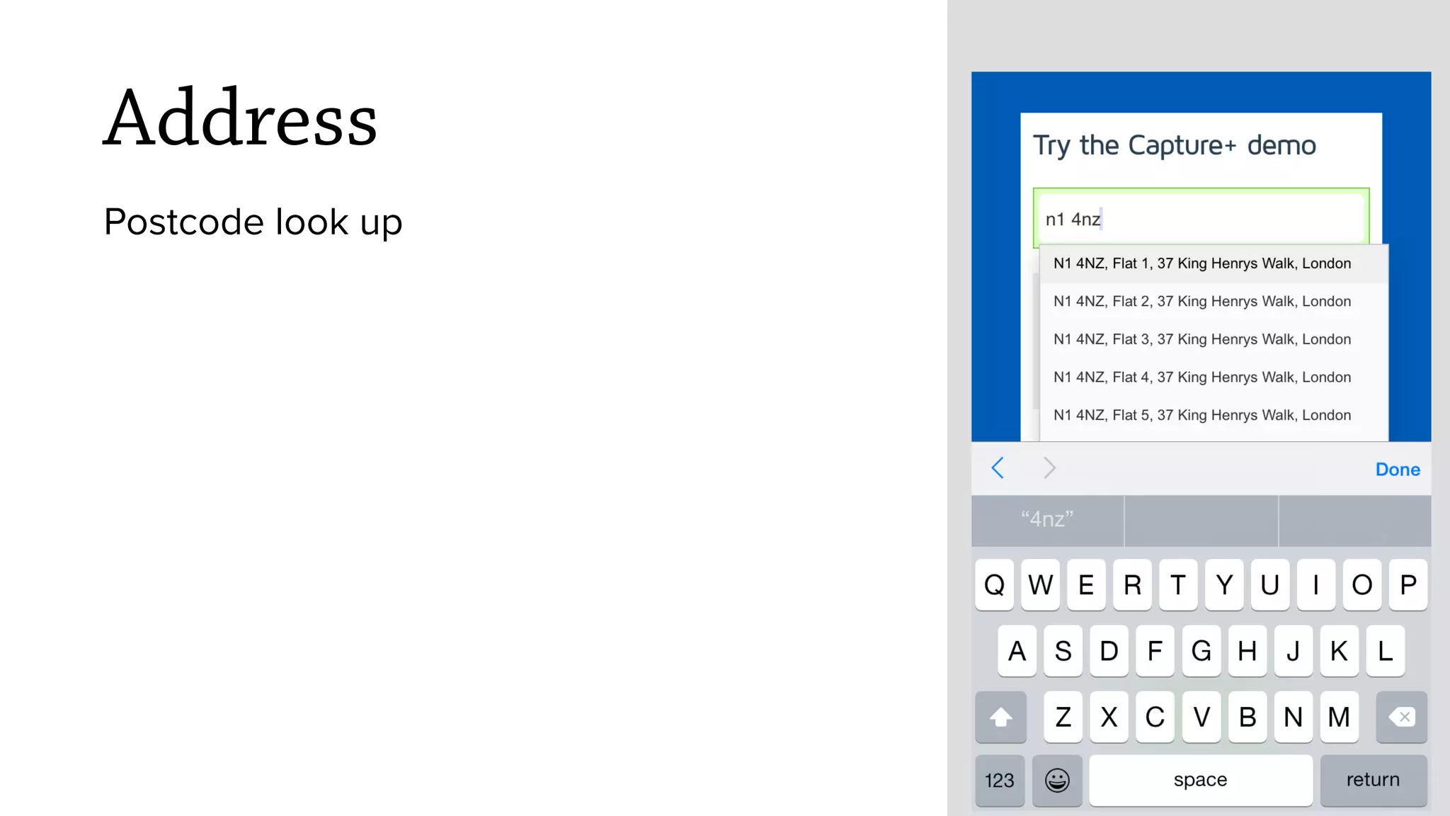
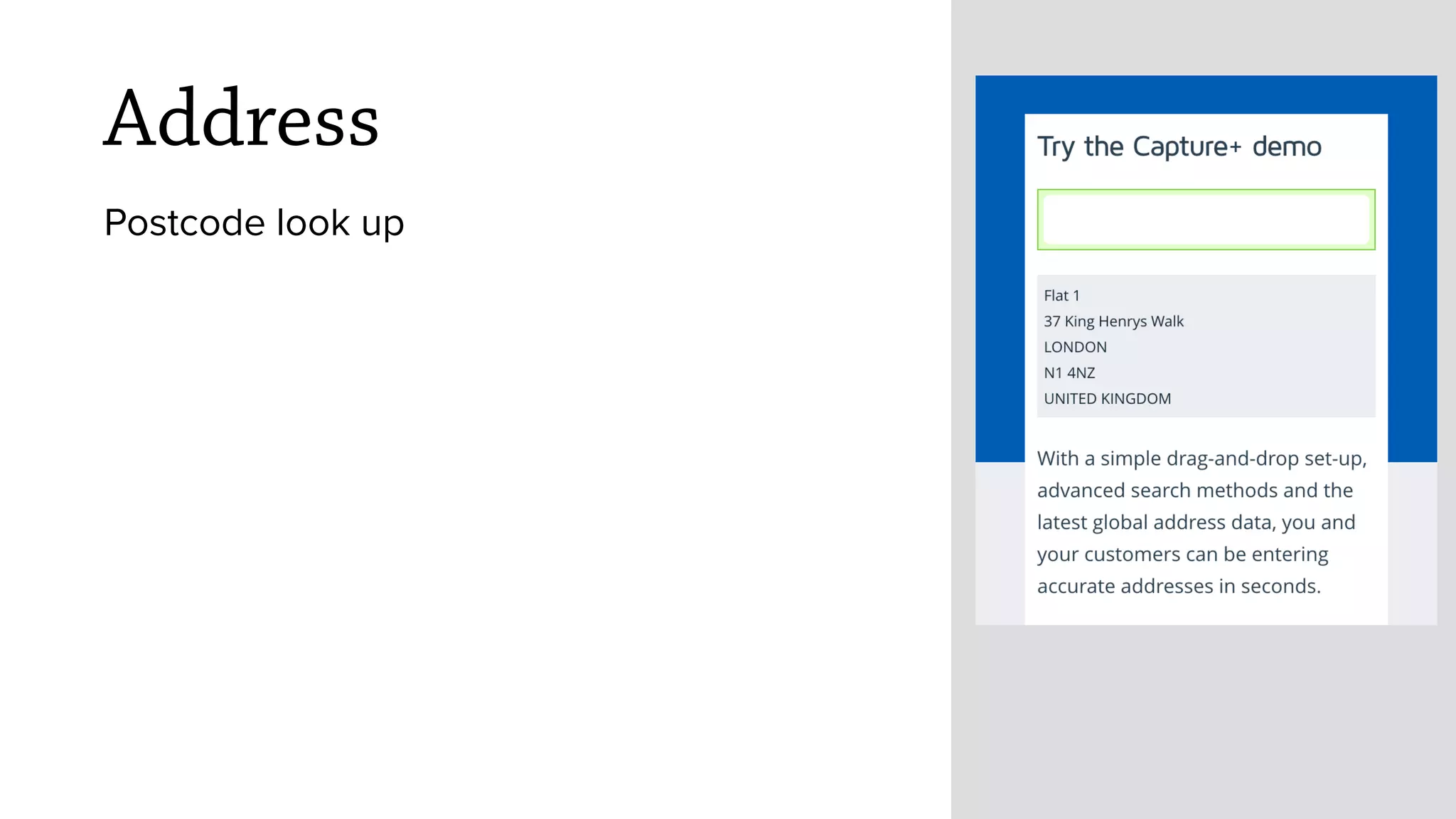
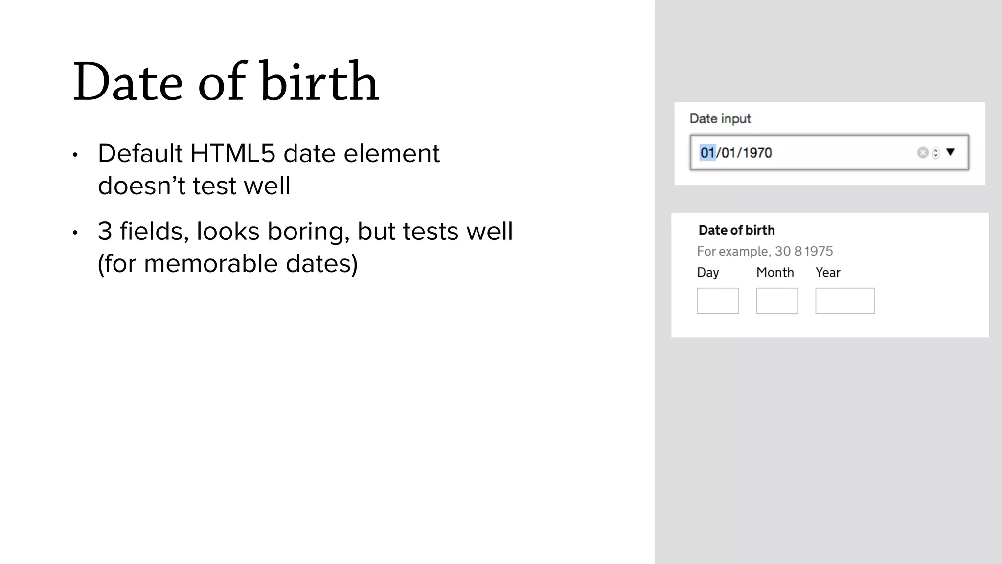

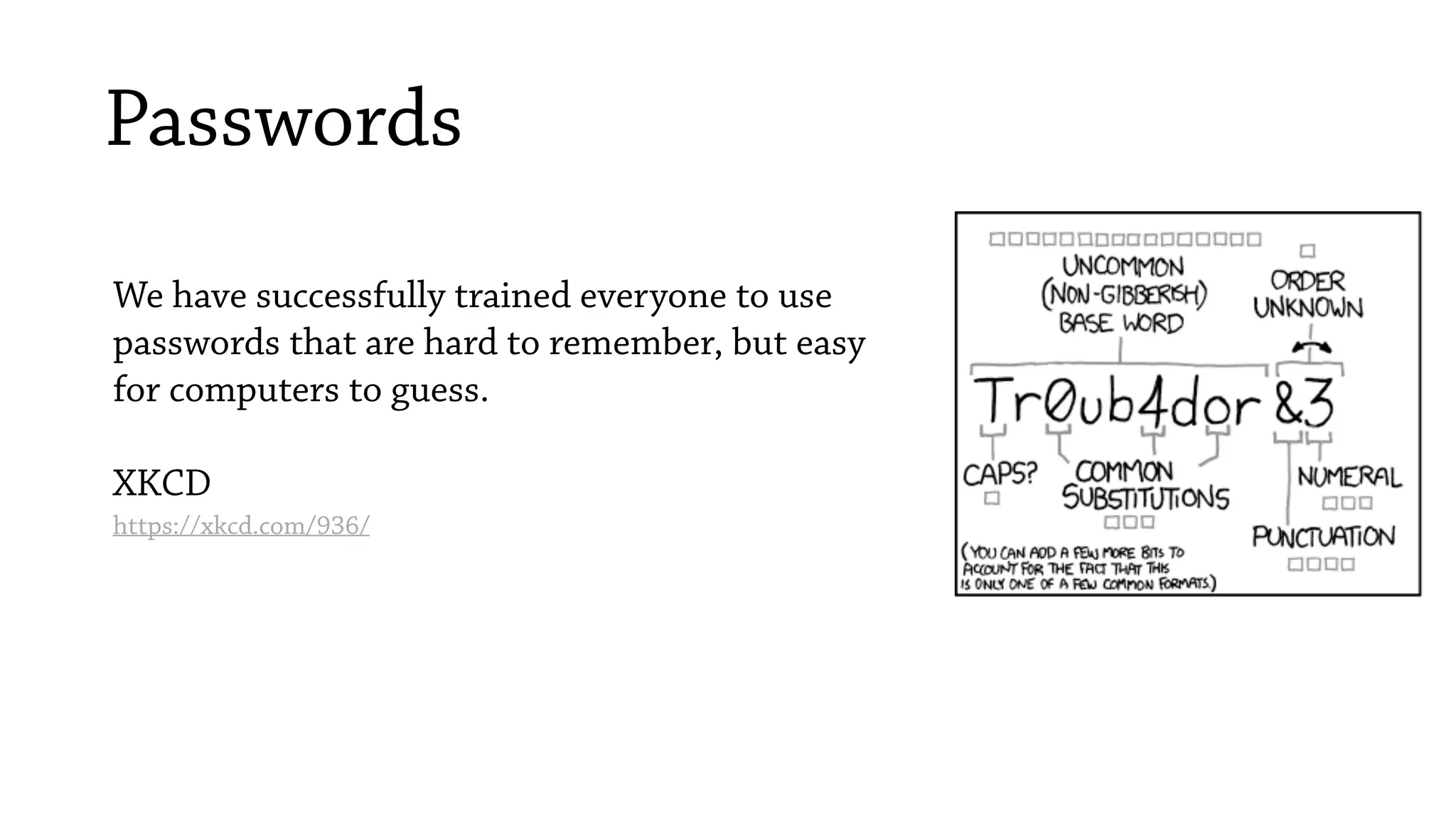
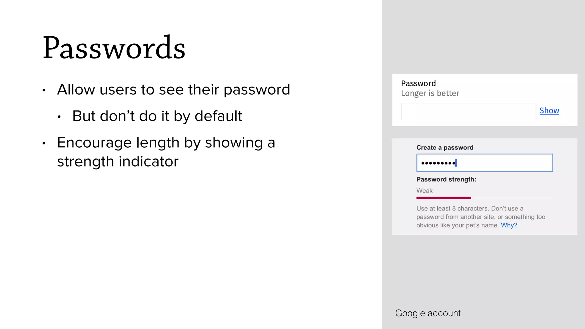
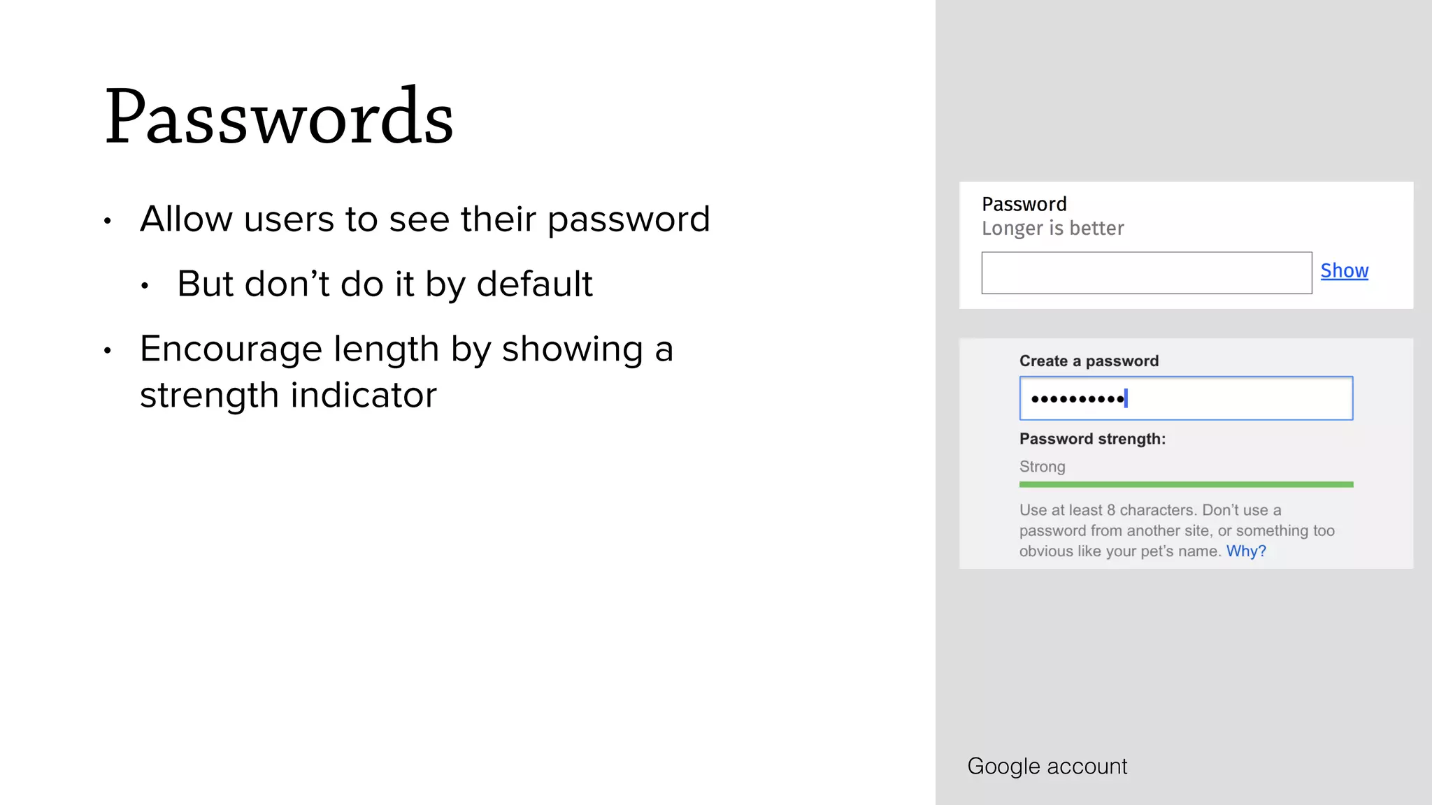


1. The document provides guidance on designing better forms through questioning each question, considering the flow of the form, and focusing on design details. 2. It recommends questioning every question by considering who needs the answer and why, if it is required to answer, what happens if there is a mistake, and if the question can be removed. A question protocol template is provided to analyze each question. 3. The document stresses the importance of designing the form flow like a conversation by grouping related questions and using bullet points to start and end the conversation clearly stating next steps. 4. Finally, it discusses design details like placing labels above each field, using help text carefully, making fields tappable on mobile, improving


![PowerISO 9.2 Mac Crack + Serial Key Free Download 2026 [Latest] Software.pptx](https://cdn.slidesharecdn.com/ss_thumbnails/software-251207185653-5d5700e6-thumbnail.jpg?width=640&height=640&fit=bounds)


![Wondershare Filmora 15.0.11 Crack for Mac Key Full Download [Latest] pptx](https://cdn.slidesharecdn.com/ss_thumbnails/software-251207184836-1d16ba16-thumbnail.jpg?width=640&height=640&fit=bounds)


![CleanMyMac X v5.2.8 Crack for MacOS Full Version [Latest] pptx](https://cdn.slidesharecdn.com/ss_thumbnails/softwareoverview-251207194121-a81f0142-thumbnail.jpg?width=640&height=640&fit=bounds)
![Moho Pro 14.4 Crack for MacOS Works Until 2050 [Latest] pptx](https://cdn.slidesharecdn.com/ss_thumbnails/softwareoverview-251207192639-797289c4-thumbnail.jpg?width=640&height=640&fit=bounds)


