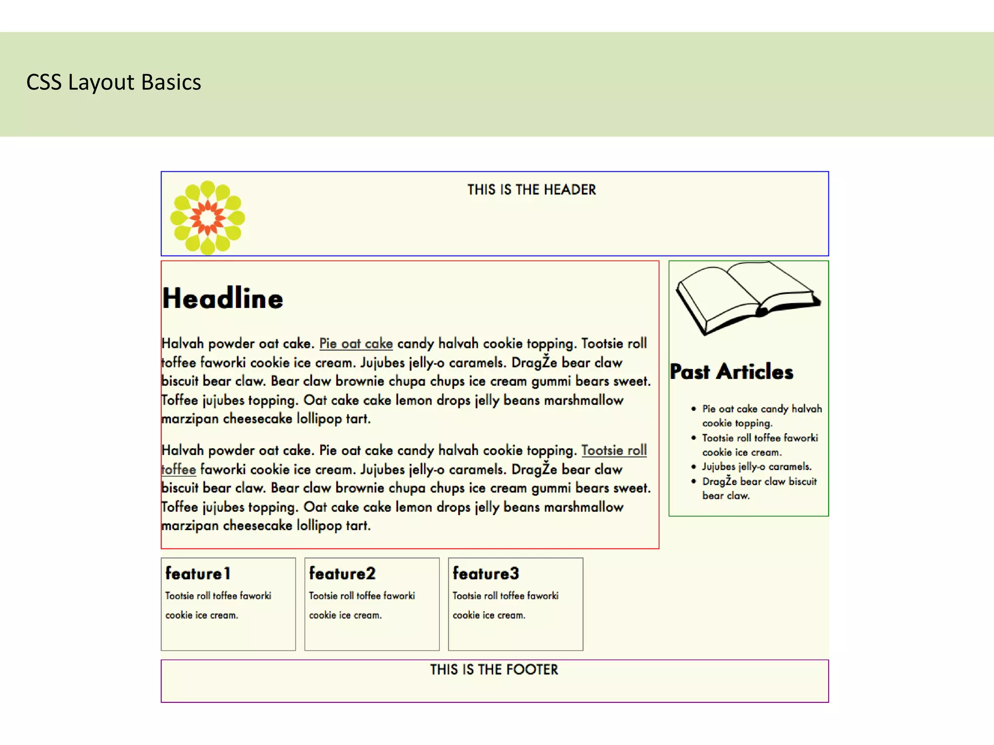
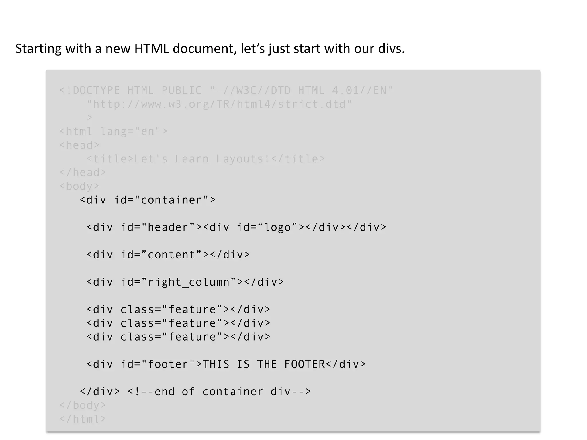
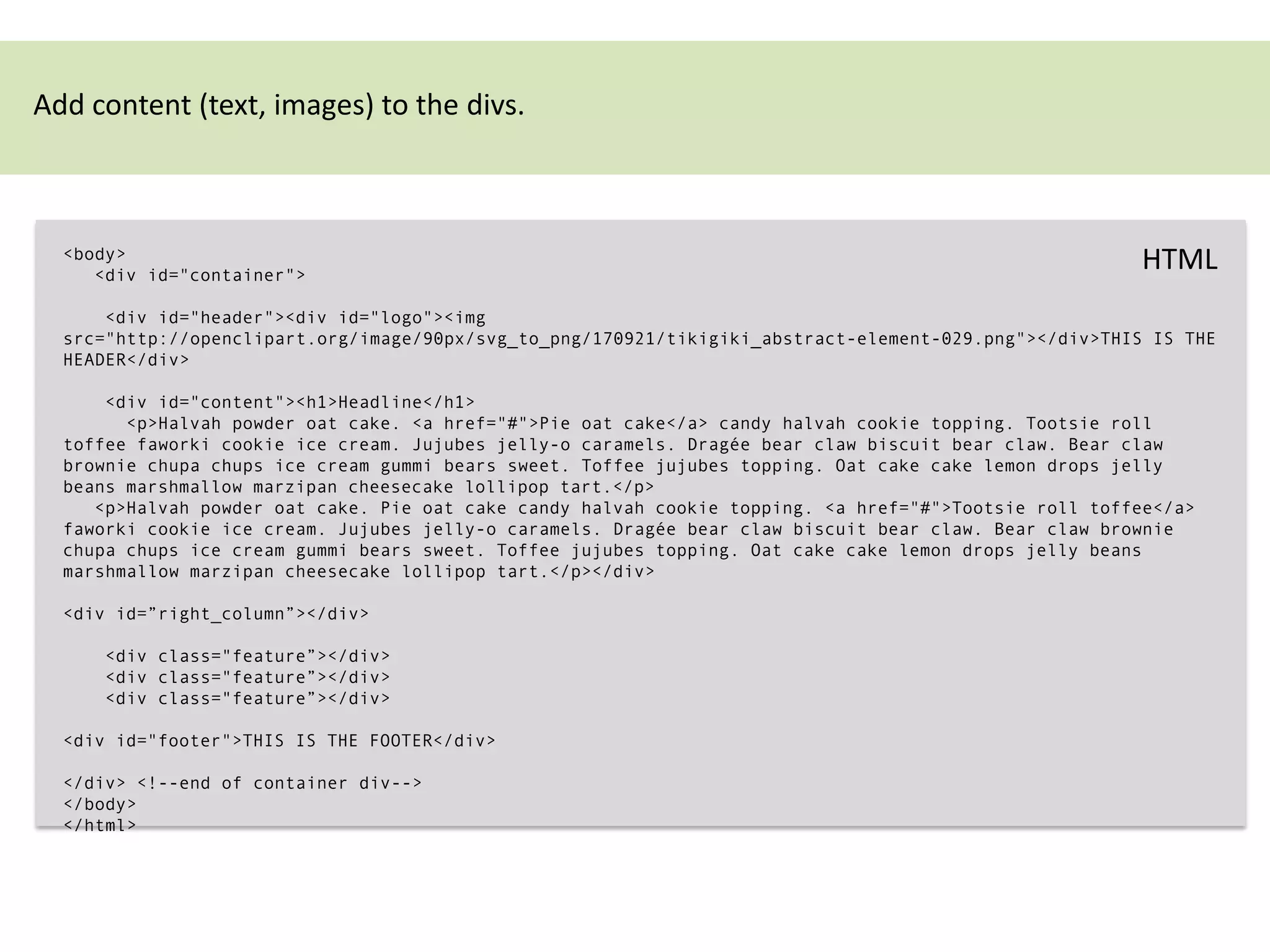
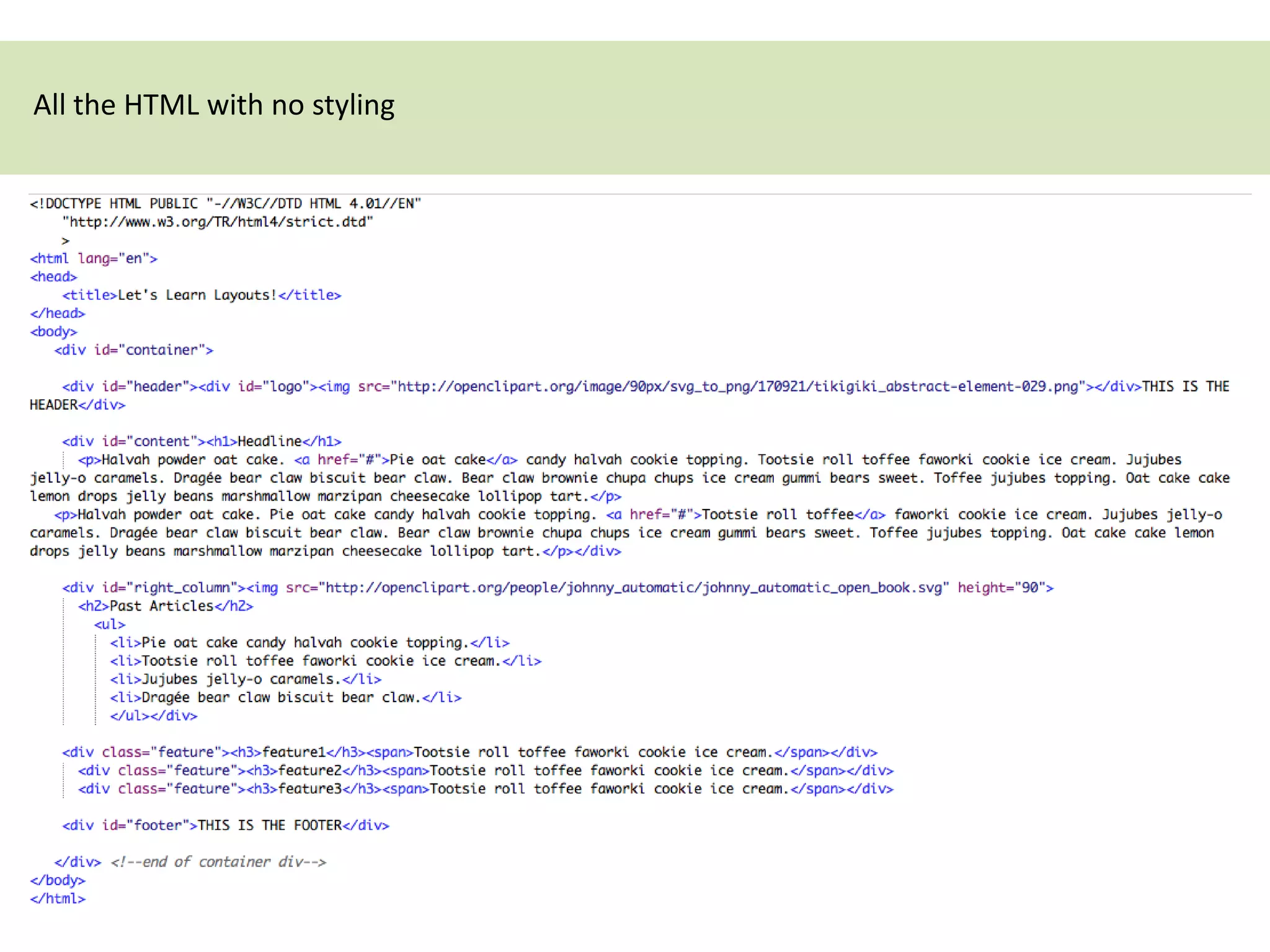
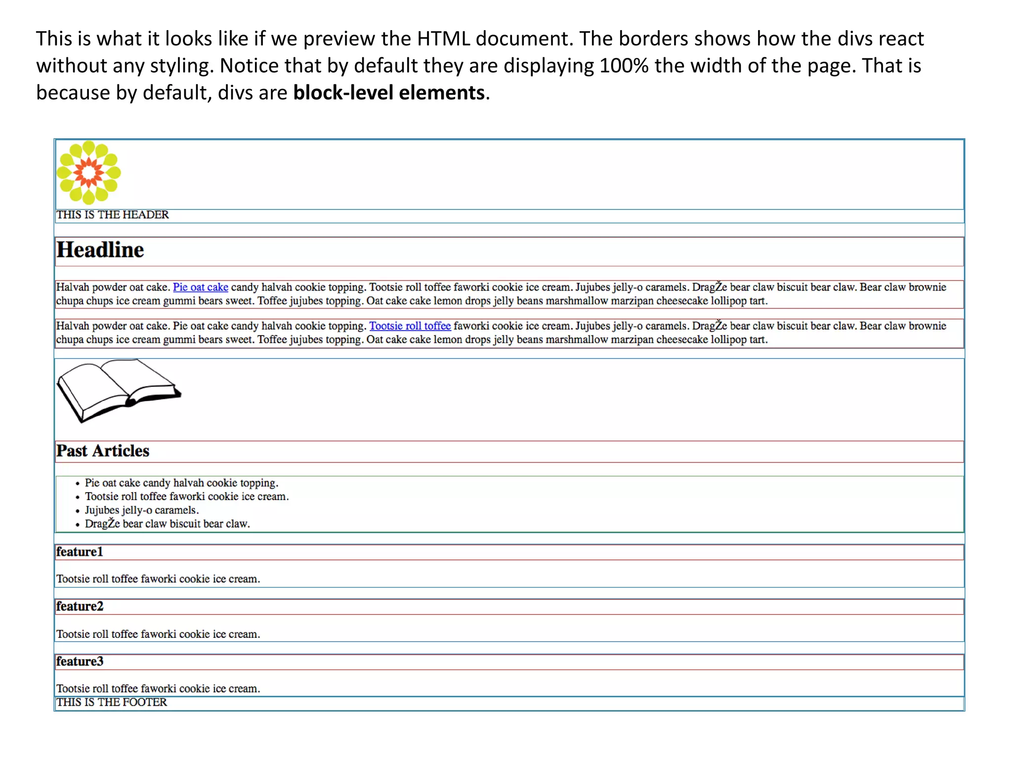
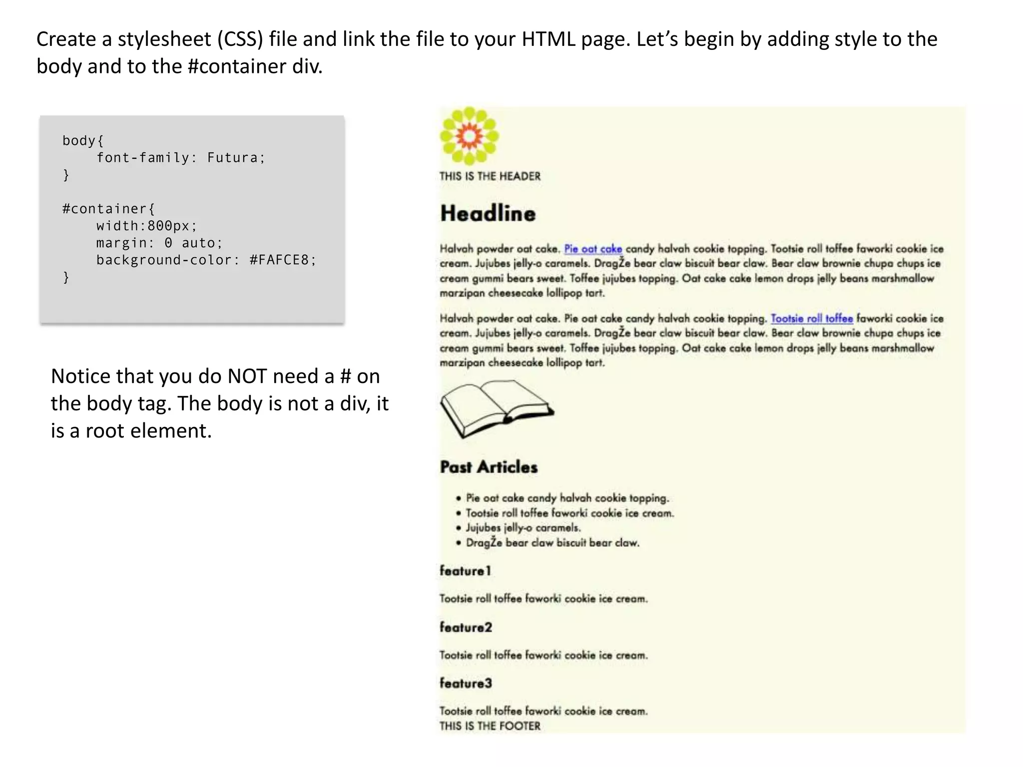
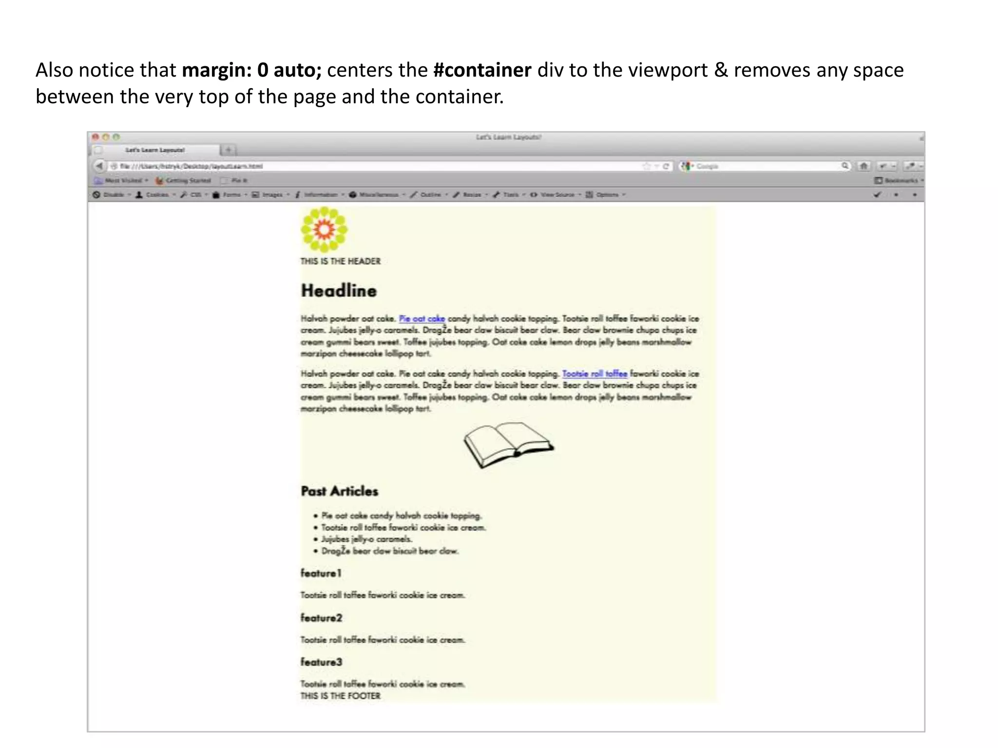
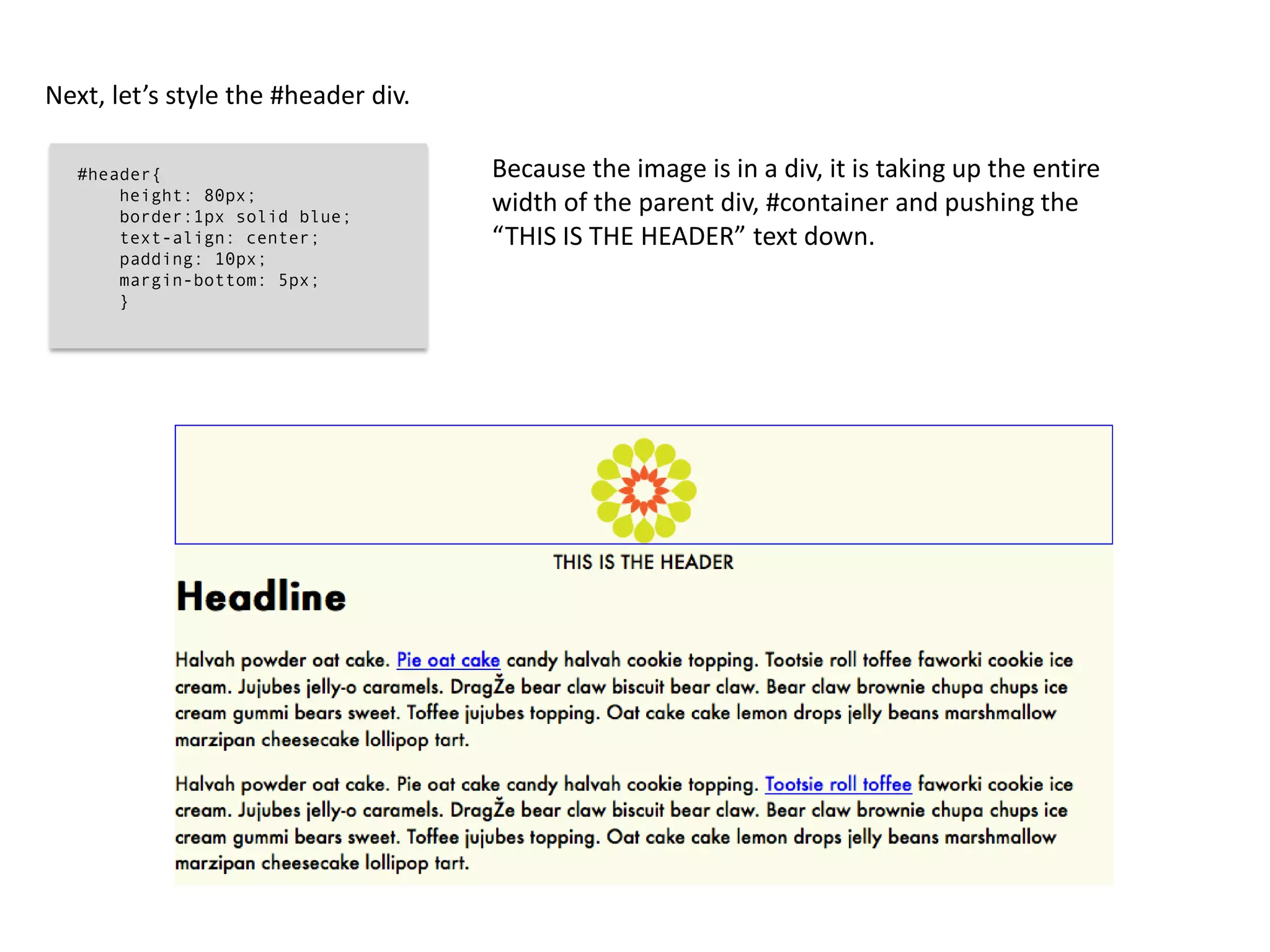
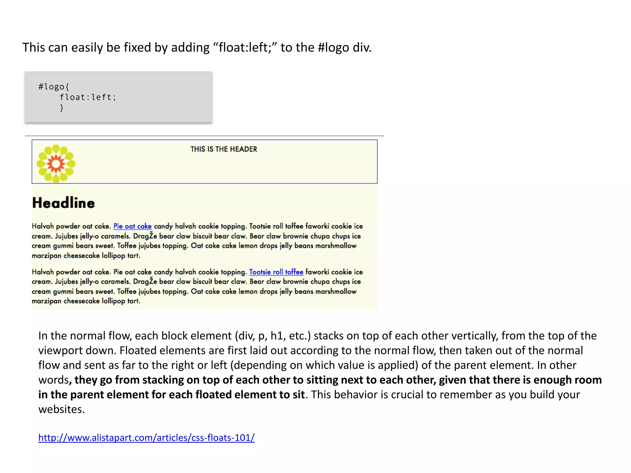
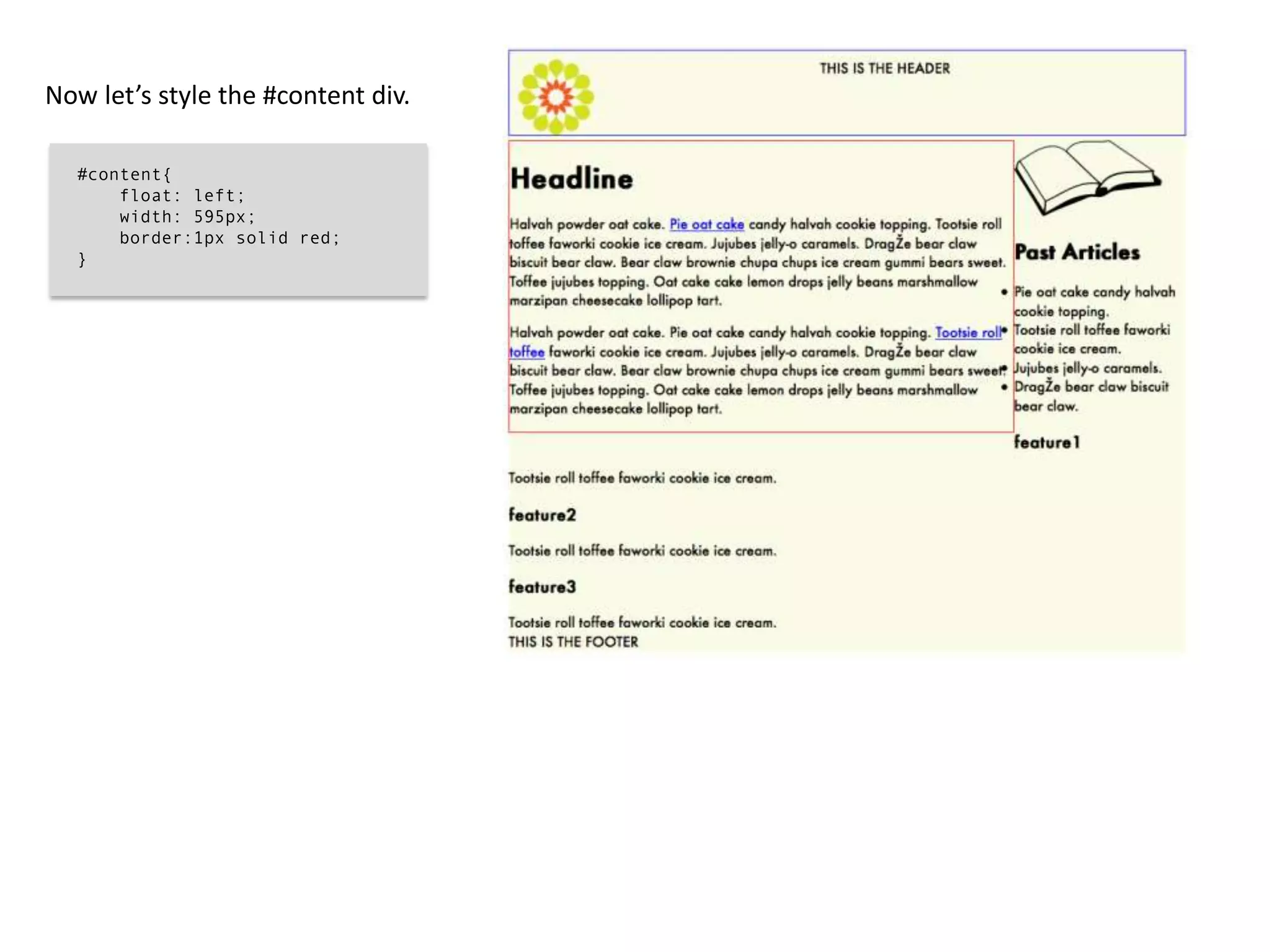
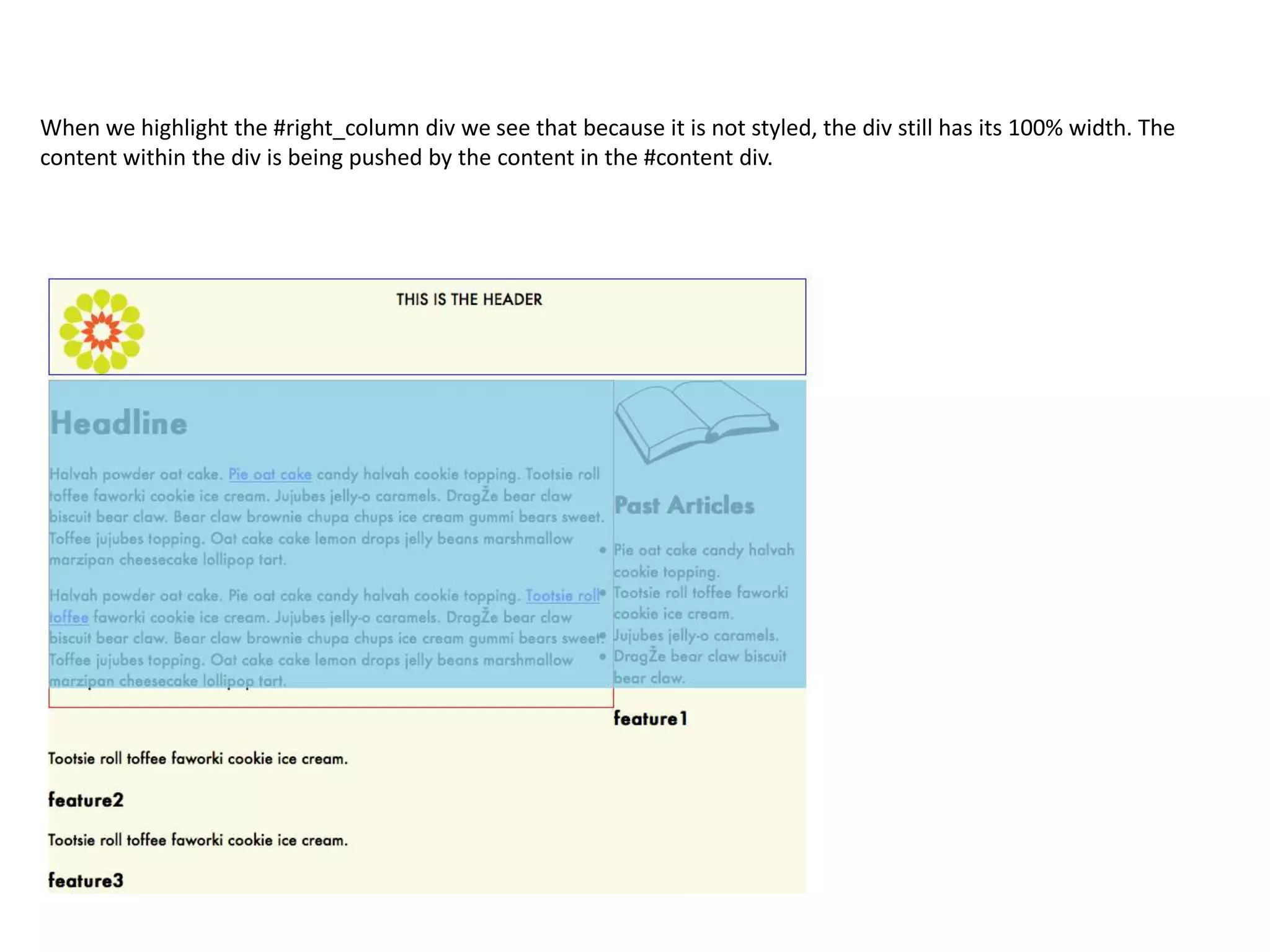
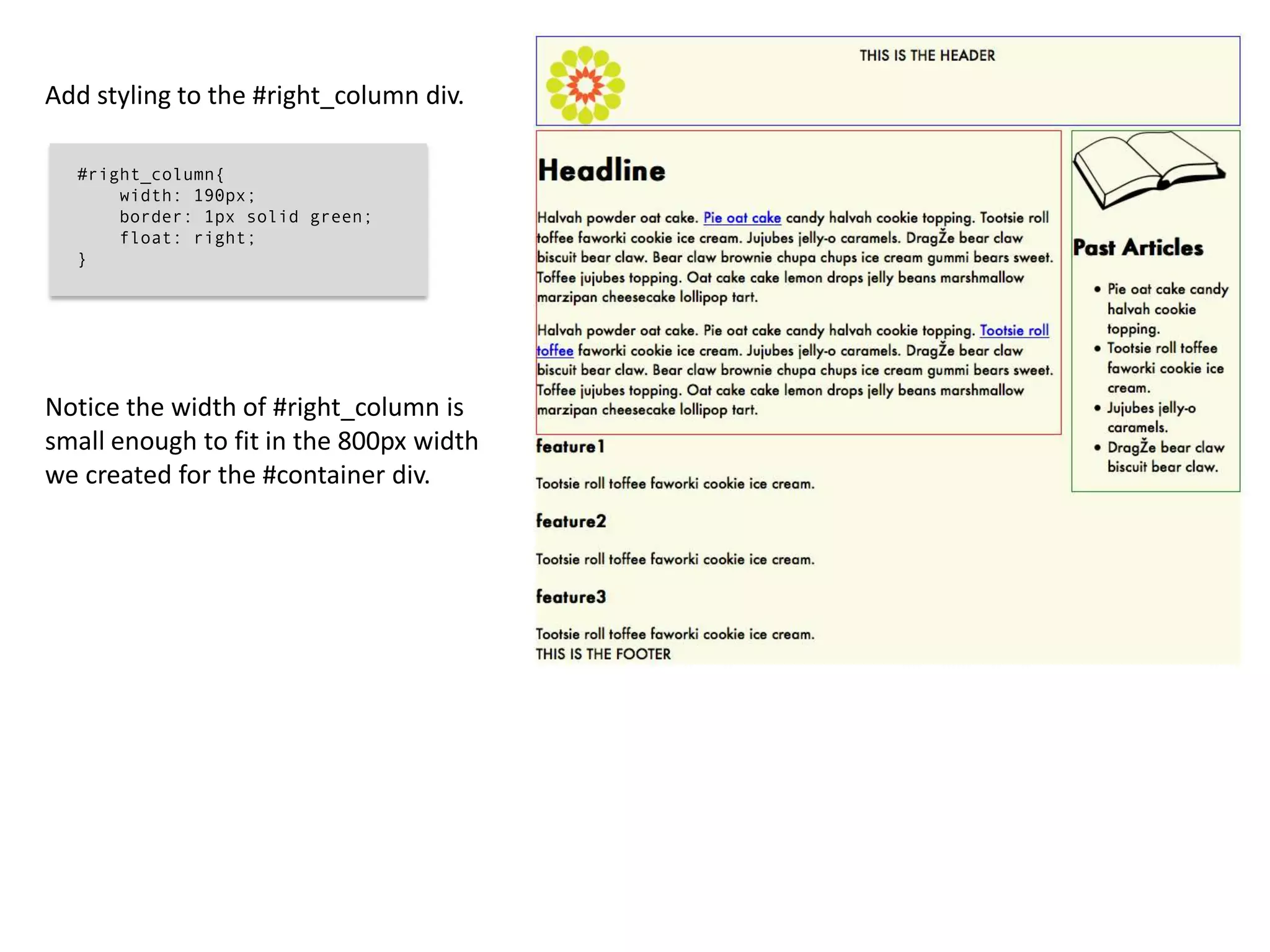
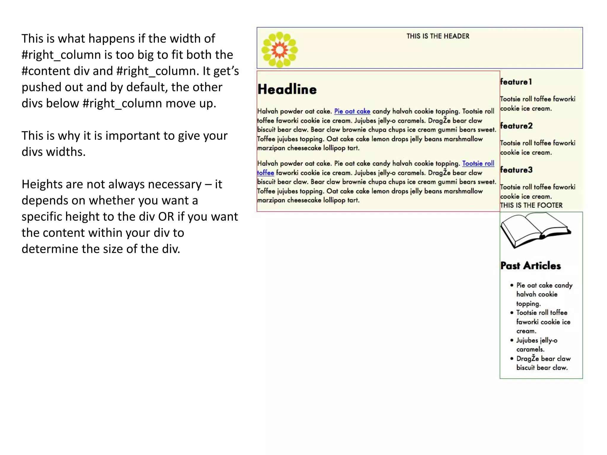
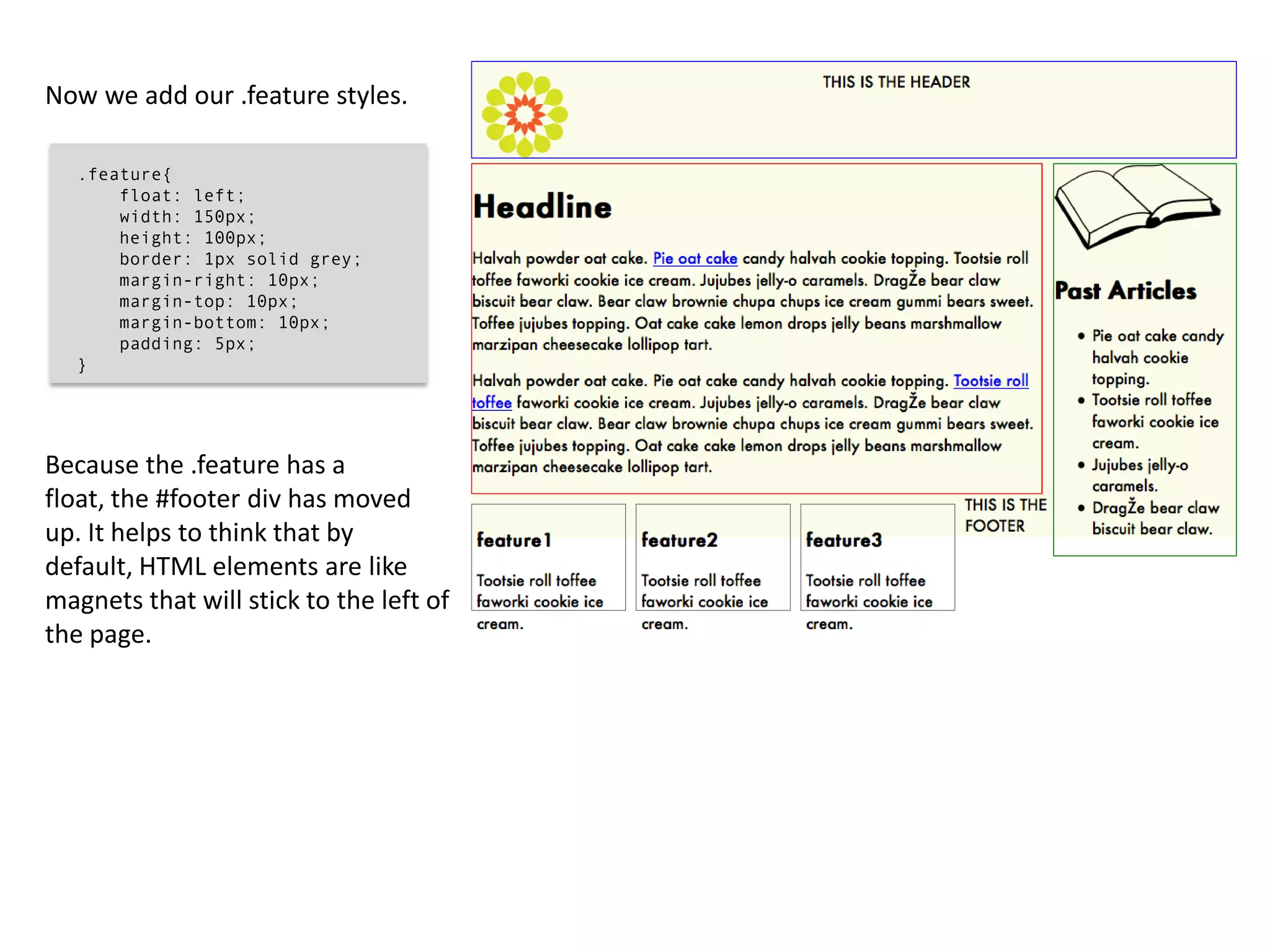
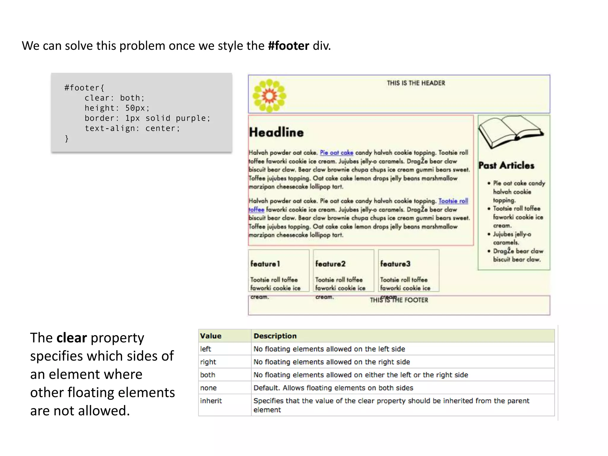
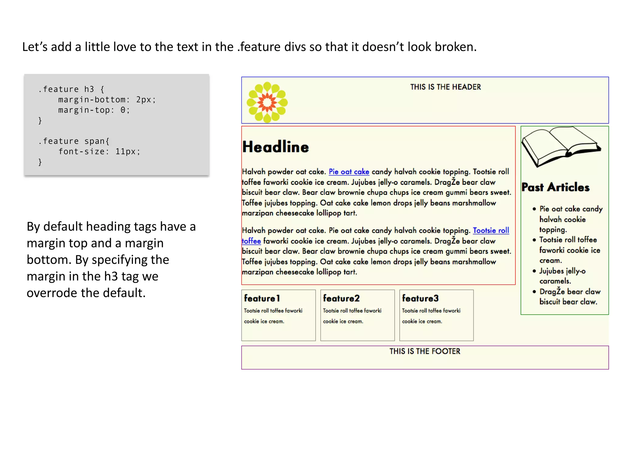
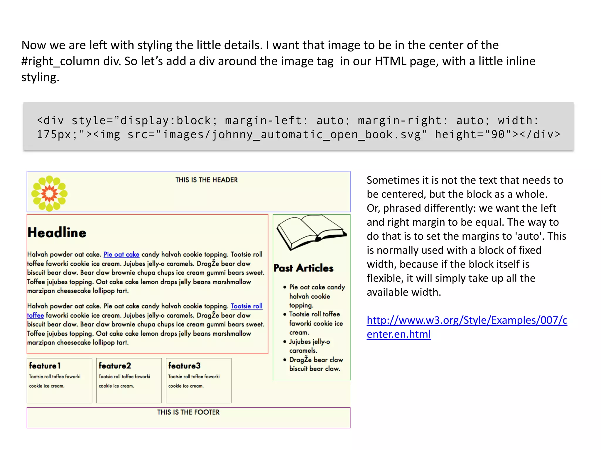
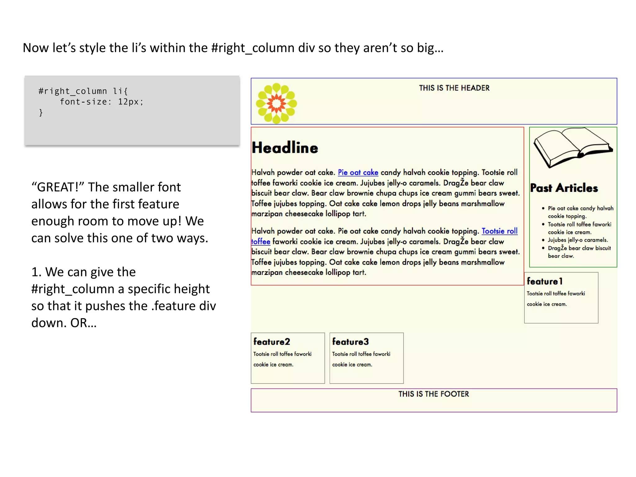
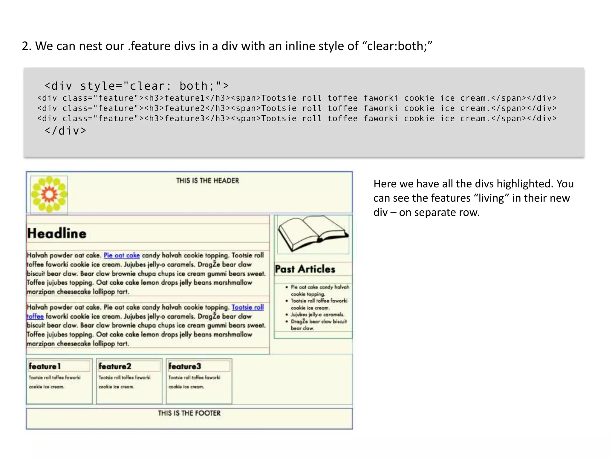
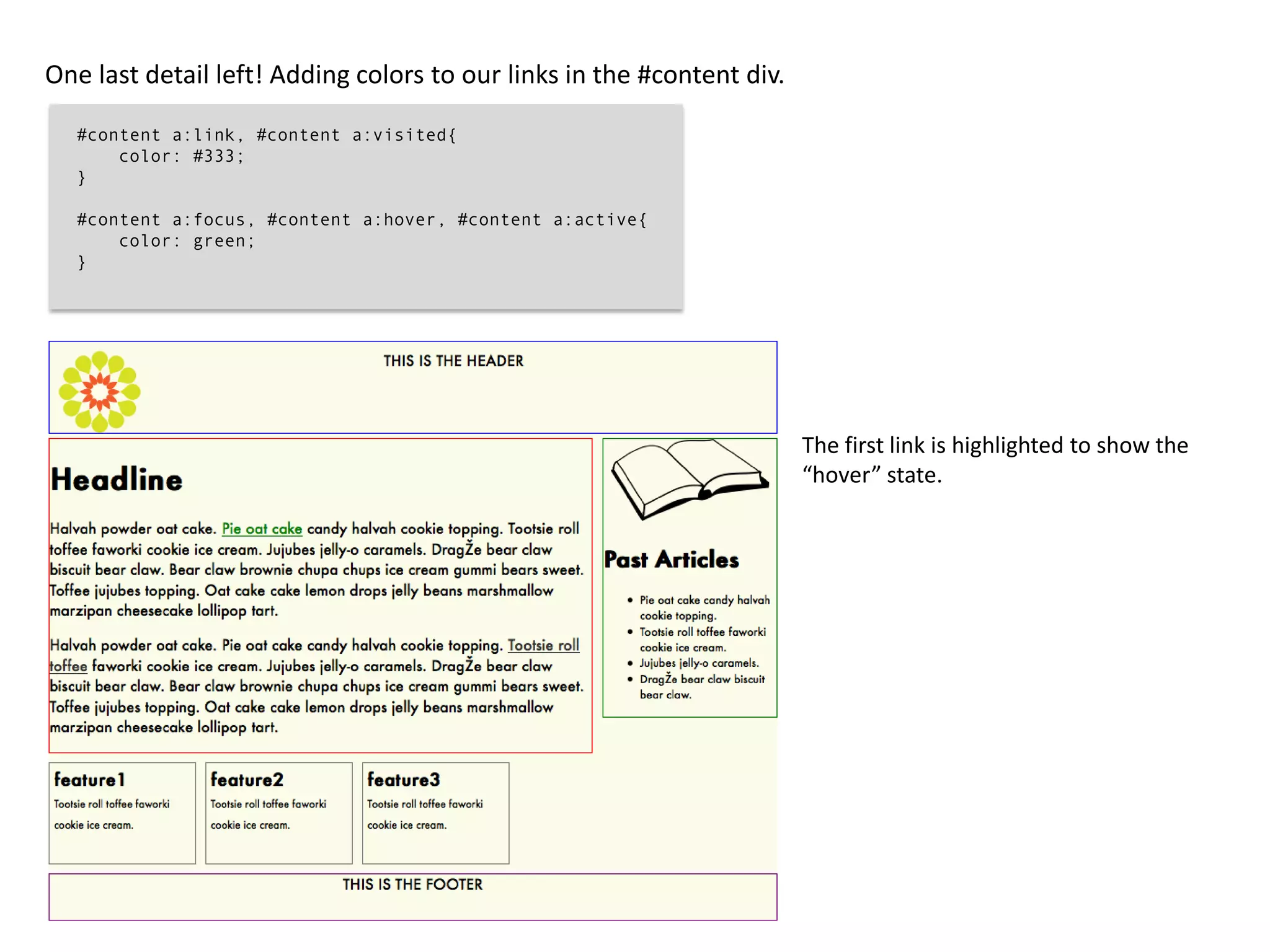
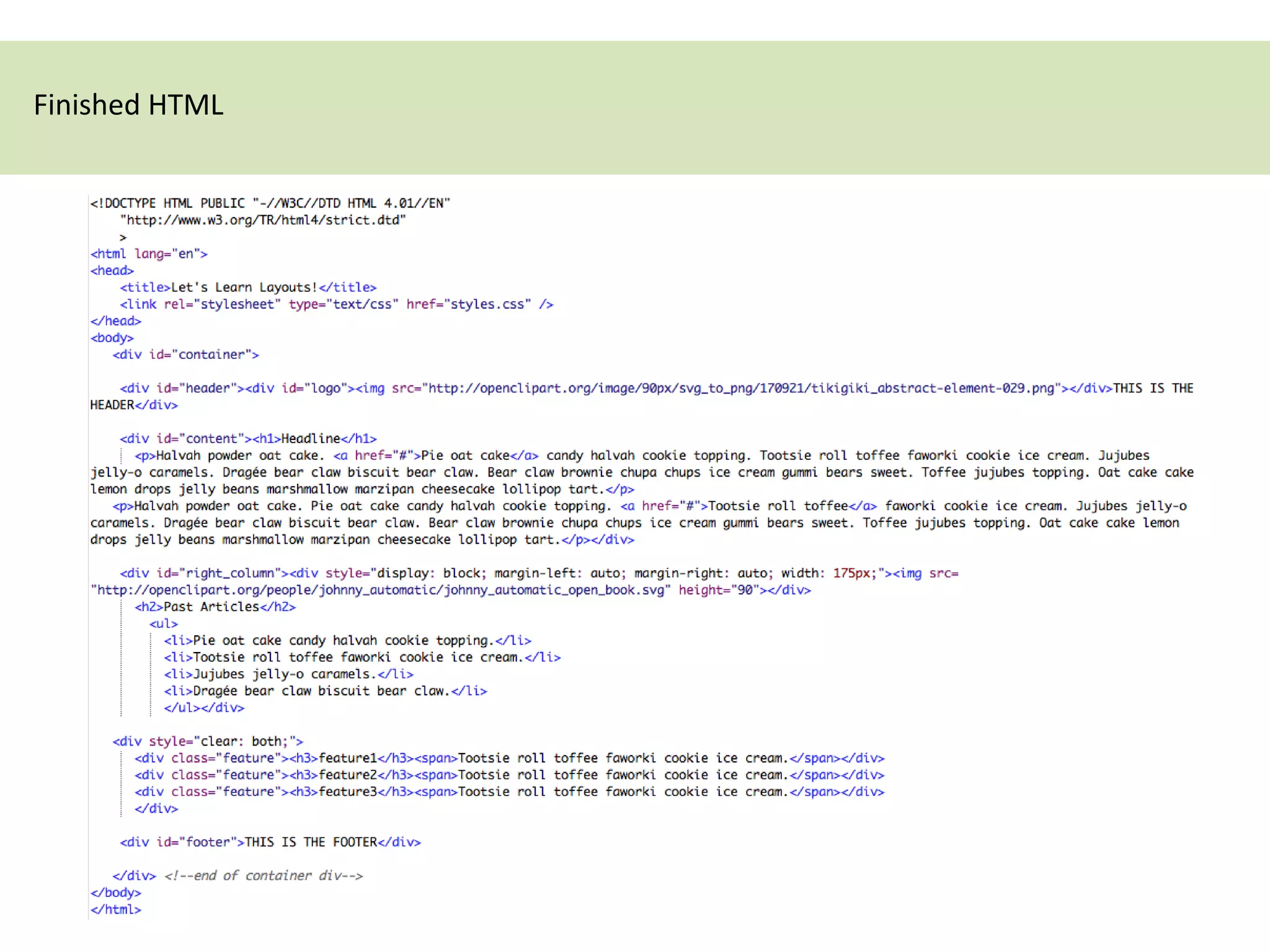
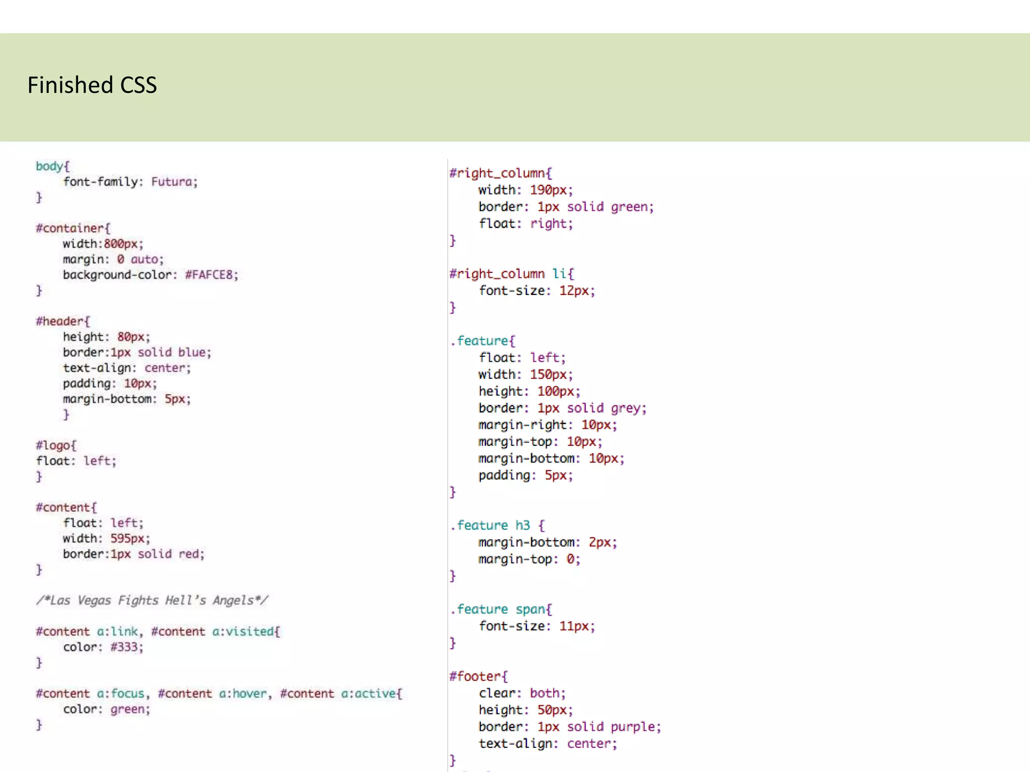
CSS Layout Basics
Starting with a new HTML document, let’s just start with our divs.

       <!DOCTYPE HTML PUBLIC "-//W3C//DTD HTML 4.01//EN"
           "http://www.w3.org/TR/html4/strict.dtd"
           >
       <html lang="en">
       <head>
           <title>Let's Learn Layouts!</title>
       </head>
       <body>
          <div id="container">

           <div id="header”><div id=“logo”></div></div>

           <div id=”content”></div>

           <div id=”right_column”></div>

           <div class="feature”></div>
           <div class="feature”></div>
           <div class="feature”></div>

           <div id="footer">THIS IS THE FOOTER</div>

          </div> <!--end of container div-->
       </body>
       </html>
Add content (text, images) to the divs.


  <body>
     <div id="container">
                                                                                                       HTML
      <div id="header"><div id="logo"><img
  src="http://openclipart.org/image/90px/svg_to_png/170921/tikigiki_abstract-element-029.png"></div>THIS IS THE
  HEADER</div>

      <div id="content"><h1>Headline</h1>
        <p>Halvah powder oat cake. <a href="#">Pie oat cake</a> candy halvah cookie topping. Tootsie roll
  toffee faworki cookie ice cream. Jujubes jelly-o caramels. Dragée bear claw biscuit bear claw. Bear claw
  brownie chupa chups ice cream gummi bears sweet. Toffee jujubes topping. Oat cake cake lemon drops jelly
  beans marshmallow marzipan cheesecake lollipop tart.</p>
     <p>Halvah powder oat cake. Pie oat cake candy halvah cookie topping. <a href="#">Tootsie roll toffee</a>
  faworki cookie ice cream. Jujubes jelly-o caramels. Dragée bear claw biscuit bear claw. Bear claw brownie
  chupa chups ice cream gummi bears sweet. Toffee jujubes topping. Oat cake cake lemon drops jelly beans
  marshmallow marzipan cheesecake lollipop tart.</p></div>

  <div id=”right_column”></div>

     <div class="feature”></div>
     <div class="feature”></div>
     <div class="feature”></div>

  <div id="footer">THIS IS THE FOOTER</div>

  </div> <!--end of container div-->
  </body>
  </html>
All the HTML with no styling
This is what it looks like if we preview the HTML document. The borders shows how the divs react
without any styling. Notice that by default they are displaying 100% the width of the page. That is
because by default, divs are block-level elements.
Create a stylesheet (CSS) file and link the file to your HTML page. Let’s begin by adding style to the
body and to the #container div.


  body{
      font-family: Futura;
  }

  #container{
      width:800px;
      margin: 0 auto;
      background-color: #FAFCE8;
  }


 Notice that you do NOT need a # on
 the body tag. The body is not a div, it
 is a root element.
Also notice that margin: 0 auto; centers the #container div to the viewport & removes any space
between the very top of the page and the container.
Next, let’s style the #header div.

  #header{                           Because the image is in a div, it is taking up the entire
      height: 80px;
      border:1px solid blue;
                                     width of the parent div, #container and pushing the
      text-align: center;            “THIS IS THE HEADER” text down.
      padding: 10px;
      margin-bottom: 5px;
      }
This can easily be fixed by adding “float:left;” to the #logo div.

   #logo{
       float:left;
       }


   In the normal flow, each block element (div, p, h1, etc.) stacks on top of each other vertically, from the top of the
   viewport down. Floated elements are first laid out according to the normal flow, then taken out of the normal
   flow and sent as far to the right or left (depending on which value is applied) of the parent element. In other
   words, they go from stacking on top of each other to sitting next to each other, given that there is enough room
   in the parent element for each floated element to sit. This behavior is crucial to remember as you build your
   websites.

   http://www.alistapart.com/articles/css-floats-101/
Now let’s style the #content div.

  #content{
      float: left;
      width: 595px;
      border:1px solid red;
  }
When we highlight the #right_column div we see that because it is not styled, the div still has its 100% width. The
content within the div is being pushed by the content in the #content div.
Add styling to the #right_column div.

  #right_column{
      width: 190px;
      border: 1px solid green;
      float: right;
  }


Notice the width of #right_column is
small enough to fit in the 800px width
we created for the #container div.
This is what happens if the width of
#right_column is too big to fit both the
#content div and #right_column. It get’s
pushed out and by default, the other
divs below #right_column move up.

This is why it is important to give your
divs widths.

Heights are not always necessary – it
depends on whether you want a
specific height to the div OR if you want
the content within your div to
determine the size of the div.
Now we add our .feature styles.

   .feature{
       float: left;
       width: 150px;
       height: 100px;
       border: 1px solid grey;
       margin-right: 10px;
       margin-top: 10px;
       margin-bottom: 10px;
       padding: 5px;
   }


Because the .feature has a
float, the #footer div has moved
up. It helps to think that by
default, HTML elements are like
magnets that will stick to the left of
the page.
We can solve this problem once we style the #footer div.


       #footer{
           clear: both;
           height: 50px;
           border: 1px solid purple;
           text-align: center;
       }


 The clear property
 specifies which sides of
 an element where
 other floating elements
 are not allowed.
Let’s add a little love to the text in the .feature divs so that it doesn’t look broken.

  .feature h3 {
      margin-bottom: 2px;
      margin-top: 0;
  }

  .feature span{
      font-size: 11px;
  }


By default heading tags have a
margin top and a margin
bottom. By specifying the
margin in the h3 tag we
overrode the default.
Now we are left with styling the little details. I want that image to be in the center of the
#right_column div. So let’s add a div around the image tag in our HTML page, with a little inline
styling.


  <div style=”display:block; margin-left: auto; margin-right: auto; width:
  175px;"><img src=“images/johnny_automatic_open_book.svg" height="90"></div>


                                                                 Sometimes it is not the text that needs to
                                                                 be centered, but the block as a whole.
                                                                 Or, phrased differently: we want the left
                                                                 and right margin to be equal. The way to
                                                                 do that is to set the margins to 'auto'. This
                                                                 is normally used with a block of fixed
                                                                 width, because if the block itself is
                                                                 flexible, it will simply take up all the
                                                                 available width.

                                                                 http://www.w3.org/Style/Examples/007/c
                                                                 enter.en.html
Now let’s style the li’s within the #right_column div so they aren’t so big…

  #right_column li{
      font-size: 12px;
  }


 “GREAT!” The smaller font
 allows for the first feature
 enough room to move up! We
 can solve this one of two ways.

 1. We can give the
 #right_column a specific height
 so that it pushes the .feature div
 down. OR…
2. We can nest our .feature divs in a div with an inline style of “clear:both;”

    <div style="clear: both;">
  <div class="feature"><h3>feature1</h3><span>Tootsie roll toffee faworki cookie ice cream.</span></div>
  <div class="feature"><h3>feature2</h3><span>Tootsie roll toffee faworki cookie ice cream.</span></div>
  <div class="feature"><h3>feature3</h3><span>Tootsie roll toffee faworki cookie ice cream.</span></div>
    </div>


                                                                   Here we have all the divs highlighted. You
                                                                   can see the features “living” in their new
                                                                   div – on separate row.
One last detail left! Adding colors to our links in the #content div.

  #content a:link, #content a:visited{
      color: #333;
  }

  #content a:focus, #content a:hover, #content a:active{
      color: green;
  }


                                                                        The first link is highlighted to show the
                                                                        “hover” state.
Finished HTML
Finished CSS

CSS Layout Tutorial

  • 1.
  • 2.
    Starting with anew HTML document, let’s just start with our divs. <!DOCTYPE HTML PUBLIC "-//W3C//DTD HTML 4.01//EN" "http://www.w3.org/TR/html4/strict.dtd" > <html lang="en"> <head> <title>Let's Learn Layouts!</title> </head> <body> <div id="container"> <div id="header”><div id=“logo”></div></div> <div id=”content”></div> <div id=”right_column”></div> <div class="feature”></div> <div class="feature”></div> <div class="feature”></div> <div id="footer">THIS IS THE FOOTER</div> </div> <!--end of container div--> </body> </html>
  • 3.
    Add content (text,images) to the divs. <body> <div id="container"> HTML <div id="header"><div id="logo"><img src="http://openclipart.org/image/90px/svg_to_png/170921/tikigiki_abstract-element-029.png"></div>THIS IS THE HEADER</div> <div id="content"><h1>Headline</h1> <p>Halvah powder oat cake. <a href="#">Pie oat cake</a> candy halvah cookie topping. Tootsie roll toffee faworki cookie ice cream. Jujubes jelly-o caramels. Dragée bear claw biscuit bear claw. Bear claw brownie chupa chups ice cream gummi bears sweet. Toffee jujubes topping. Oat cake cake lemon drops jelly beans marshmallow marzipan cheesecake lollipop tart.</p> <p>Halvah powder oat cake. Pie oat cake candy halvah cookie topping. <a href="#">Tootsie roll toffee</a> faworki cookie ice cream. Jujubes jelly-o caramels. Dragée bear claw biscuit bear claw. Bear claw brownie chupa chups ice cream gummi bears sweet. Toffee jujubes topping. Oat cake cake lemon drops jelly beans marshmallow marzipan cheesecake lollipop tart.</p></div> <div id=”right_column”></div> <div class="feature”></div> <div class="feature”></div> <div class="feature”></div> <div id="footer">THIS IS THE FOOTER</div> </div> <!--end of container div--> </body> </html>
  • 4.
    All the HTMLwith no styling
  • 5.
    This is whatit looks like if we preview the HTML document. The borders shows how the divs react without any styling. Notice that by default they are displaying 100% the width of the page. That is because by default, divs are block-level elements.
  • 6.
    Create a stylesheet(CSS) file and link the file to your HTML page. Let’s begin by adding style to the body and to the #container div. body{ font-family: Futura; } #container{ width:800px; margin: 0 auto; background-color: #FAFCE8; } Notice that you do NOT need a # on the body tag. The body is not a div, it is a root element.
  • 7.
    Also notice thatmargin: 0 auto; centers the #container div to the viewport & removes any space between the very top of the page and the container.
  • 8.
    Next, let’s stylethe #header div. #header{ Because the image is in a div, it is taking up the entire height: 80px; border:1px solid blue; width of the parent div, #container and pushing the text-align: center; “THIS IS THE HEADER” text down. padding: 10px; margin-bottom: 5px; }
  • 9.
    This can easilybe fixed by adding “float:left;” to the #logo div. #logo{ float:left; } In the normal flow, each block element (div, p, h1, etc.) stacks on top of each other vertically, from the top of the viewport down. Floated elements are first laid out according to the normal flow, then taken out of the normal flow and sent as far to the right or left (depending on which value is applied) of the parent element. In other words, they go from stacking on top of each other to sitting next to each other, given that there is enough room in the parent element for each floated element to sit. This behavior is crucial to remember as you build your websites. http://www.alistapart.com/articles/css-floats-101/
  • 10.
    Now let’s stylethe #content div. #content{ float: left; width: 595px; border:1px solid red; }
  • 11.
    When we highlightthe #right_column div we see that because it is not styled, the div still has its 100% width. The content within the div is being pushed by the content in the #content div.
  • 12.
    Add styling tothe #right_column div. #right_column{ width: 190px; border: 1px solid green; float: right; } Notice the width of #right_column is small enough to fit in the 800px width we created for the #container div.
  • 13.
    This is whathappens if the width of #right_column is too big to fit both the #content div and #right_column. It get’s pushed out and by default, the other divs below #right_column move up. This is why it is important to give your divs widths. Heights are not always necessary – it depends on whether you want a specific height to the div OR if you want the content within your div to determine the size of the div.
  • 14.
    Now we addour .feature styles. .feature{ float: left; width: 150px; height: 100px; border: 1px solid grey; margin-right: 10px; margin-top: 10px; margin-bottom: 10px; padding: 5px; } Because the .feature has a float, the #footer div has moved up. It helps to think that by default, HTML elements are like magnets that will stick to the left of the page.
  • 15.
    We can solvethis problem once we style the #footer div. #footer{ clear: both; height: 50px; border: 1px solid purple; text-align: center; } The clear property specifies which sides of an element where other floating elements are not allowed.
  • 16.
    Let’s add alittle love to the text in the .feature divs so that it doesn’t look broken. .feature h3 { margin-bottom: 2px; margin-top: 0; } .feature span{ font-size: 11px; } By default heading tags have a margin top and a margin bottom. By specifying the margin in the h3 tag we overrode the default.
  • 17.
    Now we areleft with styling the little details. I want that image to be in the center of the #right_column div. So let’s add a div around the image tag in our HTML page, with a little inline styling. <div style=”display:block; margin-left: auto; margin-right: auto; width: 175px;"><img src=“images/johnny_automatic_open_book.svg" height="90"></div> Sometimes it is not the text that needs to be centered, but the block as a whole. Or, phrased differently: we want the left and right margin to be equal. The way to do that is to set the margins to 'auto'. This is normally used with a block of fixed width, because if the block itself is flexible, it will simply take up all the available width. http://www.w3.org/Style/Examples/007/c enter.en.html
  • 18.
    Now let’s stylethe li’s within the #right_column div so they aren’t so big… #right_column li{ font-size: 12px; } “GREAT!” The smaller font allows for the first feature enough room to move up! We can solve this one of two ways. 1. We can give the #right_column a specific height so that it pushes the .feature div down. OR…
  • 19.
    2. We cannest our .feature divs in a div with an inline style of “clear:both;” <div style="clear: both;"> <div class="feature"><h3>feature1</h3><span>Tootsie roll toffee faworki cookie ice cream.</span></div> <div class="feature"><h3>feature2</h3><span>Tootsie roll toffee faworki cookie ice cream.</span></div> <div class="feature"><h3>feature3</h3><span>Tootsie roll toffee faworki cookie ice cream.</span></div> </div> Here we have all the divs highlighted. You can see the features “living” in their new div – on separate row.
  • 20.
    One last detailleft! Adding colors to our links in the #content div. #content a:link, #content a:visited{ color: #333; } #content a:focus, #content a:hover, #content a:active{ color: green; } The first link is highlighted to show the “hover” state.
  • 21.
  • 22.