Download as PDF, PPTX


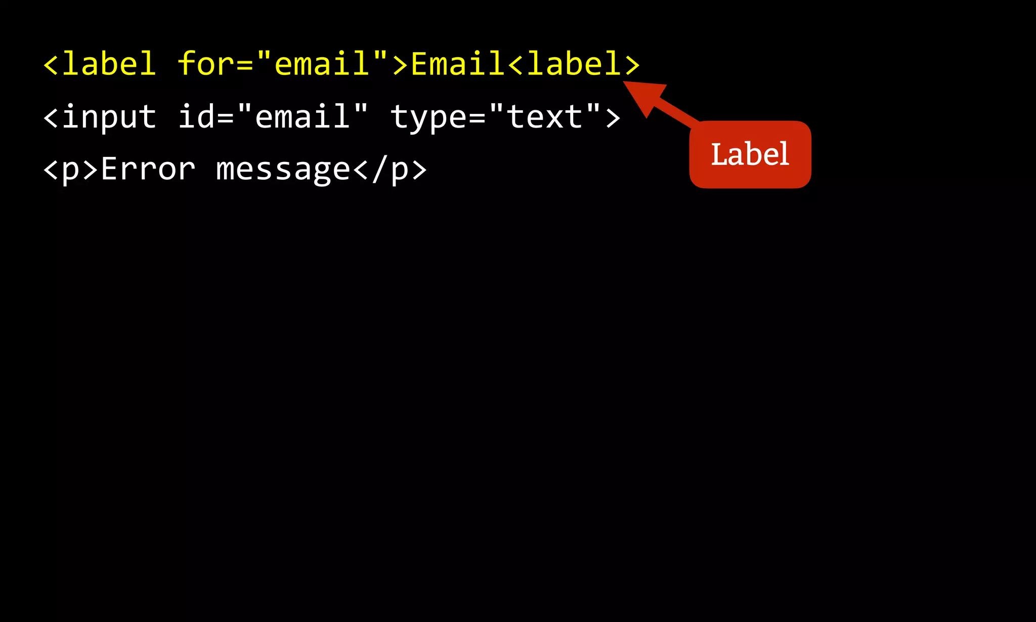
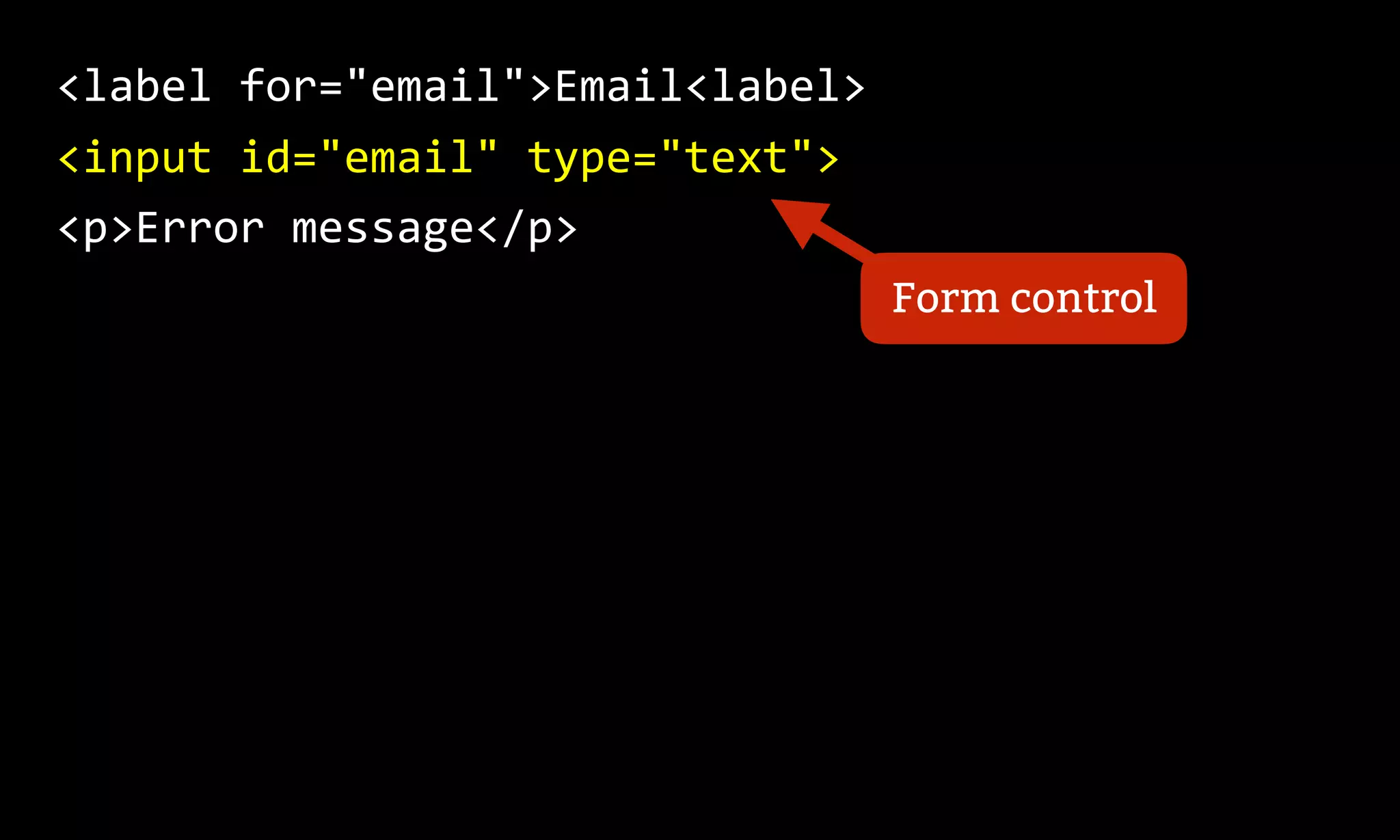
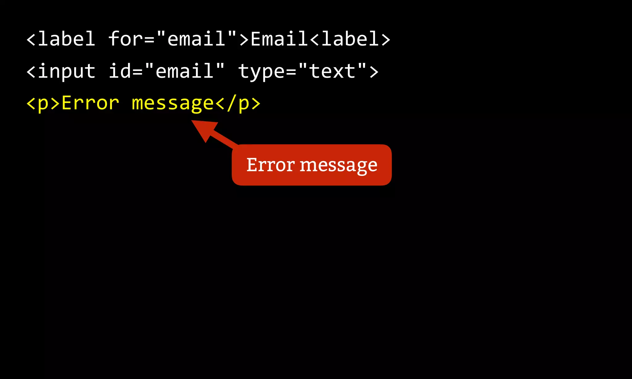


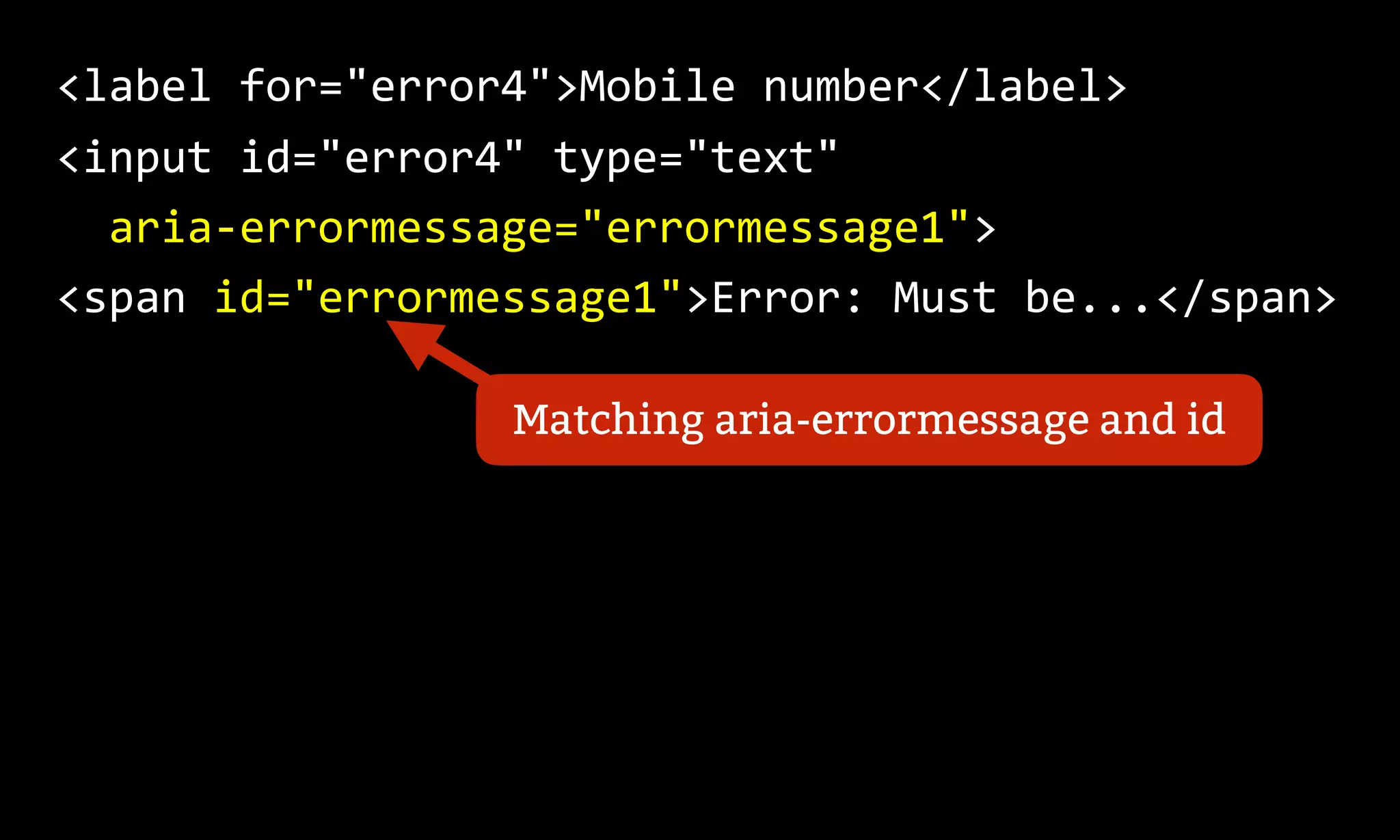


This document discusses making inline error messages accessible for assistive technologies like screen readers. It provides 4 methods for programmatically associating error messages with form fields: 1) wrapping the label, 2) using aria-describedby, 3) aria-labelledby, and 4) the newer aria-errormessage. It also recommends using aria-invalid to indicate the validation state and aria-live to announce changes for screen reader users. The goal is to ensure error messages are announced and read aloud as part of the form interaction for assistive technology users.
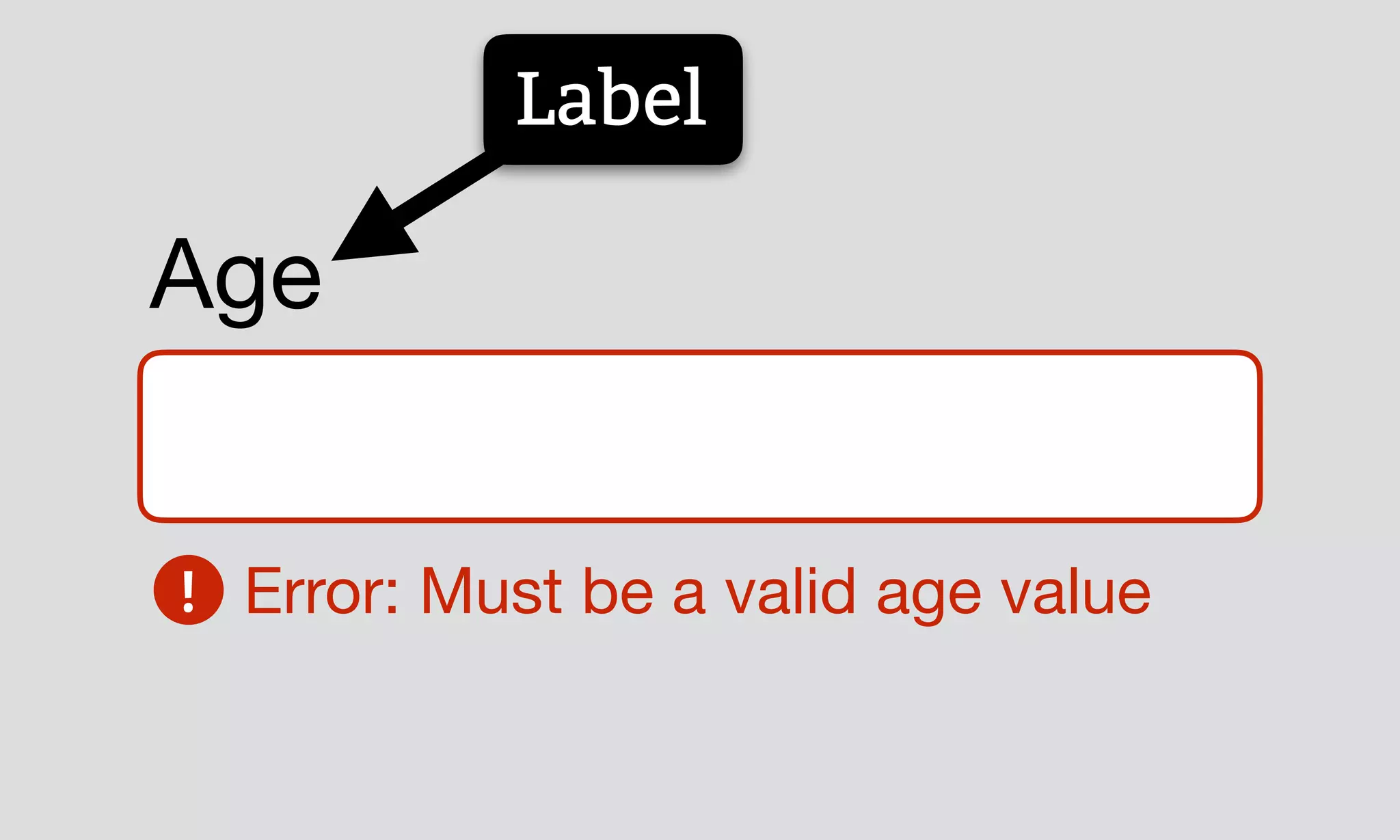
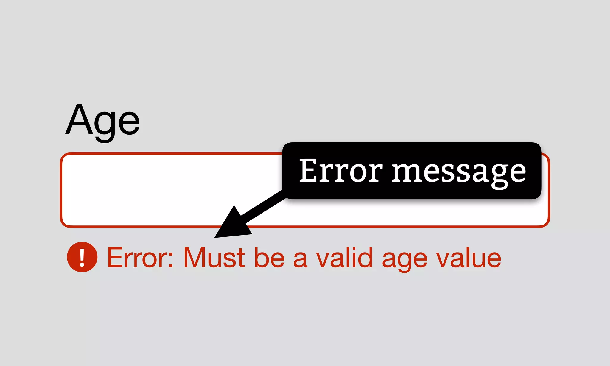
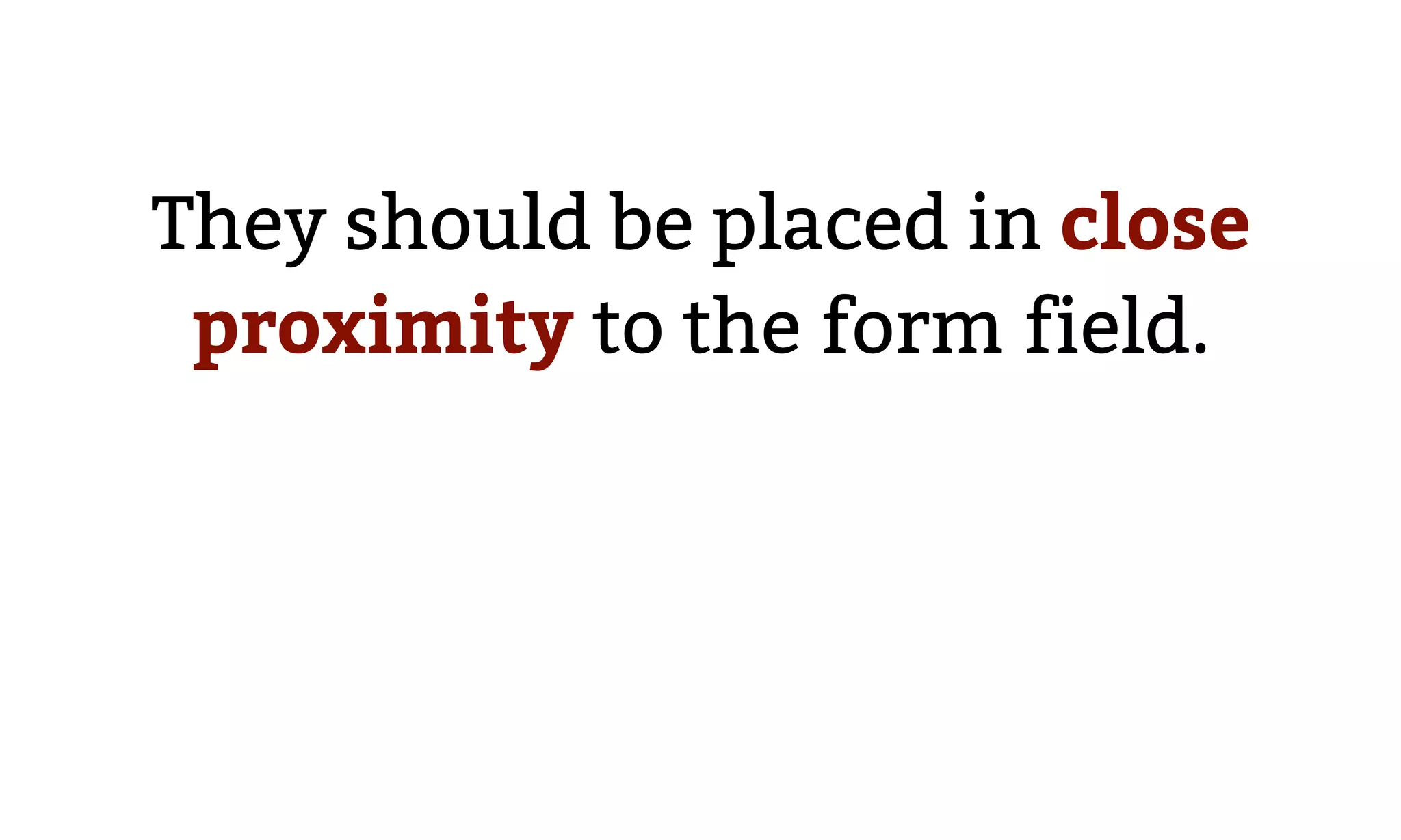
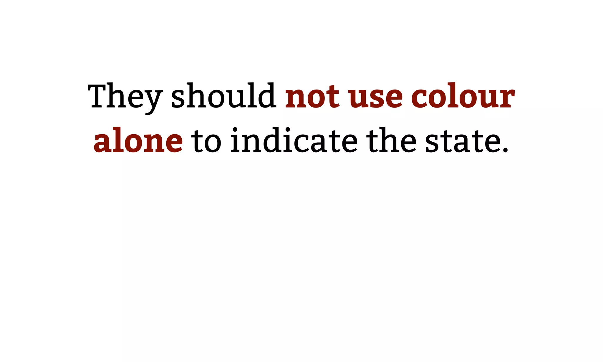
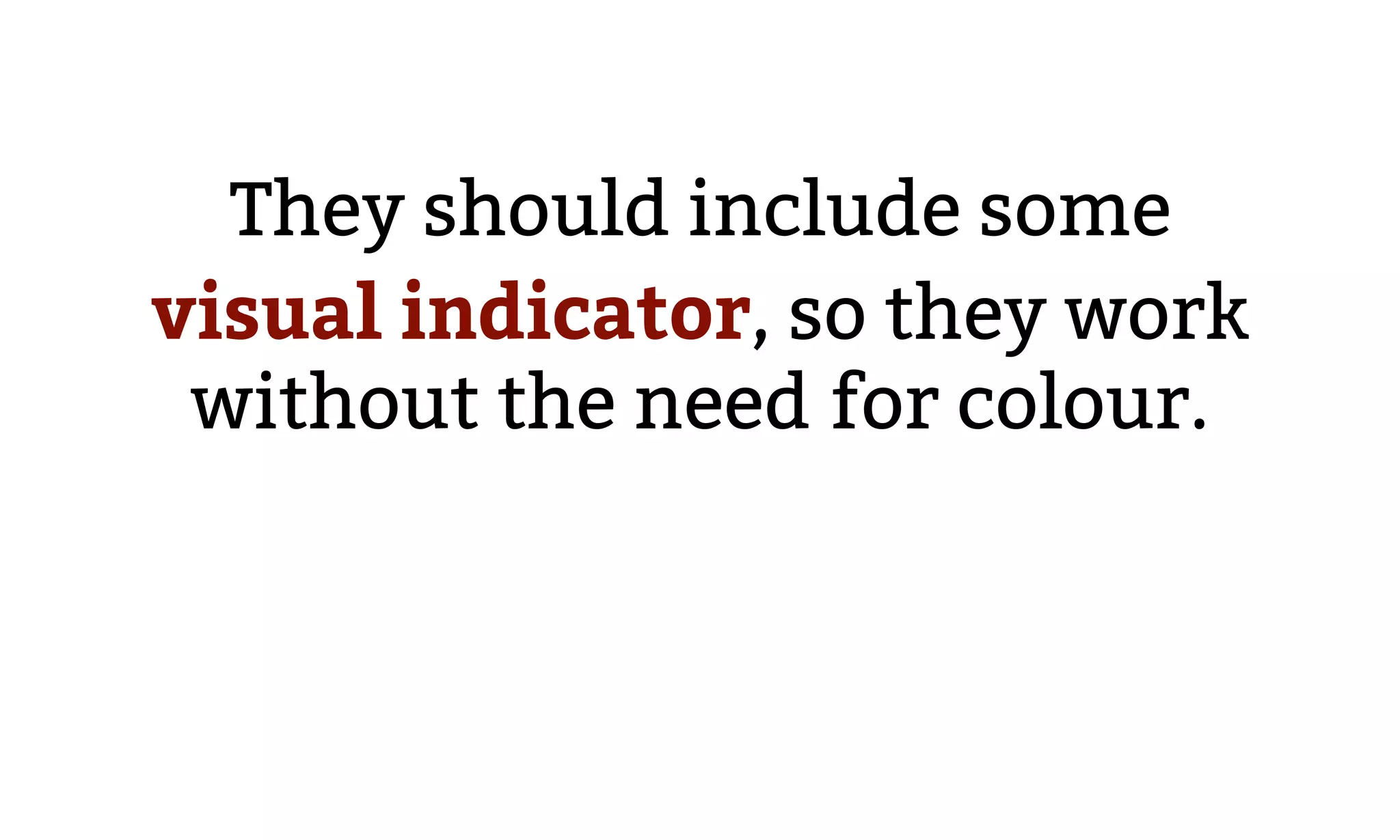
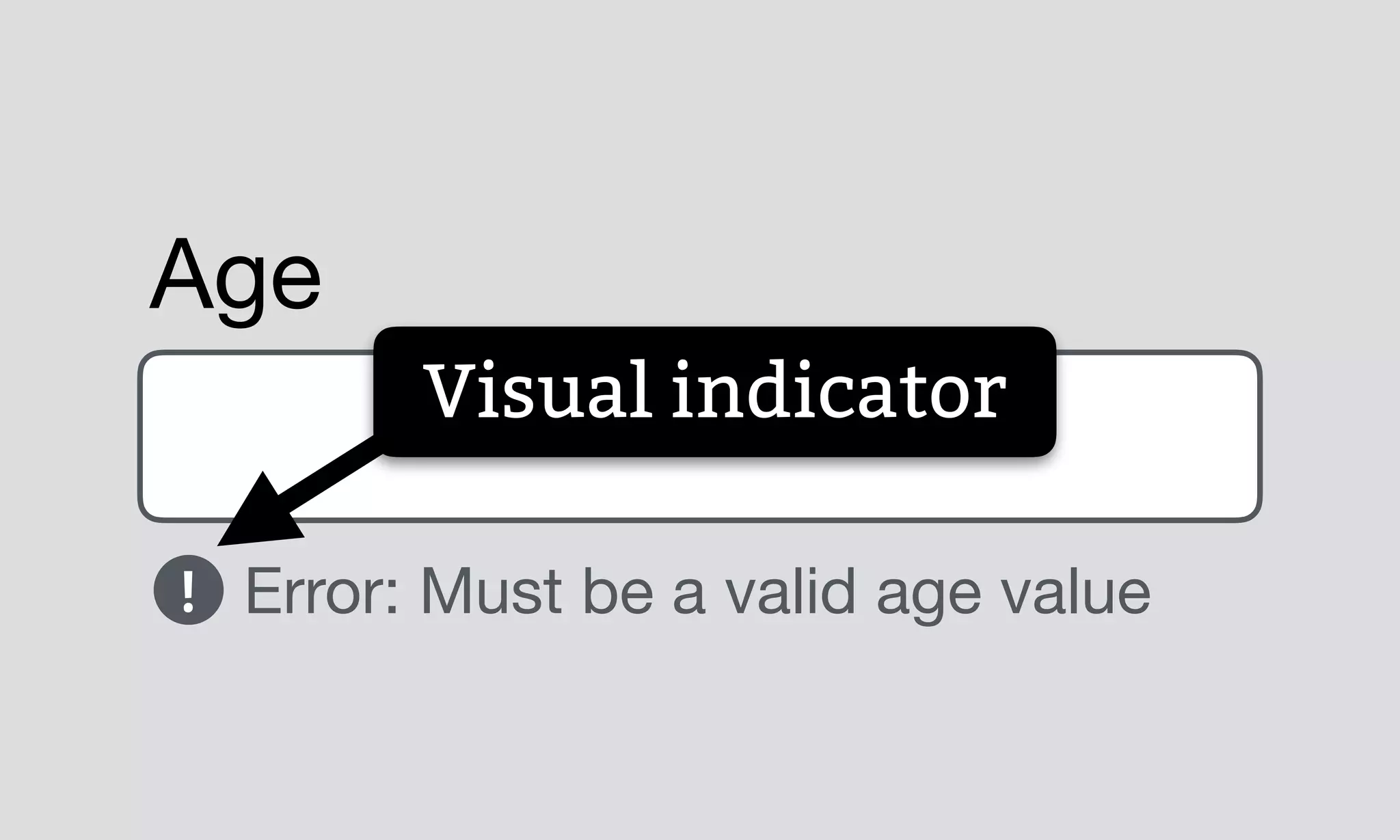
Focus on accessibility in design, particularly using inline error messages that inform users. Importance of proximity and not relying solely on color for indications.
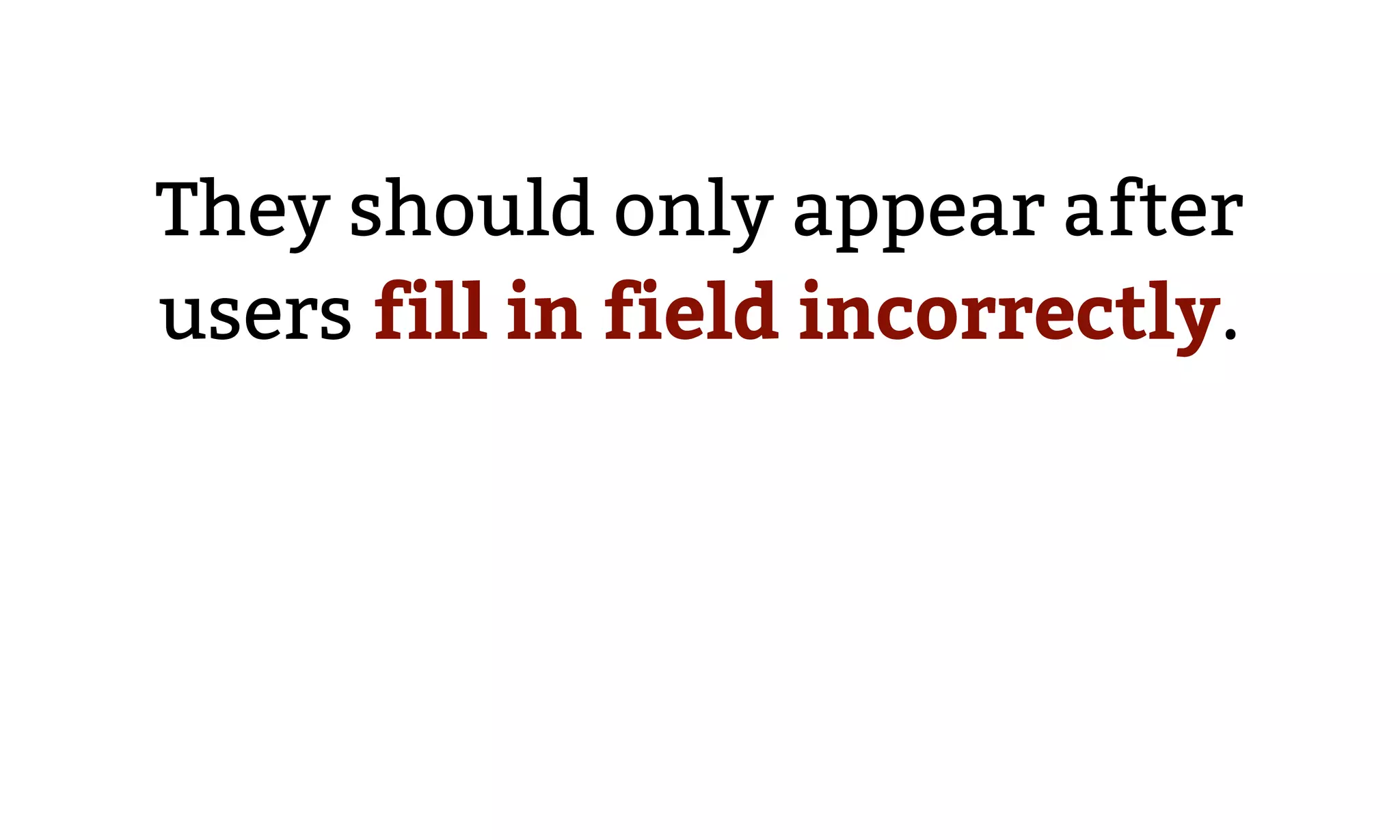
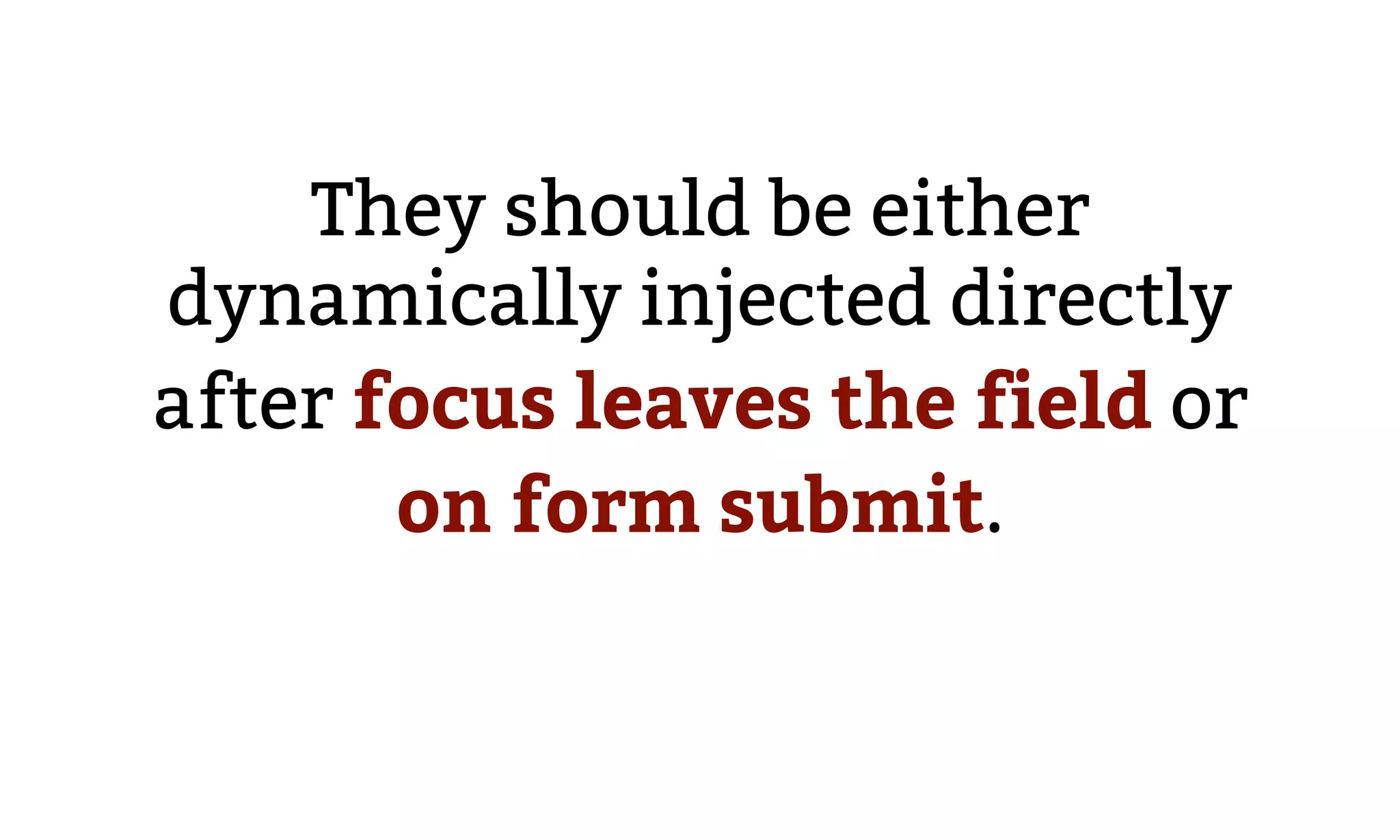
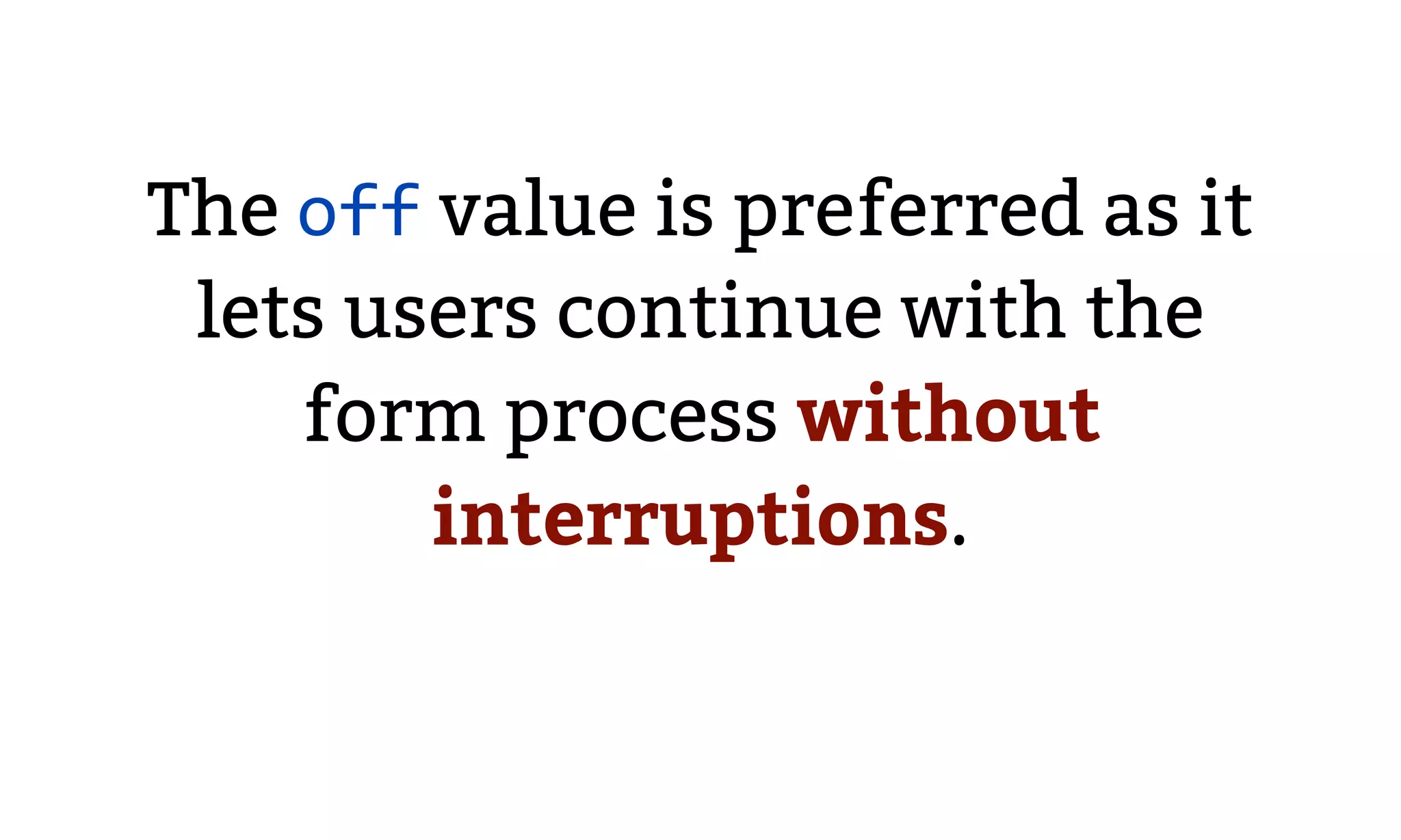
Discusses purposes and contexts for error messages, emphasizing their need to be timely and related to user actions, with dynamic display instructions.
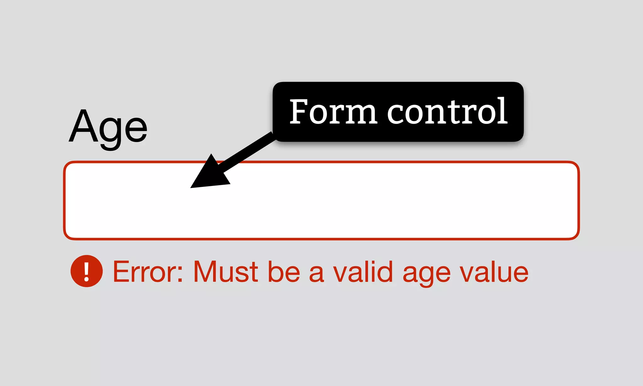
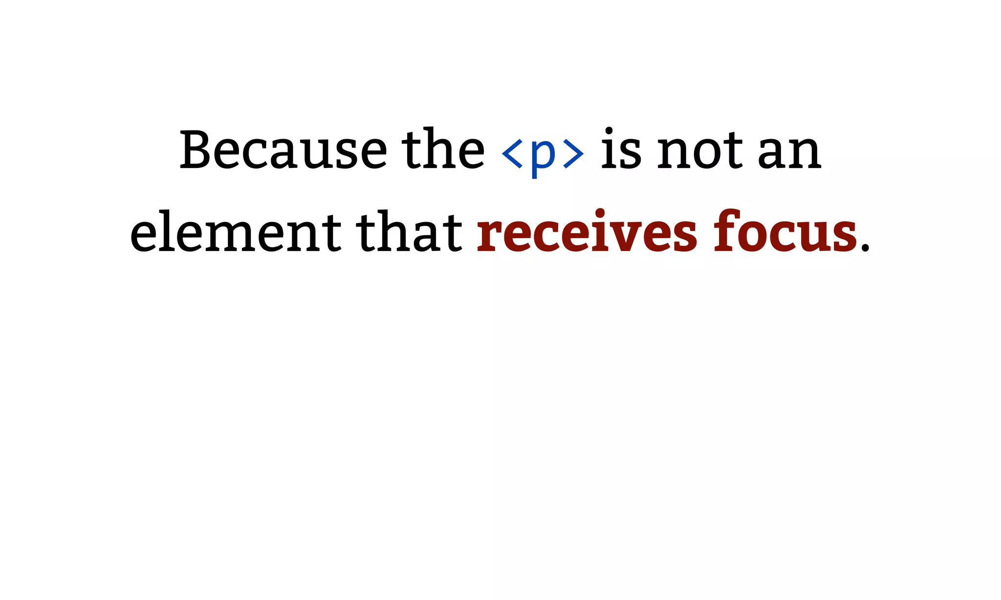
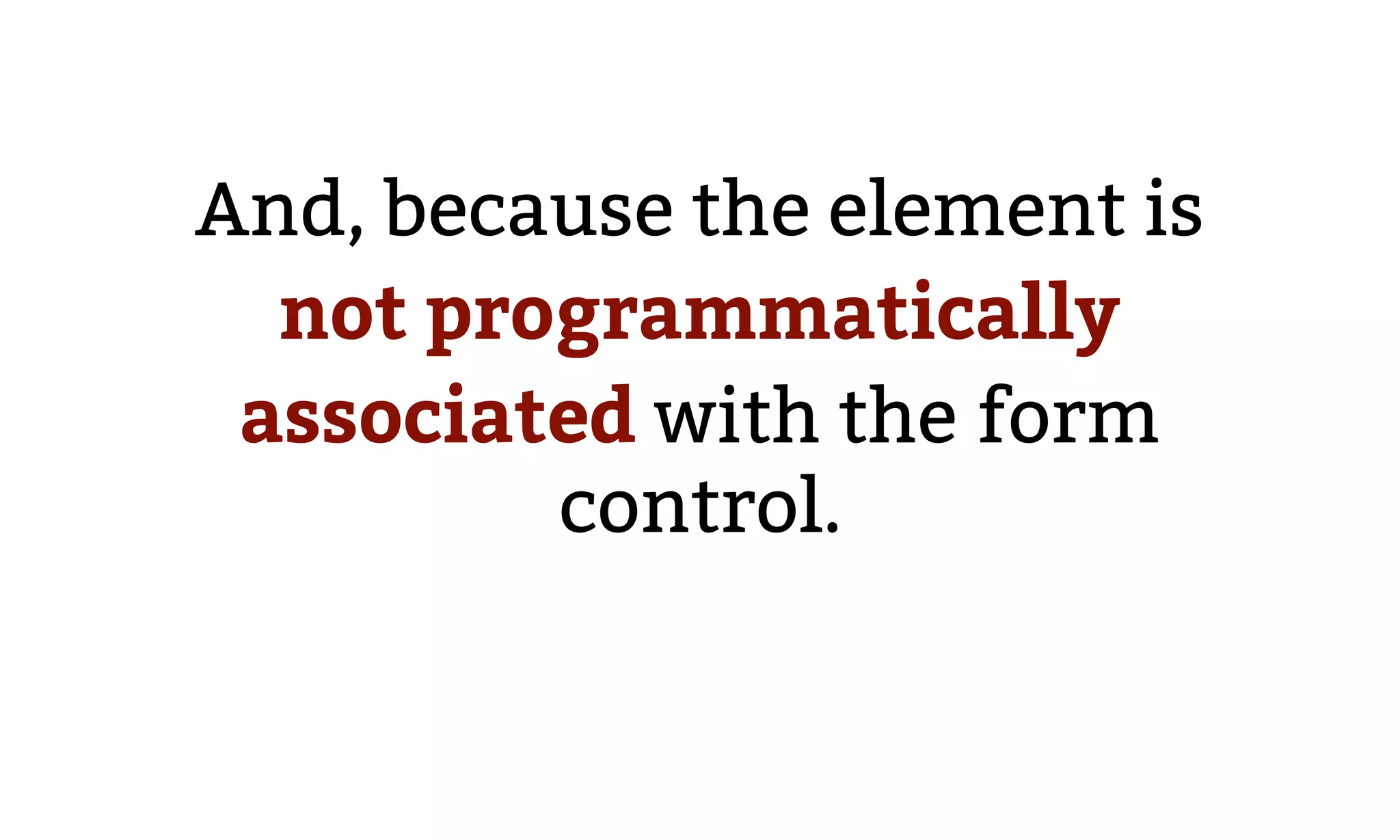
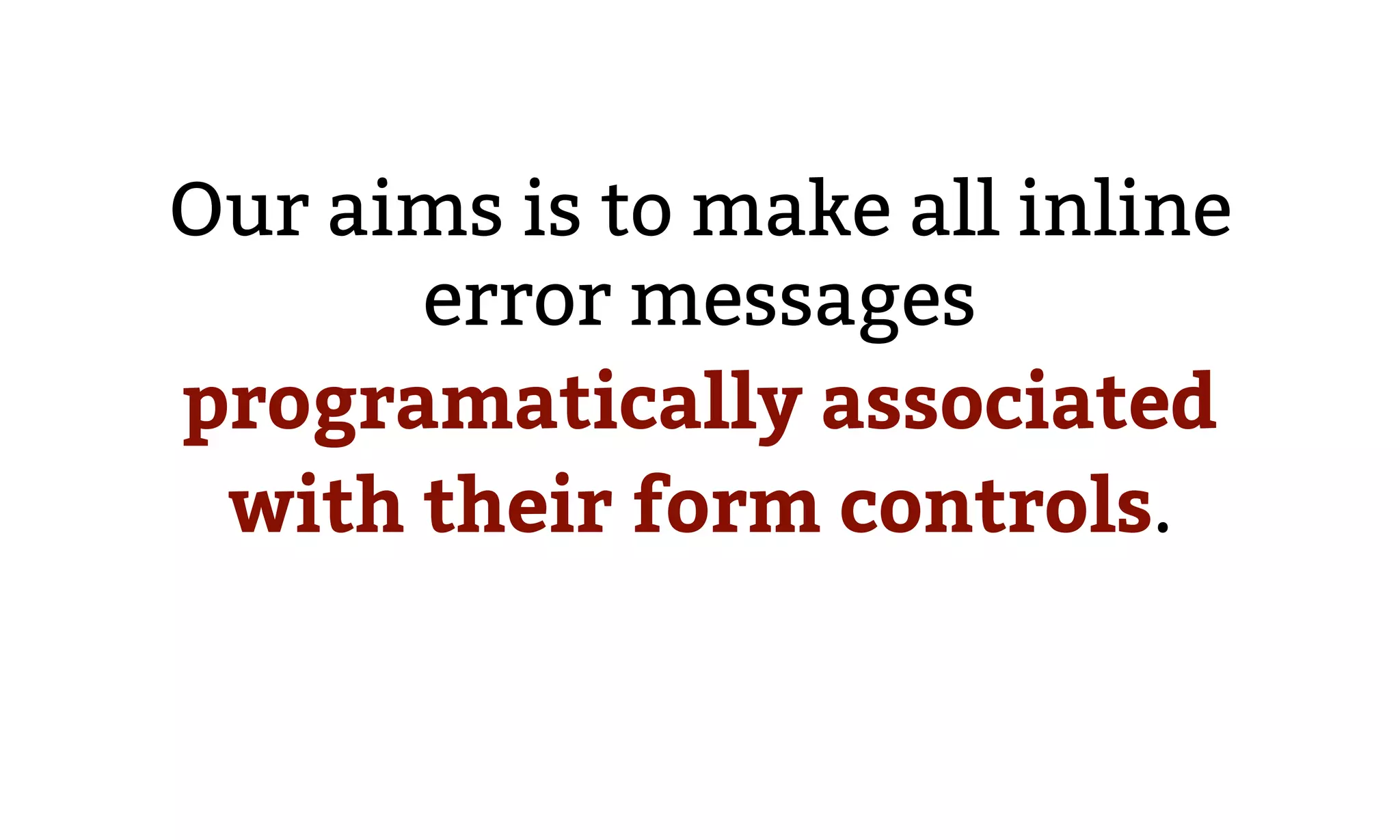
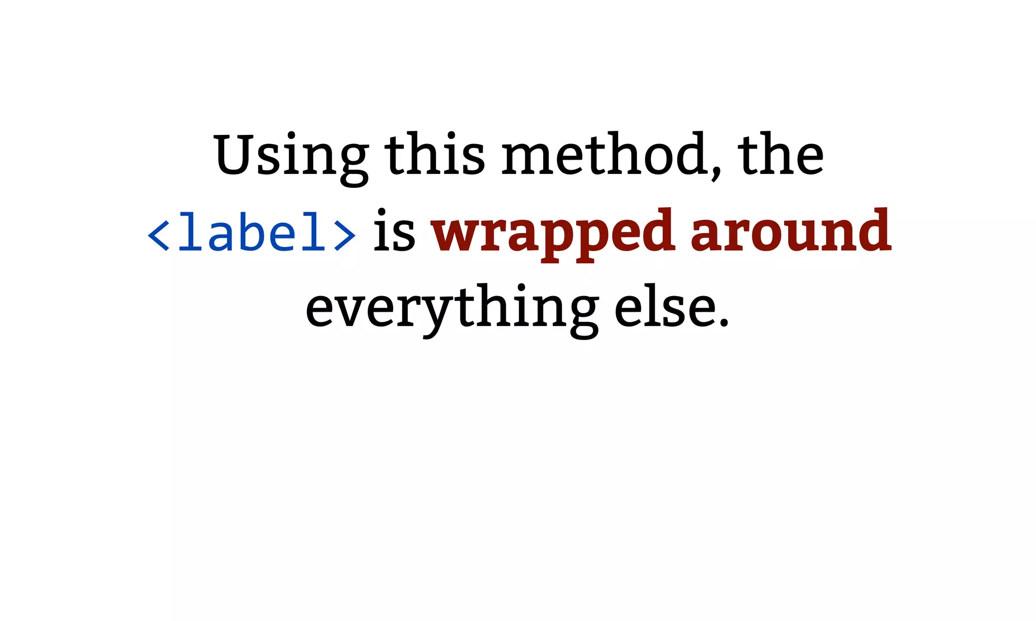
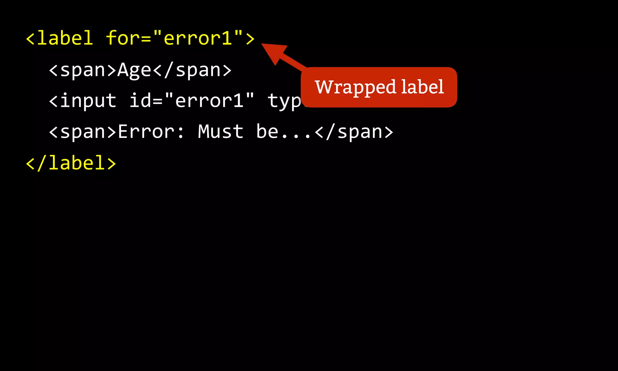
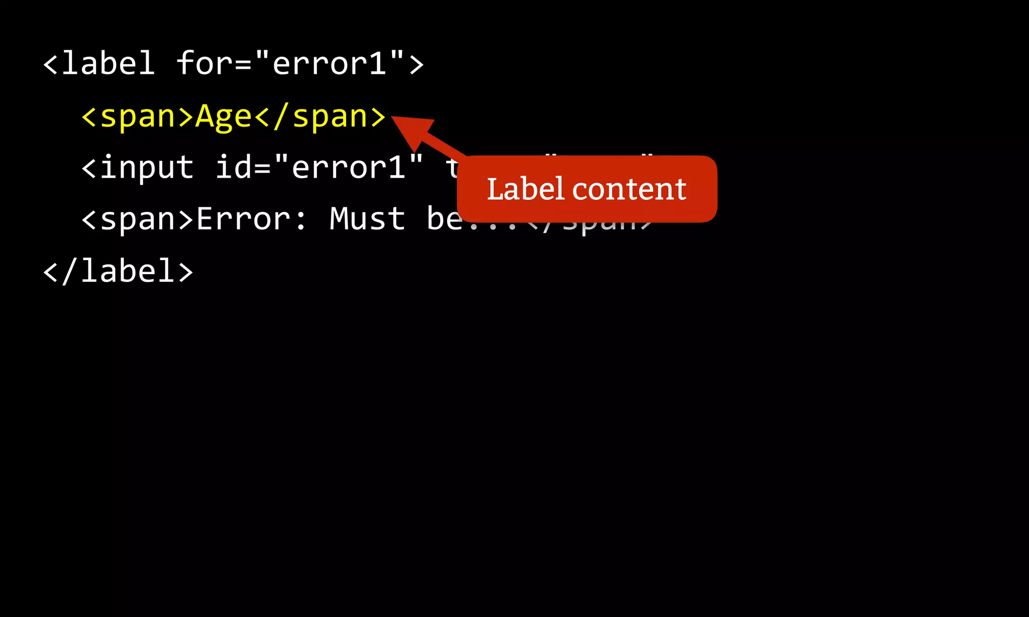
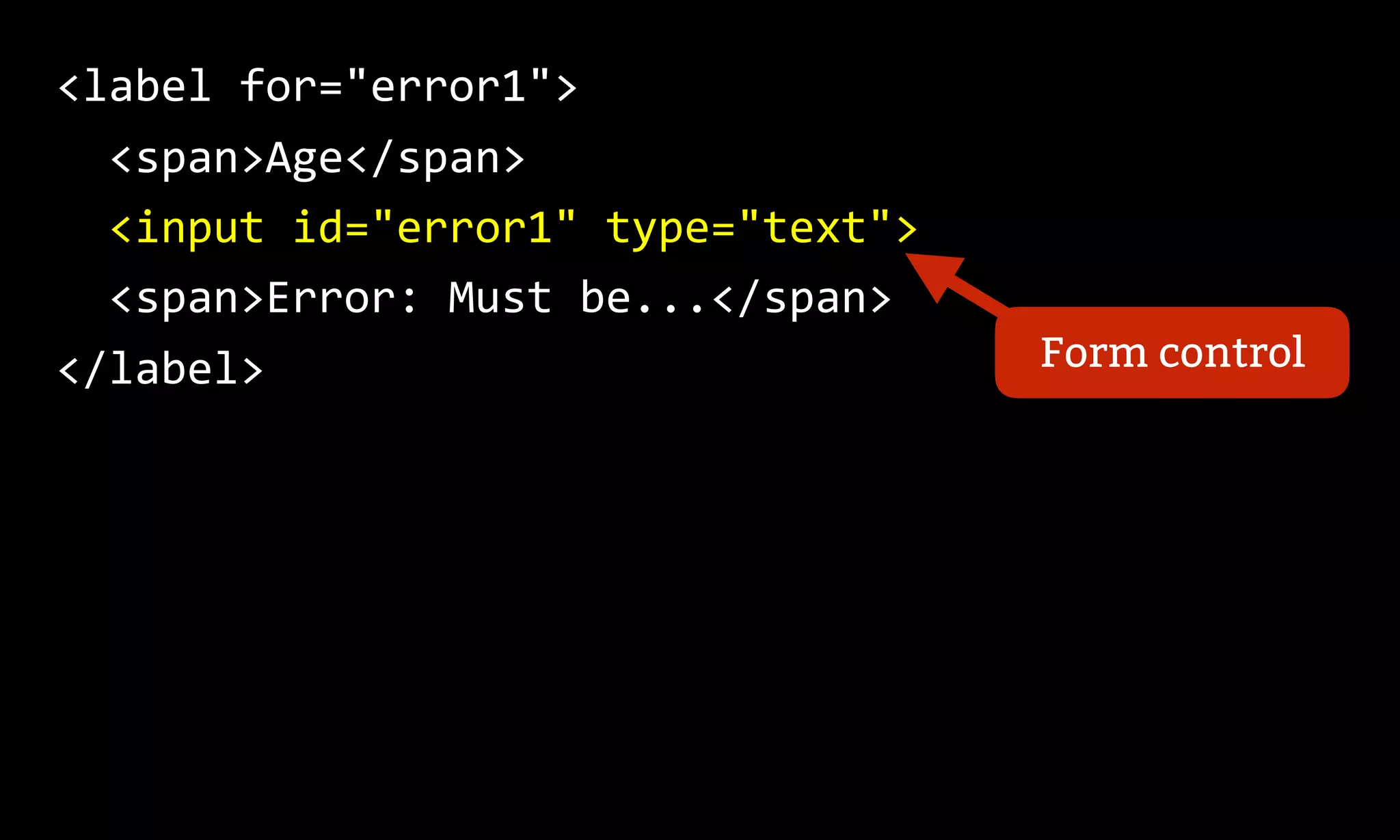
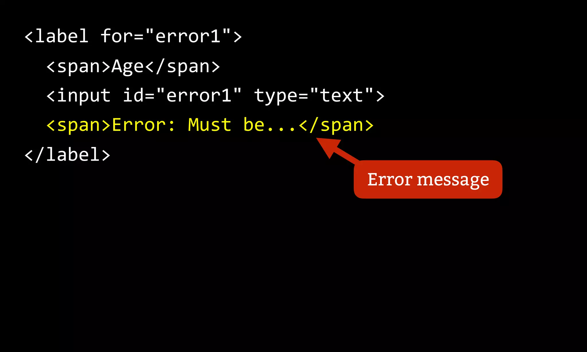
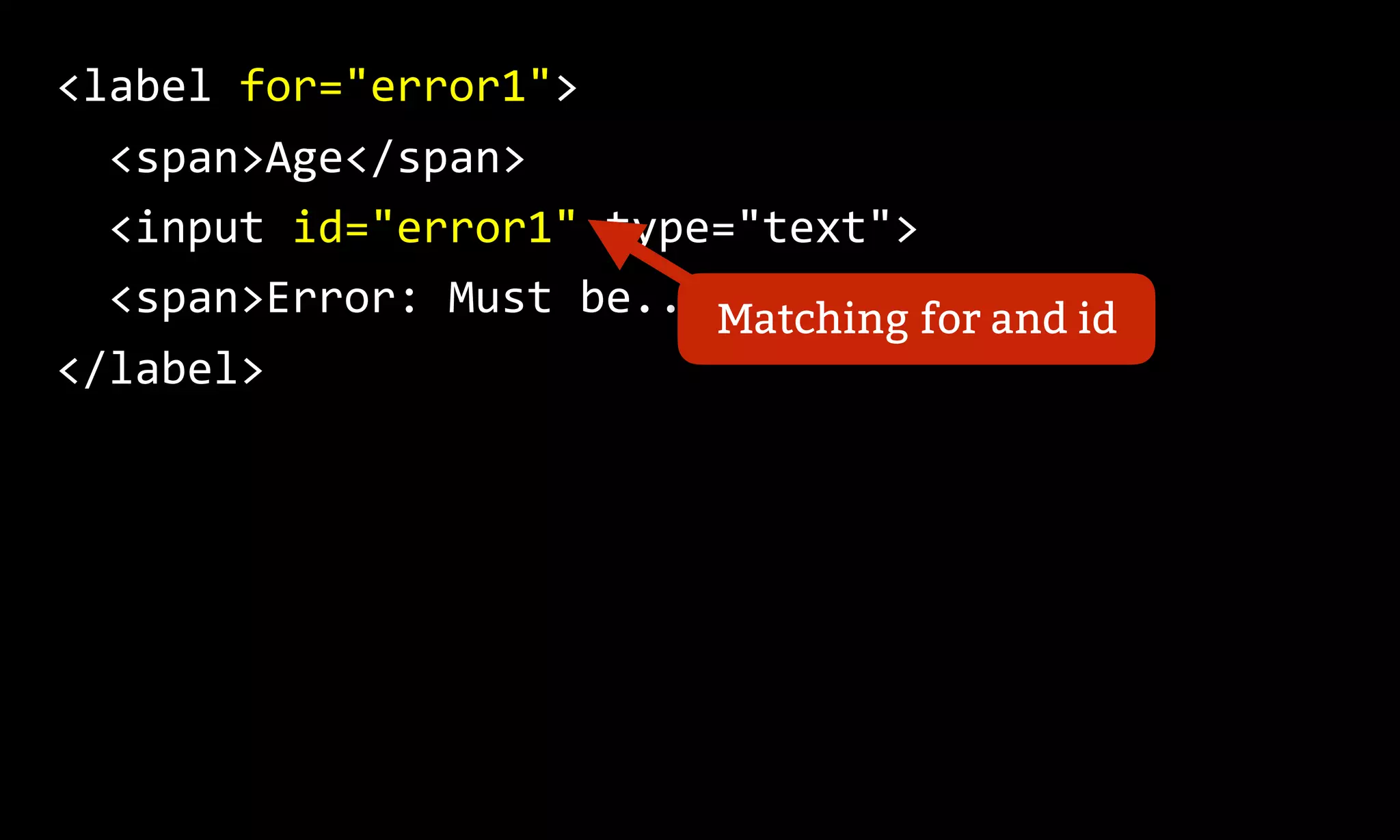
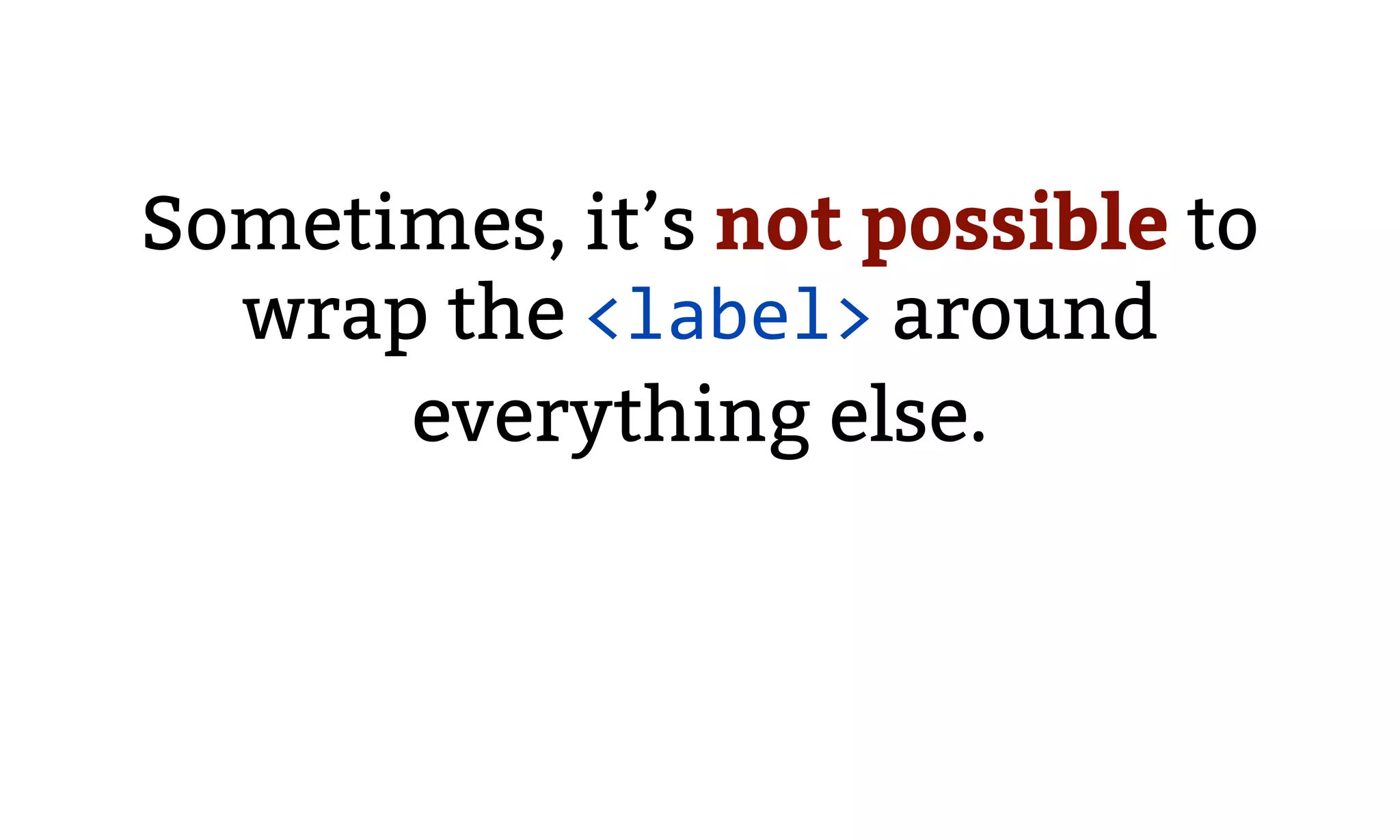
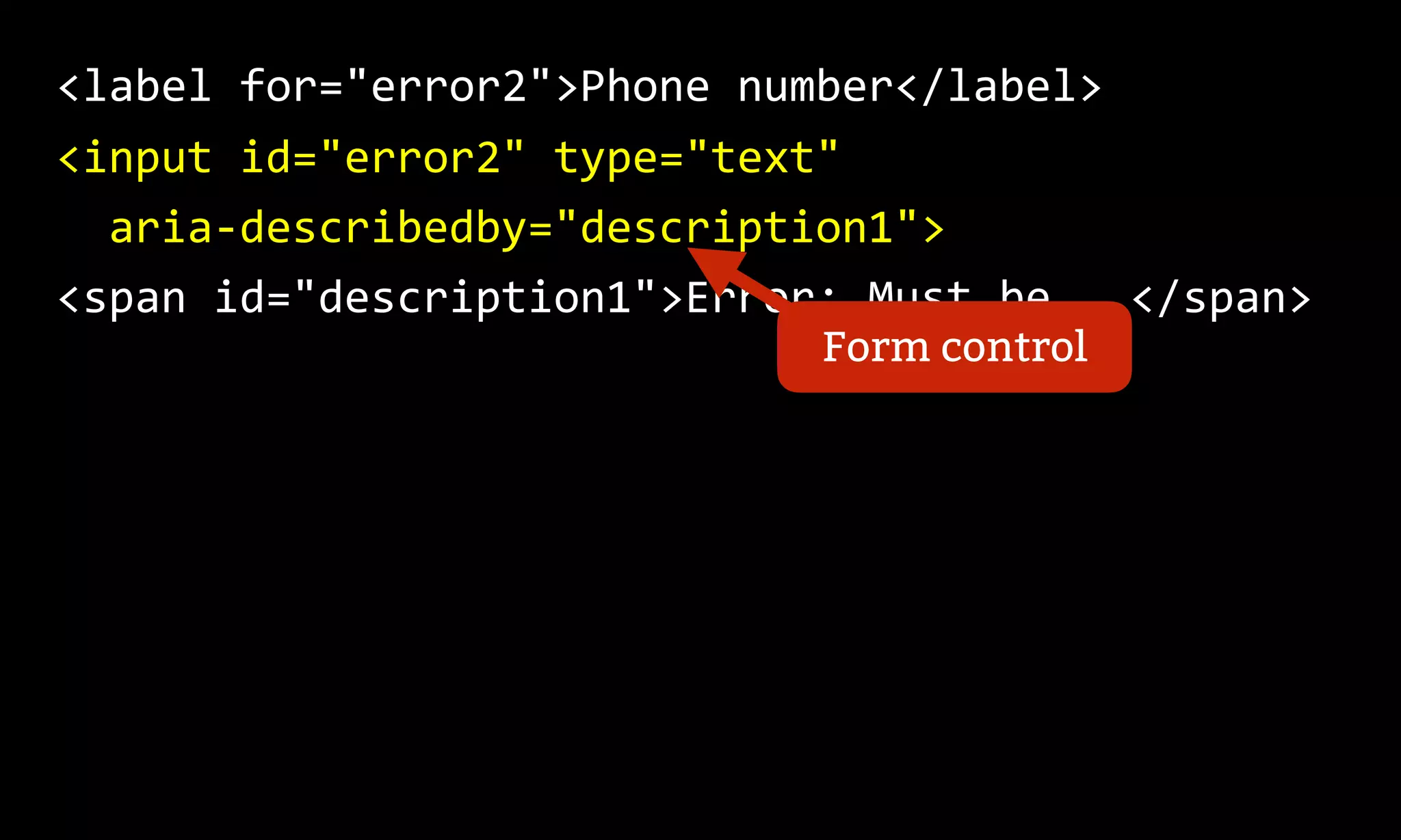
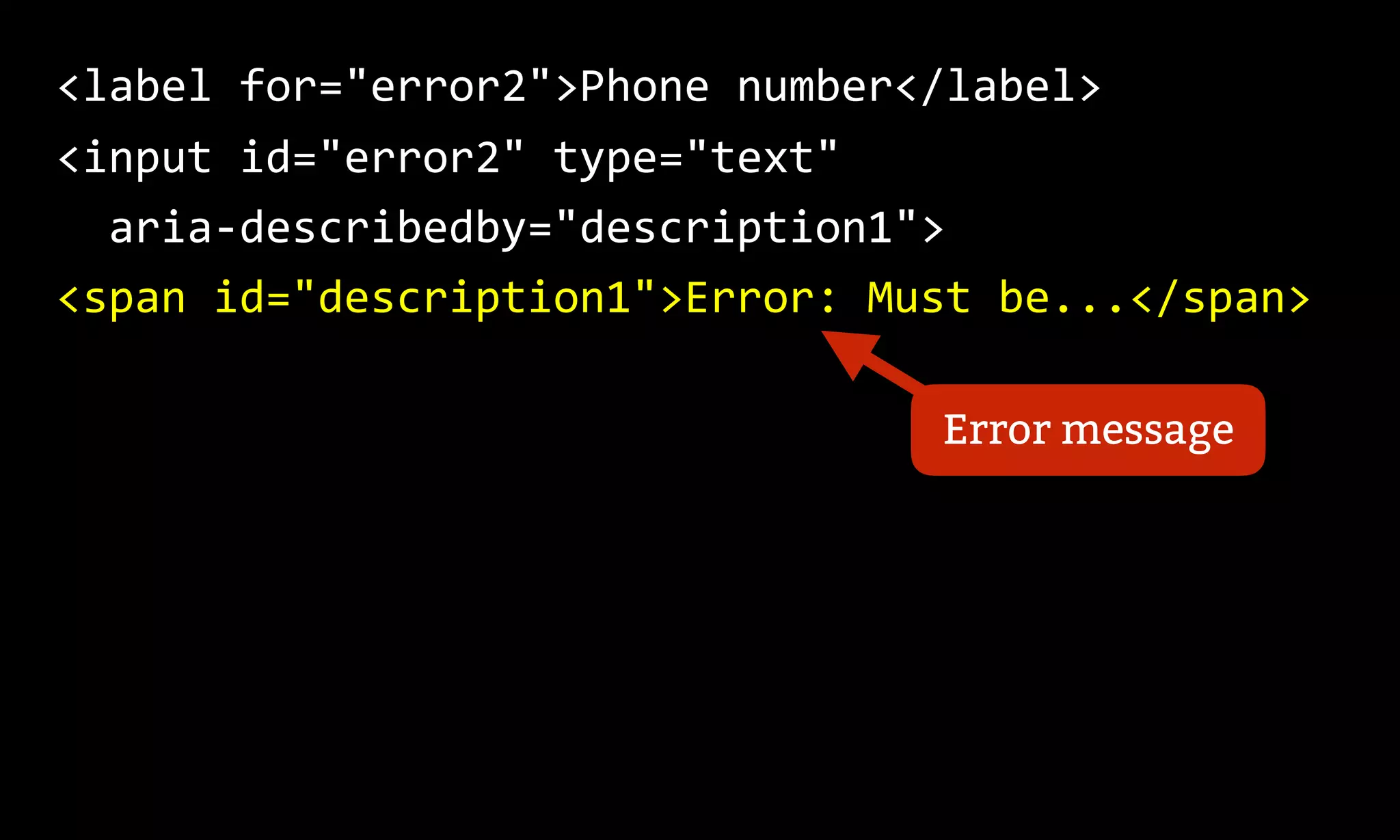
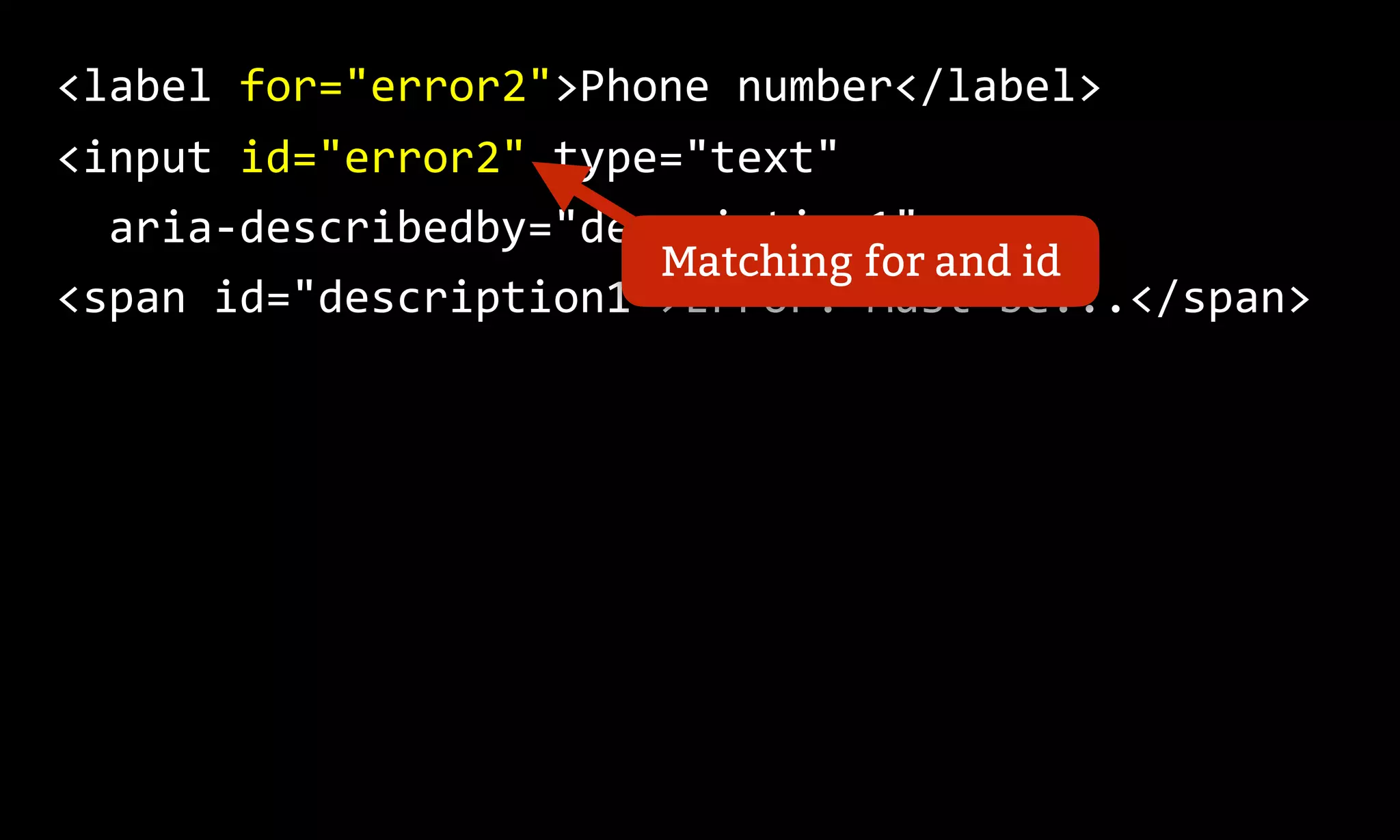
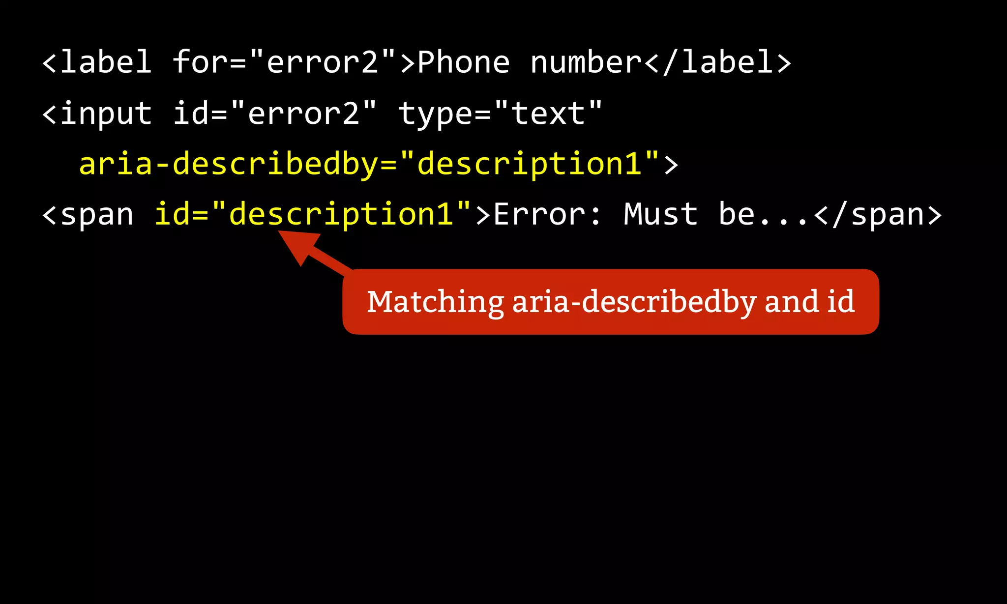
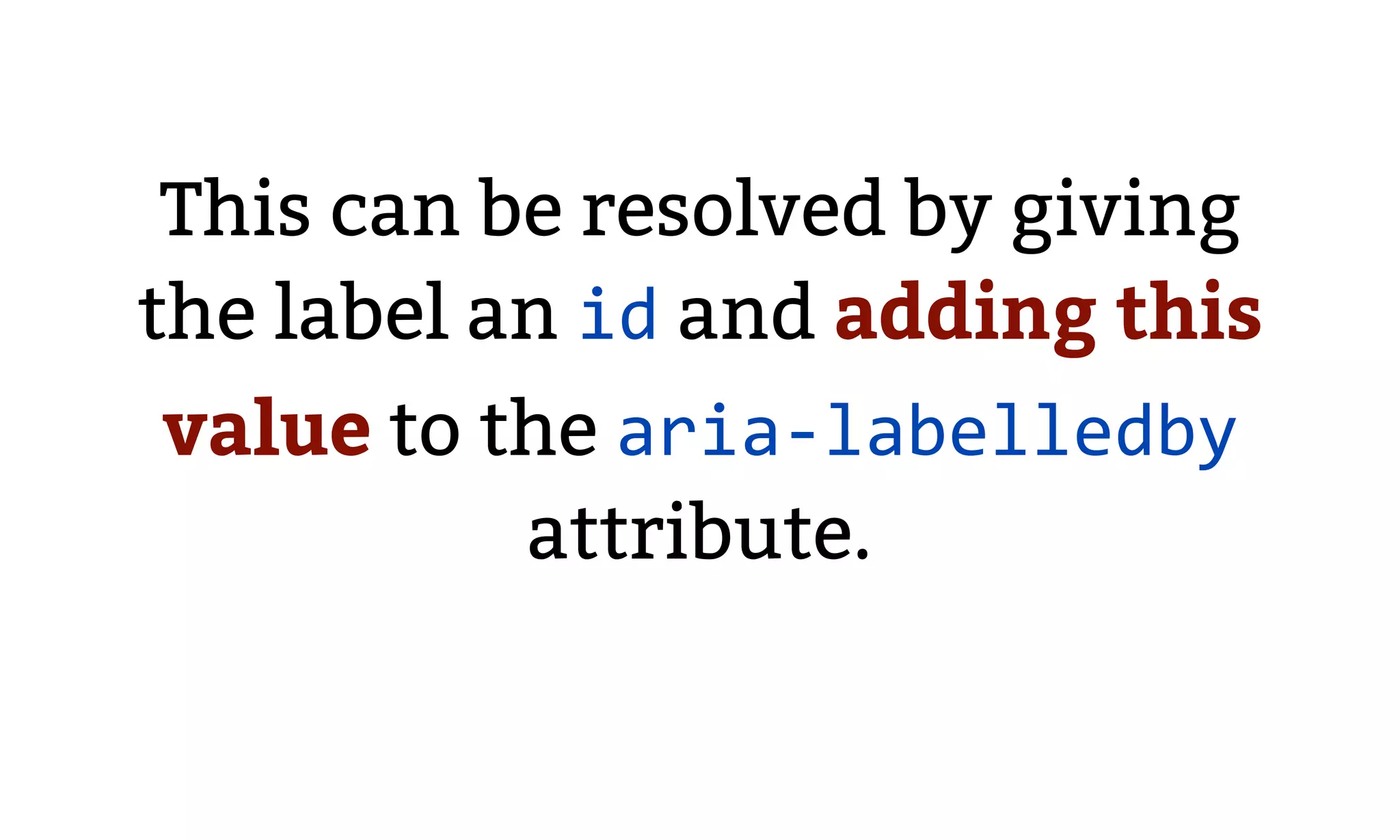
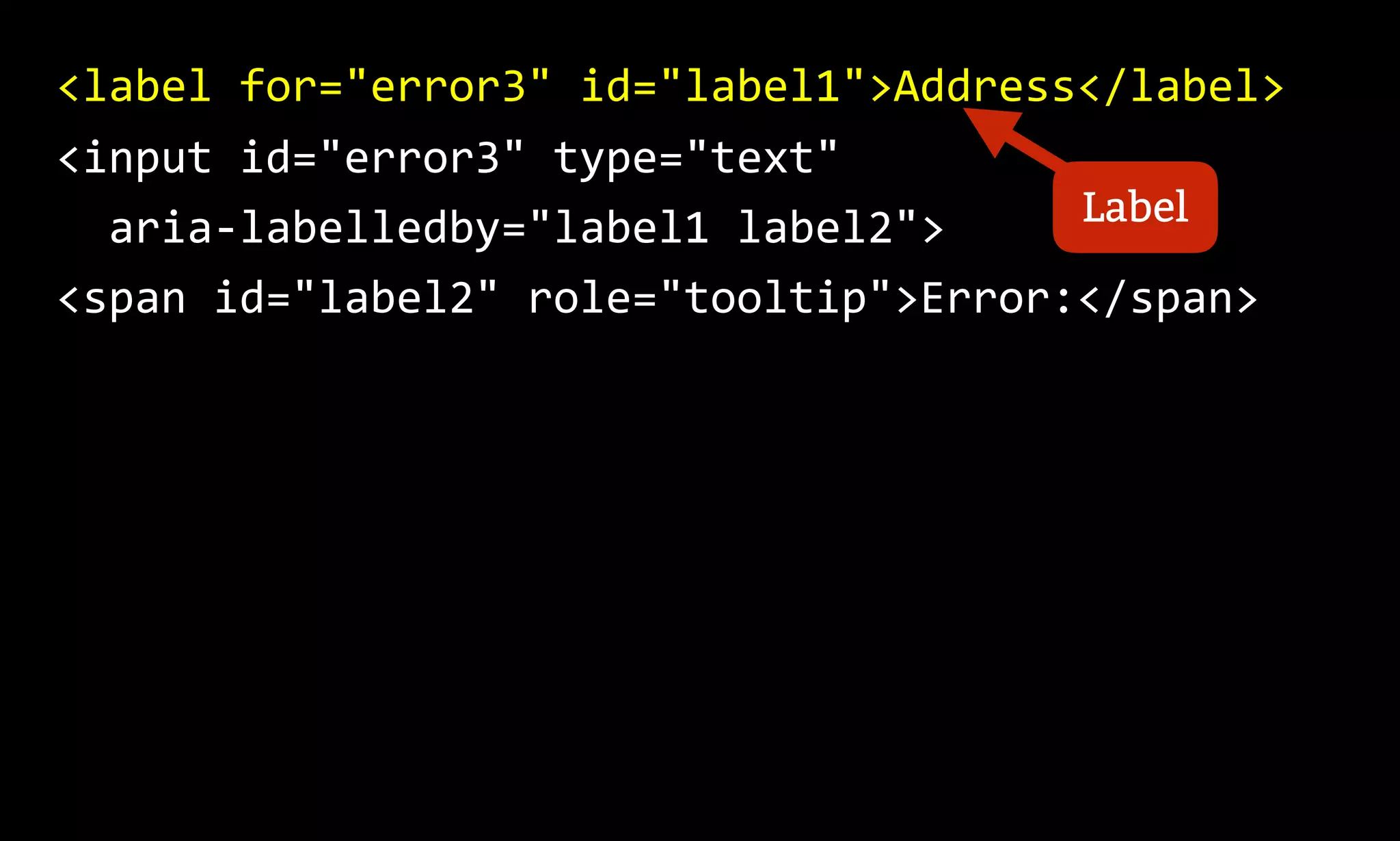
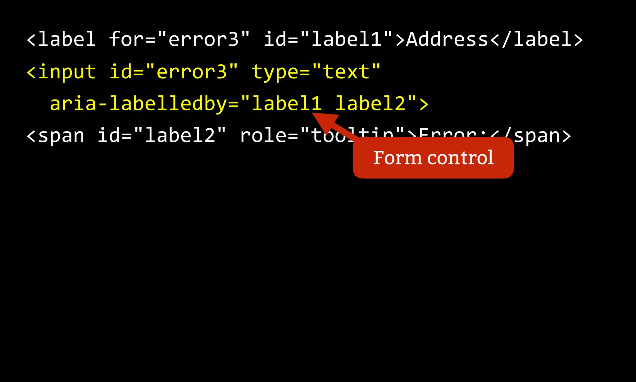
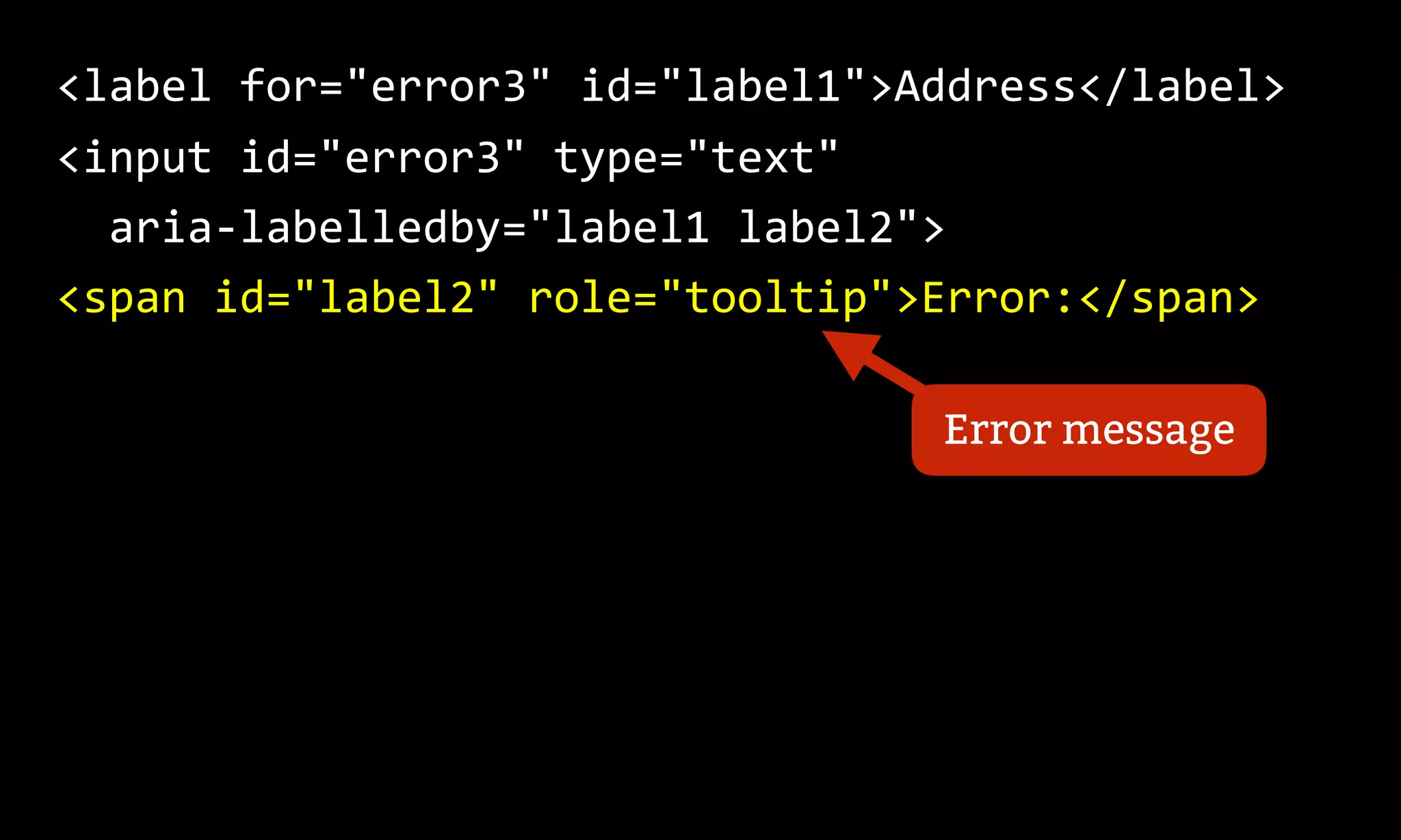
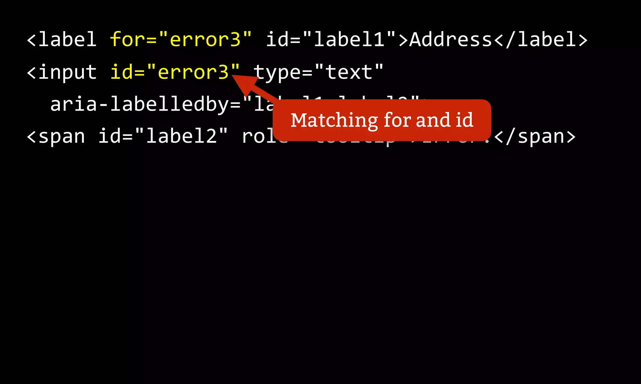
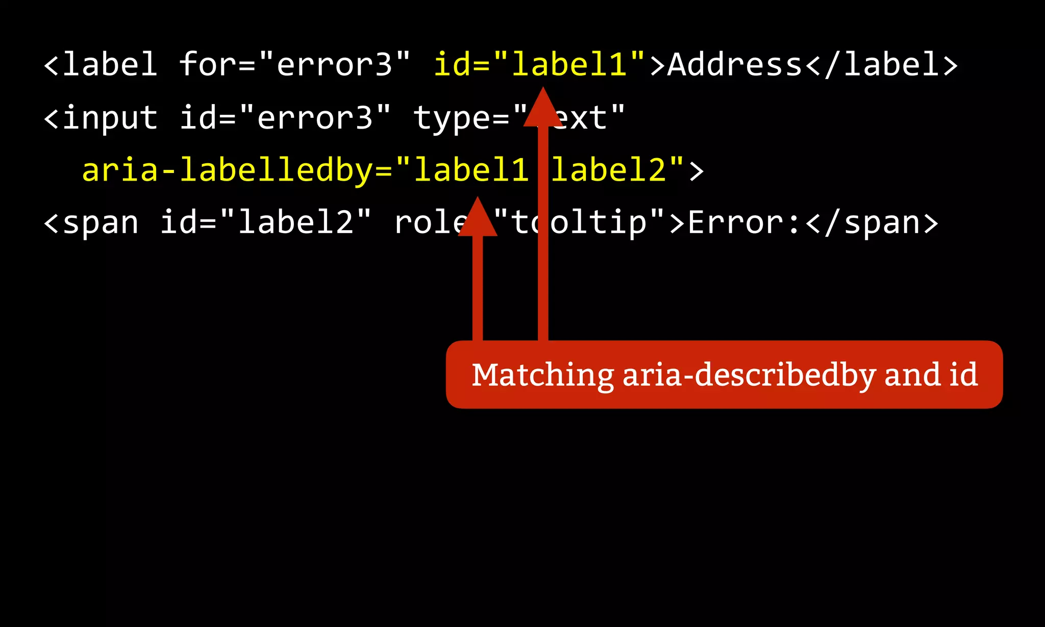
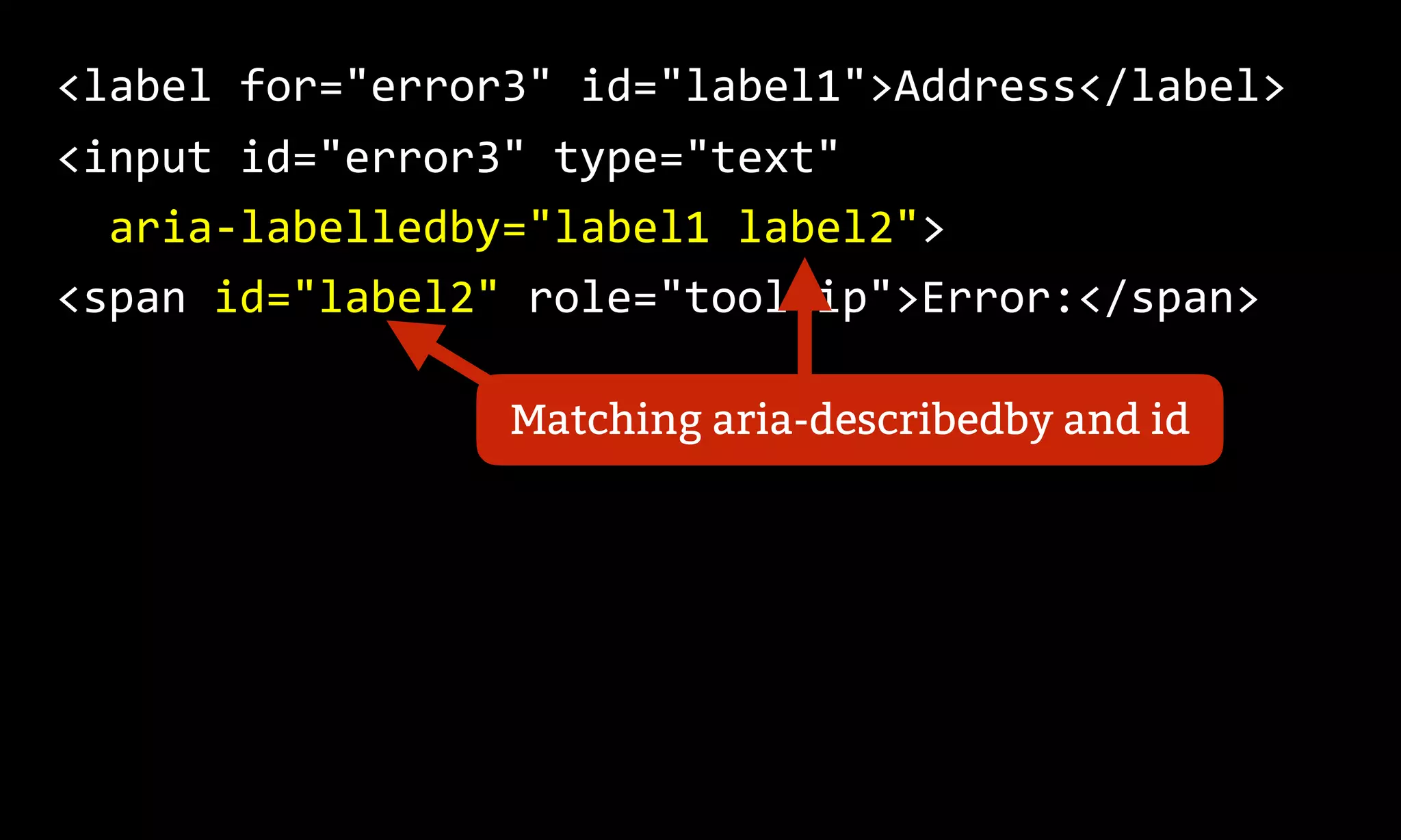
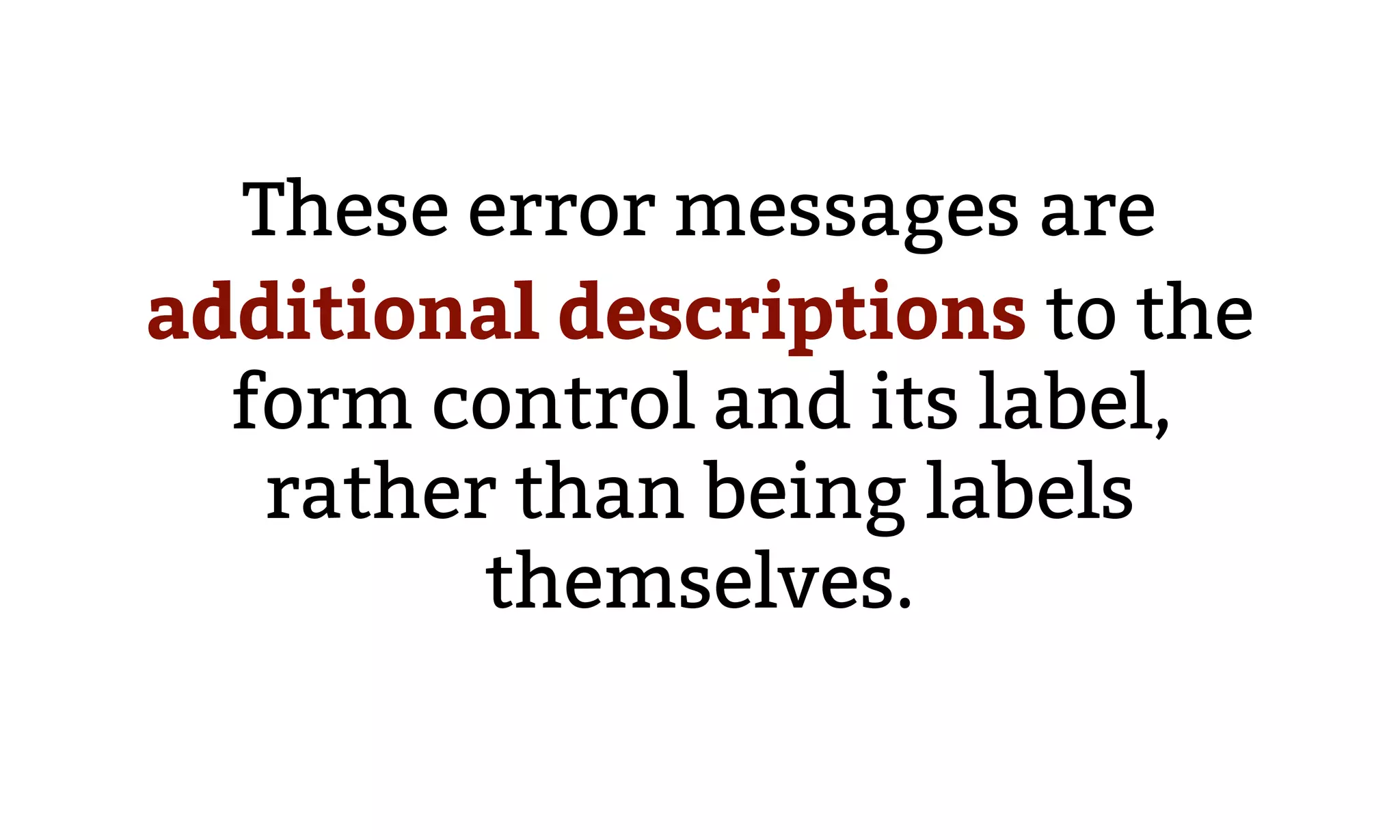
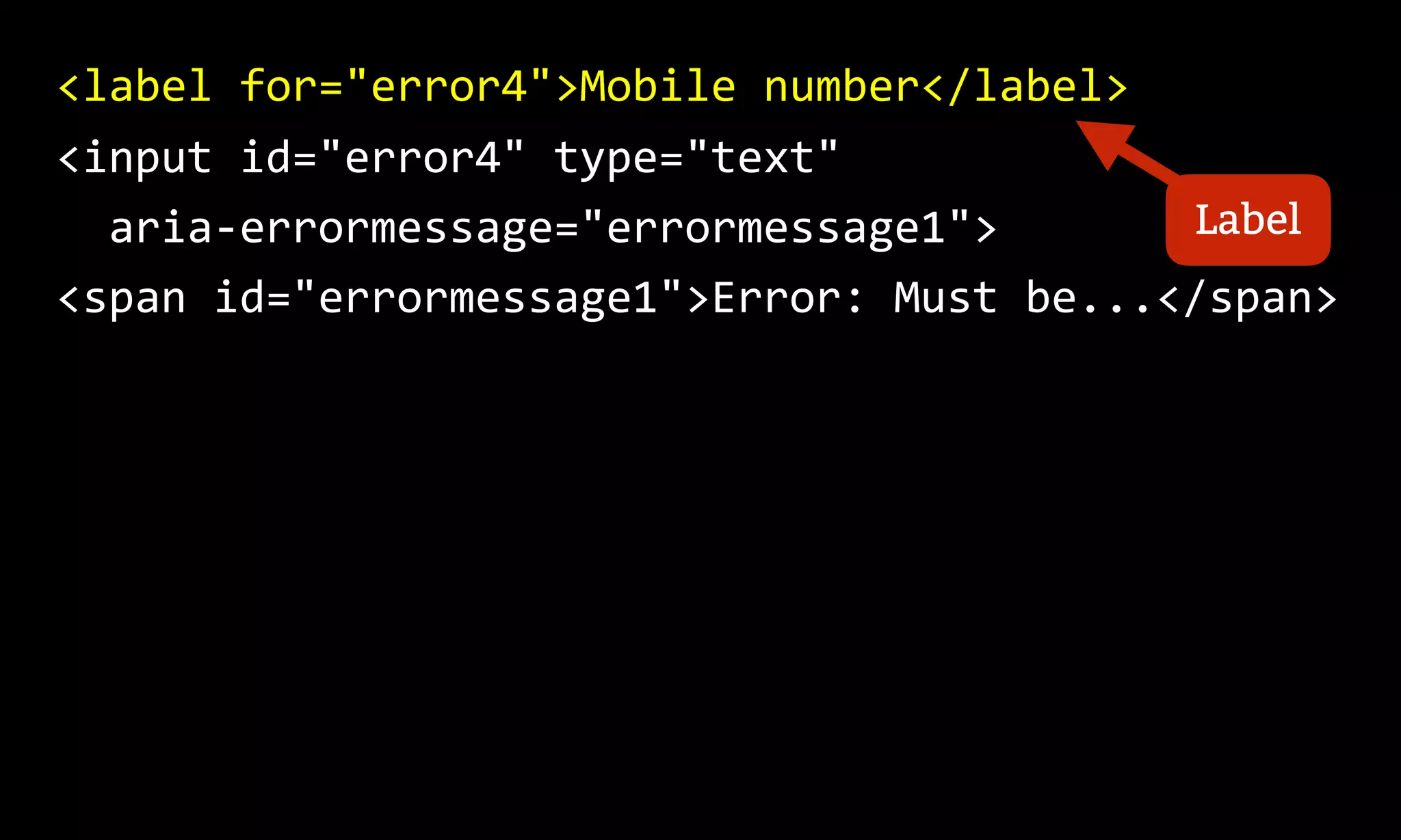
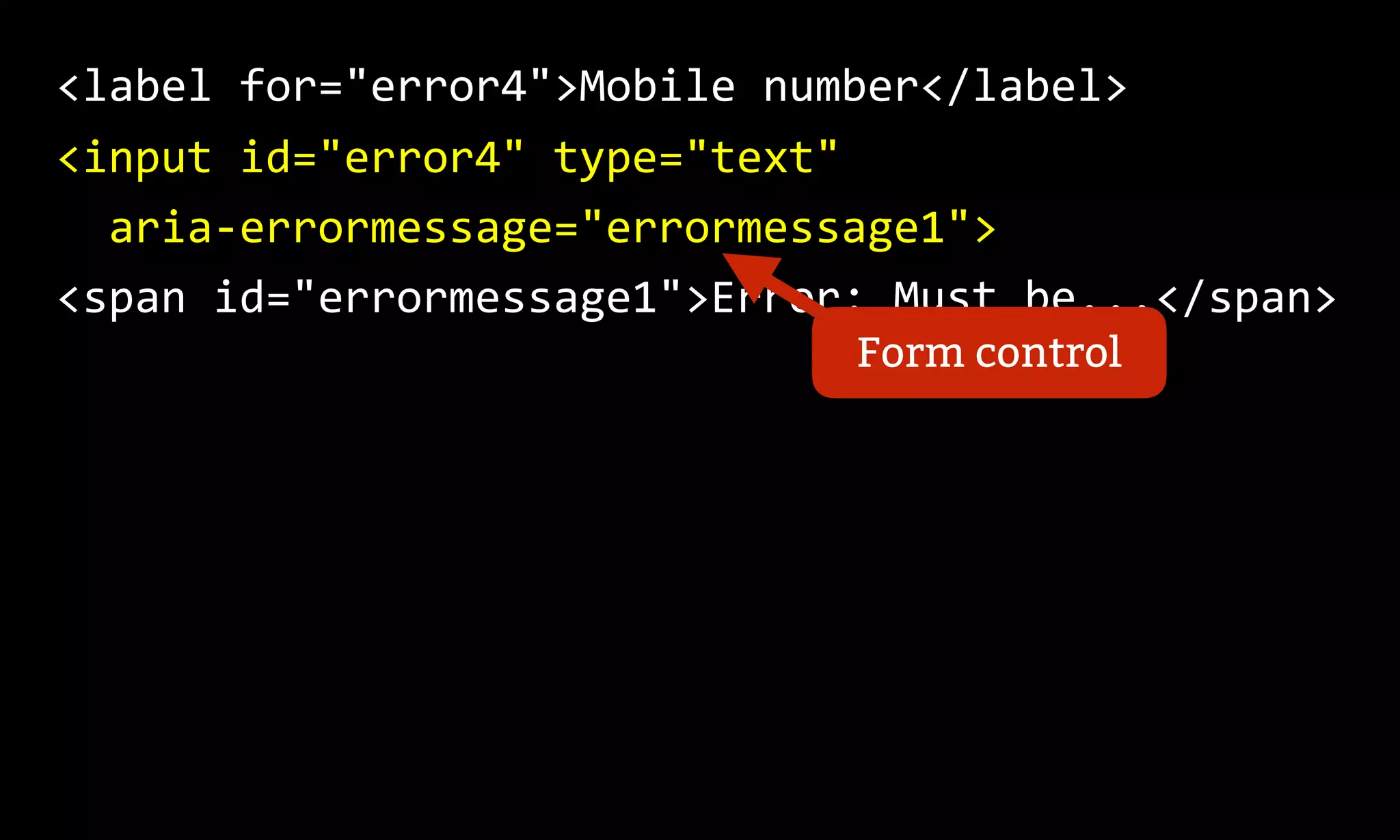
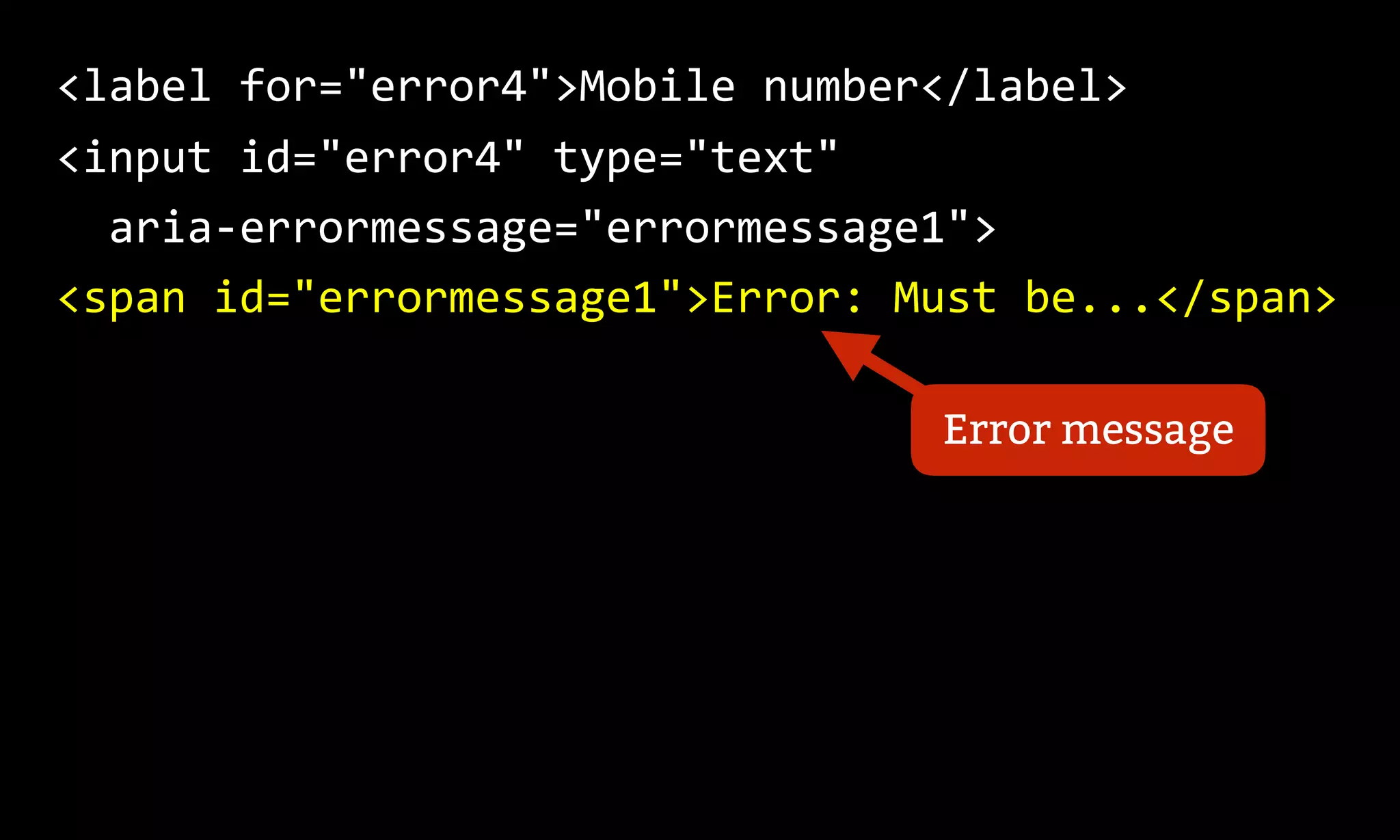
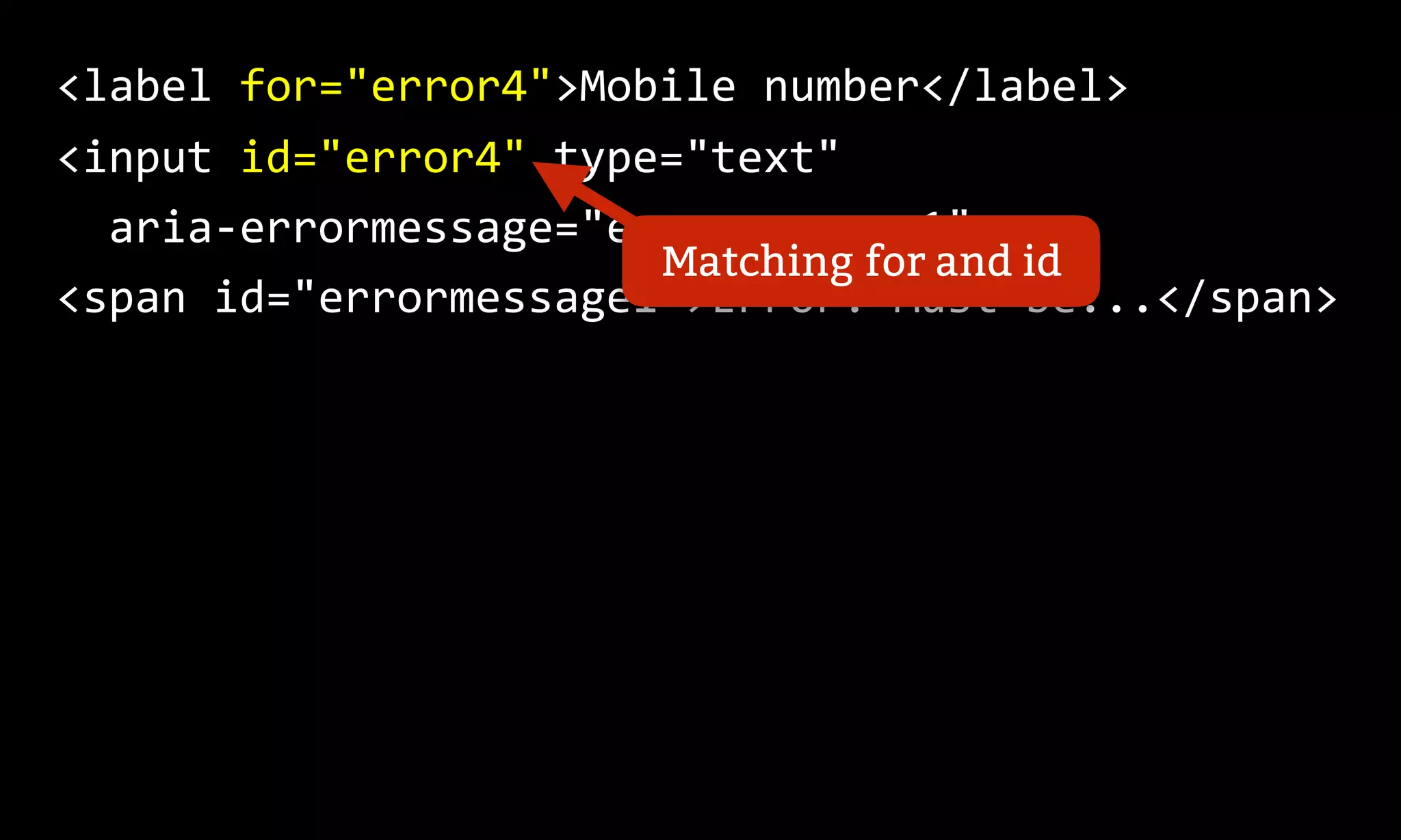
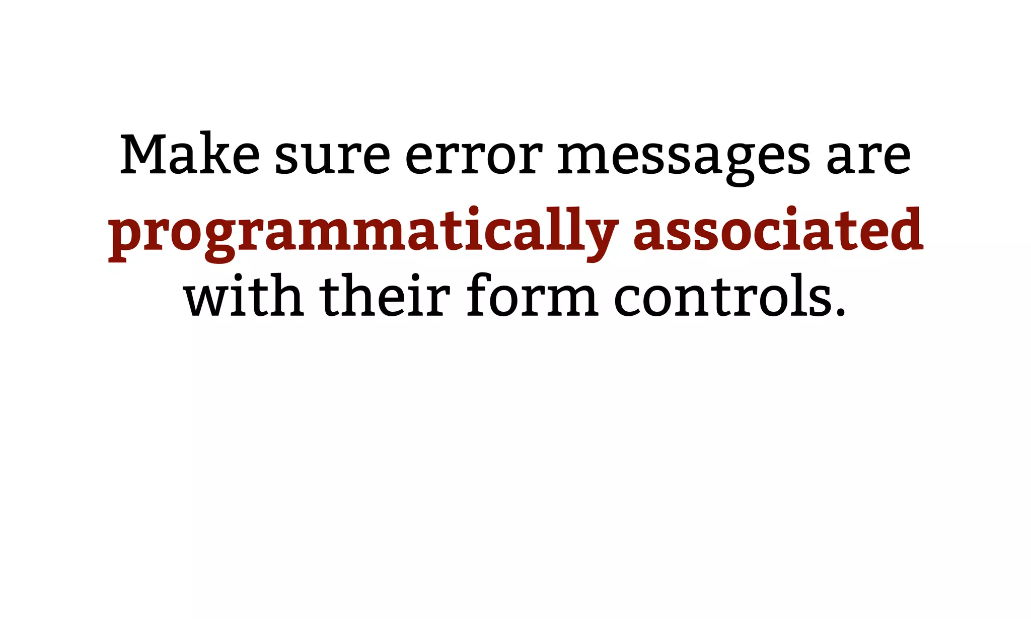
Highlights the need for inline error messages to be programmatically linked to form controls, presenting methods like wrapped labels and ARIA attributes.
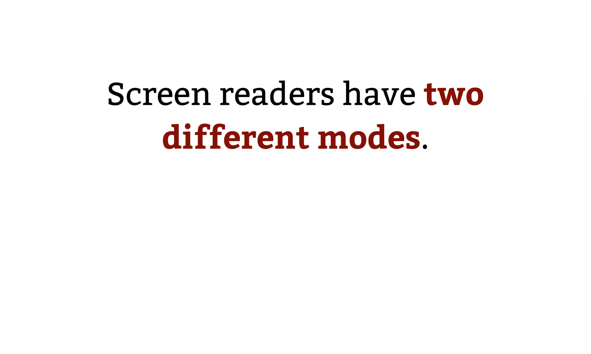
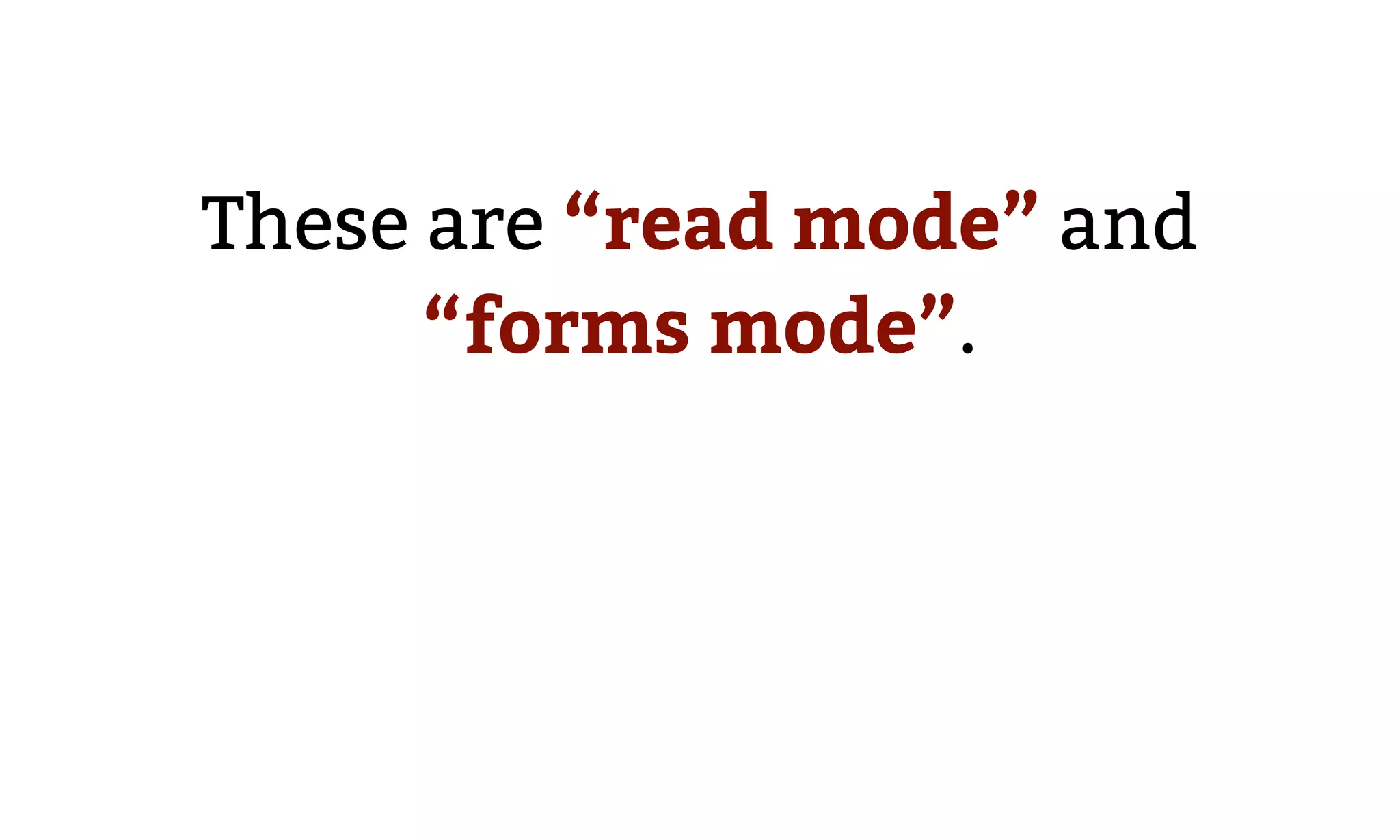
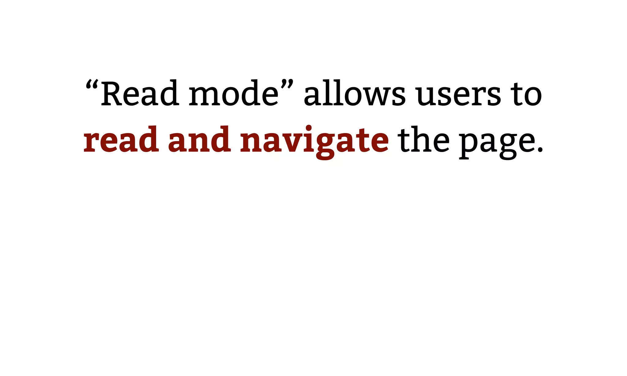
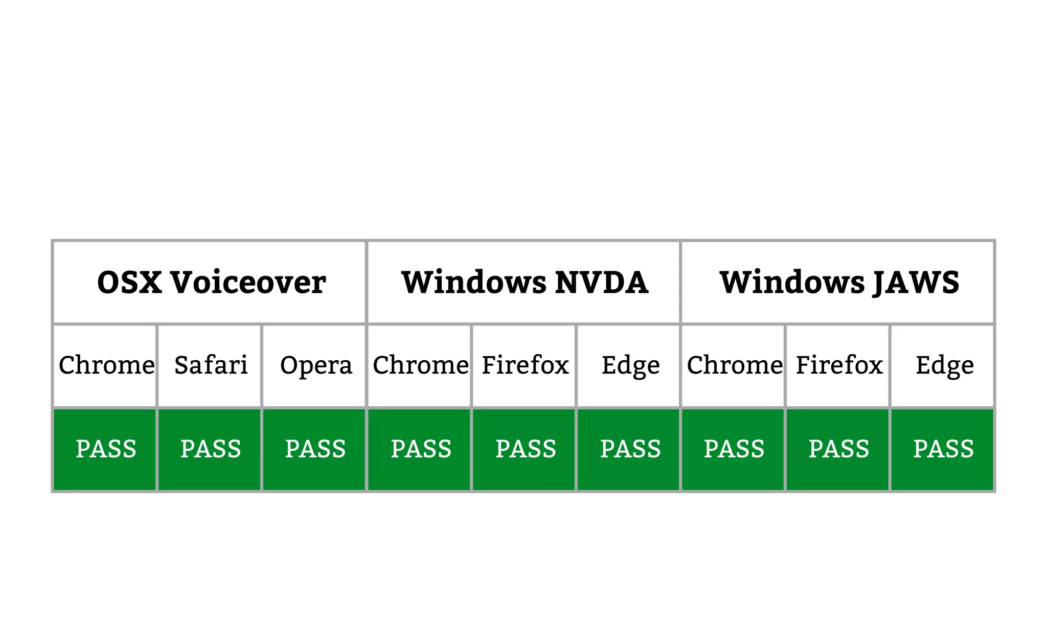
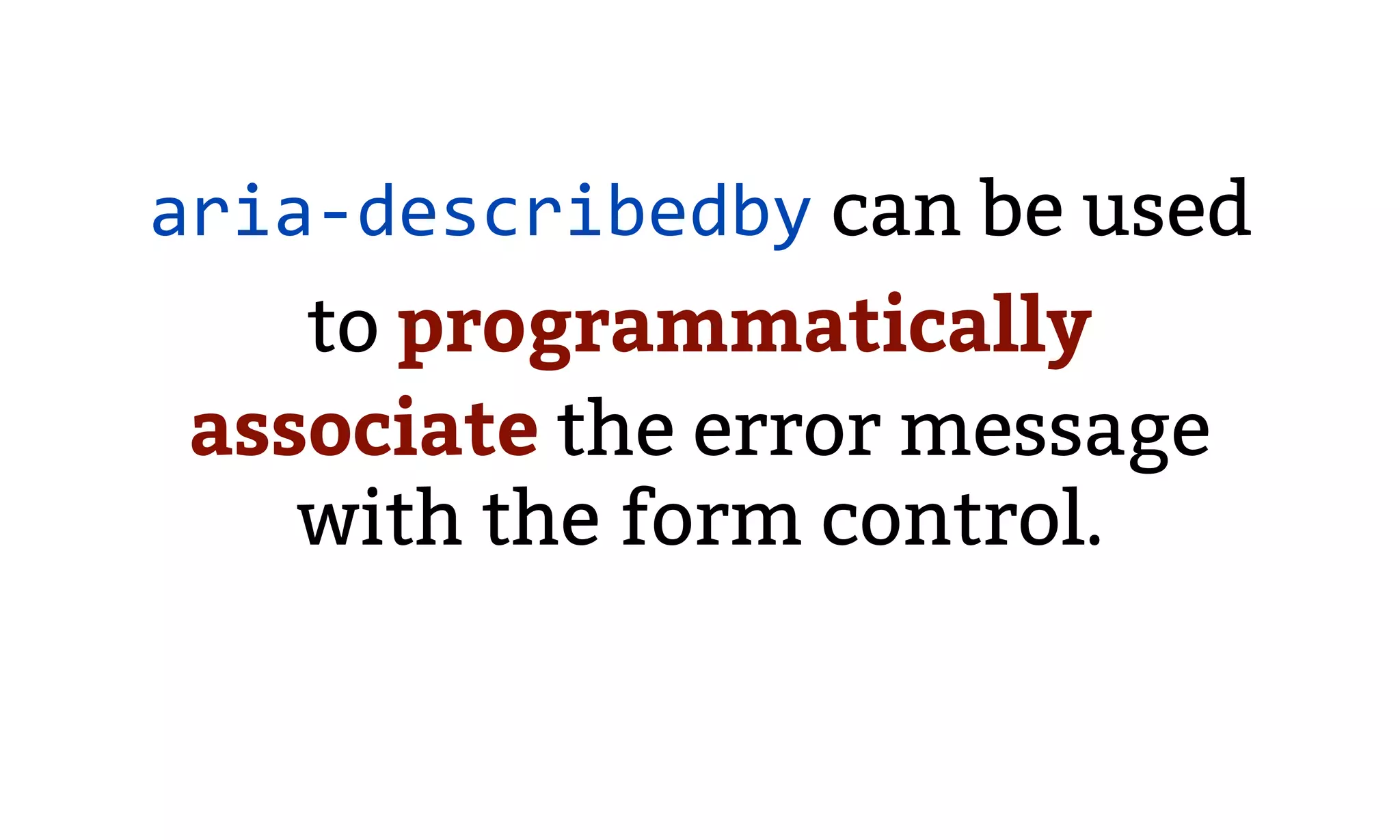
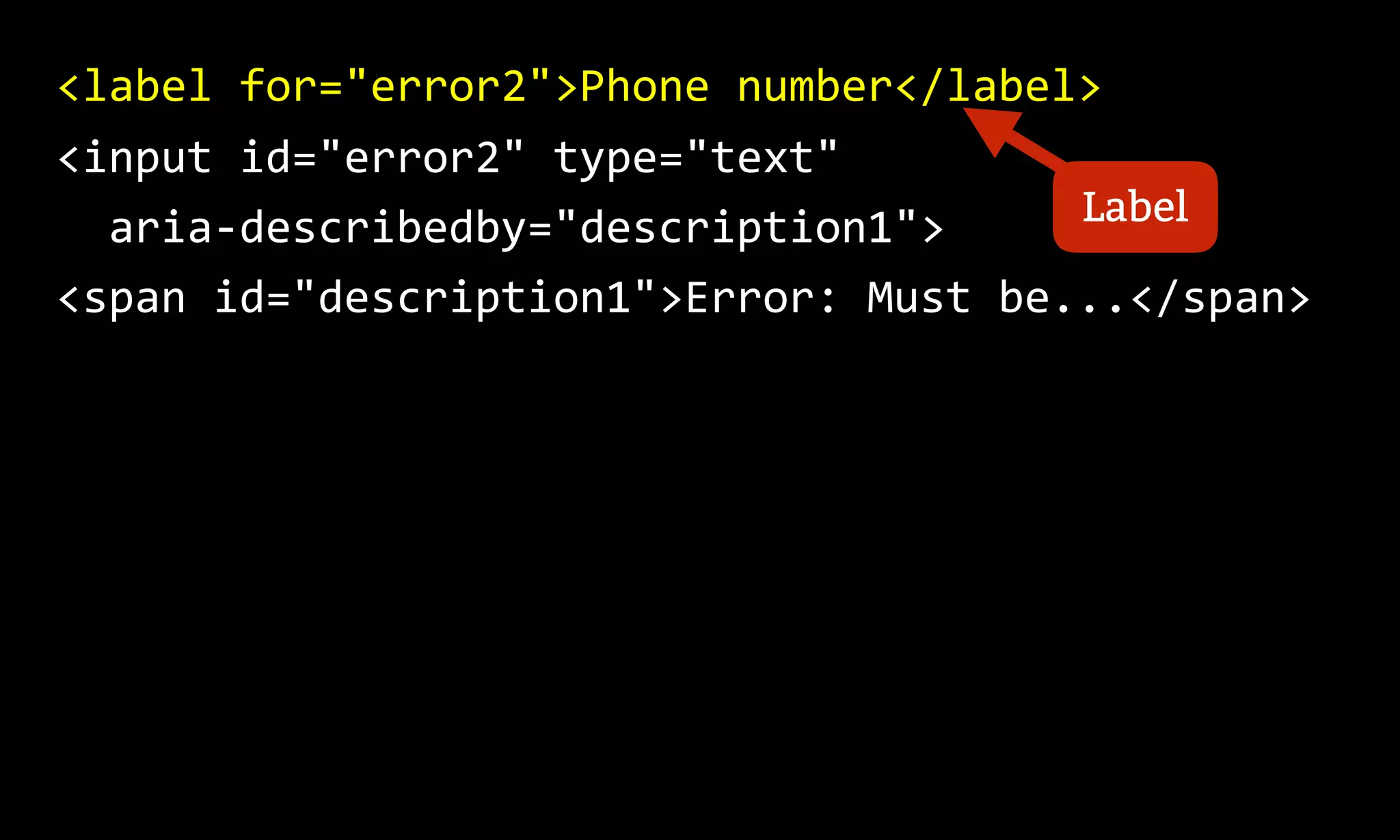
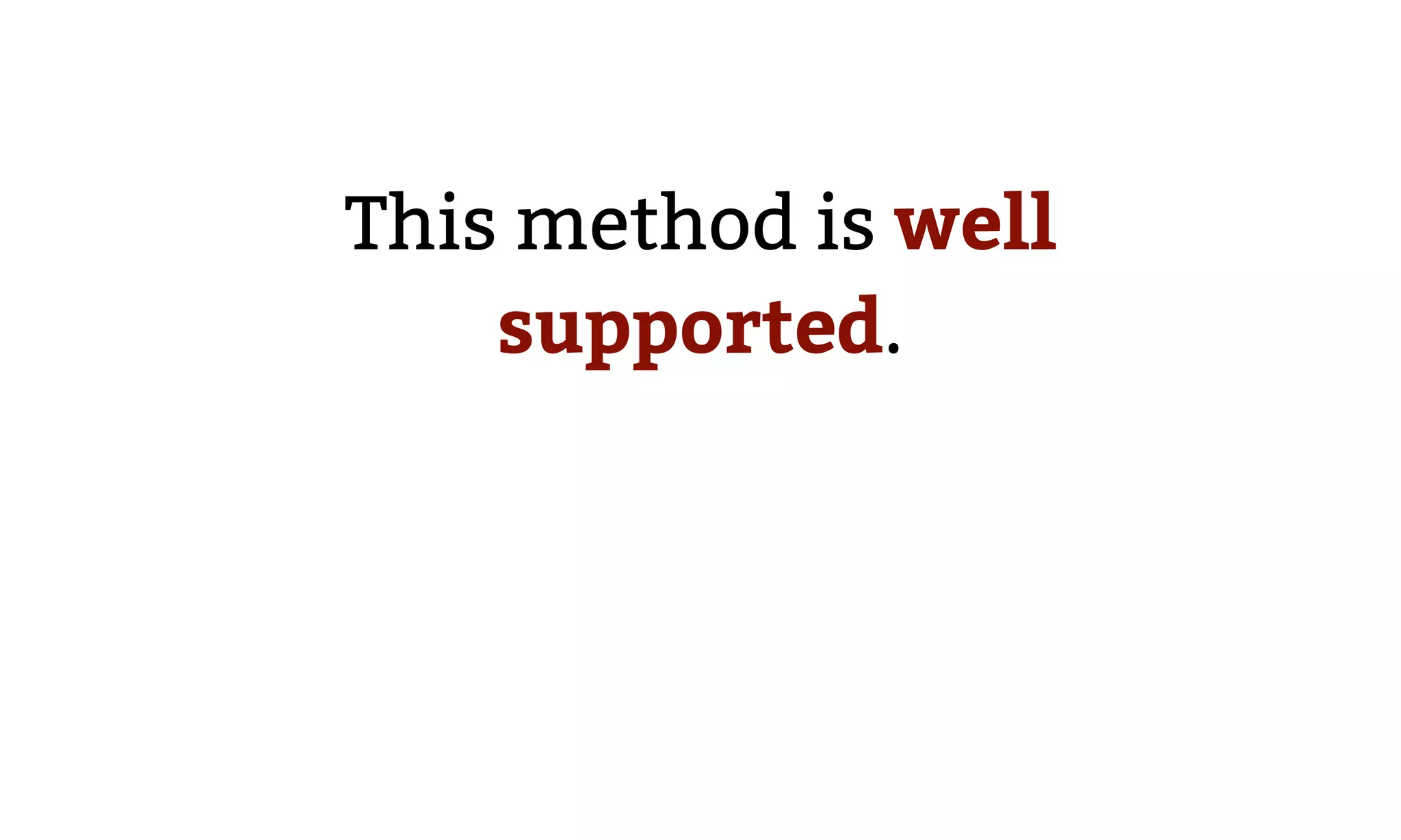
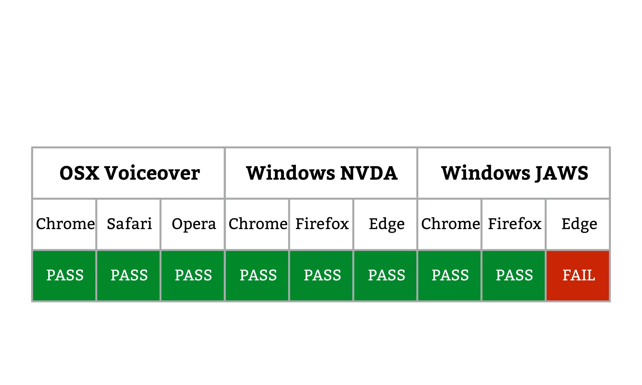
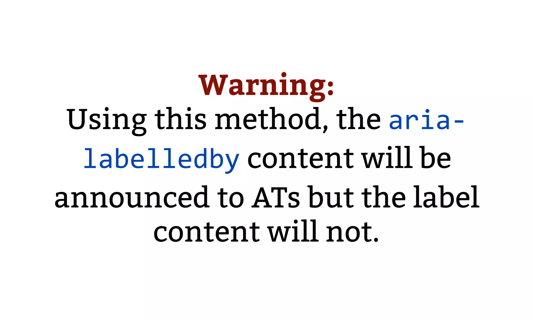
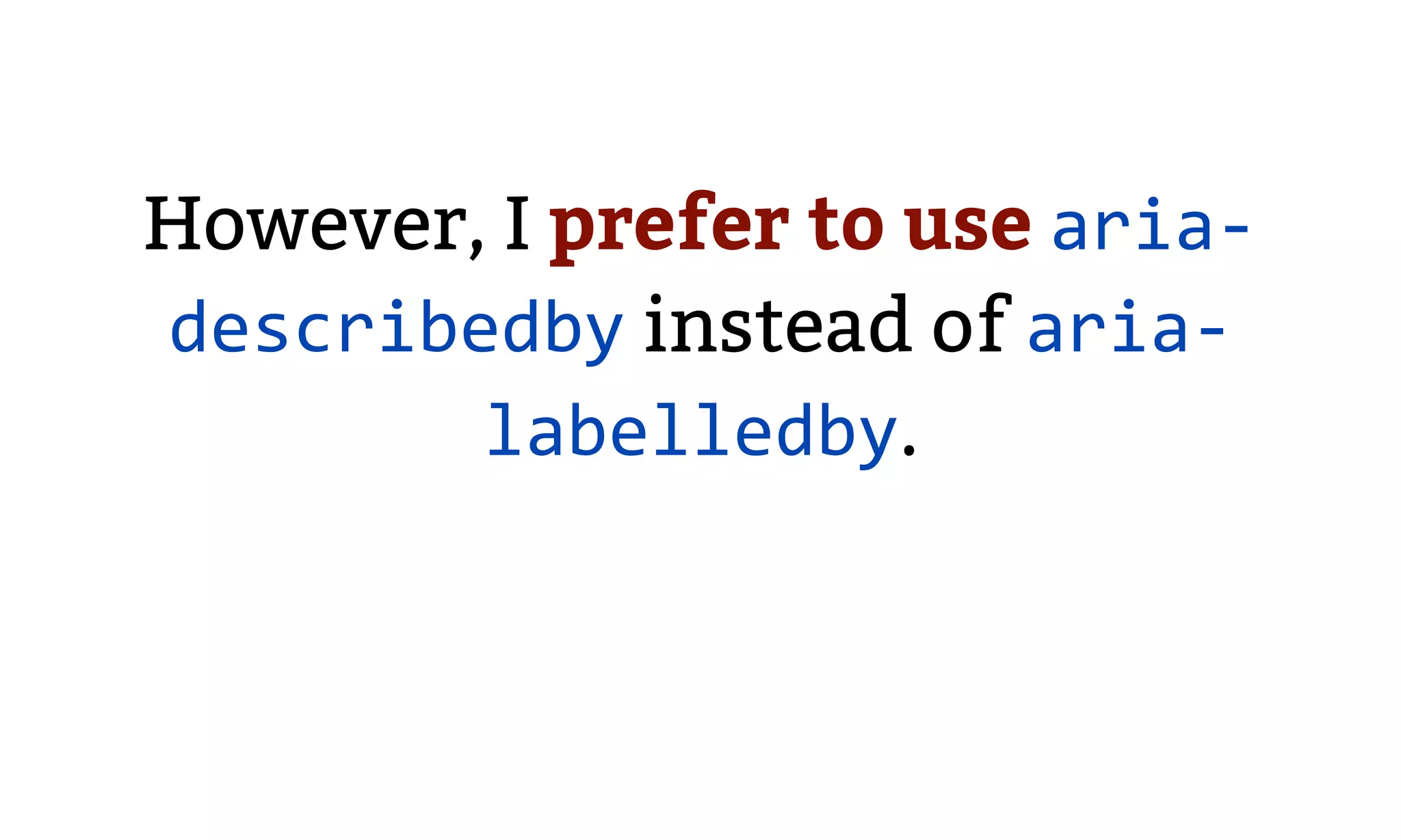
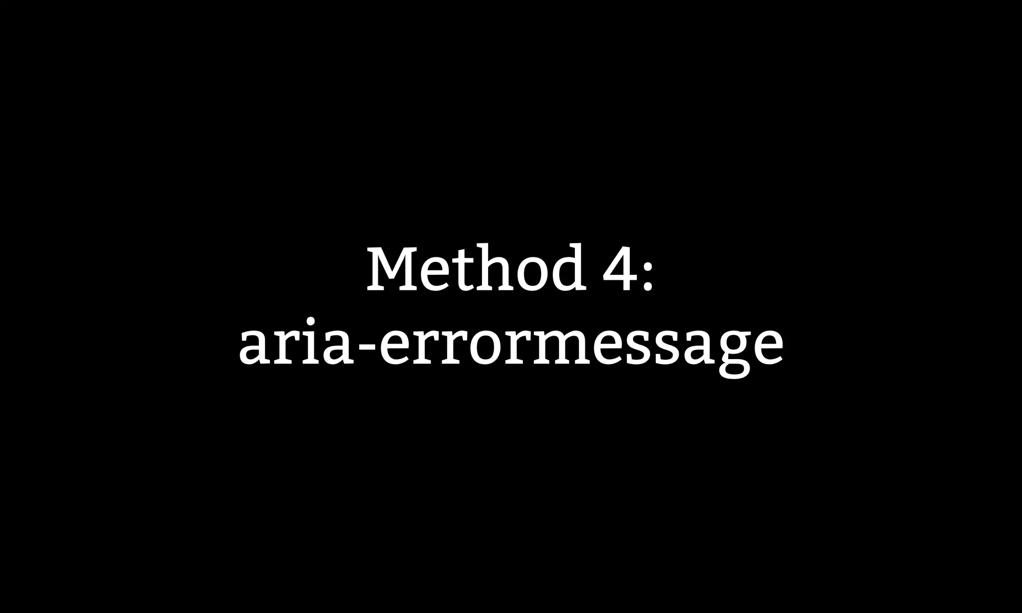
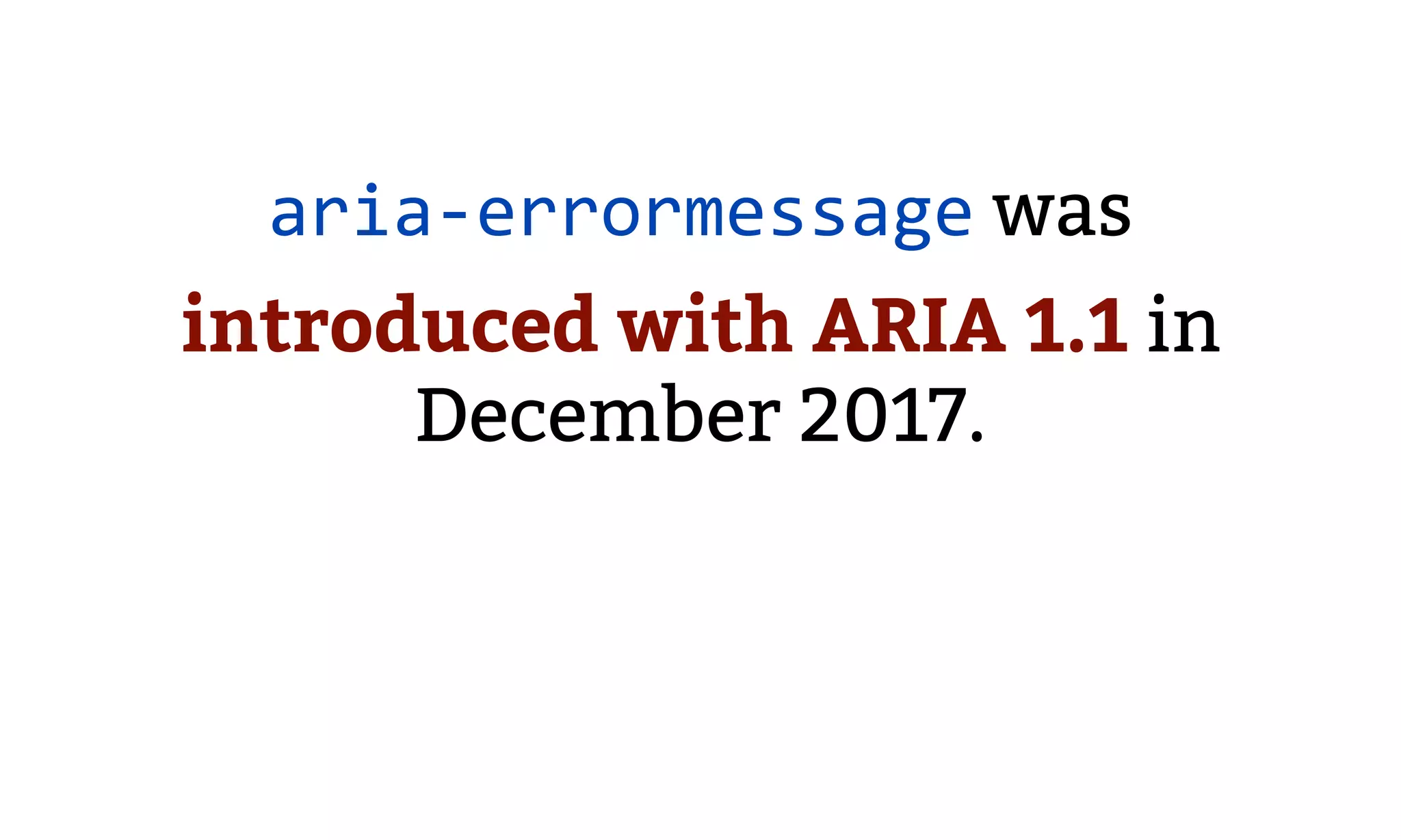
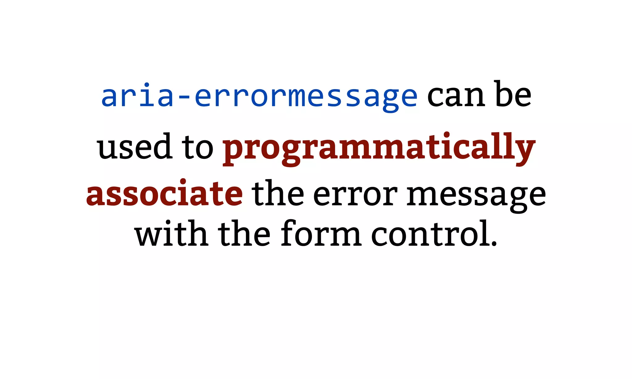
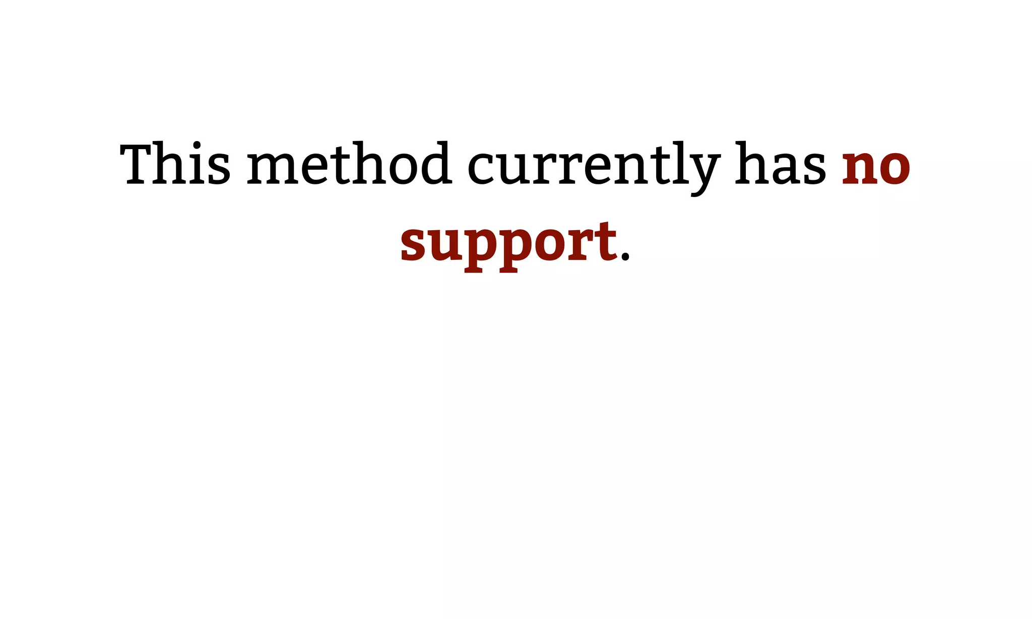
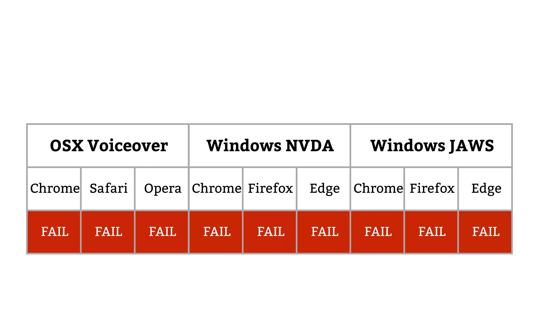
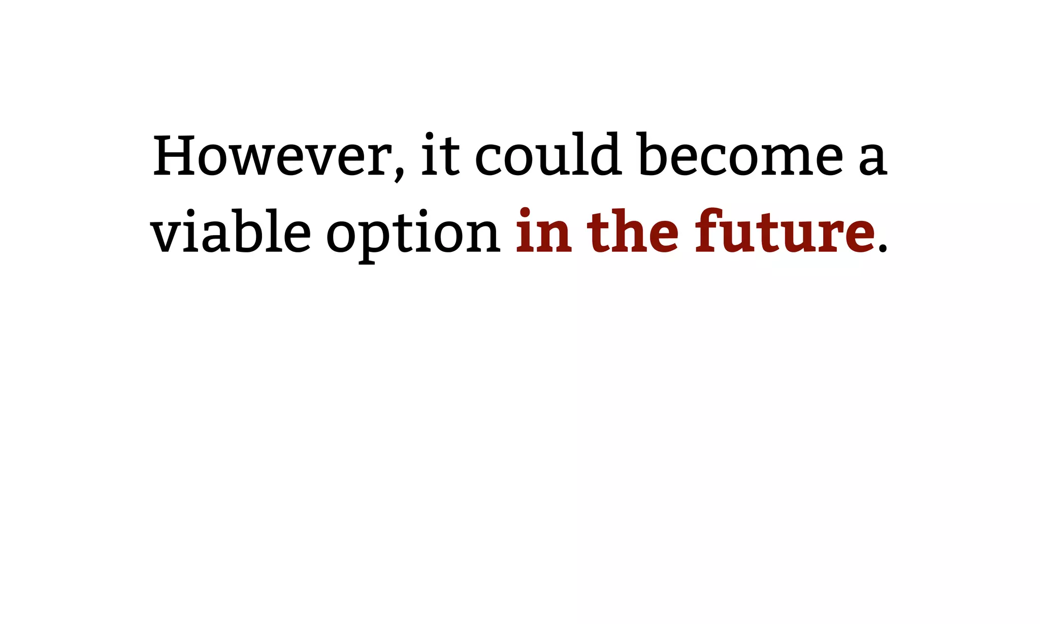
Explains four ARIA methods for associating error messages programmatically with corresponding fields, including support levels and potential future implementations.
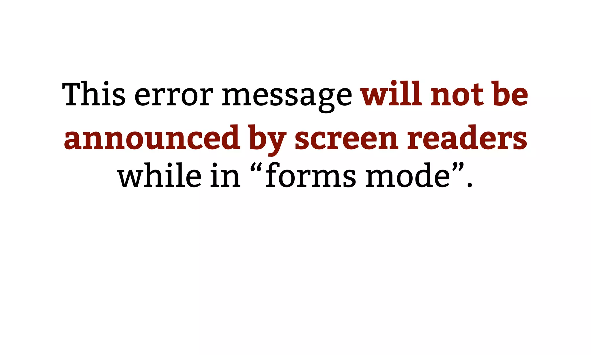
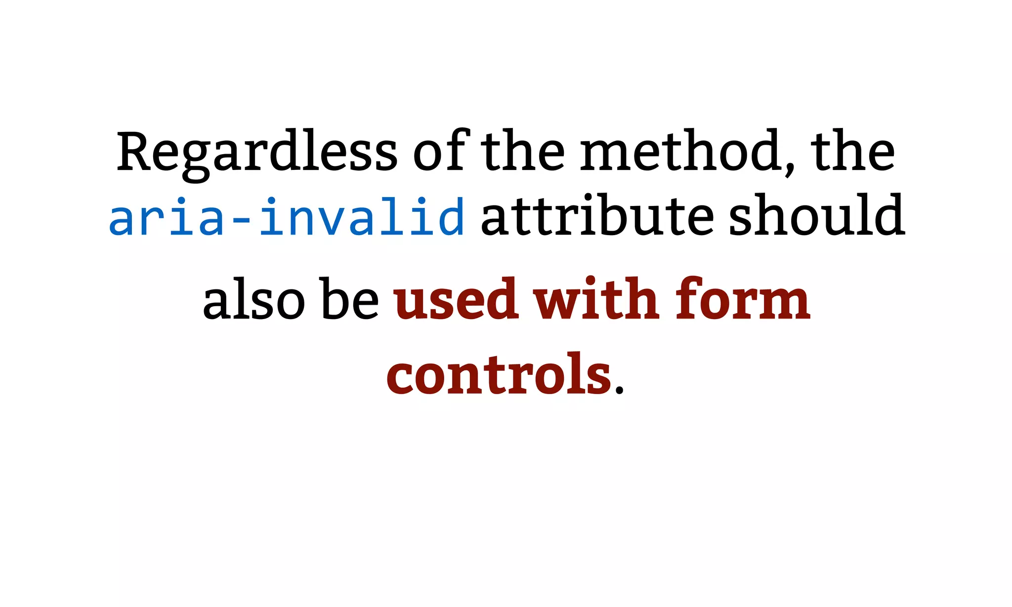
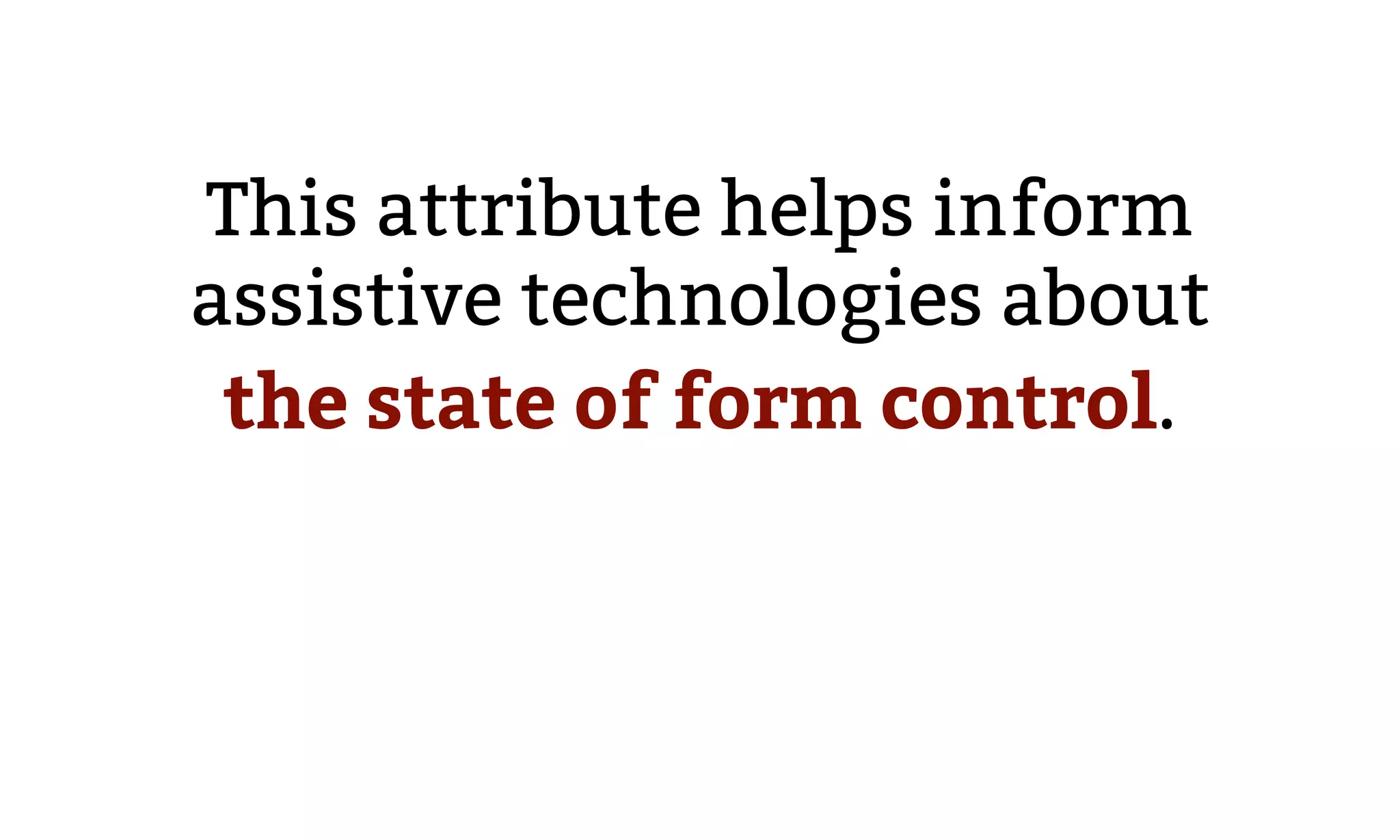
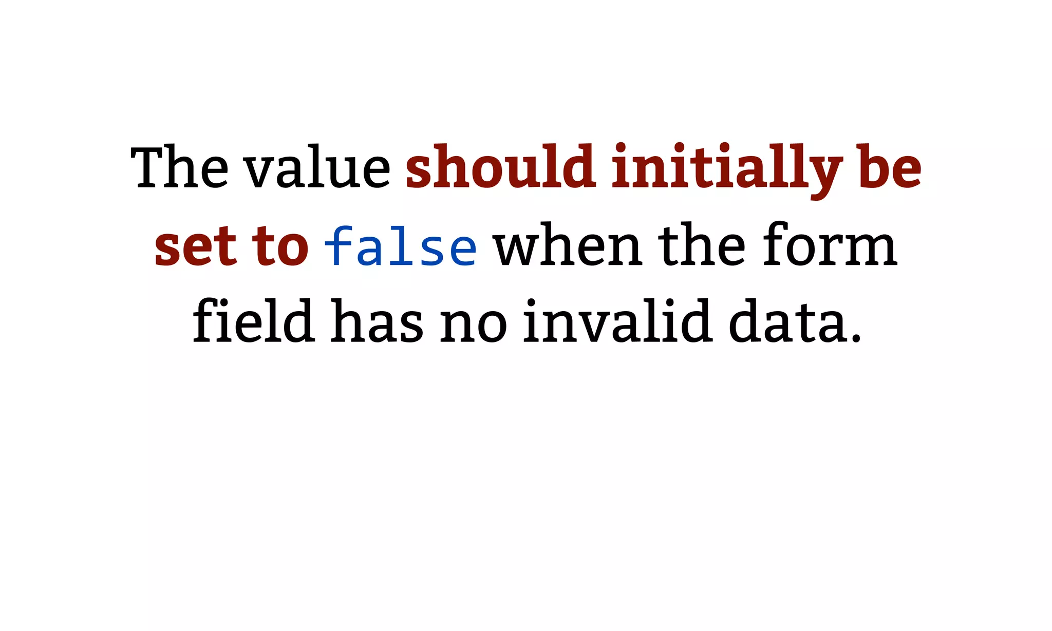
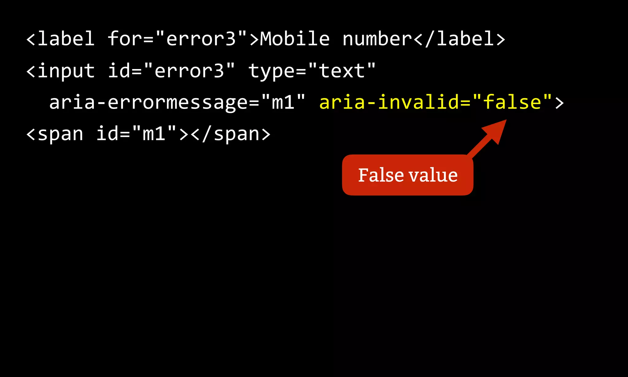
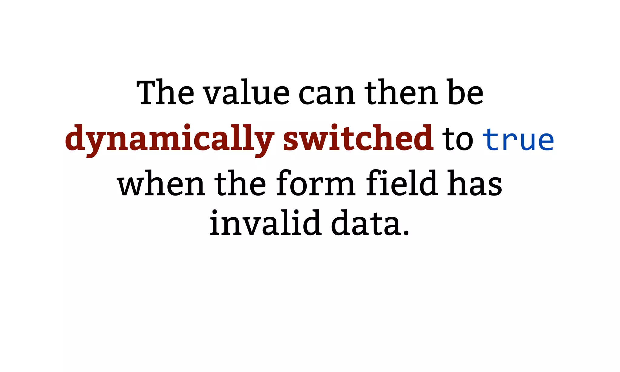
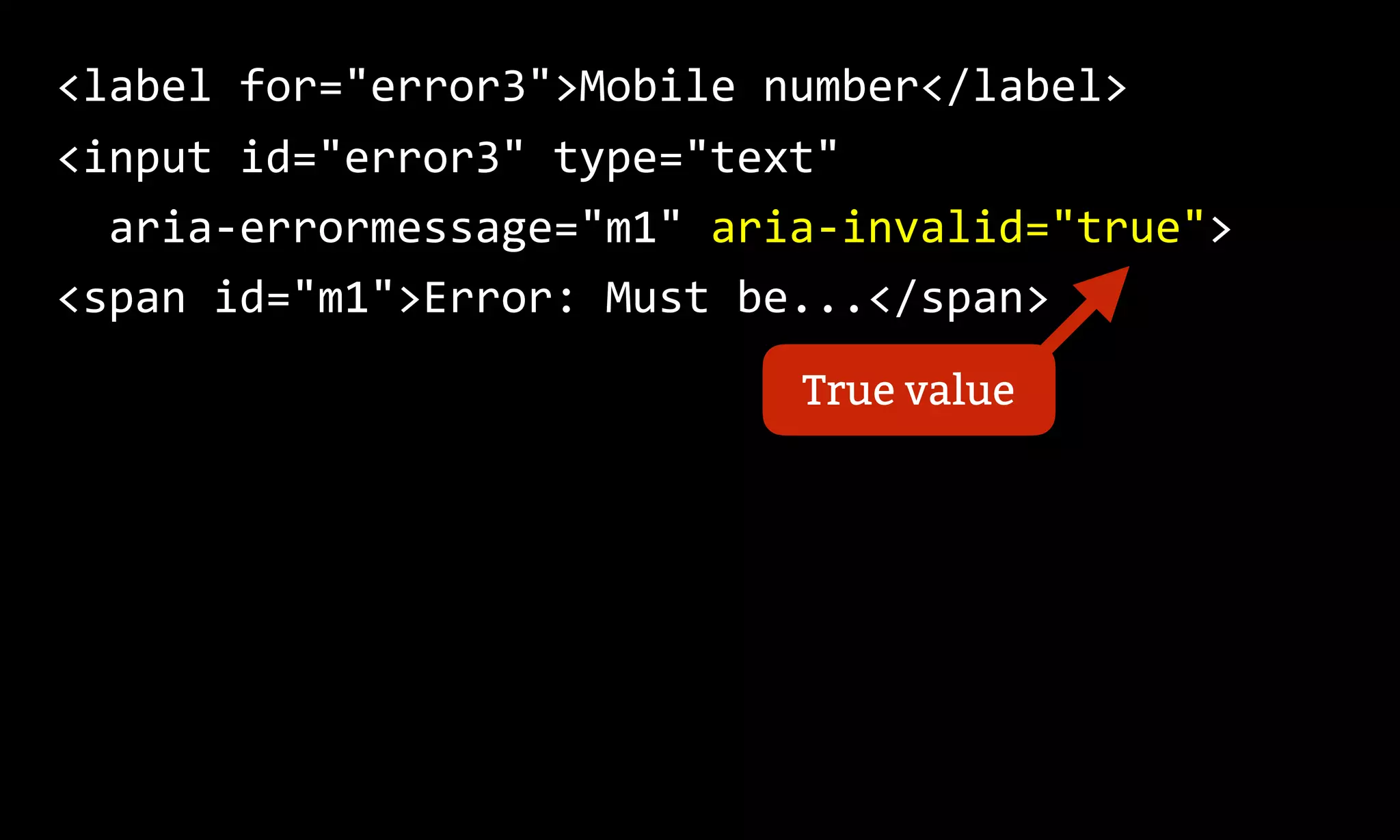
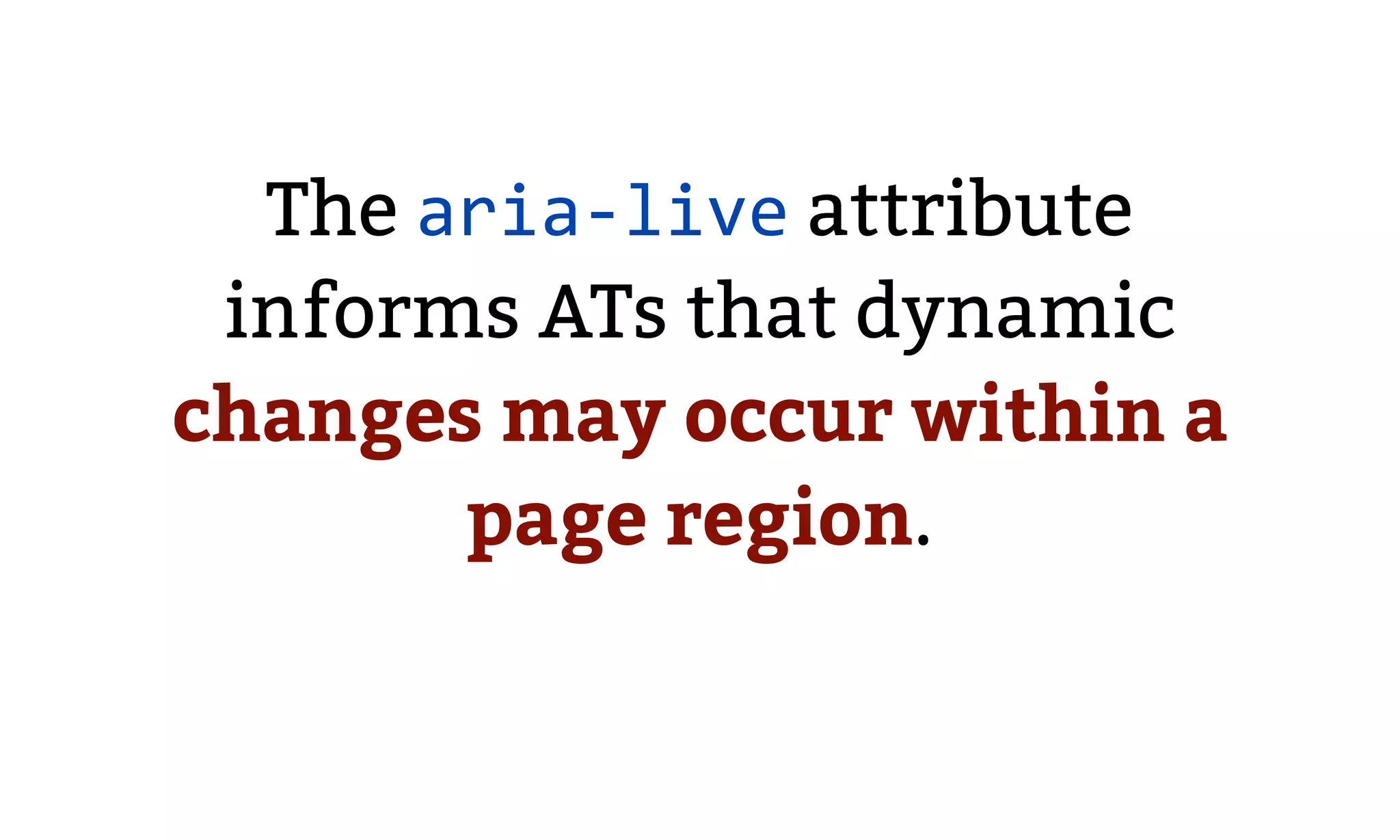
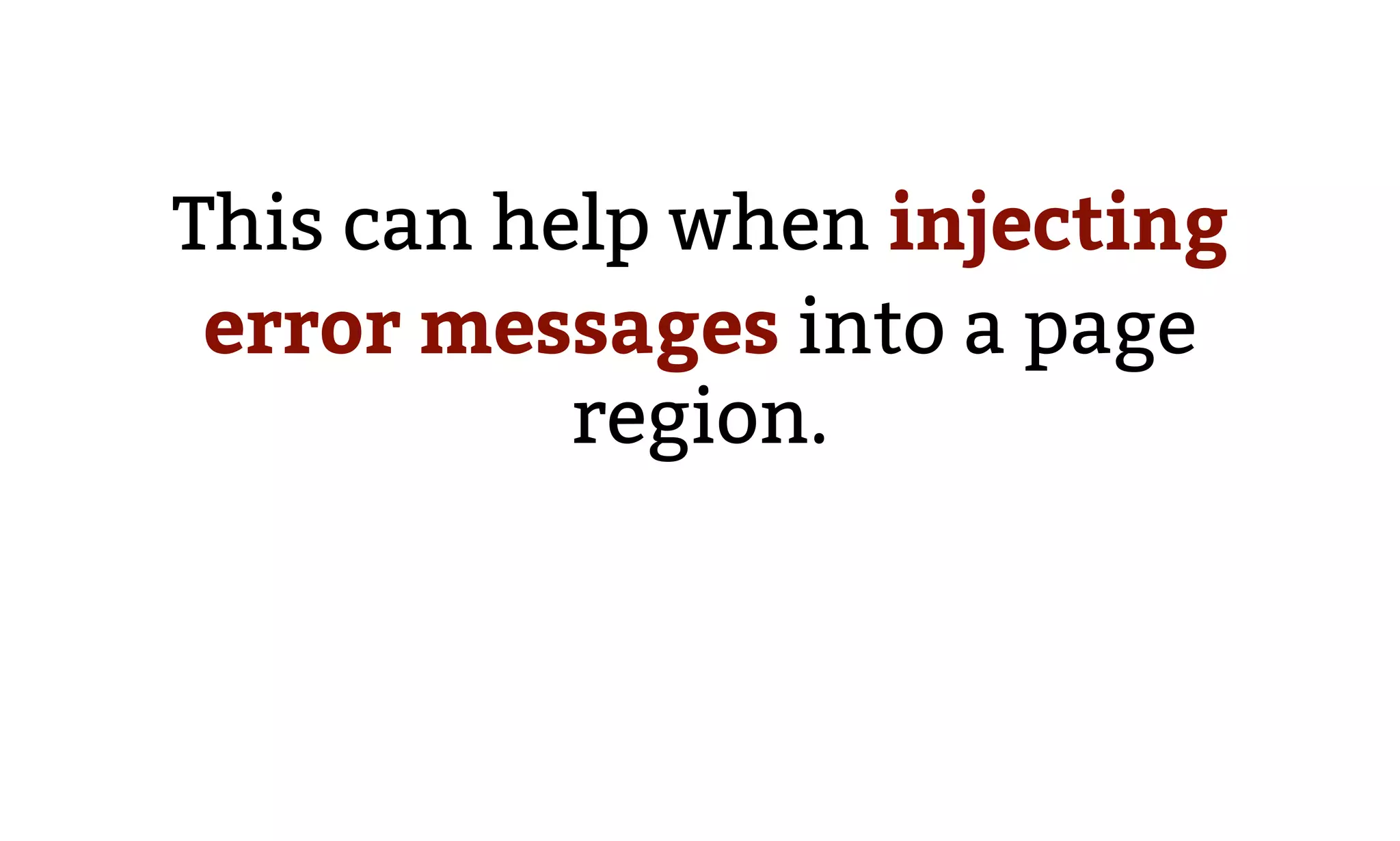
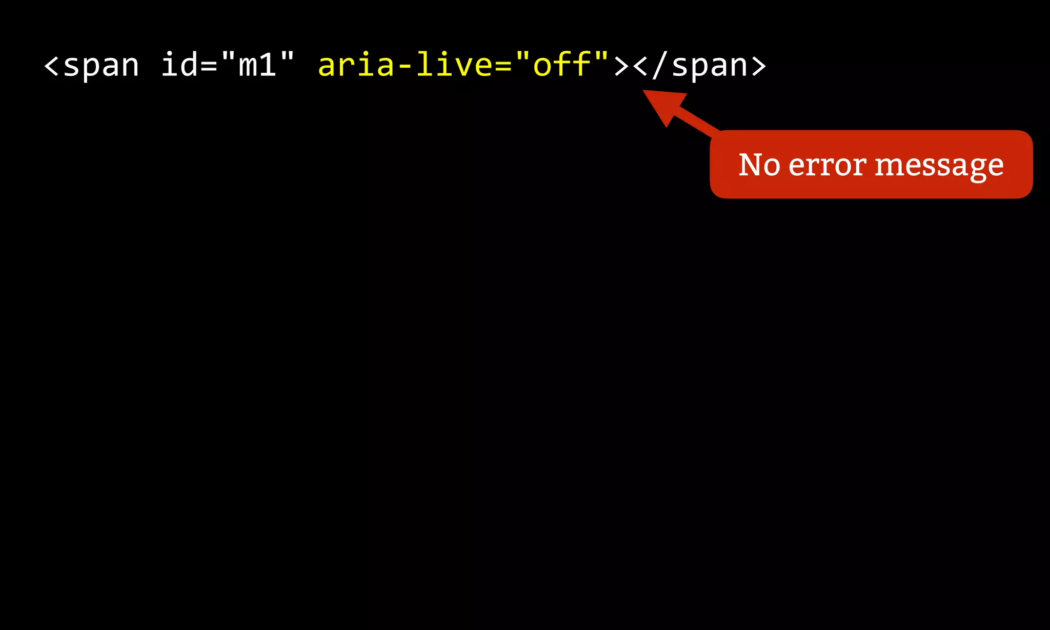
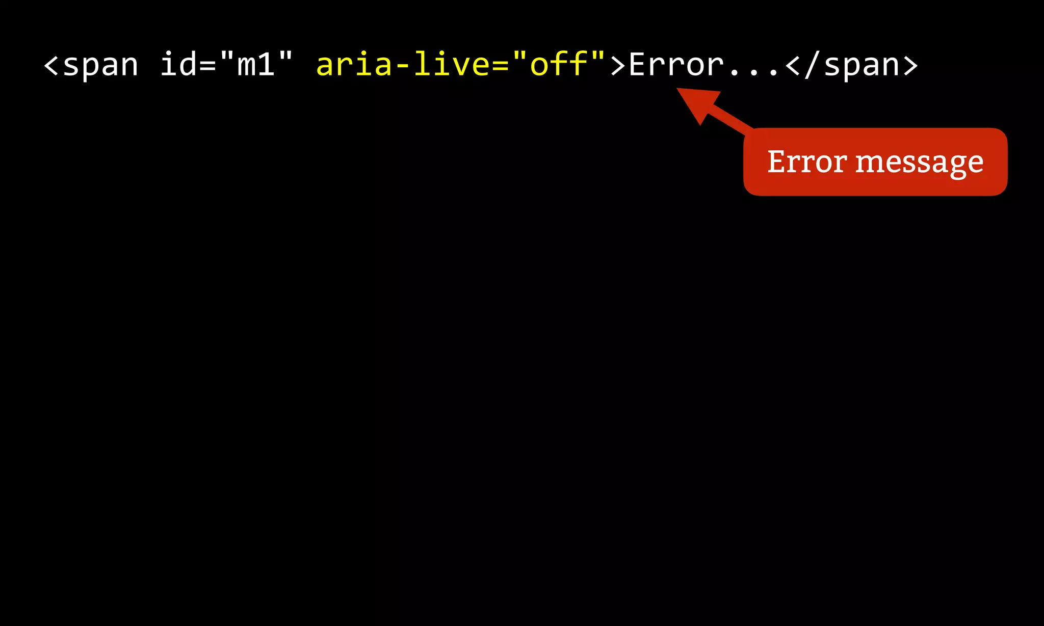
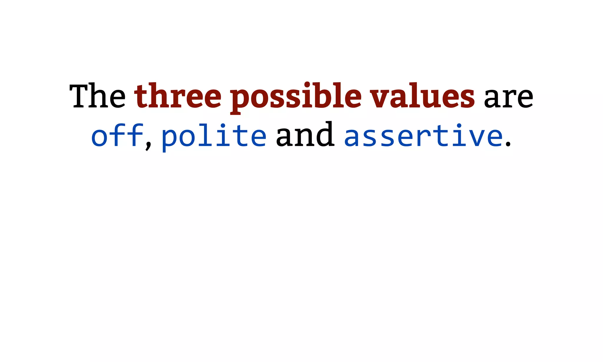
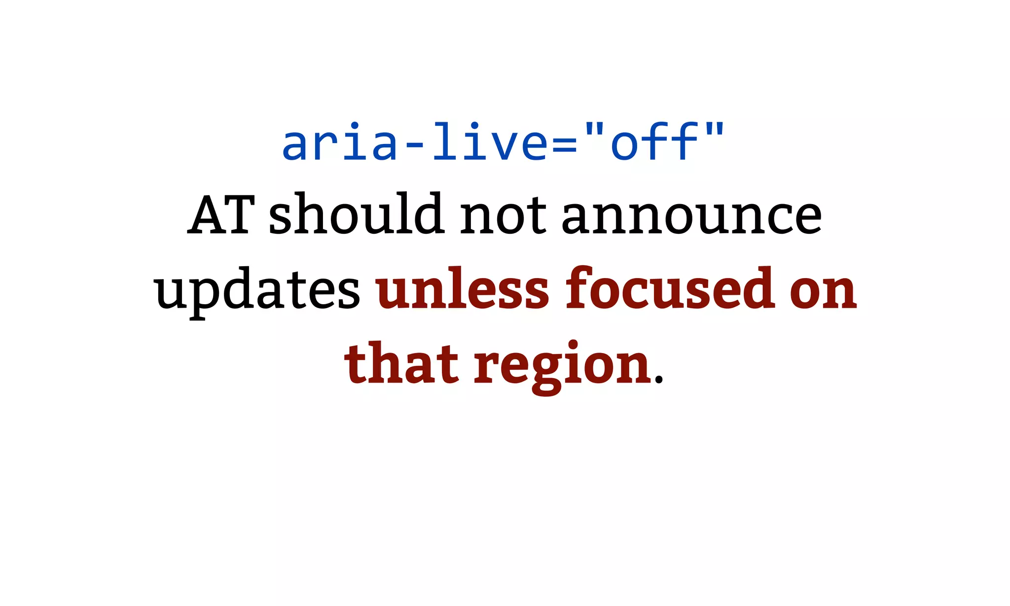
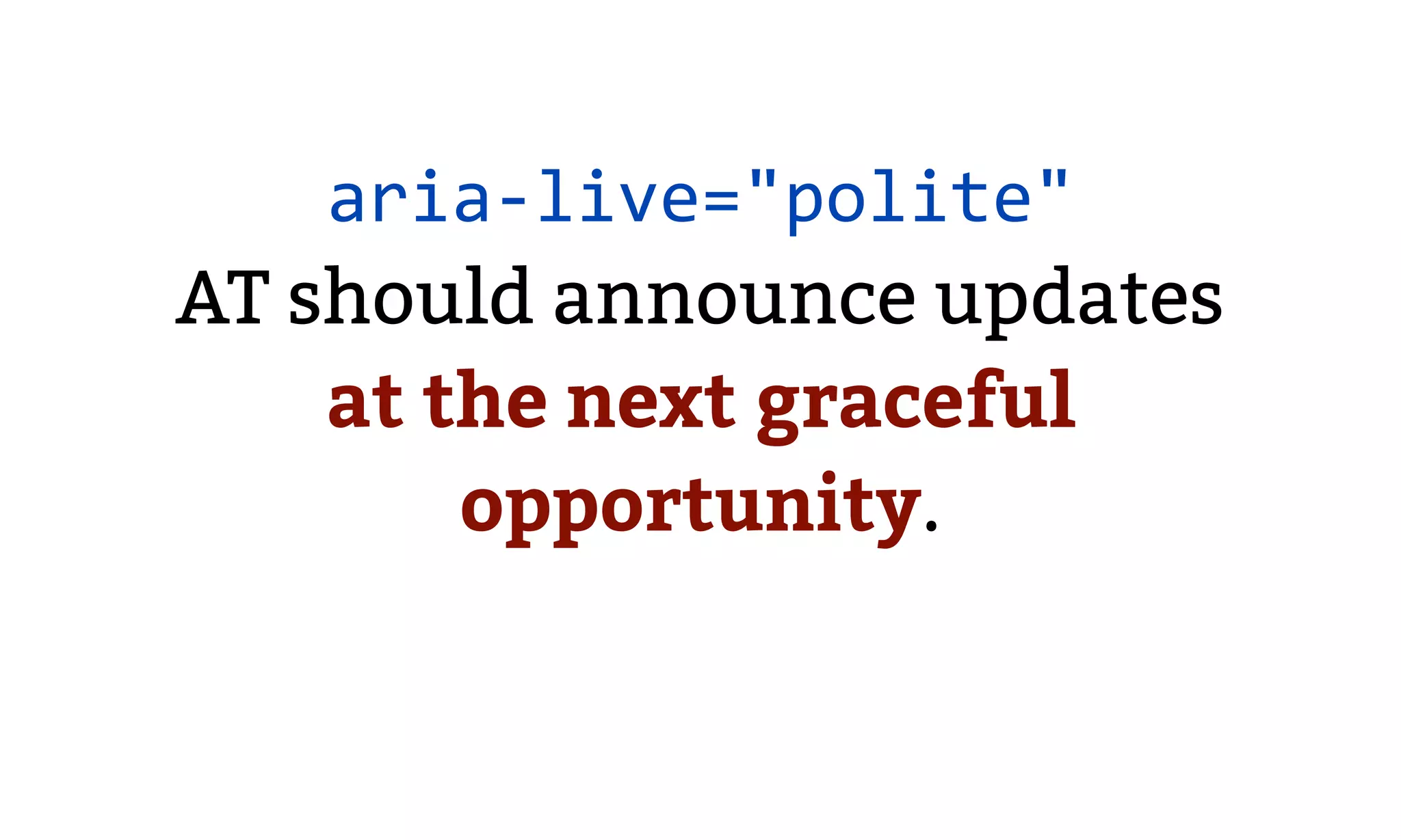
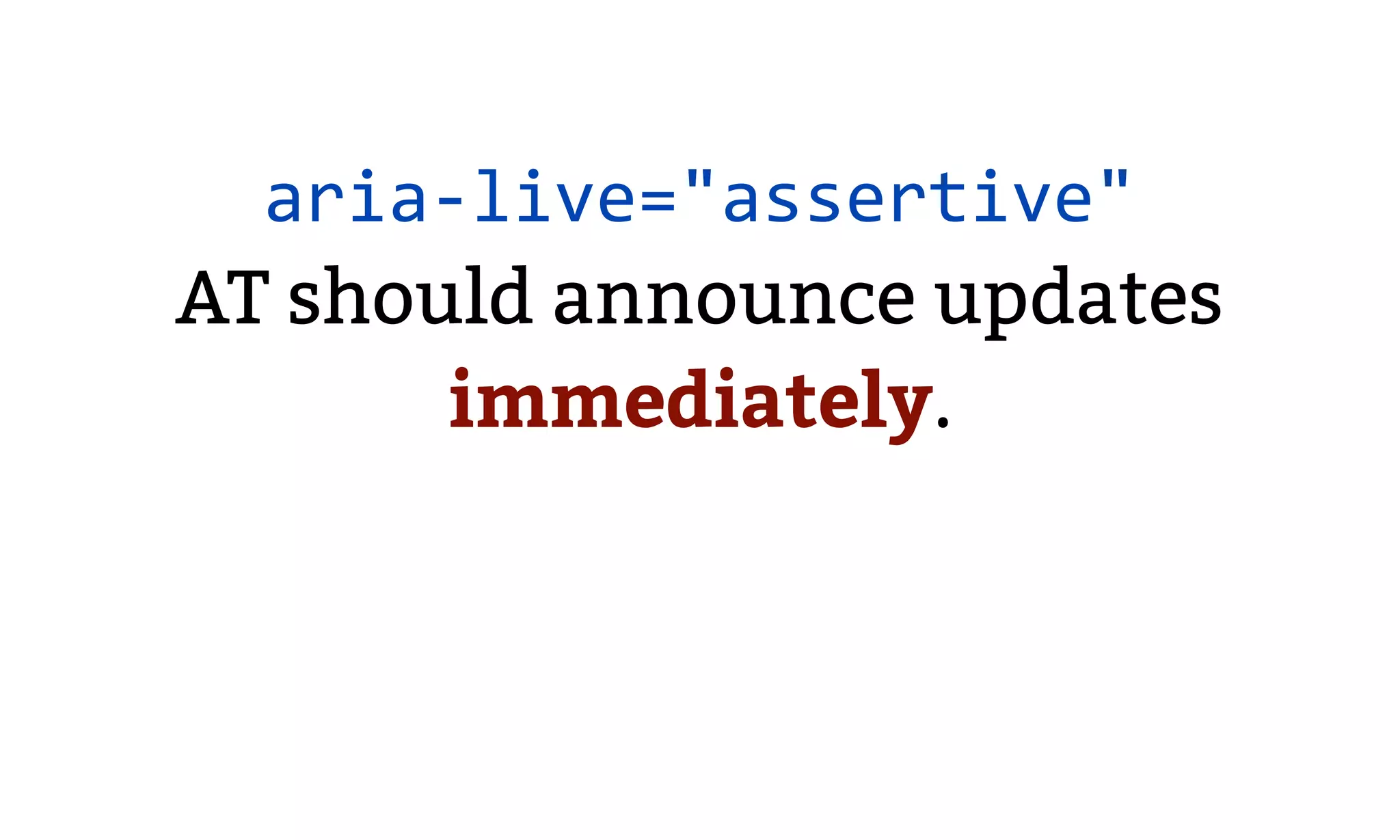
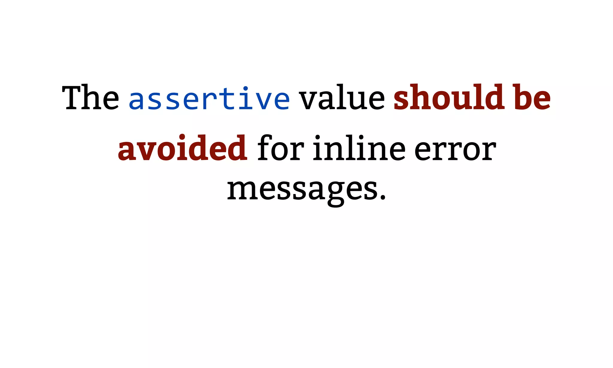
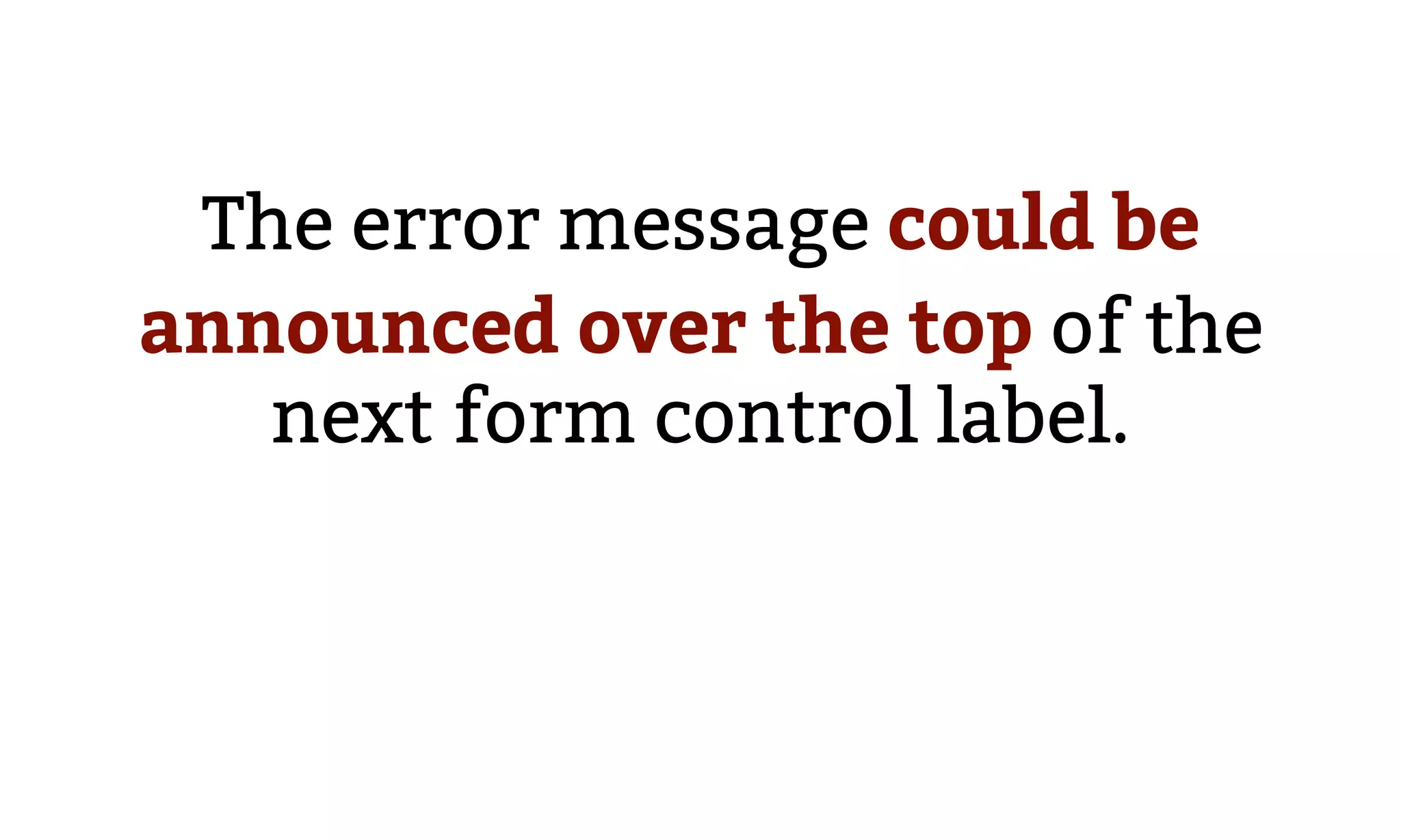
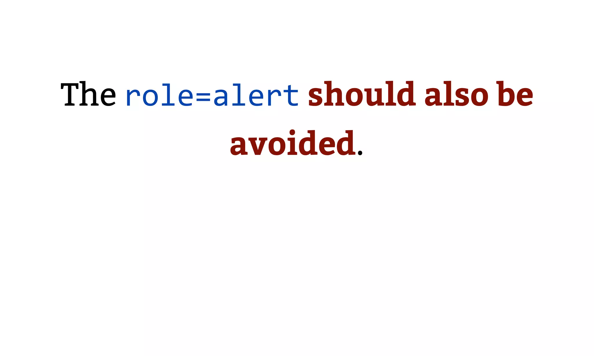
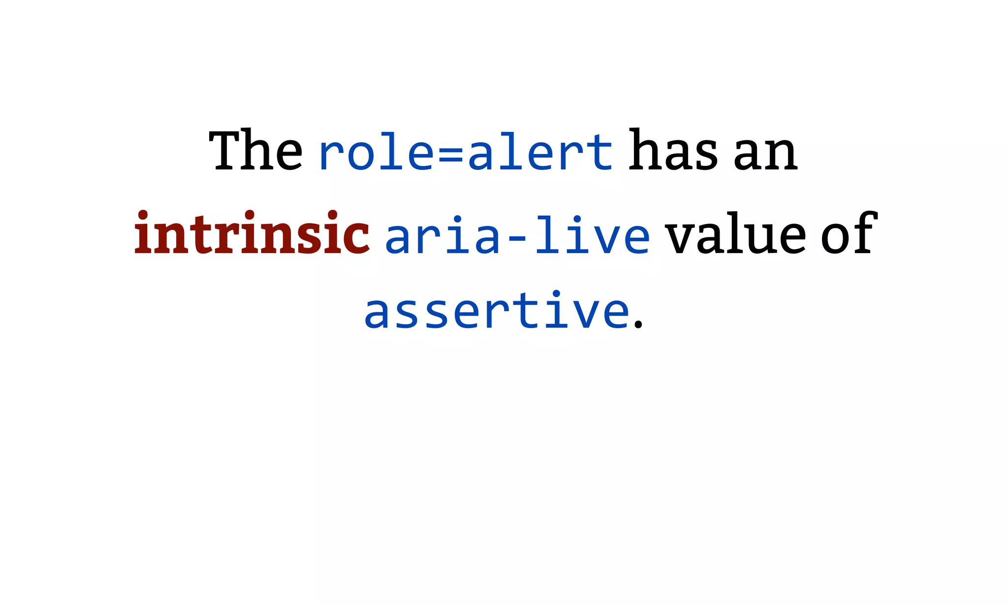
Discusses the use of ARIA attributes like aria-invalid and aria-live to manage error states and message updates dynamically with audience considerations.
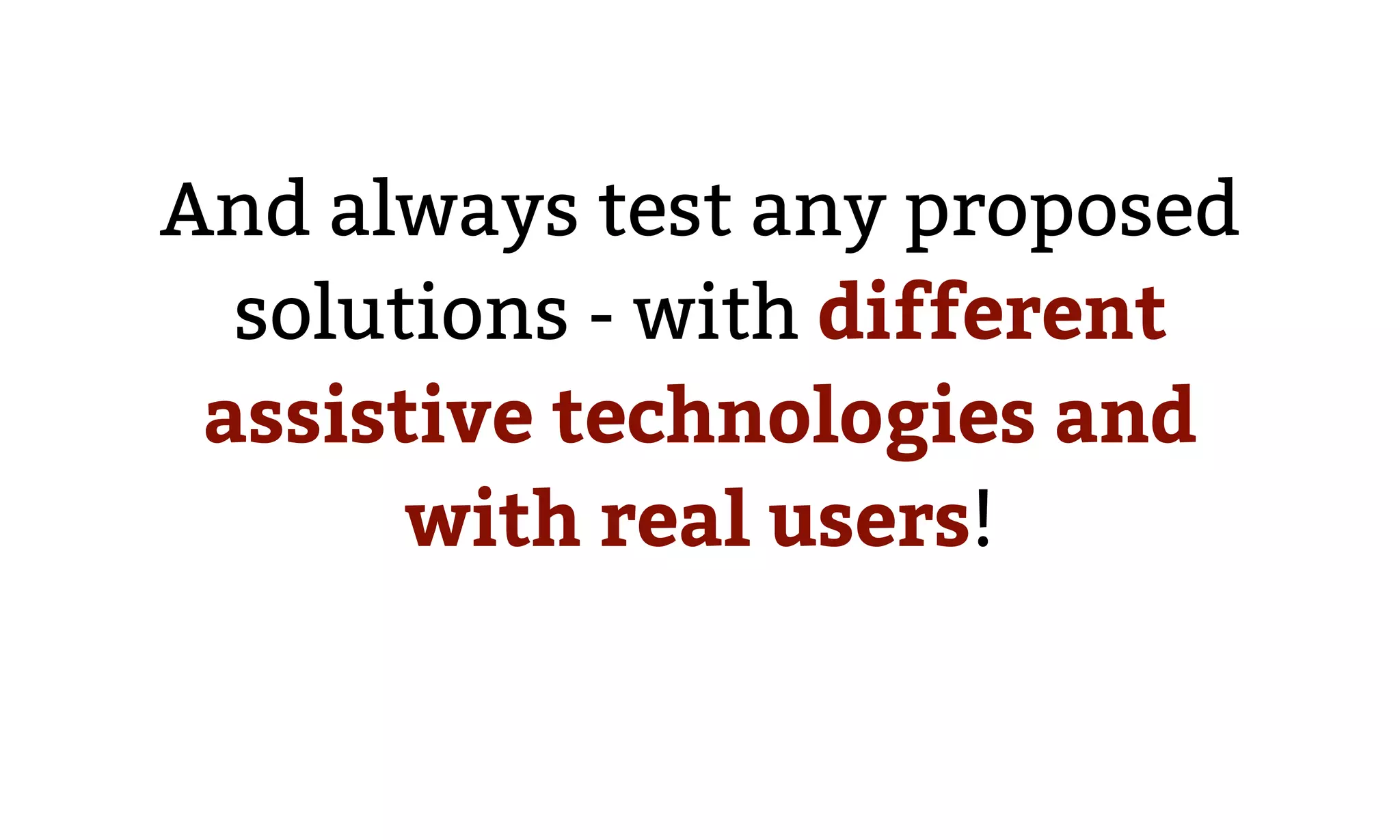
Emphasizes the importance of testing error message solutions for accessibility and their functional association with form controls.