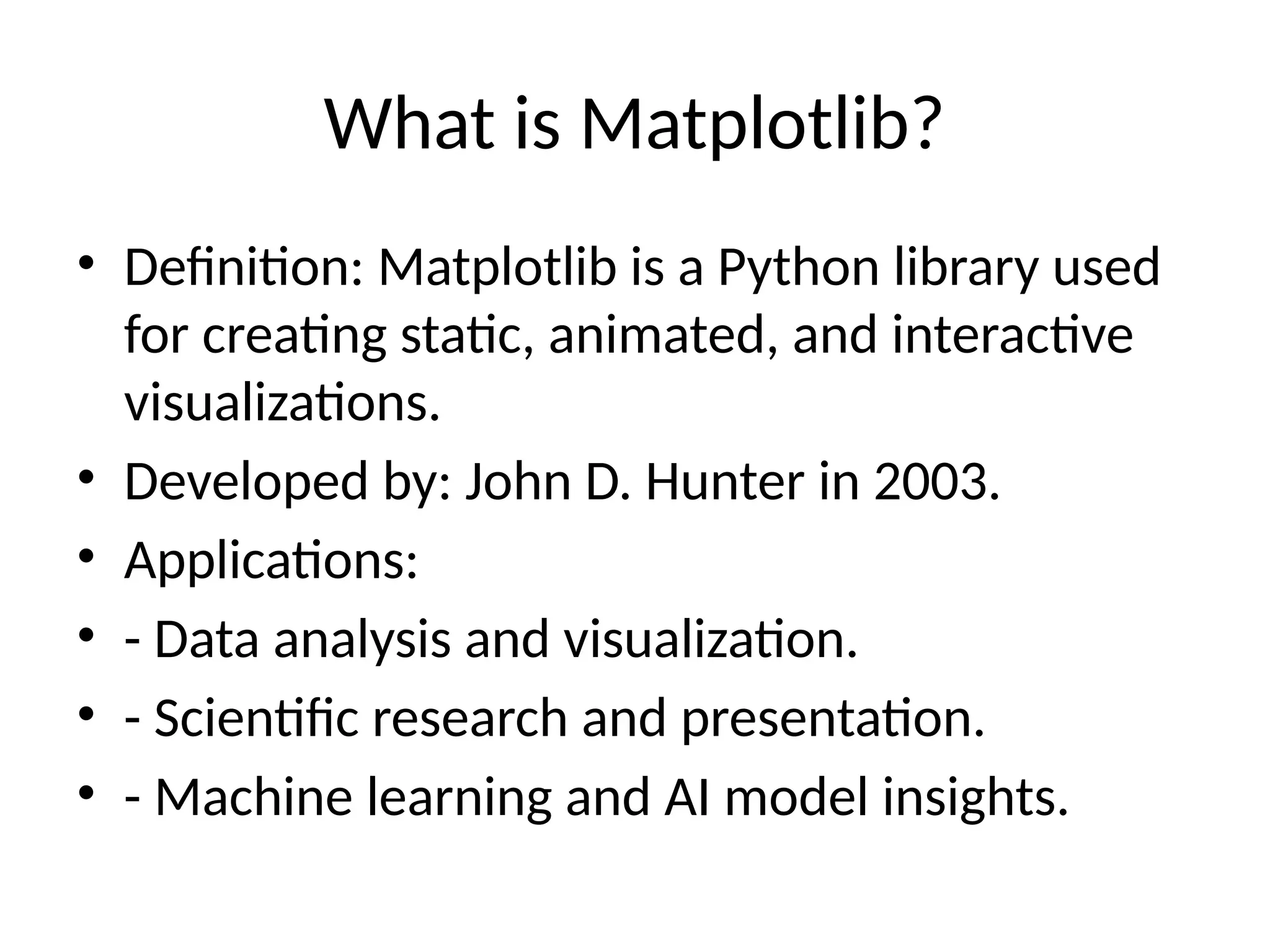
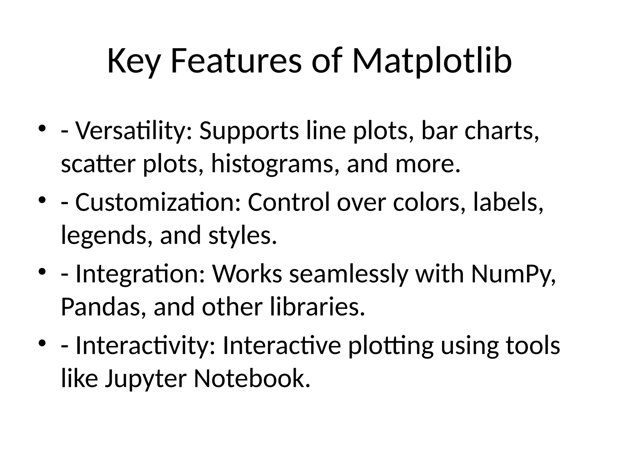
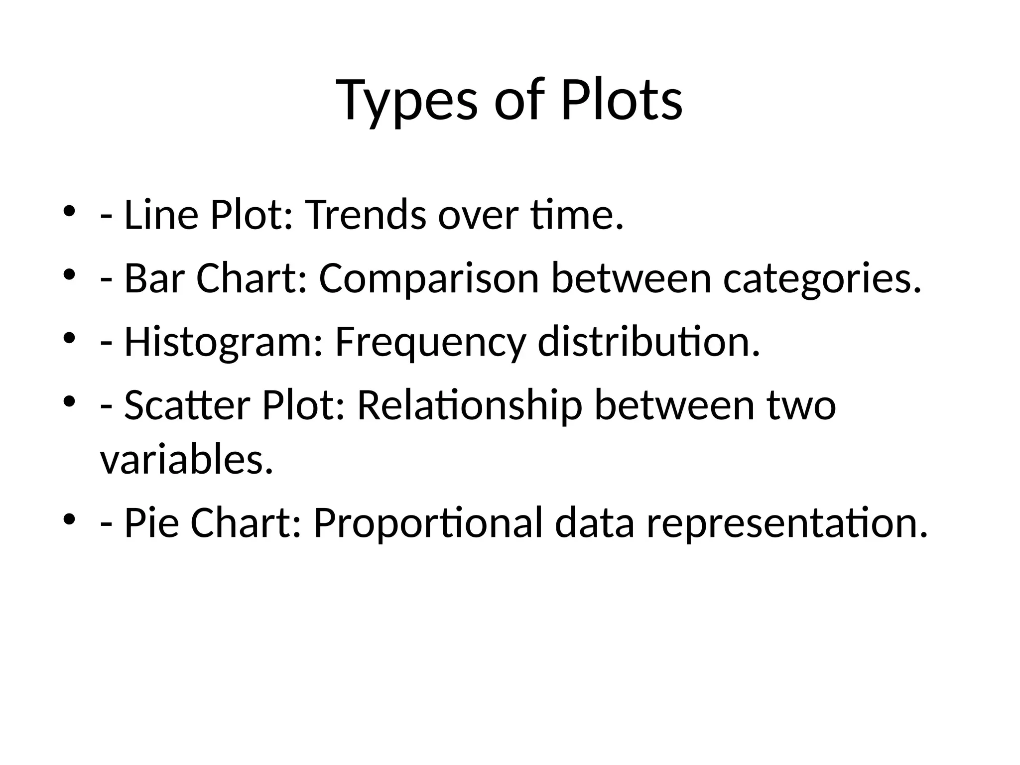
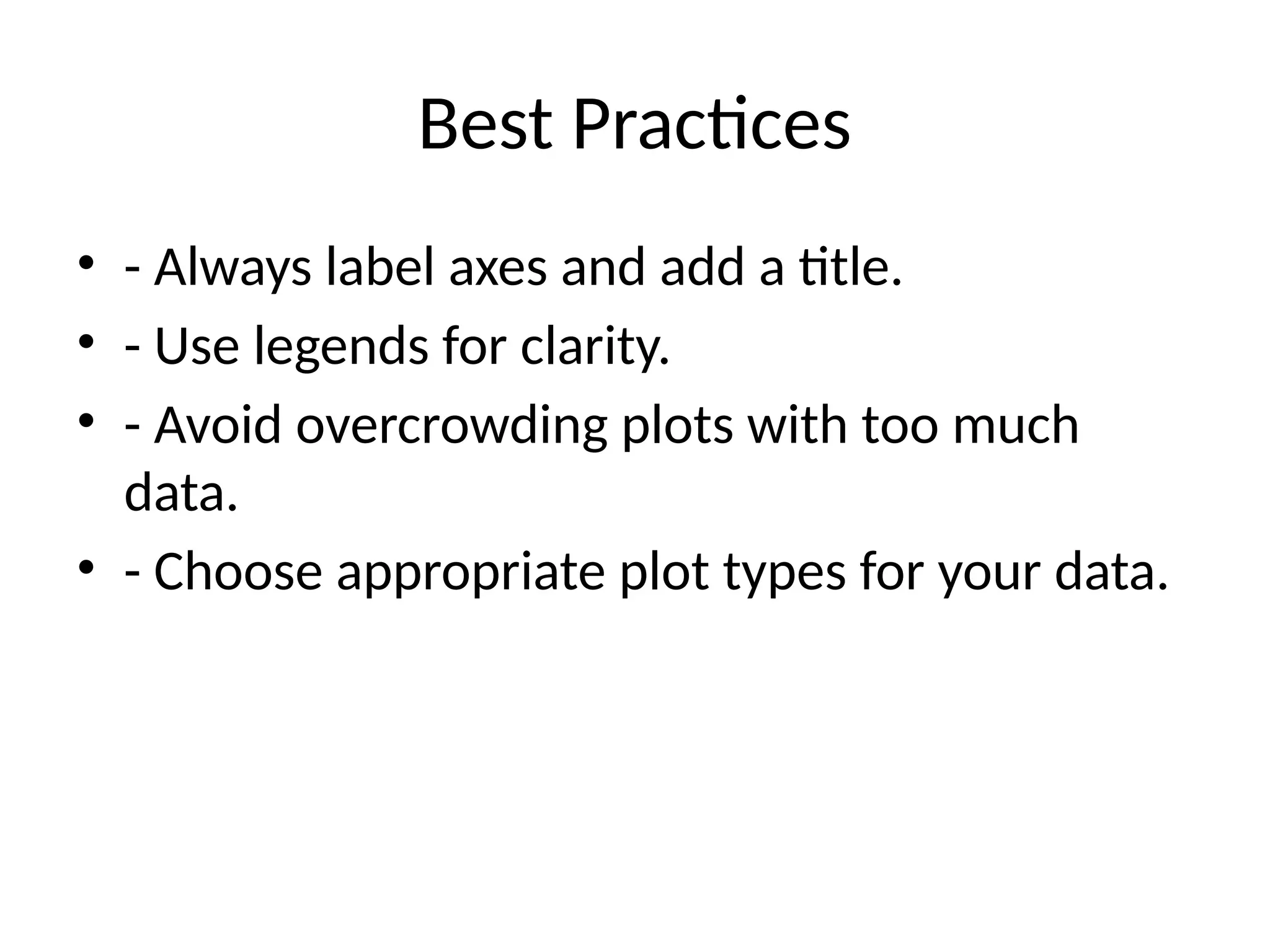
What is Matplotlib?
• Definition: Matplotlib is a Python library used
for creating static, animated, and interactive
visualizations.
• Developed by: John D. Hunter in 2003.
• Applications:
• - Data analysis and visualization.
• - Scientific research and presentation.
• - Machine learning and AI model insights.
Key Features of Matplotlib
• - Versatility: Supports line plots, bar charts,
scatter plots, histograms, and more.
• - Customization: Control over colors, labels,
legends, and styles.
• - Integration: Works seamlessly with NumPy,
Pandas, and other libraries.
• - Interactivity: Interactive plotting using tools
like Jupyter Notebook.
Installation
• Install Matplotlib using pip:
• ```bash
• pip install matplotlib
• ```
• - Ensure Python and pip are installed.
• - Use a virtual environment for better
dependency management.
Basic Components
• 1. Figure: The entire canvas for plotting.
• 2. Axes: The specific area within a figure
where data is plotted.
• 3. Plot Elements: Titles, labels, legends, grids,
etc.
Creating a Basic Plot
• Example Code:
• import matplotlib.pyplot as plt
• x = [1, 2, 3, 4]
• y = [10, 20, 25, 30]
• plt.plot(x, y)
• plt.title('Basic Plot')
• plt.xlabel('X-axis')
• plt.ylabel('Y-axis')
• plt.show()
• ```
Types of Plots
• - Line Plot: Trends over time.
• - Bar Chart: Comparison between categories.
• - Histogram: Frequency distribution.
• - Scatter Plot: Relationship between two
variables.
• - Pie Chart: Proportional data representation.
Customization Options
• - Colors: Change line or marker colors.
• - Line Styles: Dashed, dotted, etc.
• - Markers: Represent data points (circle, square, etc.).
• - Grid: Enable or disable gridlines.
• Example:
• ```python
• plt.plot(x, y, color='red', linestyle='--', marker='o')
• plt.grid(True)
• ```
Advanced Visualizations
• - Subplots: Multiple plots in one figure.
• ```python
• plt.subplot(1, 2, 1) # Row 1, Column 2, Plot 1
• plt.plot(x, y)
• plt.subplot(1, 2, 2) # Row 1, Column 2, Plot 2
• plt.bar(x, y)
• plt.show()
• ```
• - 3D Plots: Using `mpl_toolkits.mplot3d`.
Working with Pandas and NumPy
• Example:
• ```python
• import pandas as pd
• import numpy as np
• import matplotlib.pyplot as plt
• data = pd.DataFrame({
• 'A': np.random.rand(10),
• 'B': np.random.rand(10)
• })
• data.plot(kind='bar')
• plt.show()
• ```
Best Practices
• - Always label axes and add a title.
• - Use legends for clarity.
• - Avoid overcrowding plots with too much
data.
• - Choose appropriate plot types for your data.
Resources
• - [Matplotlib
Documentation](https://matplotlib.org/stable
/contents.html)
• - [Python Data Science
Handbook](https://jakevdp.github.io/PythonD
ataScienceHandbook/)
• - Online tutorials and YouTube channels.

Matplotlib_Presentation jk jdjklskncncsjkk

  • 1.
    What is Matplotlib? •Definition: Matplotlib is a Python library used for creating static, animated, and interactive visualizations. • Developed by: John D. Hunter in 2003. • Applications: • - Data analysis and visualization. • - Scientific research and presentation. • - Machine learning and AI model insights.
  • 2.
    Key Features ofMatplotlib • - Versatility: Supports line plots, bar charts, scatter plots, histograms, and more. • - Customization: Control over colors, labels, legends, and styles. • - Integration: Works seamlessly with NumPy, Pandas, and other libraries. • - Interactivity: Interactive plotting using tools like Jupyter Notebook.
  • 3.
    Installation • Install Matplotlibusing pip: • ```bash • pip install matplotlib • ``` • - Ensure Python and pip are installed. • - Use a virtual environment for better dependency management.
  • 4.
    Basic Components • 1.Figure: The entire canvas for plotting. • 2. Axes: The specific area within a figure where data is plotted. • 3. Plot Elements: Titles, labels, legends, grids, etc.
  • 5.
    Creating a BasicPlot • Example Code: • import matplotlib.pyplot as plt • x = [1, 2, 3, 4] • y = [10, 20, 25, 30] • plt.plot(x, y) • plt.title('Basic Plot') • plt.xlabel('X-axis') • plt.ylabel('Y-axis') • plt.show() • ```
  • 6.
    Types of Plots •- Line Plot: Trends over time. • - Bar Chart: Comparison between categories. • - Histogram: Frequency distribution. • - Scatter Plot: Relationship between two variables. • - Pie Chart: Proportional data representation.
  • 7.
    Customization Options • -Colors: Change line or marker colors. • - Line Styles: Dashed, dotted, etc. • - Markers: Represent data points (circle, square, etc.). • - Grid: Enable or disable gridlines. • Example: • ```python • plt.plot(x, y, color='red', linestyle='--', marker='o') • plt.grid(True) • ```
  • 8.
    Advanced Visualizations • -Subplots: Multiple plots in one figure. • ```python • plt.subplot(1, 2, 1) # Row 1, Column 2, Plot 1 • plt.plot(x, y) • plt.subplot(1, 2, 2) # Row 1, Column 2, Plot 2 • plt.bar(x, y) • plt.show() • ``` • - 3D Plots: Using `mpl_toolkits.mplot3d`.
  • 9.
    Working with Pandasand NumPy • Example: • ```python • import pandas as pd • import numpy as np • import matplotlib.pyplot as plt • data = pd.DataFrame({ • 'A': np.random.rand(10), • 'B': np.random.rand(10) • }) • data.plot(kind='bar') • plt.show() • ```
  • 10.
    Best Practices • -Always label axes and add a title. • - Use legends for clarity. • - Avoid overcrowding plots with too much data. • - Choose appropriate plot types for your data.
  • 11.
    Resources • - [Matplotlib Documentation](https://matplotlib.org/stable /contents.html) •- [Python Data Science Handbook](https://jakevdp.github.io/PythonD ataScienceHandbook/) • - Online tutorials and YouTube channels.