Want to get the most out of search on your High Availability GitHub Enterprise Server deployment? Reach out to support to get set up with our new search architecture!
The path to better performance is often found in simplicity.
The post The uphill climb of making diff lines performant appeared first on The GitHub Blog.
]]>Pull requests are the beating heart of GitHub. As engineers, this is where we spend a good portion of our time. And at GitHub’s scale—where pull requests can range from tiny one-line fixes to changes spanning thousands of files and millions of lines—the pull request review experience has to stay fast and responsive.
We recently shipped the new React-based experience for the Files changed tab (now the default experience for all users). One of our main goals was to ensure a more performant experience across the board, especially for large pull requests. That meant investing in, and consistently prioritizing, the hard problems like optimized rendering, interaction latency, and memory consumption.
For most users before optimization, the experience was fast and responsive. But when viewing large pull requests, performance would noticeably decline. For example, we observed that in extreme cases, the JavaScript heap could exceed 1 GB, DOM node counts surpassed 400,000, and page interactions became extremely sluggish or even unusable. Interaction to Next Paint (INP) scores (a key metric in determining responsiveness) were above acceptable levels, resulting in an experience where users could quantifiably feel the input lag.
Our recent improvements to the Files changed tab have meaningfully improved some of these core performance metrics. While we covered several of these changes briefly in a recent changelog, we’re going to cover them in more detail here. Read on for why they mattered, what we measured, and how those updates improved responsiveness and memory pressure across the board and especially in large pull requests.
Performance improvements by pull request size and complexity
As we started to investigate and plan our next steps for improving these performance issues, it became clear early on that there wouldn’t be one silver bullet. Techniques that preserve every feature and browser-native behavior can still hit a ceiling at the extreme end. Meanwhile, mitigations designed to keep the worst-case from tipping over can be the wrong tradeoff for everyday reviews.
Instead of looking for a single solution, we began developing a set of strategies. We selected multiple targeted approaches, each designed to address a specific pull request size and complexity.
Those strategies focused on the following themes:
- Focused optimizations for diff-line components. Make the primary diff experience efficient for most pull requests. Medium and large reviews stay fast without sacrificing expected behavior, like native find-in-page.
- Gracefully degrade with virtualization. Keep the experience usable for the largest pull requests. Prioritize responsiveness and stability by limiting what is rendered at any moment.
- Invest in foundational components and rendering improvements. These compound across every pull request size, regardless of which mode a user ends up in.
With these strategies in mind, let’s explore the specific steps we took to address these challenges and how our initial iterations set the stage for the improvements that followed.
First steps: Optimizing diff lines
With our team’s goal of improving pull request performance, we had three main objectives:
- Reduce memory and JavaScript heap size.
- Reduce the DOM node count.
- Reduce our average INP and significantly improve our p95 and p99 measurements
To hit these goals, we focused on simplification: less state, fewer elements, less JavaScript, and fewer React components. Before we look at the results and new architecture, let’s take a step back and look at where we started.
What worked and what didn’t with v1
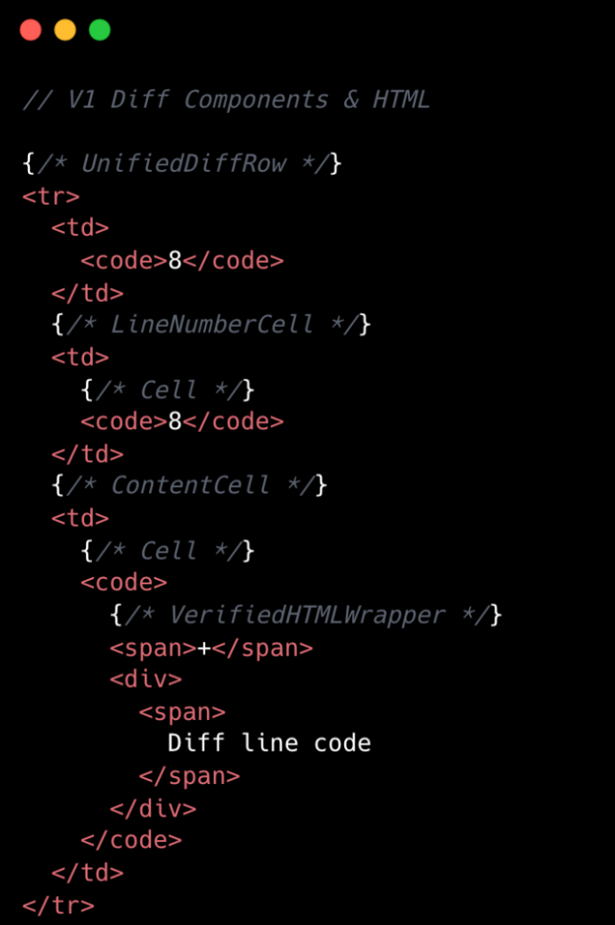
In v1, each diff line was expensive to render. In unified view, a single line required roughly 10 DOM elements; in split view, closer to 15. That’s before syntax highlighting, which adds many more <span> tags and drives the DOM count even higher.
The following is a simplified visual of the React Component structure mixed with the DOM tree elements for v1 diffs.
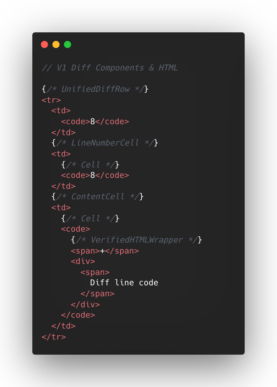
At the React layer, unified diffs typically contain at least eight components per line, while the split view contain a minimum of 13. And these numbers represent baseline counts; extra UI states like comments, hover, and focus could add more components on top.
This approach made sense to us in v1, when we first ported the diff lines to React from our classic Rails view. Our original plan centered around lots of small reusable React components and maintaining DOM tree structure.
But we also ended up attaching a lot of React event handlers in our small components, often five to six per component. On a small scale, that was fine, but on a large scale that compounded quickly. A single diff line could carry 20+ event handlers multiplied across thousands of lines.
Beyond performance impact, it also increased complexity for developers. This is a familiar scenario where you implement an initial design, only to discover later its limitations when faced with the demands of unbounded data.
To summarize, for every v1 diff line there would be:
- Minimum of 10-15 DOM tree elements
- Minimum of 8-13 React Components
- Minimum of 20 React Event Handlers
- Lots of small re-usable React Components
This v1 strategy proved unsustainable for our largest pull requests, as we consistently observed that larger pull request sizes directly led to slower INP and increased JavaScript heap usage. We needed to determine the best path for improving this setup.
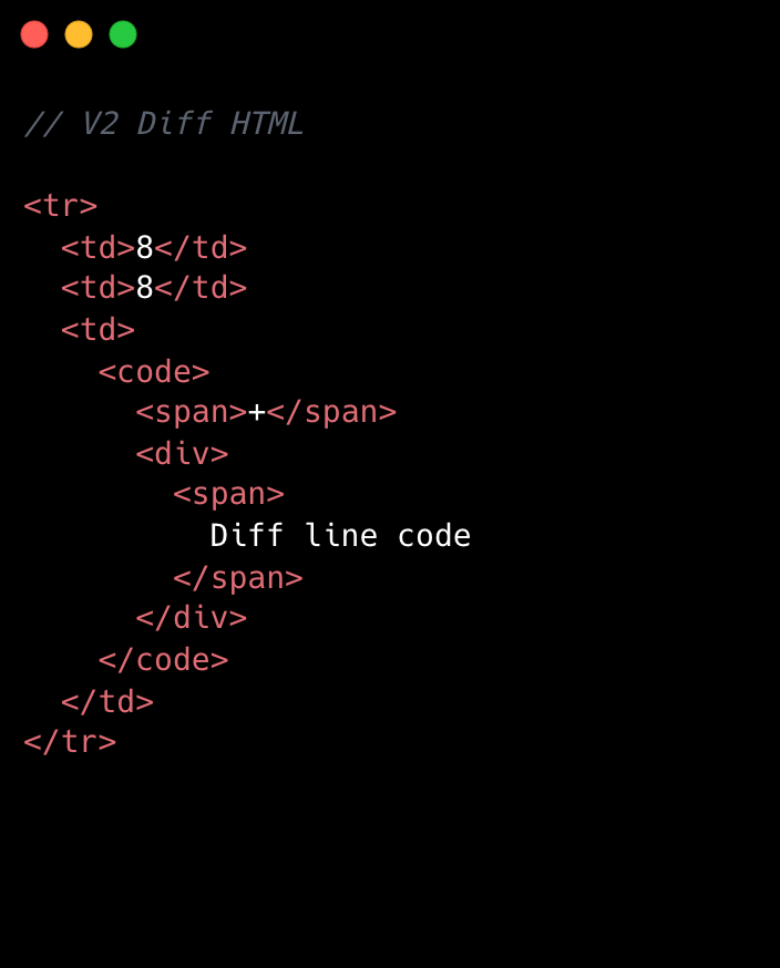
Small changes make a large impact: v2
No change is too small when it comes to performance, especially at scale. For example, we removed unnecessary <code> tags from our line number cells. While dropping two DOM nodes per diff line might appear minor, across 10,000 lines, that’s 20,000 fewer nodes in the DOM. These kinds of targeted, incremental optimizations, no matter how small, compound to create a much faster and more efficient experience. By not overlooking these details, we ensured that every opportunity for improvement was captured, amplifying the overall impact on our largest pull requests.
Refer to the images below to see how v1 looks compared to v2.
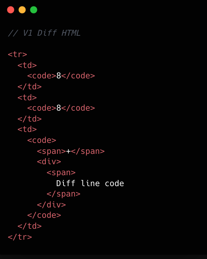
This becomes clearer if we look at the component structure behind this HTML:
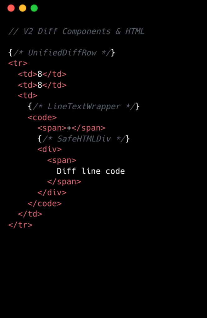
We went from eight components per diff line to two. Most of the v1 components were thin wrappers that let us share code between Split and Unified views. But that abstraction had a cost: each wrapper carried logic for both views, even though only one rendered at a time. In v2, we gave each view its own dedicated component. Some code is duplicated, but the result is simpler and faster.
Simplifying the component tree
For v2, we removed deeply nested component trees, opting for dedicated components for each split and unified diff line. While this led to some code duplication, it simplified data access and reduced complexity.
Event handling is now managed by a single top-level handler using data-attribute values. So, for instance, when you click and drag to select multiple diff lines, the handler checks each event’s data-attribute to determine which lines to highlight, instead of each line having its own mouse enter function. This approach streamlines both code and improves performance.
Moving complex state to conditionally rendered child components
The most impactful change from v1 to v2 was moving app state for commenting and context menus into their respective components. Given GitHub’s scale, where some pull requests exceed thousands of lines of code, it isn’t practical for every line to carry complex commenting state when only a small subset of lines will ever have comments or menus open. By moving the commenting state into the nested components for each diff line, we ensured that the diff-line component’s main responsibility is just rendering code—aligning more closely with the Single Responsibility Principle.
O(1) data access and less “useEffect” hooks
In v1, we gradually accumulated a lot of O(n) lookups across shared data stores and component state. We also introduced extra re-rendering through useEffect hooks scattered throughout the diff-line component tree.
To address this in v2, we adopted a two-part strategy. First, we restricted useEffect usage strictly to the top level of diff files. We also established linting rules to prevent the introduction of useEffect hooks in line-wrapping React components. This approach enables accurate memoization of diff line components and ensures reliable, predictable behavior.
Next, we redesigned our global and diff state machines to utilize O(1) constant time lookups by employing JavaScript Map. This let us build fast, consistent selectors for common operations throughout our codebase, such as line selection and comment management. These changes have enhanced code quality, improved performance, and reduced complexity by maintaining flattened, mapped data structures.
Now, any given diff line simply checks a map by passing the file path and the line number to determine whether or not there are comments on that line. An access might look like: commentsMap[‘path/to/file.tsx’][‘L8’]
Did it work?
Definitely. The page runs faster than it ever did, and JavaScript heap and INP numbers are massively reduced. For a numeric look, check out the results below. These metrics were evaluated on a pull request using a split diff setting with 10,000 line changes in the diff comparison.
| Metric | v1 | v2 | Improvement |
|---|---|---|---|
| Total lines of code | 2,800 | 2,000 | 27% less |
| Total unique component types | 19 | 10 | 47% fewer |
| Total components rendered | ~183,504 | ~50,004 | 74% fewer |
| Total DOM nodes | ~200,000 | ~180,000 | 10% fewer |
| Total memory usage | ~150-250 MB | ~80-120 MB | ~50% less |
| INP on a large pull request using m1 MacBook pro with 4x slowdown: | ~450 ms | ~100 ms | ~78% faster |
As you can see, this effort had a massive impact, but the improvements didn’t end there.
Virtualization for our largest pull requests
When you’re working with massive pull requests—p95+ (those with over 10,000 diff lines and surrounding context lines)—the usual performance tricks just don’t cut it. Even the most efficient components will struggle if we try to render tens of thousands of them at once. That’s where window virtualization steps in.
In front-end development, window virtualization is a technique that keeps only the visible portion of a large list or dataset in the DOM at any given time. Instead of loading everything (which would crush memory and slow things to a crawl), it dynamically renders just what you see on screen, and swaps in new elements as you scroll. This approach is like having a moving “window” over your data, so your browser isn’t bogged down by off-screen content.
To make this happen, we integrated TanStack Virtual into our diff view, ensuring that only the visible portion of the diff list is present in the DOM at any time. The impact was huge: we saw a 10X reduction in JavaScript heap usage and DOM nodes for p95+ pull requests. INP fell from 275–700+ milliseconds (ms) to just 40–80 ms for those big pull requests. By only showing what’s needed, the experience is much faster.
Further performance optimizations
To push performance even further, we tackled several major areas across our stack, each delivering meaningful wins for speed and responsiveness. By focusing on trimming unnecessary React re-renders and honing our state management, we cut down wasted computation, making UI updates noticeably faster and interactions smoother.
On the styling front, we swapped out heavy CSS selectors (e.g. :has(...)) and re-engineered drag and resize handling with GPU transforms, eliminating forced layouts and sluggishness and giving users a crisp, efficient interface for complex actions.
We also stepped up our monitoring game with interaction-level INP tracking, diff-size segmentation, and memory tagging, all surfaced in a Datadog dashboard. This continues to give our developers real-time, actionable metrics to spot and squash bottlenecks before they become issues.
On the server side, we optimized rendering to hydrate only visible diff lines. This slashed our time-to-interactive and keeps memory usage in check, ensuring that even huge pull requests feel fast and responsive on load.
Finally, with progressive diff loading and smart background fetches, users are now able to see and interact with content sooner. No more waiting for a massive number of diffs to finish loading.
All together, these targeted optimizations made our UI feel lighter, faster, and ready for anything our users throw at it.
Diff-initely better: The power of streamlined performance
This exciting journey to streamline the diff line architecture yielded substantial improvements in performance, efficiency and maintainability. By reducing unnecessary DOM nodes, simplifying our React component tree, and relocating complex state to conditionally rendered child components, we achieved faster rendering times and lower memory consumption. The adoption of more O(1) data access patterns and stricter rules for state management further optimized performance. This made our UI more responsive (faster INP!) and easier to reason with.
These measurable gains demonstrate that targeted refactoring, even within our large and mature codebase, can deliver meaningful benefits to all users—and that sometimes focusing on small, simple improvements can have the largest impact. To see the performance gains in action, go check out your open pull requests.
The post The uphill climb of making diff lines performant appeared first on The GitHub Blog.
]]>I used coding agents to build agents that automated part of my job. Here's what I learned about working better with coding agents.
The post Agent-driven development in Copilot Applied Science appeared first on The GitHub Blog.
]]>I may have just automated myself into a completely different job…
This is a familiar pattern among software engineers, who often, through inspiration, frustration, or sometimes even laziness, build systems to remove toil and focus on more creative work. We then end up owning and maintaining those systems, unlocking that automated goodness for the rest of those around us.
As an AI researcher, I recently took this beyond what was previously possible and have automated away my intellectual toil. And now I find myself maintaining this tool to enable all my peers on the Copilot Applied Science team to do the same.
During this process, I learned a lot about how to effectively create and collaborate using GitHub Copilot. Applying these learnings has unlocked an incredibly fast development loop for myself as well as enabled my team mates to build solutions to fit their needs.
Before I get into explaining how I made this possible, let me set the stage for what spawned this project so you better understand the scope of what you can do with GitHub Copilot.
The impetus
A large part of my job involves analyzing coding agent performance as measured against standardized evaluation benchmarks, like TerminalBench2 or SWEBench-Pro. This often involves poring through tons of what are called trajectories, which are essentially lists of the thought processes and actions agents take while performing tasks.
Each task in an evaluation dataset produces its own trajectory, showing how the agent attempted to solve that task. These trajectories are often .json files with hundreds of lines of code. Multiply that over dozens of tasks in a benchmark set and again over the many benchmark runs needing analysis on any given day, and we’re talking hundreds of thousands of lines of code to analyze.
It’s an impossible task to do alone, so I would typically turn to AI to help. When analyzing new benchmark runs, I found that I kept repeating the same loop: I used GitHub Copilot to surface patterns in the trajectories then investigated them myself—reducing the number of lines of code I had to read from hundreds of thousands to a few hundred.
However, the engineer in me saw this repetitive task and said, “I want to automate that.” Agents provide us with the means to automate this kind of intellectual work, and thus eval-agents was born.
The plan
Engineering and science teams work better together. That was my guiding principle as I set about solving this new challenge.
Thus, I approached the design and implementation strategy of this project with a couple of goals in mind:
- Make these agents easy to share and use
- Make it easy to author new agents
- Make coding agents the primary vehicle for contributions
Bullets one and two are in GitHub’s lifeblood and are values and skills I’ve gained throughout my career, especially during my stint as an OSS maintainer on the GitHub CLI.
However, goal three shaped the project the most. I noticed that when I set GitHub Copilot up to help me build the tool effectively, it also made the project easier to use and collaborate on. That experience taught me a few key lessons, which ultimately helped push the first and second goals forward in ways I didn’t expect.
Making coding agents your primary contributor
I’ll start by describing my agentic coding setup:
- Coding agent: Copilot CLI
- Model used: Claude Opus 4.6
- IDE: VSCode
It’s also noteworthy that I leveraged the Copilot SDK to accelerate agent creation, which is powered under the hood by the Copilot CLI. This gave me access to existing tools and MCP servers, a way to register new tools and skills, and a whole bunch of other agentic goodness out of the box that I didn’t have to reinvent myself.
With that out of the way, I could streamline the whole development process very quickly by following a few core principles:
- Prompting strategies: agents work best when you’re conversational, verbose, and when you leverage planning modes before agent modes.
- Architectural strategies: refactor often, update docs often, clean up often.
- Iteration strategies: “trust but verify” is now “blame process, not agents.”
Uncovering and following these strategies led to an incredible phenomenon: adding new agents and features was fast and easy. We had five folks jump into the project for the first time, and we created a total of 11 new agents, four new skills, and the concept of eval-agent workflows (think scientist streams of reasoning) in less than three days. That amounted to a change of +28,858/-2,884 lines of code across 345 files.
Holy crap!
Below, I’ll go into detail about these three principles and how they enabled this amazing feat of collaboration and innovation.
Prompting strategies
We know that AI coding agents are really good at solving well-scoped problems but need handholding for the more complex problems you’d only entrust to your more senior engineers.
So, if you want your agent to act like an engineer, treat it like one. Guide its thinking, over-explain your assumptions, and leverage its research speed to plan before jumping into changes. I found it far more effective to put some stream-of-consciousness musings about a problem I was chewing on into a prompt and working with Copilot in planning mode than to give it a terse problem statement or solution.
Here’s an example of a prompt I wrote to add more robust regression tests to the tool:
> /plan I've recently observed Copilot happily updating tests to fit its new paradigms even though those tests shouldn't be updated. How can I create a reserved test space that Copilot can't touch or must reserve to protect against regressions?This resulted in a back and forth that ultimately led to a series of guardrails akin to contract testing that can only be updated by humans. I had an idea of what I wanted, and through conversation, Copilot helped me get to the right solution.
It turns out that the things that make human engineers the most effective at doing their jobs are the same things that make these agents effective at doing theirs.
Architectural strategies
Engineers, rejoice! Remember all those refactors you wanted to do to make the codebase more readable, the tests you never had time to write, and the docs you wish had existed when you onboarded? They’re now the most important thing you can be working on when building an agent-first repository.
Gone are the days where deprioritizing this work over new feature work was necessary, because delivering features with Copilot becomes trivial when you have a well-maintained, agent-first project.
I’ve spent most of my time on this project refactoring names and file structures, documenting new features or patterns, and adding test cases for problems that I’ve uncovered as I go. I’ve even spent a few cycles cleaning up the dead code that the agents (like your junior engineers) may have missed while implementing all these new features and changes.
This work makes it easy for Copilot to navigate the codebase and understand the patterns, just like it would for any other engineer.
I can even ask, “Knowing what I know now, how would I design this differently?” And I can then justify actually going back and rearchitecting the whole project (with the help of Copilot, of course).
It’s a dream come true!
And this leads me to my last bit of guidance.
Iteration strategies
As agents and models have improved, I have moved from a “trust but verify” mindset to one that is more trusting than doubtful. This mirrors how the industry treats human teams: “blame process, not people.” It’s how the most effective teams operate, because people make mistakes, so we build systems around that reality.
This idea of blameless culture provides psychological safety for teams to iterate and innovate, knowing that they won’t be blamed if they make a mistake. The core principle is that we implement processes and guardrails to protect against mistakes, and if a mistake does happen, we learn from it and introduce new processes and guardrails so that our teams won’t make the same mistake again.
Applying this same philosophy to agent-driven development has been fundamental to unlocking this incredibly rapid iteration pipeline. That means we add processes and guardrails to help prevent the agent from making mistakes, but when it does make a mistake, we add additional guardrails and processes—like more robust tests and better prompts—so the agent can’t make the same mistake again. Taking this one step further means that practicing good CI/CD principles is a must.
Practices like strict typing ensure the agent conforms to interfaces. Robust linters impose implementation rules on the agent that keep it following good patterns and practices. And integration, end-to-end, and contract tests—which can be expensive to build manually—become much cheaper to implement with agent assistance, while giving you confidence that new changes don’t break existing features.
When Copilot has these tools available in its development loop, it can check its own work. You’re setting it up for success, much in the same way you’d set up a junior engineer for success in your project.
Putting it all together
Here’s what all this means for your development loop when you’ve got your codebase set up for agent-driven development:
- Plan a new feature with Copilot using
/plan.- Iterate on the plan.
- Ensure that testing is included in the plan.
- Ensure that docs updates are included in the plan and done before code is implemented. These can serve as additional guidelines that live beside your plan.
- Let Copilot implement the feature on
/autopilot. - Prompt Copilot to initiate a review loop with the Copilot Code Review agent. For me, it’s often something like:
request Copilot Code Review, wait for the review to finish, address any relevant comments, and then re-request review. Continue this loop until there are no more relevant comments. - Human review. This is where I enforce the patterns I discussed in the previous sections.
Additionally, outside of your feature loop, be sure you’re prompting Copilot early and often with the following:
/plan Review the code for any missing tests, any tests that may be broken, and dead code/plan Review the code for any duplication or opportunities for abstraction/plan Review the documentation and code to identify any documentation gaps. Be sure to update the copilot-instructions.md to reflect any relevant changes
I have these run automatically once a week, but I often find myself running them throughout the week as new features and fixes go in to maintain my agent-driven development environment.
Take this with you
What started as a frustration with an impossibly repetitive analysis task turned into something far more interesting: a new way of thinking about how we build software, how we collaborate, and how we grow as engineers.
Building agents with a coding agent-first mindset has fundamentally changed how I work. It’s not just about the automation wins—though watching four scientists ship 11 agents, four skills, and a brand-new concept in under three days is nothing short of remarkable. It’s about what this style of development forces you to prioritize: clean architecture, thorough documentation, meaningful tests, and thoughtful design—the things we always knew mattered but never had time for.
The analogy to a junior engineer keeps proving itself out. You onboard them well, give them clear context, build guardrails so their mistakes don’t become disasters, and then trust them to grow. If something goes wrong, you blame the process. Not the agent. If there’s one thing I want you to take away from this, it’s that the skills that make you a great engineer and a great teammate are the same skills that make you great at building with Copilot. The technology is new. The principles aren’t.
So go clean up that codebase, write that documentation you’ve been putting off, and start treating your Copilot like the newest member of your team. You might just automate yourself into the most interesting work of your career.
Think I’m crazy? Well, try this:
- Download Copilot CLI
- Activate Copilot CLI in any repo:
cd <repo_path> && copilot - Paste in the following prompt:
/plan Read <link to this blog post> and help me plan how I could best improve this repo for agent-first development
The post Agent-driven development in Copilot Applied Science appeared first on The GitHub Blog.
]]>AI automates triage for accessibility feedback, allowing us to focus on fixing barriers—turning a chaotic backlog into continuous, rapid resolutions.
The post Continuous AI for accessibility: How GitHub transforms feedback into inclusion appeared first on The GitHub Blog.
]]>For years, accessibility feedback at GitHub didn’t have a clear place to go.
Unlike typical product feedback, accessibility issues don’t belong to any single team—they cut across the entire ecosystem. For example, a screen reader user might report a broken workflow that touches navigation, authentication, and settings. A keyboard-only user might hit a trap in a shared component used across dozens of pages. A low vision user might flag a color contrast issue that affects every surface using a shared design element. No single team owns any of these problems—but every one of them blocks a real person.
These reports require coordination that our existing processes weren’t originally built for. Feedback was often scattered across backlogs, bugs lingered without owners, and users followed up to silence. Improvements were often promised for a mythical “phase two” that rarely materialized.
We knew we needed to change this. But before we could build something better, we had to lay the groundwork—centralizing scattered reports, creating templates, and triaging years of backlog. Only once we had that foundation in place could we ask: How can AI make this easier?
The answer was an internal workflow, powered by GitHub Actions, GitHub Copilot, and GitHub Models, that ensures every piece of user and customer feedback becomes a tracked, prioritized issue. When someone reports an accessibility barrier, their feedback is captured, reviewed, and followed through until it’s addressed. We didn’t want AI to replace human judgment—we wanted it to handle repetitive work so humans could focus on fixing the software.
This is how we went from chaos to a system where every piece of accessibility feedback is tracked, prioritized, and acted on—not eventually, but continuously.
Accessibility as a living system
Continuous AI for accessibility weaves inclusion into the fabric of software development. It’s not a single product or a one-time audit—it’s a living methodology that combines automation, artificial intelligence, and human expertise.
This philosophy connects directly to our support for the 2025 Global Accessibility Awareness Day (GAAD) pledge: strengthening accessibility across the open source ecosystem by ensuring user and customer feedback is routed to the right teams and translated into meaningful platform improvements.
The most important breakthroughs rarely come from code scanners—they come from listening to real people. But listening at scale is hard, which is why we needed technology to help amplify those voices. We built a feedback workflow that functions less like a static ticketing system and more like a dynamic engine—leveraging GitHub products to clarify, structure, and track user and customer feedback, turning it into implementation-ready solutions.
Designing for people first
Before jumping into solutions, we stepped back to understand who this system needed to serve:
- Issue submitters: Community managers, support agents, and sales reps submit issues on behalf of users and customers. They aren’t always accessibility experts, so they need a system that guides them and teaches accessibility concepts in the flow of work.
- Accessibility and service teams: Engineers and designers responsible for fixes need structured, actionable data—reproducible steps, WCAG mapping, severity scores, and clear ownership.
- Program and product managers: Leadership needs visibility into pain points by category, trends, and progress over time to allocate resources strategically.
With these personas in mind, we knew we wanted to 1) treat feedback as data flowing through a pipeline and 2) build a system able to evolve with us.
How feedback flows
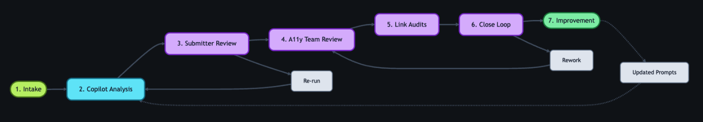
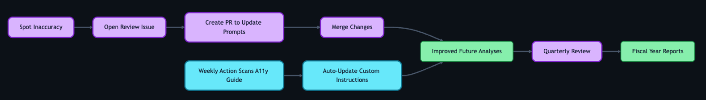
With that foundation set, we built an architecture around an event-driven pattern, where each step triggers a GitHub Action that orchestrates what comes next—ensuring consistent handling no matter where the feedback originates. We built this system largely by hand starting in mid-2024. Today, tools like Agentic Workflows let you create GitHub Actions using natural language—meaning this kind of system could be built in a fraction of the time.
The workflow reacts to key events: Issue creation launches GitHub Copilot analysis via the GitHub Models API, status changes initiate hand-offs between teams, and resolution triggers submitter follow-up with the user. Every Action can also be triggered manually or re-run as needed—automation covers the common path, while humans can step in at any point.
Feedback isn’t just captured—it continuously flows through the right channels, providing visibility, structure, and actionability at every stage.
*Click images to enlarge.
1. Actioning intake
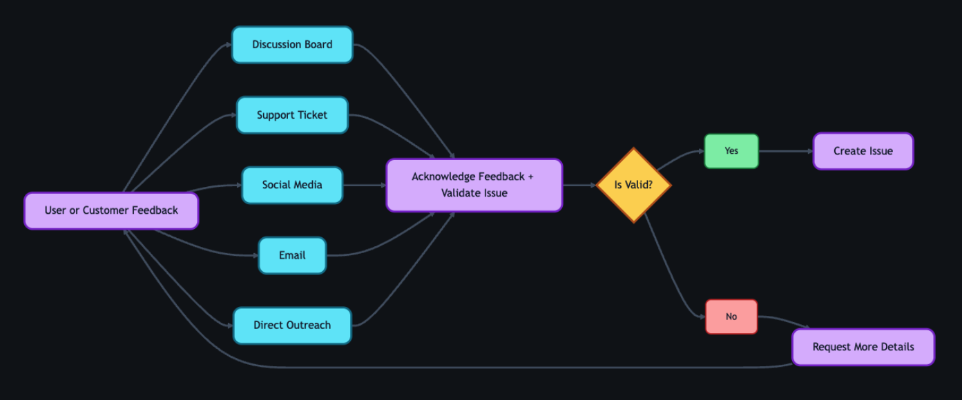
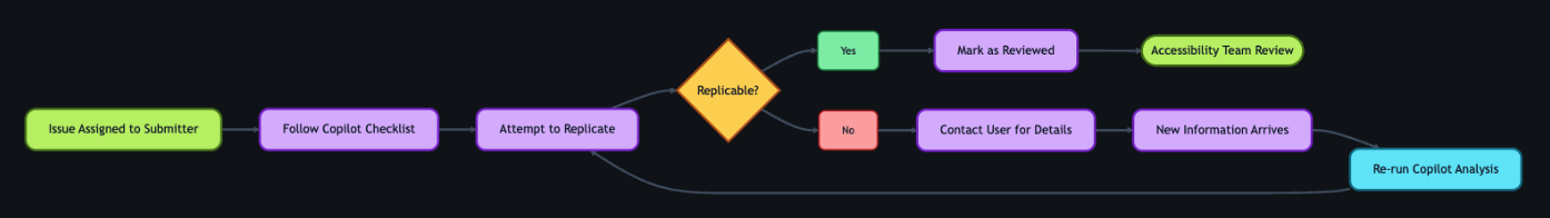
Feedback can come from anywhere—support tickets, social media posts, email, direct outreach—but most users choose the GitHub accessibility discussion board. It’s where they can work together and build community around shared experiences. Today, 90% of the accessibility feedback flows through that single channel. Because posts are public, other users can confirm the problem, add context, or suggest workarounds—so issues often arrive with richer detail than a support ticket ever could. Regardless of the source, every piece of feedback gets acknowledged within five business days, and even feedback we can’t act on gets a response pointing to helpful resources.
When feedback requires action from internal teams, a team member manually creates a tracking issue using our custom accessibility feedback issue template. Issue templates are pre-defined forms that standardize how information is collected when opening a new issue. The template captures the initial context—what the user reported, where it came from, and which components are involved—so nothing is lost between intake and triage.
This is where automation kicks in. Creating the issue triggers a GitHub Action that engages GitHub Copilot, and a second Action adds the issue to a project board, providing a centralized view of current status, surfacing trends, and helping identify emerging needs.
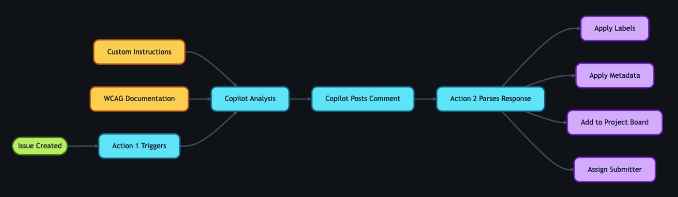
2. GitHub Copilot analysis
With the tracking issue created, a GitHub Action workflow programmatically calls the GitHub Models API to analyze the report. We chose stored prompts over model fine-tuning so that anyone on the team can update the AI’s behavior through a pull request—no retraining pipeline, no specialized ML knowledge required.
We configured GitHub Copilot using custom instructions developed by our accessibility subject matter experts. Our prompt serves two roles: triage analysis, which classifies issues by WCAG violation, severity, and affected user group, and accessibility coaching, where GitHub Copilot acts as a subject-matter expert to help teams write and review accessible code.
These instruction files point to our accessibility policies, component library, and internal documentation that details how we interpret and apply WCAG success criteria. When our standards evolve, the team updates the markdown and instruction files via pull request—the AI’s behavior changes with the next run, not the next training cycle. For a detailed walkthrough of this approach, see our guide on optimizing GitHub Copilot custom instructions for accessibility.
The automation works in two steps. First, an Action fires on issue creation and triggers GitHub Copilot to analyze the report. GitHub Copilot populates approximately 80% of the issue’s metadata automatically—over 40 data points including issue type, user segment, original source, affected components, and enough context to understand the user’s experience. The remaining 20% requires manual input from the team member. GitHub Copilot then posts a comment on the issue containing:
- A summary of the problem and user impact
- Suggested WCAG success criteria for potential violations
- Severity level (sev1 through sev4, where sev1 is critical)
- Impacted user groups (screen reader users, keyboard users, low vision users, etc.)
- Recommended team assignment (design, engineering, or both)
- A checklist of low-barrier accessibility tests so the submitter can verify the issue
Then a second Action fires on that comment, parses the response, applies labels based on the severity GitHub Copilot assigned, updates the issue’s status on the project board, and assigns it to the submitter for review.
If GitHub Copilot’s analysis seems off, anyone can flag it by opening an issue describing what it got wrong and what it should have said—feeding directly into our continuous improvement process.
3. Submitter review
Before we act on GitHub Copilot’s recommendations, two layers of review happen—starting with the issue submitter.
The submitter attempts to replicate the problem the user reported. The checklist GitHub Copilot provides in its comment guides our community managers, support agents, and sales reps through expert-level testing procedures—no accessibility expertise required. Each item includes plain-language explanations, step-by-step instructions, and links to tools and documentation.
Example questions include:
- Can you navigate the page using only a keyboard? Press “Tab” to move through interactive elements. Can you reach all buttons, links, and form fields? Can you see where your focus is at all times?
- Do images have descriptive alt text? Right-click an image and select “Inspect” to view the markup. Does the
altattribute describe the image’s purpose, or is it a generic file name? - Are interactive elements clearly labeled? Using a screen reader, navigate to a button or link. Is its purpose announced clearly? Alternatively, review the accessibility tree in your browser’s developer tools to inspect how elements are exposed to assistive technologies.
If the submitter can replicate the problem, they mark the issue as reviewed, which triggers the next GitHub Action. If they can’t reproduce it, they reach out to the user for more details. Once new information arrives, the submitter can re-run the GitHub Copilot analysis—either by manually triggering the Action from the Actions tab or by removing and re-adding the relevant label to kick it off automatically. AI provides the draft, but humans provide the verification.
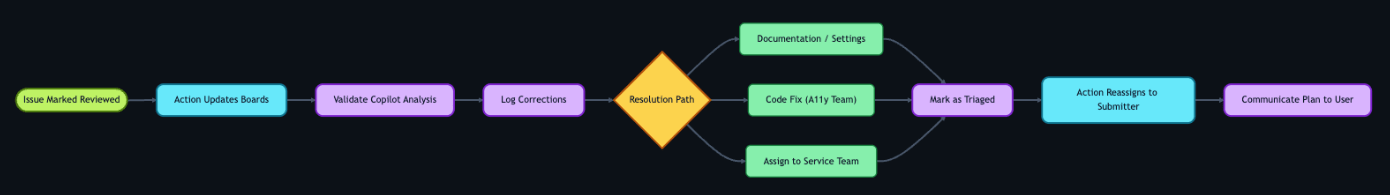
4. Accessibility team review
Once the submitter marks the issue as reviewed, a GitHub Action updates its status on the workflow project board and adds it to a separate accessibility first responder board. This alerts the accessibility team—engineers, designers, champions, testing vendors, and managers—that GitHub Copilot’s analysis is ready for their review.
The team validates GitHub Copilot’s analysis—checking the severity level, WCAG mapping, and category labels—and corrects anything the AI got wrong. When there’s a discrepancy, we assume the human is correct. We log these corrections and use them to refine the prompt files, improving future accuracy.
Once validated, the team determines the resolution approach:
- Documentation or settings update: Provide the solution directly to the user.
- Code fix by the accessibility team: Create a pull request directly.
- Service team needed: Assign the issue to the appropriate service team and track it through resolution.
With a path forward set, the team marks the issue as triaged. An Action then reassigns it to the submitter, who communicates the plan to the user—letting them know what’s being done and what to expect.
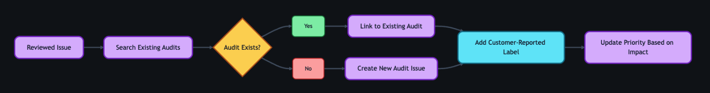
5. Linking to audits
As part of the review process, the team connects user and customer feedback to our formal accessibility audit system.
Roughly 75–80% of the time, reported issues correspond to something we already know about from internal audits. Instead of creating duplicates, we find the existing internal audit issue and add a customer-reported label. This lets us prioritize based on real-world impact—a sev2 issue might technically be less critical than a sev1, but if multiple users are reporting it, we bump up its priority.
If the feedback reveals something new, we create a new audit issue and link it to the tracking issue.
6. Closing the loop
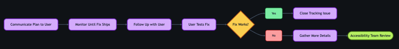
This is the most critical step for trust. Users who take the time to report accessibility barriers deserve to know their feedback led to action.
Once a resolution path is set, the submitter reaches out to the original user to let them know the plan—what’s being fixed, and what to expect. When the fix ships, the submitter follows up again and asks the user to test it. Because most issues originate from the community discussion board, we post confirmations there for everyone to see.
If the user confirms the fix works, we close the tracking issue. If the fix doesn’t fully address the problem, the submitter gathers more details and the process loops back to the accessibility team review. We don’t close issues until the user confirms the fix works for them.
7. Continuous improvement
The workflow doesn’t end when an issue closes—it feeds back into itself.
When submitters or accessibility team members spot inaccuracies in GitHub Copilot’s output, they open a new issue requesting a review of the results. Every GitHub Copilot analysis comment includes a link to create this issue at the bottom, so the feedback loop is built into the workflow itself. The team reviews the inaccuracy, and the correction becomes a pull request to the custom instruction and prompt files described earlier.
We also automate the integration of new accessibility guidance. A separate GitHub Action scans our internal accessibility guide repository weekly and incorporates changes into GitHub Copilot’s custom instructions automatically.
The goal isn’t perfection—it’s continuous improvement. Each quarter, we review accuracy metrics and refine our instructions. These reviews feed into quarterly and fiscal year reports that track resolution times, WCAG failure patterns, and feedback volume trends—giving leadership visibility into both progress and persistent gaps. The system gets smarter over time, and now we have the data to show it.
Impact in numbers
A year ago, nearly half of accessibility feedback sat unresolved for over 300 days. Today, that backlog isn’t just smaller—it’s gone. And the improvements don’t stop there.
- 89% of issues now close within 90 days (up from 21%)
- 62% reduction in average resolution time (118 days → 45 days)
- 70% reduction in manual administrative time
- 1,150% increase in issues resolved within 30 days (4 → 50 year-over-year)
- 50% reduction in critical sev1 issues
- 100% of issues closed within 60 days in our most recent quarter
We track this through automated weekly and quarterly reports generated by GitHub Actions—surfacing which WCAG criteria fail most often and how resolution times trend over time.
Beyond the numbers
A user named James emailed us to report that the GitHub Copilot CLI was inaccessible. Decorative formatting created noise for screen readers, and interactive elements were impossible to navigate.
A team member created a tracking issue. Within moments, GitHub Copilot analyzed the report—mapping James’s description to specific technical concepts, linking to internal documentation, and providing reproduction steps so the submitter could experience the product exactly as James did.
With that context, the team member realized our engineering team had already shipped accessible CLI updates earlier in the year—James simply wasn’t aware.
They replied immediately. His response? “Thanks for pointing out the –screen-reader mode, which I think will help massively.”
Because the AI workflow identified the problem correctly, we turned a frustration into a resolution in hours.
But the most rewarding result isn’t the speed—it’s the feedback from users. Not just that we responded, but that the fixes actually worked for them:
- “Huge thanks to the team for updating the contributions graph in the high contrast theme. The addition of borders around the grid edges is a small but meaningful improvement. Keep it up!”
- “Let’s say you want to create several labels for your GitHub-powered workflow: bug, enhancement, dependency updates… But what if you are blind? Before you had only hex codes randomly thrown at you… now it’s fixed, and those colors have meaningful English names. Well done, GitHub!”
- “This may not be very professional but I literally just screamed! This fix has actually made my day… Before this I was getting my wife to manage the GitHub issues but now I can actually navigate them by myself! It means a lot that I can now be a bit more independent so thank you again.”
That independence is the point. Every workflow, every automation, every review—it all exists so moments like these are the expectation, not the exception.
The bigger picture
Stories like these remind us why the foundation matters. Design annotations, code scanners, accessibility champions, and testing with people with disabilities—these aren’t replaced by AI. They are what make AI-assisted workflows effective. Without that human foundation, AI is just a faster way to miss the point.
We’re still learning, and the system is still evolving. But every piece of feedback teaches us something, and that knowledge now flows continuously back to our team, our users, and the tools we build.
If you maintain a repository—whether it’s a massive enterprise project or a weekend open-source library—you can build this kind of system today. Start small. Create an issue template for accessibility. Add a .github/copilot-instructions.md file with your team’s accessibility standards. Let AI handle the triage and formatting so your team can focus on what really matters: writing more inclusive code.
And if you hit an accessibility barrier while using GitHub, please share your feedback. It won’t disappear into a backlog. We’re listening—and now we have the system to follow through.
The post Continuous AI for accessibility: How GitHub transforms feedback into inclusion appeared first on The GitHub Blog.
]]>Here's how we made the search experience better, faster, and more resilient for GHES customers.
The post How we rebuilt the search architecture for high availability in GitHub Enterprise Server appeared first on The GitHub Blog.
]]>So much of what you interact with on GitHub depends on search—obviously the search bars and filtering experiences like the GitHub Issues page, but it is also the core of the releases page, projects page, the counts for issues and pull requests, and more. Given that search is such a core part of the GitHub platform, we’ve spent the last year making it even more durable. That means, less time spent managing GitHub Enterprise Server, and more time working on what your customers care most about.
In recent years, GitHub Enterprise Server administrators had to be especially careful with search indexes, the special database tables optimized for searching. If they didn’t follow maintenance or upgrade steps in exactly the right order, search indexes could become damaged and need repair, or they might get locked and cause problems during upgrades. Quick context if you’re not running High Availability (HA) setups, they’re designed to keep GitHub Enterprise Server running smoothly even if part of the system fails. You have a primary node that handles all the writes and traffic, and replica nodes that stay in sync and can take over if needed.
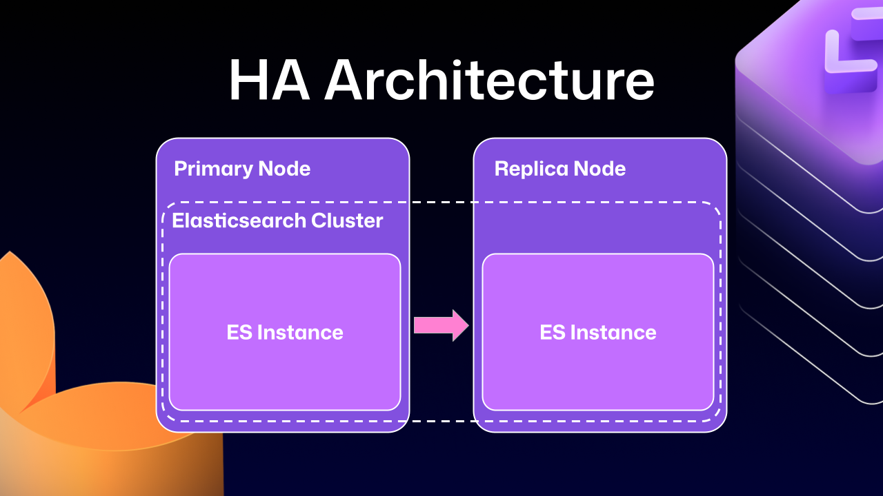
Much of this difficulty comes from how previous versions of Elasticsearch, our search database of choice, were integrated. HA GitHub Enterprise Server installations use a leader/follower pattern. The leader (primary server) receives all the writes, updates, and traffic. Followers (replicas) are designed to be read-only. This pattern is deeply ingrained into all of the operations of GitHub Enterprise Server.
This is where Elasticsearch started running into issues. Since it couldn’t support having a primary node and a replica node, GitHub engineering had to create an Elasticsearch cluster across the primary and replica nodes. This made replicating data straightforward and additionally gave some performance benefits, since each node could locally handle search requests.
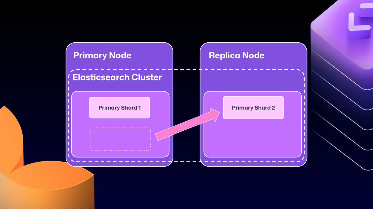
Unfortunately, the problems of clustering across servers eventually began to outweigh the benefits. For example, at any point Elasticsearch could move a primary shard (responsible for receiving/validating writes) to a replica. If that replica was then taken down for maintenance, GitHub Enterprise Server could end up in a locked state. The replica would wait for Elasticsearch to be healthy before starting up, but Elasticsearch couldn’t become healthy until the replica rejoined.
For a number of GitHub Enterprise Server releases, engineers at GitHub tried to make this mode more stable. We implemented checks to ensure Elasticsearch was in a healthy state, as well as other processes to try and correct drifting states. We went as far as attempting to build a “search mirroring” system that would allow us to move away from the clustered mode. But database replication is incredibly challenging and these efforts needed consistency.
What changed?
After years of work, we’re now able to use Elasticsearch’s Cross Cluster Replication (CCR) feature to support HA GitHub Enterprise.
“But David,” you say, “That’s replication between clusters. How does that help here?”
I’m so glad you asked. With this mode, we’re moving to use several, “single-node” Elasticsearch clusters. Now each Enterprise server instance will operate as independent single node Elasticsearch clusters.
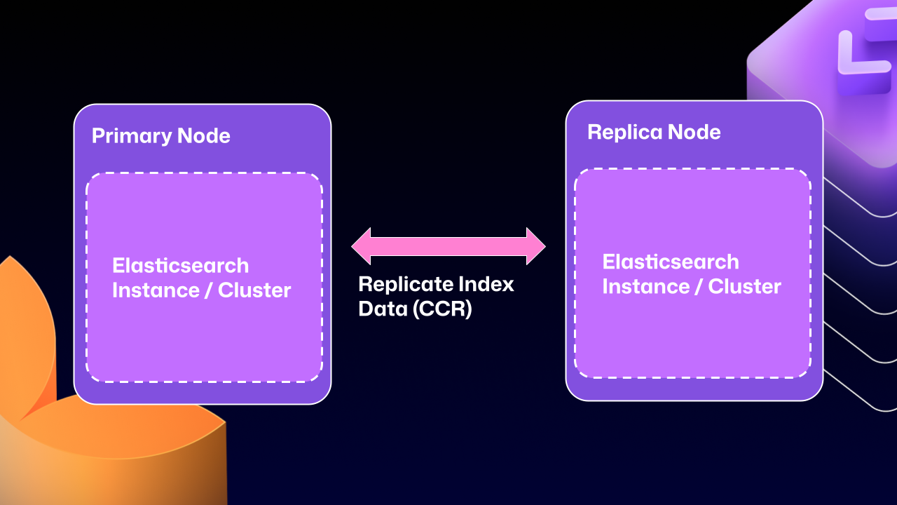
CCR lets us share the index data between nodes in a way that is carefully controlled and natively supported by Elasticsearch. It copies data once it’s been persisted to the Lucene segments (Elasticsearch’s underlying data store). This ensures we’re replicating data that has been durably persisted within the Elasticsearch cluster.
In other words, now that Elasticsearch supports a leader/follower pattern, GitHub Enterprise Server administrators will no longer be left in a state where critical data winds up on read-only nodes.
Under the hood
Elasticsearch has an auto-follow API, but it only applies to indexes created after the policy exists. GitHub Enterprise Server HA installations already have a long-lived set of indexes, so we need a bootstrap step that attaches followers to existing indexes, then enables auto-follow for anything created in the future.
Here’s a sample of what that workflow looks like:
function bootstrap_ccr(primary, replica):
  # Fetch the current indexes on each
  primary_indexes = list_indexes(primary)
  replica_indexes = list_indexes(replica)

  # Filter out the system indexes
  managed = filter(primary_indexes, is_managed_ghe_index)

  # For indexes without follower patterns we need to
  #   initialize that contract
  for index in managed:
    if index not in replica_indexes:
      ensure_follower_index(replica, leader=primary, index=index)
    else:
      ensure_following(replica, leader=primary, index=index)

  # Finally we will setup auto-follower patterns
  #   so new indexes are automatically followed
  ensure_auto_follow_policy(
    replica,
    leader=primary,
    patterns=[managed_index_patterns],
    exclude=[system_index_patterns]
  )
This is just one of the new workflows we’ve created to enable CCR in GitHub Enterprise Server. We’ve needed to engineer custom workflows for failover, index deletion, and upgrades. Elasticsearch only handles the document replication, and we’re responsible for the rest of the index’s lifecycle.
How to get started with CCR mode
To get started using the new CCR mode, reach out to [email protected] and let them know you’d like to use the new HA mode for GitHub Enterprise Server. They’ll set up your organization so that you can download the required license.
Once you’ve downloaded your new license, you’ll need to set `ghe-config app.elasticsearch.ccr true`. With that finished, administrators can run a `config-apply` or an upgrade on your cluster to move to 3.19.1, which is the first release to support this new architecture.
When your GitHub Enterprise Server restarts, Elasticsearch will migrate your installation to use the new replication method. This will consolidate all the data onto the primary nodes, break clustering across nodes, and restart replication using CCR. This update may take some time depending on the size of your GitHub Enterprise Server instance.
While the new HA method is optional for now, we’ll be making it our default over the next two years. We want to ensure there’s ample time for GitHub Enterprise administrators to get their feedback in, so now is the time to try it out.
We’re excited for you to start using the new HA mode for a more seamless experience managing GitHub Enterprise Server.
The post How we rebuilt the search architecture for high availability in GitHub Enterprise Server appeared first on The GitHub Blog.
]]>Learn how GitHub built an accessible, multi-terminal-safe ASCII animation for the Copilot CLI using custom tooling, ANSI color roles, and advanced terminal engineering.
The post From pixels to characters: The engineering behind GitHub Copilot CLI’s animated ASCII banner appeared first on The GitHub Blog.
]]>Most people think ASCII art is simple, and a nostalgic remnant of the early internet. But when the GitHub Copilot CLI team asked for a small entrance banner for the new command-line experience, they discovered the opposite: An ASCII animation in a real-world terminal is one of the most constrained UI engineering problems you can take on.
Part of what makes this even more interesting is the moment we’re in. Over the past year, CLIs have seen a surge of investment as AI-assisted and agentic workflows move directly into the terminal. But unlike the web—where design systems, accessibility standards, and rendering models are well-established—the CLI world is still fragmented. Terminals behave differently, have few shared standards, and offer almost no consistent accessibility guidelines. That reality shaped every engineering decision in this project.
Different terminals interpret ANSI color codes differently. Screen readers treat fast-changing characters as noise. Layout engines vary. Buffers flicker. Some users override global colors for accessibility. Others throttle redraw speed. There is no canvas, no compositor, no consistent rendering model, and no standard animation framework.
So when an animated Copilot mascot flying into the terminal appeared, it looked playful. But behind it was serious engineering work, unexpected complexity, a custom design toolchain, and a tight pairing between a designer and a long-time CLI engineer.
That complexity only became fully visible once the system was built. In the end, animating a three-second ASCII banner required over 6,000 lines of TypeScript—most of it dedicated not to visuals, but to handling terminal inconsistencies, accessibility constraints, and maintainable rendering logic.
This is the technical story of how it came together.
Why animated ASCII is a hard engineering problem
Before diving into the build process, it’s worth calling out why this problem space is more advanced than it looks.
Terminals don’t have a canvas
Unlike browsers (DOM), native apps (views), or graphics frameworks (GPU surfaces), terminals treat output as a stream of characters. There’s no native concept of:
- Frames
- Sprites
- Z-index
- Rasterized pixels
- Animation tick rates
Because of this, every “frame” has to be manually repainted using cursor movements and redraw commands. There’s no compositor smoothing anything over behind the scenes. Everything is stdout writes + ANSI control sequences.
ANSI escape codes are inconsistent, and terminal color is its own engineering challenge
ANSI escape codes like \x1b[35m (bright magenta) or \x1b[H (cursor home) behave differently across terminals—not just in how they render, but in whether they’re supported at all. Some environments (like Windows Command Prompt or older versions of PowerShell) have limited or no ANSI support without extra configuration.
But even in terminals that do support ANSI, the hardest part isn’t the cursor movement. It’s the colors.
When you’re building a CLI, you realistically have three approaches:
- Use no color at all. This guarantees broad compatibility, but makes it harder to highlight meaning or guide users’ attention—especially in dense CLI output.
- Use richer color modes (3-bit, 4-bit, 8-bit, or truecolor) that aren’t uniformly supported or customizable. This introduces a maintenance headache: Different terminals, themes, and accessibility profiles render the same color codes differently, and users often disagree about what “good” colors look like.
- Use a minimal, customizable palette (usually 4-bit colors) that most terminals allow users to override in their preferences. This is the safest path, but it limits how accurately you can represent a brand palette—and it forces you to design for environments with widely varying contrast and theme choices.
For the Copilot CLI animation, this meant treating color as a semantic system, not a literal one: Instead of committing specific RGB values, the team mapped high-level “roles” (eyes, goggles, shadow, border) to ANSI colors that degrade gracefully across different terminals and accessibility settings.
Accessibility is a first-class concern
Terminals are used by developers with a wide range of visual abilities—not just blind users with screen readers, but also low-vision users, color-blind users, and anyone working in high-contrast or customized themes.
That means:
- Rapid re-renders can create auditory clutter for screen readers
- Color-based meaning must degrade safely, since bold, dim, or subtle hues may not be perceivable
- Low-vision users may not see contrast differences that designers expect
- Animations must be opt-in, not automatic
- Clearing sequences must avoid confusing assistive technologies
This is also why the Copilot CLI animation ended up behind an opt-in flag early on—accessibility constraints shaped the architecture from the start.
These constraints guided every decision in the Copilot CLI animation. The banner had to work when colors were overridden, when contrast was limited, and even when the animation itself wasn’t visible.
Ink (React for the terminal) helps, but it’s not an animation engine
Ink lets you build terminal interfaces using React components, but:
- It re-renders on every state change
- It doesn’t manage frame deltas
- It doesn’t synchronize with terminal paint cycles
- It doesn’t solve flicker or cursor ghosting
Which meant animation logic had to be handcrafted.
Frame-based ASCII animation has no existing workflow for designers
There are tools for ASCII art, but virtually none for:
- Frame-by-frame editing
- Multi-color ANSI previews
- Exporting color roles
- Generating Ink-ready components
- Testing contrast and accessibility
Even existing ANSI preview tools don’t simulate how different terminals remap colors or handle cursor updates, which makes accurate design iteration almost impossible without custom tooling. So the team had to build one.
Part 1: A request that didn’t fit any workflow
Cameron Foxly (@cameronfoxly), a brand designer at GitHub with a background in animation, was asked to create a banner for the Copilot CLI.
“Normally, I’d build something in After Effects and hand off assets,” Cameron said. “But engineers didn’t have the time to manually translate animation frames into a CLI. And honestly, I wanted something more fun.”
He’d seen the static ASCII intro in Claude Code and knew Copilot deserved more personality.
The 3D Copilot mascot flying in to reveal the CLI logo felt right. But after attempting to create just one frame manually, the idea quickly ran into reality.
“It was a nightmare,” Cameron said. “If this is going to exist, I need to build my own tool.”
Part 2: Building an ASCII animation editor from scratch
Cameron opened an empty repository in VS Code, and began asking GitHub Copilot for help scaffolding an animation MVP that could:
- Read text files as frames
- Render them sequentially
- Control timing
- Clear the screen without flicker
- Add a primitive “UI”
Within an hour, he had a working prototype that was monochrome, but functional.
Simplified early animation loop
Below is a simplified example variation of the frame loop logic Cameron prototyped:
import fs from "fs";
import readline from "readline";

/**
 * Load ASCII frames from a directory.
 */
const frames = fs
  .readdirSync("./frames")
  .filter(f => f.endsWith(".txt"))
  .map(f => fs.readFileSync(`./frames/${f}`, "utf8"));

let current = 0;

function render() {
  // Move cursor to top-left of terminal
  readline.cursorTo(process.stdout, 0, 0);

  // Clear the screen below the cursor
  readline.clearScreenDown(process.stdout);

  // Write the current frame
  process.stdout.write(frames[current]);

  // Advance to next frame
  current = (current + 1) % frames.length;
}

// 75ms = ~13fps. Higher can cause flicker in some terminals.
setInterval(render, 75);
This introduced the first major obstacle: color. The prototype worked in monochrome, but the moment color was added, inconsistencies across terminals—and accessibility constraints—became the dominant engineering problem.
Part 3: ANSI color theory and the real-world limitations
The Copilot brand palette is vibrant and high-contrast, which is great for web but exceptionally challenging for terminals.
ANSI terminals support:
- 16-color mode (standard)
- 256-color mode (extended)
- Sometimes truecolor (“24-bit”) but inconsistently
Even in 256-color mode, terminals remap colors based on:
- User themes
- Accessibility settings
- High-contrast modes
- Light/dark backgrounds
- OS-level overrides
Which means you can’t rely on exact hues. You have to design with variability in mind.
Cameron needed a way to paint characters with ANSI color roles while previewing how they look in different terminals.
He took a screenshot of the Wikipedia ANSI table, handed it to Copilot, and asked it to scaffold a palette UI for his tool.
Adding a color “brush” tool
A simplified version:
function applyColor(char, color) {
  // Minimal example: real implementation needed support for roles,
  // contrast testing, and multiple ANSI modes.
  const codes = {
    magenta: "\x1b[35m",
    cyan: "\x1b[36m",
    white: "\x1b[37m"
  };

  return `${codes[color]}${char}\x1b[0m`; // Reset after each char
}
This enabled Cameron to paint ANSI-colored ASCII like you would in Photoshop, one character at a time.
But now he had to export it into the real Copilot CLI codebase.
Part 4: Exporting to Ink (React for the terminal)
Ink is a React renderer for building CLIs using JSX components. Instead of writing to the DOM, components render to stdout.
Cameron asked Copilot to help generate an Ink component that would:
- Accept frames
- Render them line-by-line
- Animate them with state updates
- Integrate cleanly into the CLI codebase
Simplified Ink frame renderer
import React from "react";
import { Box, Text } from "ink";

/**
 * Render a single ASCII frame.
 */
export const CopilotBanner = ({ frame }) => (
  <Box flexDirection="column">
    {frame.split("\n").map((line, i) => (
      <Text key={i}>{line}</Text>
    ))}
  </Box>
);
And a minimal animation wrapper:
export const AnimatedBanner = () => {
  const [i, setI] = React.useState(0);

  React.useEffect(() => {
    const id = setInterval(() => setI(x => (x + 1) % frames.length), 75);
    return () => clearInterval(id);
  }, []);

  return <CopilotBanner frame={frames[i]} />;
};
This gave Cameron the confidence to open a pull request (his first engineering pull request in nine years at GitHub).
“Copilot filled in syntax I didn’t know,” Cameron said. “But I still made all the architectural decisions.”
Now it was time for the engineering team to turn a prototype into something production-worthy.
Part 5: Terminal animation isn’t solved technology
Andy Feller (@andyfeller), a long-time GitHub engineer behind the GitHub CLI, partnered with Cameron to bring the animation into the Copilot CLI codebase.
Unlike browsers—which share rendering engines, accessibility APIs, and standards like WCAG—terminal environments are a patchwork of behaviors inherited from decades-old hardware like the VT100. There’s no DOM, no semantic structure, and only partial agreement on capabilities across terminals. This makes even “simple” UI design problems in the terminal uniquely challenging, especially as AI-driven workflows push CLIs into daily use for more developers.
“There’s no framework for terminal animations,” Andy explained. “We had to figure out how to do this without flickering, without breaking accessibility, and across wildly different terminals.”
Andy broke the engineering challenges into four broad categories:
Challenge 1: From banner to ready without flickering
Most terminals repaint the entire viewport when new content arrives. At the same time, CLIs come with a strict usability expectation: when developers run a command, they want to get to work immediately. Any animation that flickers, blocks input, or lingers too long actively degrades the experience.
This created a core tension the team had to resolve: how to introduce a brief, animated banner without slowing startup, stealing focus, or destabilizing the terminal render loop.
In practice, this was complicated by the fact that terminals behave differently under load. Some:
- Throttle fast writes
- Reveal cleared frames momentarily
- Buffer output differently
- Repaint the cursor region inconsistently
To avoid flicker while keeping the CLI responsive across popular terminals like iTerm2, Windows Terminal, and VS Code, the team had to carefully coordinate several interdependent concerns:
- Keeping the animation under three seconds so it never delayed user interaction
- Separating static and non-static components to minimize unnecessary redraws
- Initializing MCP servers, custom agents, and user setup without blocking render
- Working within Ink’s asynchronous re-rendering model
The result was an animation treated as a non-blocking, best-effort enhancement—visible when it could be rendered safely, but never at the expense of startup performance or usability.
Challenge 2: Brand color mapping in ANSI
“ANSI color consistency simply doesn’t exist,” Andy said.
Most modern terminals support 8-bit color, allowing CLIs to choose from 256 colors. However, how those colors are actually rendered varies widely based on terminal themes, OS settings, and user accessibility overrides. In practice, CLIs can’t rely on exact hues—or even consistent contrast—across environments.
The Copilot banner introduced an additional complexity: although it’s rendered using text characters, the block-letter Copilot logo functions as a graphical object, not readable body text. Under accessibility guidelines, non-text graphical elements have different contrast requirements than text, and they must remain perceivable without relying on fine detail or precise color matching.
To account for this, the team deliberately chose a minimal 4-bit ANSI palette—one of the few color modes most terminals allow users to customize—to ensure the animation remained legible under high-contrast themes, low-vision settings, and color overrides.
This meant the team had to:
- Treat the Copilot wordmark as non-text graphical content with appropriate contrast requirements
- Select ANSI color codes that approximate the Copilot palette without relying on exact hues
- Satisfy WCAG contrast guidance for both text and non-text elements
- Ensure the animation remained legible in light and dark terminals
- Degrade gracefully when users override terminal colors for accessibility
- Test color combinations across multiple terminal emulators and theme configurations
Rather than encoding brand colors directly, the animation maps semantic roles—such as borders, eyes, highlights, and text—to ANSI color slots that terminals can reinterpret safely. This allows the banner to remain recognizable without assuming control over the user’s color environment.
Challenge 3: Making the animation maintainable
Cameron’s prototype was a great starting point for Andy to incorporate into the Copilot CLI but it wasn’t without its challenges:
- Banner consisted of ~20 animation frames covering an 11×78 area
- There are ~10 animation elements to stylize in any given frame
- Needed a way to separate the text of the frame from the colors involved
- Each frame mapped hard coded colors to row and column coordinates
- Each frame required precise timing to display Cameron’s vision
First, the animation was broken down into distinct animation elements that could be used to create separate light and dark themes:
type AnimationElements =
    | "block_text"
    | "block_shadow"
    | "border"
    | "eyes"
    | "head"
    | "goggles"
    | "shine"
    | "stars"
    | "text";

type AnimationTheme = Record<AnimationElements, ANSIColors>;

const ANIMATION_ANSI_DARK: AnimationTheme = {
    block_text: "cyan",
    block_shadow: "white",
    border: "white",
    eyes: "greenBright",
    head: "magentaBright",
    goggles: "cyanBright",
    shine: "whiteBright",
    stars: "yellowBright",
    text: "whiteBright",
};

const ANIMATION_ANSI_LIGHT: AnimationTheme = {
    block_text: "blue",
    block_shadow: "blackBright",
    border: "blackBright",
    eyes: "green",
    head: "magenta",
    goggles: "cyan",
    shine: "whiteBright",
    stars: "yellow",
    text: "black",
};
Next, the overall animation and subsequent frames would capture content, color, duration needed to animate the banner:
interface AnimationFrame {
    title: string;
    duration: number;
    content: string;
    colors?: Record<string, AnimationElements>; // Map of "row,col" positions to animation elements
}

interface Animation {
    metadata: {
        id: string;
        name: string;
        description: string;
    };
    frames: AnimationFrame[];
}
Then, each animation frame was captured to separate frame content from stylistic and animation details, resulting in over 6,000 lines of TypeScript to safely animate three seconds of the Copilot logo across terminals with wildly different rendering and accessibility behaviors:
    const frames: AnimationFrame[] = [
        {
            title: "Frame 1",
            duration: 80,
            content: `
┌┐
││


││
└┘`,
            colors: {
                "1,0": "border",
                "1,1": "border",
                "2,0": "border",
                "2,1": "border",
                "10,0": "border",
                "10,1": "border",
                "11,0": "border",
                "11,1": "border",
            },
        },
        {
            title: "Frame 2",
            duration: 80,
            content: `
┌──     ──┐
│         │
 █▄▄▄
 ███▀█
 ███ ▐▌
 ███ ▐▌
   ▀▀█▌
   ▐ ▌
    ▐
│█▄▄▌     │
└▀▀▀    ──┘`,
            colors: {
                "1,0": "border",
                "1,1": "border",
                "1,2": "border",
                "1,8": "border",
                "1,9": "border",
                "1,10": "border",
                "2,0": "border",
                "2,10": "border",
                "3,1": "head",
                "3,2": "head",
                "3,3": "head",
                "3,4": "head",
                "4,1": "head",
                "4,2": "head",
                "4,3": "goggles",
                "4,4": "goggles",
                "4,5": "goggles",
                "5,1": "head",
                "5,2": "goggles",
                "5,3": "goggles",
                "5,5": "goggles",
                "5,6": "goggles",
                "6,1": "head",
                "6,2": "goggles",
                "6,3": "goggles",
                "6,5": "goggles",
                "6,6": "goggles",
                "7,3": "goggles",
                "7,4": "goggles",
                "7,5": "goggles",
                "7,6": "goggles",
                "8,3": "eyes",
                "8,5": "head",
                "9,4": "head",
                "10,0": "border",
                "10,1": "head",
                "10,2": "head",
                "10,3": "head",
                "10,4": "head",
                "10,10": "border",
                "11,0": "border",
                "11,1": "head",
                "11,2": "head",
                "11,3": "head",
                "11,8": "border",
                "11,9": "border",
                "11,10": "border",
            },
        },
Finally, each animation frame is rendered building segments of text based on consecutive color usage with the necessary ANSI escape codes:
           {frameContent.map((line, rowIndex) => {
                const truncatedLine = line.length > 80 ? line.substring(0, 80) : line;
                const coloredChars = Array.from(truncatedLine).map((char, colIndex) => {
                    const color = getCharacterColor(rowIndex, colIndex, currentFrame, theme, hasDarkTerminalBackground);
                    return { char, color };
                });

                // Group consecutive characters with the same color
                const segments: Array<{ text: string; color: string }> = [];
                let currentSegment = { text: "", color: coloredChars[0]?.color || theme.COPILOT };

                coloredChars.forEach(({ char, color }) => {
                    if (color === currentSegment.color) {
                        currentSegment.text += char;
                    } else {
                        if (currentSegment.text) segments.push(currentSegment);
                        currentSegment = { text: char, color };
                    }
                });
                if (currentSegment.text) segments.push(currentSegment);

                return (
                    <Text key={rowIndex} wrap="truncate">
                        {segments.map((segment, segIndex) => (
                            <Text key={segIndex} color={segment.color}>
                                {segment.text}
                            </Text>
                        ))}
                    </Text>
                );
            })}
Challenge 4: Accessibility-first design
The engineering team approached the banner with the same philosophy as the GitHub CLI’s accessibility work:
- Respect global color overrides both in terminal and system preferences
- After the first use, avoid animations unless explicitly enabled via the Copilot CLI configuration file
- Minimize ANSI instructions that can confuse assistive tech
“CLI accessibility is under researched,” Andy noted. “We’ve learned a lot from users who are blind as well as users with low vision, and those lessons shaped this project.”
Because of this, the animation is opt-in and gated behind its own flag—so it’s not something developers see by default. And when developers run the CLI in –screen-reader mode, the banner is automatically skipped so no decorative characters or motion are sent to assistive technologies.
Part 6: An architecture built to scale
By the end of the refactor, the team had:
- Frames stored as plain text
- Animation elements
- Themes as simple mappings
- A runtime colorization step
- Ink-driven timing and rendering
- A maintainable foundation for future animations
This pattern—storing frames as plain text, layering semantic roles, and applying themes at runtime—isn’t specific to Copilot. It’s a reusable approach for anyone building terminal UIs or animations.
Part 7: What this project reveals about building for the terminal
A “simple ASCII banner” turned into:
- A frame-based animation tool that didn’t exist
- A custom ANSI color palette strategy
- A new Ink component
- A maintainable rendering architecture
- Accessibility-first CLI design choices
- A designer’s first engineering contribution
- Real-world testing across diverse terminals
- Open source contributions from the community
“The most rewarding part was stepping into open source for the first time,” Cameron said. “With Copilot, I was able to build out my MVP ASCII animation tool into a full open source app at ascii-motion.app,. Someone fixed a typo in my README, and it made my day.”
As Andy pointed out, building accessible experiences for CLIs is still largely unexplored territory and far behind the tooling and standards available for the web.
Today, developers are already contributing to Cameron’s ASCII Motion tool, and the Copilot CLI team can ship new animations without rebuilding the system.
This is what building for the terminal demands: deep understanding of constraints, discipline around accessibility, and the willingness to invent tooling where none exists.
Use GitHub Copilot in your terminal
The GitHub Copilot CLI brings AI-assisted workflows directly into your terminal — including commands for explaining code, generating files, refactoring, testing, and navigating unfamiliar projects.
The post From pixels to characters: The engineering behind GitHub Copilot CLI’s animated ASCII banner appeared first on The GitHub Blog.
]]>User feedback led us to clean up outdated mitigations. See why observability and lifecycle management are critical for defense systems.
The post When protections outlive their purpose: A lesson on managing defense systems at scale appeared first on The GitHub Blog.
]]>To keep a platform like GitHub available and responsive, it’s critical to build defense mechanisms. A whole lot of them. Rate limits, traffic controls, and protective measures spread across multiple layers of infrastructure. These all play a role in keeping the service healthy during abuse or attacks.
We recently ran into a challenge: Those same protections can quietly outlive their usefulness and start blocking legitimate users. This is especially true for protections added as emergency responses during incidents, when responding quickly means accepting broader controls that aren’t necessarily meant to be long-term. User feedback led us to clean up outdated mitigations and reinforced that observability is just as critical for defenses as it is for features.
We apologize for the disruption. We should have caught and removed these protections sooner. Here’s what happened.
What users reported
We saw reports on social media from people getting “too many requests” errors during normal, low-volume browsing, such as when following a GitHub link from another service or app, or just browsing around with no obvious pattern of abuse.
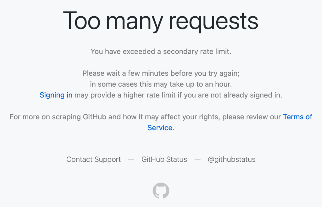
These were users making a handful of normal requests hitting rate limits that shouldn’t have applied to them.
What we found
Investigating these reports, we discovered the root cause: Protection rules added during past abuse incidents had been left in place. These rules were based on patterns that had been strongly associated with abusive traffic when they were created. The problem is that those same patterns were also matching some logged-out requests from legitimate clients.
These patterns are combinations of industry-standard fingerprinting techniques alongside platform-specific business logic — composite signals that help us distinguish legitimate usage from abuse. But, unfortunately, composite signals can occasionally produce false positives.
The composite approach did provide filtering. Among requests that matched the suspicious fingerprints, only about 0.5–0.9% were actually blocked; specifically, those that also triggered the business-logic rules. Requests that matched both criteria were blocked 100% of the time.
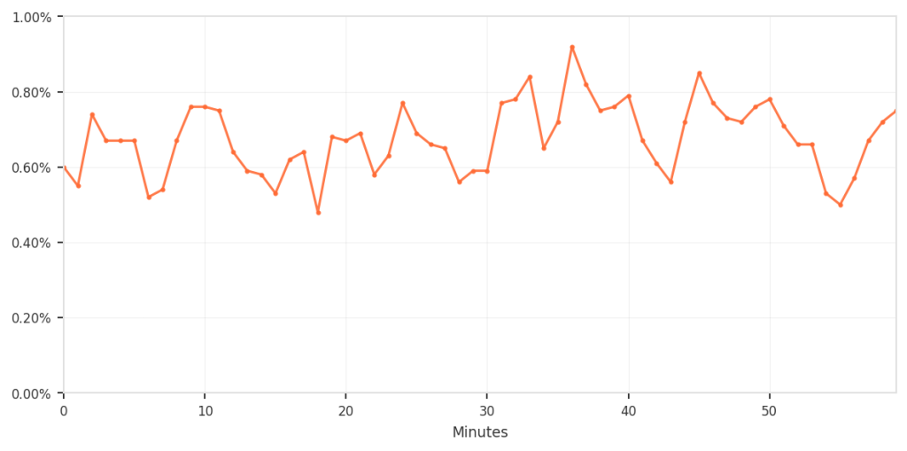
The overall impact was small but consistent; however, for the customers who were affected, we recognize that any incorrect blocking is unacceptable and can be disruptive. To put all of this in perspective, the following shows the false-positive rate relative to total traffic.
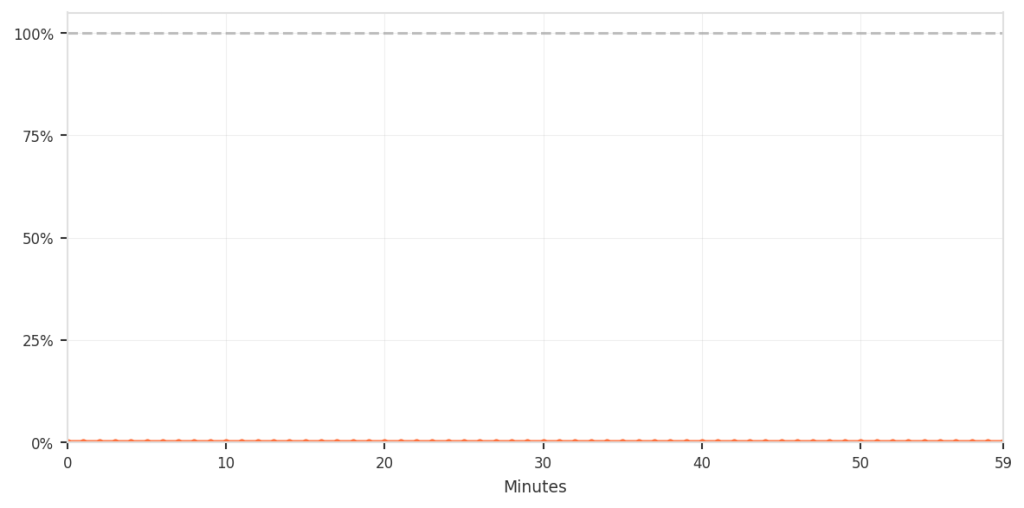
Although the percentage was low, it still meant that real users were incorrectly blocked during normal browsing, which is not acceptable. The chart below zooms in specifically on this false-positive pattern over time.
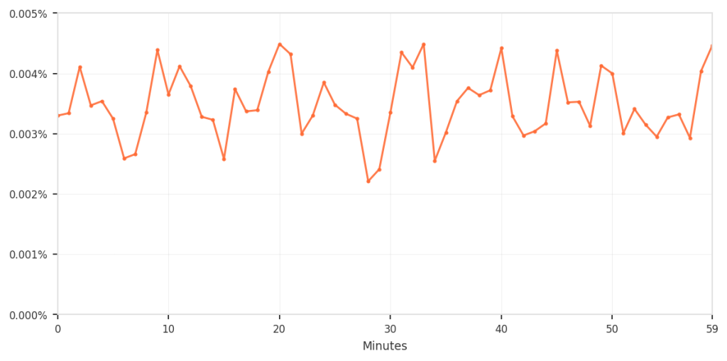
This is a common challenge when defending platforms at scale. During active incidents, you need to respond quickly, and you accept some tradeoffs to keep the service available. The mitigations are correct and necessary at that moment. Those emergency controls don’t age well as threat patterns evolve and legitimate tools and usage change.
Without active maintenance, temporary mitigations become permanent, and their side effects compound quietly.
Tracing through the stack
The investigation itself highlighted why these issues can persist. When users reported errors, we traced requests across multiple layers of infrastructure to identify where the blocks occurred.
To understand why this tracing is necessary, it helps to see how protection mechanisms are applied throughout our infrastructure. We’ve built a custom, multi-layered protection infrastructure tailored to GitHub’s unique operational requirements and scale, building upon the flexibility and extensibility of open-source projects like HAProxy. Here’s a simplified view of how requests flow through these defense layers (simplified to avoid disclosing specific defense mechanisms and to keep the concepts broadly applicable):
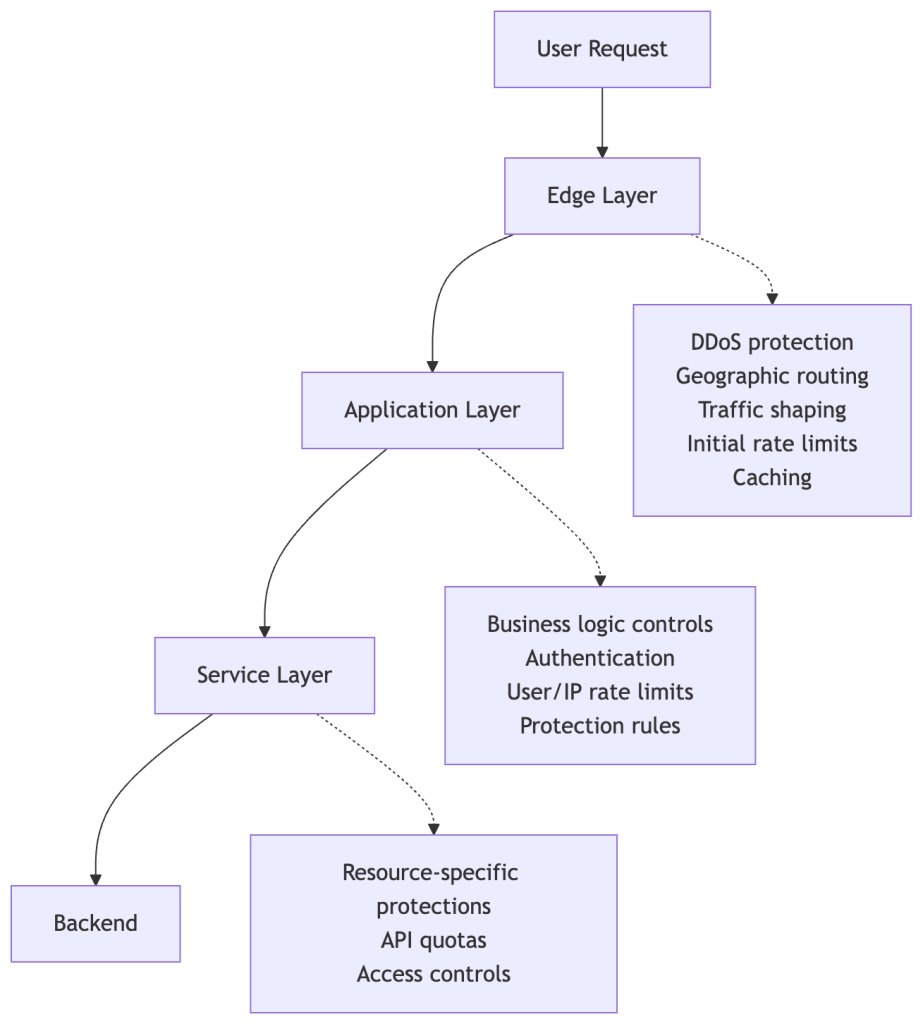
Each layer has legitimate reasons to rate-limit or block requests. During an incident, a protection might be added at any of these layers depending on where the abuse is best mitigated and what controls are fastest to deploy.
The challenge: When a request gets blocked, tracing which layer made that decision requires correlating logs across multiple systems, each with different schemas.
In this case, we started with user reports and worked backward:
- User reports provided timestamps and approximate behavior patterns.
- Edge tier logs showed the requests reaching our infrastructure.
- Application tier logs revealed 429 “Too Many Requests” responses.
- Protection rule analysis ultimately identified which rules matched these requests.
The investigation took us from external reports to distributed logs to rule configurations, demonstrating that maintaining comprehensive visibility into what’s actually blocking requests and where is essential.
The lifecycle of incident mitigations
Here’s how these protections outlived their purpose:
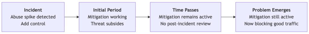
Each mitigation was necessary when added. But the controls where we didn’t consistently apply lifecycle management (setting expiration dates, conducting post-incident rule reviews, or monitoring impact) became technical debt that accumulated until users noticed.
What we did
We reviewed these mitigations, analyzing what each one was blocking today versus what it was meant to block when created. We removed the rules that were no longer serving their purpose, and kept protections against ongoing threats.
What we’re building
Beyond the immediate fix, we’re improving the lifecycle management of protective controls:
- Better visibility across all protection layers to trace the source of rate limits and blocks.
- Treating incident mitigations as temporary by default. Making them permanent should require an intentional, documented decision.
- Post-incident practices that evaluate emergency controls and evolve them into sustainable, targeted solutions.
Defense mechanisms – even those deployed quickly during incidents – need the same care as the systems they protect. They need observability, documentation, and active maintenance. When protections are added during incidents and left in place, they become technical debt that quietly accumulates.
Thanks to everyone who reported issues publicly! Your feedback directly led to these improvements. And thanks to the teams across GitHub who worked on the investigation and are building better lifecycle management into how we operate. Our platform, team, and community are better together!
The post When protections outlive their purpose: A lesson on managing defense systems at scale appeared first on The GitHub Blog.
]]>GitHub is introducing post-quantum secure key exchange methods for SSH access to better protect Git data in transit.
The post Post-quantum security for SSH access on GitHub appeared first on The GitHub Blog.
]]>Today, we’re announcing some changes that will improve the security of accessing Git data over SSH.
What’s changing?
We’re adding a new post-quantum secure SSH key exchange algorithm, known alternately as sntrup761x25519-sha512 and [email protected], to our SSH endpoints for accessing Git data.
This only affects SSH access and doesn’t impact HTTPS access at all.
It also does not affect GitHub Enterprise Cloud with data residency in the United States region.
Why are we making these changes?
These changes will keep your data secure both now and far into the future by ensuring they are protected against future decryption attacks carried out on quantum computers.
When you make an SSH connection, a key exchange algorithm is used for both sides to agree on a secret. The secret is then used to generate encryption and integrity keys. While today’s key exchange algorithms are secure, new ones are being introduced that are secure against cryptanalytic attacks carried out by quantum computers.
We don’t know if it will ever be possible to produce a quantum computer powerful enough to break traditional key exchange algorithms. Nevertheless, an attacker could save encrypted sessions now and, if a suitable quantum computer is built in the future, decrypt them later. This is known as a “store now, decrypt later” attack.
To protect your traffic to GitHub when using SSH, we’re rolling out a hybrid post-quantum key exchange algorithm: sntrup761x25519-sha512 (also known by the older name [email protected]). This provides security against quantum computers by combining a new post-quantum-secure algorithm, Streamlined NTRU Prime, with the classical Elliptic Curve Diffie-Hellman algorithm using the X25519 curve. Even though these post-quantum algorithms are newer and thus have received less testing, combining them with the classical algorithm ensures that security won’t be weaker than what the classical algorithm provides.
These changes are rolling out to github.com and non-US resident GitHub Enterprise Cloud regions. Only FIPS-approved cryptography may be used within the US region, and this post-quantum algorithm isn’t approved by FIPS.
When are these changes effective?
We’ll enable the new algorithm on September 17, 2025 for GitHub.com and GitHub Enterprise Cloud with data residency (with the exception of the US region).
This will also be included in GitHub Enterprise Server 3.19.
How do I prepare?
This change only affects connections with a Git client over SSH. If your Git remotes start with https://, you won’t be impacted by this change.
For most uses, the new key exchange algorithm won’t result in any noticeable change. If your SSH client supports [email protected] or sntrup761x25519-sha512 (for example, OpenSSH 9.0 or newer), it will automatically choose the new algorithm by default if your client prefers it. No configuration change should be necessary unless you modified your client’s defaults.
If you use an older SSH client, your client should fall back to an older key exchange algorithm. That means you won’t experience the security benefits of using a post-quantum algorithm until you upgrade, but your SSH experience should continue to work as normal, since the SSH protocol automatically picks an algorithm that both sides support.
If you want to test whether your version of OpenSSH supports this algorithm, you can run the following command: ssh -Q kex. That lists all of the key exchange algorithms supported, so if you see sntrup761x25519-sha512 or [email protected], then it’s supported.
To check which key exchange algorithm OpenSSH uses when you connect to GitHub.com, run the following command on Linux, macOS, Git Bash, or other Unix-like environments:
$ ssh -v [email protected] exit 2>&1 | grep 'kex: algorithm:'For other implementations of SSH, please see the documentation for that implementation.
What’s next?
We’ll keep an eye on the latest developments in security. As the SSH libraries we use begin to support additional post-quantum algorithms, including ones that comply with FIPS, we’ll update you on our offerings.
The post Post-quantum security for SSH access on GitHub appeared first on The GitHub Blog.
]]>Our best practices for quickly identifying, resolving, and preventing issues at scale.
The post How GitHub engineers tackle platform problems appeared first on The GitHub Blog.
]]>In my spare time I enjoy building Gundam models, which are model kits to build iconic mechas from the Gundam universe. You might be wondering what this has to do with software engineering. Product engineers can be seen as the engineers who take these kits and build the Gundam itself. They are able to utilize all pieces and build a working product that is fun to collect or even play with!
Platform engineers, on the other hand, supply the tools needed to build these kits (like clippers and files) and maybe even build a cool display so everyone can see the final product. They ensure that whoever is constructing it has all the necessary tools, even if they don’t physically build the Gundam themselves.

About a year ago, my team at GitHub moved to the infrastructure organization, inheriting new roles and Areas of Responsibility (AoRs). Previously, the team had tackled external customer problems, such as building the new deployment views across environments. This involved interacting with users who depend on GitHub to address challenges within their respective industries. Our new customers as a platform engineering team are internal, which makes our responsibilities different from the product-focused engineering work we were doing before.
Going back to my Gundam example, rather than constructing kits, we’re now responsible for building the components of the kits. Adapting to this change meant I had to rethink my approach to code testing and problem solving.
Whether you’re working on product engineering or on the platform side, here are a few best practices to tackle platform problems.
Understanding your domain
One of the most critical steps before tackling problems is understanding the domain. A “domain” is the business and technical subject area in which a team and platform organization operate. This requires gaining an understanding of technical terms and how these systems interact to provide fast and reliable solutions. Here’s how to get up to speed:
- Talk to your neighbors: Arrange a handover meeting with a team that has more knowledge and experience with the subject matter. This meeting provides an opportunity to ask questions about terminology and gain a deeper understanding of the problems the team will be addressing.
- Investigate old issues: If there is a backlog of issues that are either stale or still persistent, they may give you a better understanding of the system’s current limitations and potential areas for improvement.
- Read the docs: Documentation is a goldmine of knowledge that can help you understand how the system works.
Bridging concepts to platform-specific skills
While the preceding advice offers general guidance applicable to both product and platform teams, platform teams — serving as the foundational layer — necessitate a more in-depth understanding.
- Networks: Understanding network fundamentals is crucial for all engineers, even those not directly involved in network operations. This includes concepts like TCP, UDP, and L4 load balancing, as well as debugging tools such as dig. A solid grasp of these areas is essential to comprehend how network traffic impacts your platform.
- Operating systems and hardware: Selecting appropriate virtual machines (VMs) or physical hardware is vital for both scalability and cost management. Making well-informed choices for particular applications requires a strong grasp of both. This is closely linked to choosing the right operating system for your machines, which is important to avoid systems with vulnerabilities or those nearing end of life.
- Infrastructure as Code (IaC): Automation tools like Terraform, Ansible, and Consul are becoming increasingly essential. Proficiency in these tools is becoming a necessity as they significantly decrease human error during infrastructure provisioning and modifications.
- Distributed systems: Dealing with platform issues, particularly in distributed systems, necessitates a deep understanding that failures are inevitable. Consequently, employing proactive solutions like failover and recovery mechanisms is crucial for preserving system reliability and preventing adverse user experiences. The optimal approach for this depends entirely on the specific problem and the desired system behavior.
Knowledge sharing
By sharing lessons and ideas, engineers can introduce new perspectives that lead to breakthroughs and innovations. Taking the time to understand why a project or solution did or didn’t work and sharing those findings provides new perspectives that we can use going forward.
Here are three reasons why knowledge sharing is so important:
- Teamwork makes the dream work: Collaboration often results in quicker problem resolution and fosters new solution innovation, as engineers have the opportunity to learn from each other and expand upon existing ideas.
- Prevent lost knowledge: If we don’t share our lessons learned, we prevent the information from being disseminated across the team or organization. This becomes a problem if an engineer leaves the company or is simply unavailable.
- Improve our customer success: As engineers, our solutions should effectively serve our customers. By sharing our knowledge and lessons learned, we can help the team build reliable, scalable, and secure platforms, which will enable us to create better products that meet customer needs and expectations!
But big differences start to appear between product engineering and infrastructure engineering when it comes to the impact radius and the testing process.
Impact radius
With platforms being the fundamental building blocks of a system, any change (small or large) can affect a wide range of products. Our team is responsible for DNS, a foundational service that impacts numerous products. Even a minor alteration to this service can have extensive repercussions, potentially disrupting access to content across our site and affecting products ranging from GitHub Pages to GitHub Copilot.
- Understand the radius: Or understand the downstream dependencies. Direct communication with teams that depend on our service provides valuable insights into how proposed changes may affect other services.
- Postmortems: By looking at past incidents related to our platform and asking “What is the impact of this incident?”, we can form more context around what change or failure was introduced, how our platform played a role in it, and how it was fixed.
- Monitoring and telemetry: Condense important monitoring and logging into a small and quickly digestible medium to give you the general health of the system. This could be a Single Availability Metric (SAM), for example. The ability to quickly glance at a single dashboard allows engineers to rapidly pinpoint the source of an issue and streamlines the debugging and incident mitigation process, as compared to searching through and interpreting detailed monitors or log messages.
Testing changes
Testing changes in a distributed environment can be challenging, especially for services like DNS. A crucial step in solving this issue is utilizing a test site as a “real” machine where you can implement and assess all your changes.
- Infrastructure as Code (IaC): When using tools like Terraform or Ansible, it’s crucial to test fundamental operations like provisioning and deprovisioning machines. There are circumstances where a machine will need to be re-provisioned. In these cases, we want to ensure the machine is not accidentally deleted and that we retain the ability to create a new one if needed.
- End-to-End (E2E): Begin directing some network traffic to these servers. Then the team can observe host behavior by directly interacting with it, or we can evaluate functionality by diverting a small portion of traffic.
- Self-healing: We want to test the platform’s ability to recover from unexpected loads and identify bottlenecks before they impact our users. Early identification of bottlenecks or bugs is crucial for maintaining the health of our platform.
Ideally changes will be implemented on a host-by-host basis once testing is complete. This approach allows for individual machine rollback and prevents changes from being applied to unaffected hosts.
What to remember
Platform engineering can be difficult. The systems GitHub operates with are complex and there are a lot of services and moving parts. However, there’s nothing like seeing everything come together. All the hard work our engineering teams do behind the scenes really pays off when the platform is running smoothly and teams are able to ship faster and more reliably — which allows GitHub to be the home to all developers.
Want to dive deeper? Check out our infrastructure related blog posts.
The post How GitHub engineers tackle platform problems appeared first on The GitHub Blog.
]]>Plus, considerations in updating one of GitHub's oldest and most heavily used features.
The post GitHub Issues search now supports nested queries and boolean operators: Here’s how we (re)built it appeared first on The GitHub Blog.
]]>Originally, Issues search was limited by a simple, flat structure of queries. But with advanced search syntax, you can now construct searches using logical AND/OR operators and nested parentheses, pinpointing the exact set of issues you care about.
Building this feature presented significant challenges: ensuring backward compatibility with existing searches, maintaining performance under high query volume, and crafting a user-friendly experience for nested searches. We’re excited to take you behind the scenes to share how we took this long-requested feature from idea to production.
Here’s what you can do with the new syntax and how it works behind the scenes
Issues search now supports building queries with logical AND/OR operators across all fields, with the ability to nest query terms. For example is:issue state:open author:rileybroughten (type:Bug OR type:Epic) finds all issues that are open AND were authored by rileybroughten AND are either of type bug or epic.
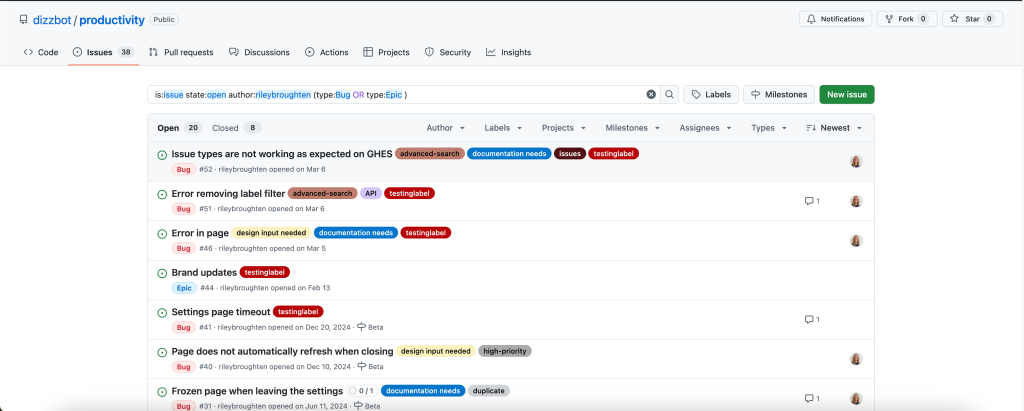
How did we get here?
Previously, as mentioned, Issues search only supported a flat list of query fields and terms, which were implicitly joined by a logical AND. For example, the query assignee:@me label:support new-project translated to “give me all issues that are assigned to me AND have the label support AND contain the text new-project.”
But the developer community has been asking for more flexibility in issue search, repeatedly, for nearly a decade now. They wanted to be able to find all issues that had either the label support or the label question, using the query label:support OR label:question. So, we shipped an enhancement towards this request in 2021, when we enabled an OR style search using a comma-separated list of values.
However, they still wanted the flexibility to search this way across all issue fields, and not just the labels field. So we got to work.
Technical architecture and implementation
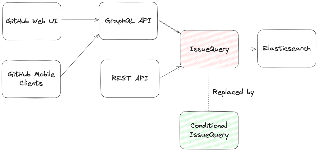
From an architectural perspective, we swapped out the existing search module for Issues (IssuesQuery), with a new search module (ConditionalIssuesQuery), that was capable of handling nested queries while continuing to support existing query formats.
This involved rewriting IssueQuery, the search module that parsed query strings and mapped them into Elasticsearch queries.
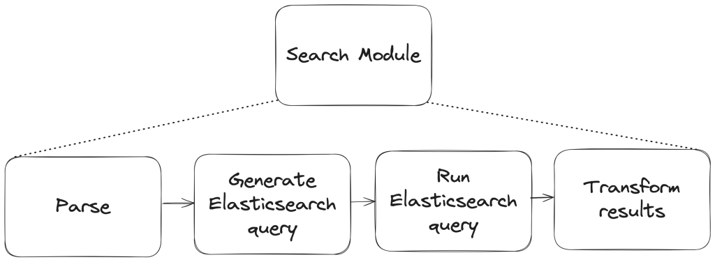
To build a new search module, we first needed to understand the existing search module, and how a single search query flowed through the system. At a high level, when a user performs a search, there are three stages in its execution:
- Parse: Breaking the user input string into a structure that is easier to process (like a list or a tree)
- Query: Transforming the parsed structure into an Elasticsearch query document, and making a query against Elasticsearch.
- Normalize: Mapping the results obtained from Elasticsearch (JSON) into Ruby objects for easy access and pruning the results to remove records that had since been removed from the database.
Each stage presented its own challenges, which we’ll explore in more detail below. The Normalize step remained unchanged during the re-write, so we won’t dive into that one.
Parse stage
The user input string (the search phrase) is first parsed into an intermediate structure. The search phrase could include:
- Query terms: The relevant words the user is trying to find more information about (ex: “models”)
- Search filters: These restrict the set of returned search documents based on some criteria (ex: “assignee:Deborah-Digges”)
Example search phrase:
- Find all issues assigned to me that contain the word “codespaces”:
is:issue assignee:@me codespaces
- Find all issues with the label documentation that are assigned to me:
assignee:@me label:documentation
The old parsing method: flat list
When only flat, simple queries were supported, it was sufficient to parse the user’s search string into a list of search terms and filters, which would then be passed along to the next stage of the search process.
The new parsing method: abstract syntax tree
As nested queries may be recursive, parsing the search string into a list was no longer sufficient. We changed this component to parse the user’s search string into an Abstract Syntax Tree (AST) using the parsing library parslet.
We defined a grammar (a PEG or Parsing Expression Grammar) to represent the structure of a search string. The grammar supports both the existing query syntax and the new nested query syntax, to allow for backward compatibility.
A simplified grammar for a boolean expression described by a PEG grammar for the parslet parser is shown below:
class Parser < Parslet::Parser
  rule(:space)  { match[" "].repeat(1) }
  rule(:space?) { space.maybe }

  rule(:lparen) { str("(") >> space? }
  rule(:rparen) { str(")") >> space? }

  rule(:and_operator) { str("and") >> space? }
  rule(:or_operator)  { str("or")  >> space? }

  rule(:var) { str("var") >> match["0-9"].repeat(1).as(:var) >> space? }

  # The primary rule deals with parentheses.
  rule(:primary) { lparen >> or_operation >> rparen | var }

  # Note that following rules are both right-recursive.
  rule(:and_operation) {
    (primary.as(:left) >> and_operator >>
      and_operation.as(:right)).as(:and) |
    primary }

  rule(:or_operation)  {
    (and_operation.as(:left) >> or_operator >>
      or_operation.as(:right)).as(:or) |
    and_operation }

  # We start at the lowest precedence rule.
  root(:or_operation)
end
For example, this user search string:is:issue AND (author:deborah-digges OR author:monalisa )
would be parsed into the following AST:
{
  "root": {
    "and": {
      "left": {
        "filter_term": {
          "attribute": "is",
          "value": [
            {
              "filter_value": "issue"
            }
          ]
        }
      },
      "right": {
        "or": {
          "left": {
            "filter_term": {
              "attribute": "author",
              "value": [
                {
                  "filter_value": "deborah-digges"
                }
              ]
            }
          },
          "right": {
            "filter_term": {
              "attribute": "author",
              "value": [
                {
                  "filter_value": "monalisa"
                }
              ]
            }
          }
        }
      }
    }
  }
}
Query
Once the query is parsed into an intermediate structure, the next steps are to:
- Transform this intermediate structure into a query document that Elasticsearch understands
- Execute the query against Elasticsearch to obtain results
Executing the query in step 2 remained the same between the old and new systems, so let’s only go over the differences in building the query document below.
The old query generation: linear mapping of filter terms using filter classes
Each filter term (Ex: label:documentation) has a class that knows how to convert it into a snippet of an Elasticsearch query document. During query document generation, the correct class for each filter term is invoked to construct the overall query document.
The new query generation: recursive AST traversal to generate Elasticsearch bool query
We recursively traversed the AST generated during parsing to build an equivalent Elasticsearch query document. The nested structure and boolean operators map nicely to Elasticsearch’s boolean query with the AND, OR, and NOT operators mapping to the must, should, and should_not clauses.
We re-used the building blocks for the smaller pieces of query generation to recursively construct a nested query document during the tree traversal.
Continuing from the example in the parsing stage, the AST would be transformed into a query document that looked like this:
{
  "query": {
    "bool": {
      "must": [
        {
          "bool": {
            "must": [
              {
                "bool": {
                  "must": {
                    "prefix": {
                      "_index": "issues"
                    }
                  }
                }
              },
              {
                "bool": {
                  "should": {
                    "terms": {
                      "author_id": [
                        "<DEBORAH_DIGGES_AUTHOR_ID>",
                        "<MONALISA_AUTHOR_ID>"
                      ]
                    }
                  }
                }
              }
            ]
          }
        }
      ]
    }
    // SOME TERMS OMITTED FOR BREVITY
  }
}
With this new query document, we execute a search against Elasticsearch. This search now supports logical AND/OR operators and parentheses to search for issues in a more fine-grained manner.
Considerations
Issues is one of the oldest and most heavily -used features on GitHub. Changing core functionality like Issues search, a feature with an average of nearly 2000 queries per second (QPS)—that’s almost 160M queries a day!—presented a number of challenges to overcome.
Ensuring backward compatibility
Issue searches are often bookmarked, shared among users, and linked in documents, making them important artifacts for developers and teams. Therefore, we wanted to introduce this new capability for nested search queries without breaking existing queries for users.
We validated the new search system before it even reached users by:
- Testing extensively: We ran our new search module against all unit and integration tests for the existing search module. To ensure that the GraphQL and REST API contracts remained unchanged, we ran the tests for the search endpoint both with the feature flag for the new search system enabled and disabled.
- Validating correctness in production with dark-shipping: For 1% of issue searches, we ran the user’s search against both the existing and new search systems in a background job, and logged differences in responses. By analyzing these differences we were able to fix bugs and missed edge cases before they reached our users.
- We weren’t sure at the outset how to define “differences,” but we settled on “number of results” for the first iteration. In general, it seemed that we could determine whether a user would be surprised by the results of their search against the new search capability if a search returned a different number of results when they were run within a second or less of each other.
Preventing performance degradation
We expected more complex nested queries to use more resources on the backend than simpler queries, so we needed to establish a realistic baseline for nested queries, while ensuring no regression in the performance of existing, simpler ones.
For 1% of Issue searches, we ran equivalent queries against both the existing and the new search systems. We used scientist, GitHub’s open source Ruby library, for carefully refactoring critical paths, to compare the performance of equivalent queries to ensure that there was no regression.
Preserving user experience
We didn’t want users to have a worse experience than before just because more complex searches were possible.
We collaborated closely with product and design teams to ensure usability didn’t decrease as we added this feature by:
- Limiting the number of nested levels in a query to five. From customer interviews, we found this to be a sweet spot for both utility and usability.
- Providing helpful UI/UX cues: We highlight the AND/OR keywords in search queries, and provide users with the same auto-complete feature for filter terms in the UI that they were accustomed to for simple flat queries.
Minimizing risk to existing users
For a feature that is used by millions of users a day, we needed to be intentional about rolling it out in a way that minimized risk to users.
We built confidence in our system by:
- Limiting blast radius: To gradually build confidence, we only integrated the new system in the GraphQL API and the Issues tab for a repository in the UI to start. This gave us time to collect, respond to, and incorporate feedback without risking a degraded experience for all consumers. Once we were happy with its performance, we rolled it out to the Issues dashboard and the REST API.
- Testing internally and with trusted partners: As with every feature we build at GitHub, we tested this feature internally for the entire period of its development by shipping it to our own team during the early days, and then gradually rolling it out to all GitHub employees. We then shipped it to trusted partners to gather initial user feedback.
And there you have it, that’s how we built, validated, and shipped the new and improved Issues search!
Feedback
Want to try out this exciting new functionality? Head to our docs to learn about how to use boolean operators and parentheses to search for the issues you care about!
If you have any feedback for this feature, please drop us a note on our community discussions.
Acknowledgements
Special thanks to AJ Schuster, Riley Broughten, Stephanie Goldstein, Eric Jorgensen Mike Melanson and Laura Lindeman for the feedback on several iterations of this blog post!
The post GitHub Issues search now supports nested queries and boolean operators: Here’s how we (re)built it appeared first on The GitHub Blog.
]]>How to build custom annotations for your design system components or use Figma’s Code Connect to help capture important accessibility details before development.
The post Design system annotations, part 2: Advanced methods of annotating components appeared first on The GitHub Blog.
]]>In part one of our design system annotation series, we discussed the ways in which accessibility can get left out of design system components from one instance to another. Our solution? Using a set of “Preset annotations” for each component with Primer. This allows designers to include specific pre-set details that aren’t already built into the component and visually communicated in the design itself.
That being said, Preset annotations are unique to each design system — and while ours may be a helpful reference for how to build them — they’re not something other organizations can utilize if you’re not also using the Primer design system.
Luckily, you can build your own. Here’s how.
How to make Preset annotations for your design system
Start by assessing components to understand which ones would need Preset annotations—not all of them will. Prioritize components that would benefit most from having a Preset annotation, and build that key information into each one. Next, determine what properties should be included. Only include key information that isn’t conveyed visually, isn’t in the component properties, and isn’t already baked into a coded component.

Prioritizing components
When a design system has 60+ components, knowing where to start can be a challenge. Which components need these annotations the most? Which ones would have the highest impact for both design teams and our users?
When we set out to create a new set of Preset annotations based on our proof of concept, we decided to use ten Primer components that would benefit the most. To help pick them, we used an internal tool called Primer Query that tracks all component implementations across the GitHub codebase as well as any audit issues connected to them. Here is a video breakdown of how it works, if you’re curious.
We then prioritized new Preset annotations based on the following criteria:
- Components that align to organization priorities (i.e. high value products and/or those that receive a lot of traffic).
- Components that appear frequently in accessibility audit issues.
- Components with React implementations (as our preferred development framework).
- Most frequently implemented components.
Mapping out the properties
For each component, we cross-referenced multiple sources to figure out what component properties and attributes would need to be added in each Preset annotation. The things we were looking for may only exist in one or two of those places, and thus are less likely to be accounted for all the way through the design and development lifecycle. The sources include:
Component documentation on Primer.style
Design system docs should contain usage guidance for designers and developers, and accessibility requirements should be a part of this guidance as well. Some of the guidance and requirements get built into the component’s Figma asset, while some only end up in the coded component.
Look for any accessibility requirements that are not built into either Figma or code. If it’s built in, putting the same info in the Preset annotation may be redundant or irrelevant.
Coded demos in Storybook
Our component sandbox helped us see how each component is built in React or Rails, as well as what the HTML output is. We looked for any code structure or accessibility attributes that are not included in the component documentation or the Figma asset itself—especially when they may vary from one implementation to another.
Component properties in the Figma asset library
Library assets provide a lot of flexibility through text layers, image fills, variants, and elaborate sets of component properties. We paid close attention to these options to understand what designers can and can’t change. Worthwhile additions to a Preset Annotation are accessibility attributes, requirements, and usage guidance in other sources that aren’t built into the Figma component.
Other potential sources
- Experiences from team members: The designers, developers, and accessibility specialists you work with may have insight into things that the docs and design tools may have missed. If your team and design system have been around for a while, their insights may be more valuable than those you’ll find in the docs, component demos, or asset libraries. Take some time to ask which components have had challenging bugs and which get intentionally broken when implemented.
- Findings from recent audits: Design system components themselves may have unresolved audit issues and remediation recommendations. If that’s the case, those issues are likely present in Storybook demos and may be unaccounted for in the component documentation. Design system audit issues may have details that both help create a Preset annotation and offer insights about what should not be carried over from existing resources.
What we learned from creating Preset annotations
Preset annotations may not be for every team or organization. However, they are especially well suited for younger design systems and those that aren’t well adopted.
Mature design systems like Primer have frequent updates. This means that without close monitoring, the design system components themselves may fall out of sync with how a Preset annotation is built. This can end up causing confusion and rework after development starts, so it may be wise to make sure there’s some capacity to maintain these annotations after they’ve been created.
For newer teams at GitHub, new members of existing teams, and team members who were less familiar with the design system, the built-in guidance and links to documentation and component demos proved very useful. Those who are more experienced are also able to fine-tune the Presets and how they’re used.
If you don’t already have extensive experience with the design system components (or peers to help build them), it can take a lot of time to assess and map out the properties needed to build a Preset. It can also be challenging to name a component property succinctly enough that it doesn’t get truncated in Figma’s properties panel. If the context is not self-evident, some training or additional documentation may help.
It’s not always clear that you need a Preset annotation
There may be enough overlap between the Preset annotation for a component and types of annotations that aren’t specific to the design system.
For example, the GitHub Annotation Toolkit has components to annotate basic <textarea> form elements in addition to a Preset annotation for our <TextArea> Primer component:
In many instances, this flexibility may be confusing because you could use either annotation. For example, the Primer <TextArea> Preset has built-in links to specific Primer docs, and while the non-Preset version doesn’t, you could always add the links manually. While there’s some overlap between the two, using either one is better than none.
One way around this confusion is to add Primer-specific properties to the default set of annotations. This would allow you to do things like toggle a boolean property on a normal Button annotation and have it show links and properties specific to your design system’s button component.
Our Preset creation process may unlock automation
There are currently a number of existing Figma plugins that advertise the ability to scan a design file to help with annotations. That being said, the results are often mixed and contain an unmanageable amount of noise and false positives. One of the reasons these issues happen is that these public plugins are design system agnostic.
Current automated annotation tools aren’t able to understand that any design system components are being used without bespoke programming or thorough training of AI models. For plugins like this to be able to label design elements accurately, they first need to understand how to identify the components on the canvas, the variants used, and the set properties.
With that in mind, perhaps the most exciting insight is that the process of mapping out component properties for a Preset annotation—the things that don’t get conveyed in the visual design or in the code—is also something that would need to be done in any attempt to automate more usable annotations.
In other words, if a team uses a design system and wants to automate adding annotations, the tool they use would need to understand their components. In order for it to understand their components well enough to automate accurately, these hidden component properties would need to be mapped out. The task of creating a set of Preset annotations may be a vital stepping stone to something even more streamlined.
A promising new method: Figma’s Code Connect
While building our new set of Preset annotations, we experimented with other ways to enhance Primer with annotations. Though not all of those experiments worked out, one of them did: adding accessibility attributes through Code Connect.
Primer was one of the early adopters of Figma’s new Code Connect feature in Dev Mode. Says Lukas Oppermann, our staff systems designer, “With Code Connect, we can actually move the design and the code a little bit further apart again. We can concentrate on creating the best UX for the designers working in Figma with design libraries and, on the code side, we can have the best developer experience.”
To that end, Code Connect allows us to bypass much of our Preset annotations, as well as the downsides of some of our other experiments. It does this by adding key accessibility details directly into the code that developers can export from Figma.
GitHub’s Octicons are used in many of our Primer components. They are decorative by default, but they sometimes need alt text or aria-label attributes depending on how they’re used. In the IconButton component, that button uses an Octicon and needs an accessible name to describe its function.
When using a basic annotation kit, this may mean adding stamps for a Button and Decorative Image as well as a note in the margins that specifies what the aria-label should be. When using Preset annotations, there are fewer things to add to the canvas and the annotation process takes less time.
With Code Connect set up, Lukas added a hidden layer in the IconButton Figma component. It has a text property for aria-label which lets designers add the value directly from the component properties panel. No annotations needed. The hidden layer doesn’t disrupt any of the visuals, and the aria-label property gets exported directly with the rest of the component’s code.
It takes time to set up Code Connect with each of your design system components. Here are a few tips to help:
- Consistency is key. Make sure that the properties you create and how you place hidden layers is consistent across components. This helps set clear expectations so your teams can understand how these hidden layers and properties function.
- Use a branch of your design system library to experiment. Hiding attributes like aria-label is quite simple compared to other complex information that Preset annotations are capable of handling.
- Use visual regression testing (VRT). Adding complexity directly to a component comes with increased risk of things breaking in the future, especially for those with many variants. Figma’s merge conflict UI is helpful, but may not catch everything.
We’ve made the GitHub Annotation Toolkit open source, so you can see first-hand how we’ve implemented our Primer A11y Preset annotations and visual regression tests. Check it out and start annotating today!
Further reading
Accessibility annotation kits are a great resource, provided they’re used responsibly. Eric Bailey, one of the contributors to our forthcoming GitHub Annotation Toolkit, has written extensively about how annotations can highlight and amplify deeply structural issues when you’re building digital products.
The post Design system annotations, part 2: Advanced methods of annotating components appeared first on The GitHub Blog.
]]>